-
Hey, guest user. Hope you're enjoying NeoGAF! Have you considered registering for an account? Come join us and add your take to the daily discourse.
You are using an out of date browser. It may not display this or other websites correctly.
You should upgrade or use an alternative browser.
You should upgrade or use an alternative browser.
Arts & Farts
- Thread starter Dreweyes
- Start date
Raging Spaniard
If they are Dutch, upright and breathing they are more racist than your favorite player
StormyTheRabbit said:Hey I saw a sketch of this, uncolored, months ago and decided to get a tattoo of it. I'm going within a month or two and was wondering if I could use this as an outline for what I want. I might switch up some colors, but overall this is perfect. Just wanted to ask before using it.
Sure thing man, and thanks! Lemme know how it turns out.
OchreHand, that stuff is RIDICULOUS, holy shit. Great all around (you have a studio job or freelance?)
Arena, MAX? Really? Is that a class requirement or some shit? Either way it looks good, a little uneven in terms of detail, but good stuff nonetheless.
Some more stuff, if any of you wanna keep up with my art blog btw, heres a link (from there you can subscribe to an rss feed too, if that's more your thing)
OchreHand said:Sweet work all. Good to see this thread is aliiiiive. Here's some I did for this month: experimenting with hot and cold palette

Dang I really like this one! Good job!
I wish I could do impressionist stuff like this. I need to take the effort to buy a canvas and oil paints.
Raging Spaniard
If they are Dutch, upright and breathing they are more racist than your favorite player
Zyzyxxz said:Dang I really like this one! Good job!
I wish I could do impressionist stuff like this. I need to take the effort to buy a canvas and oil paints.
Or, you know, a copy of Painter X
")
Raging Spaniard
If they are Dutch, upright and breathing they are more racist than your favorite player
A color version of one of the old ones
My first attempt coloring something with Photoshop:

Done completely with a mouse. I learned so much from this. The most important thing being a refined starting point makes everything else a lot easier. I'd say I ended up not using any of the original lines from the sketch, so I pretty-much drew this with a mouse. I started out just playing around putting color on a doodle I scanned with no intention of actually trying to make it look good. I spent so much time making revisions to my shitty sketch and cleaning it up that it made the entire process a lot harder than I'm sure it should have been. I was also impatient, so rather than revise the entire sketch and then paint, I did it in portions because I couldn't wait to see how it would look painted. Hence the legs not being anywhere near completion.
There's a lot I could keep doing to it. A lot of stuff still looks off, but I don't plan on ever finishing. I proved to myself I could do it and it was a great learning experience. Maybe I'll finally get a Wacom.
hey all thanks for commenting and stuff..! doing the impressionist style always came natural to me, much to the dismay of some of my art profs who preferred the very clean, renaissance style of painting. but i like it all in the end
hey thanks-- i wish i had a studio job, like at a game company. i don't even know where to begin, but painting for a living sounds like a blast. once in a while i'll get an illustration job for an article. i checked your blog and you do concept art for EA , that's really cool..
Dali, for your first try at Photoshop coloring that's really good dude... my only suggestion is to keep in mind of color harmony, so it's not just "green" clothing, "peach skin" -- but more unified. you can try adding warm complimentary colors in the green shadow areas,i think that'll help
doing the impressionist style always came natural to me, much to the dismay of some of my art profs who preferred the very clean, renaissance style of painting. but i like it all in the endRaging Spaniard said:OchreHand, that stuff is RIDICULOUS, holy shit. Great all around (you have a studio job or freelance?)
hey thanks-- i wish i had a studio job, like at a game company. i don't even know where to begin, but painting for a living sounds like a blast. once in a while i'll get an illustration job for an article. i checked your blog and you do concept art for EA , that's really cool..
Dali, for your first try at Photoshop coloring that's really good dude... my only suggestion is to keep in mind of color harmony, so it's not just "green" clothing, "peach skin" -- but more unified. you can try adding warm complimentary colors in the green shadow areas,i think that'll help
Raging Spaniard said:A color version of one of the old ones
Your art style reminds me of Moebius' work!
Raging Spaniard
If they are Dutch, upright and breathing they are more racist than your favorite player
OchreHand said:hey thanks-- i wish i had a studio job, like at a game company. i don't even know where to begin, but painting for a living sounds like a blast. once in a while i'll get an illustration job for an article. i checked your blog and you do concept art for EA , that's really cool..
Getting a game job can be tricky, since the art thats produced is very specialized. If you draw any people and do some character design along with your environment work, Id say give it a shot since you definitely have the technical and coloring skills. Your art right now would probably go well with big companies that need you to do one thing and do it very well (valve, insomniac, naughty dog, etc ... look at the environment concept artwork they produce and its not far from your own)
As far as how to go about it, heres the KEY: e-mail submissions. Find the company, the e-mail adress and apply. IT DOESNT MATTER IF THEY DONT HAVE AN OPENING, that part is key, websites are not up to date all the time and you never really know what they want anyways. Another key thing is follow up emails, thats so important I can stress it enough, so instead Im going to link you to the best art submission advice on the internet, Jon Jones (Art director at NCSoft until just recently):
From his article: Smart people are dumb. Failure is awesome
Heres one real-world application for you: Applying for a job. Most people SUCK at this, and thats why they dont get jobs. Most people I know have given up after ONE EMAIL sent to a company theyre applying for. They quit before the race even starts.
After working in sales at Liquid Development, I learned that the follow-up call after initial solicitation is the most important communication you can make. Most people I would email, whether currently clients or people I was soliciting to, would never respond to the first email. Ever. Its as if they never received it at all. Id say I got one reply out of a hundred to the first email, if that.
After that, Id sit on it a week, and send a follow-up to make sure they got the first one. At this point, usually within the next business day, Id have a reply almost every single time. The response rate here was perhaps one in four. Whether or not it was a positive or negative response, it still got responses, and opportunities were either created or dismissed.
This fascinated me. Most people give up after only one communication, when the second one works almost every single time. Youd think that it would annoy people, but mostly, people are cool about it. They know theyre terrible about responding to email, and as long as youre polite, everything is fine.
When I was applying for a job on my own, I sent out my resume and portfolio to probably 30 or 40 companies. I kept track of what I sent to who and what date, and followed up like clockwork after one week. The second email was always a quoted copy of the first, starting with a Hi, my name is Jon Jones and I applied for such-and-such position at your company a week ago. I hadnt heard back yet and I wanted to make sure that you received my email. Ive quoted it below. Thanks!
Then the floodgates opened.
Week one: 40 emails. Zero responses.
Week two: 40 follow-up emails. 35 responses within three days.
And you know what the best part was? The really, really funny thing? Every single response began with an apology for not responding sooner. Every single one, without ONE exception.
Another good article is Your portfolio repels jobs This guy has great advice all around and definitely worth your attention.
Dali said:My first attempt coloring something with Photoshop:
Done completely with a mouse. I learned so much from this. The most important thing being a refined starting point makes everything else a lot easier. I'd say I ended up not using any of the original lines from the sketch, so I pretty-much drew this with a mouse. I started out just playing around putting color on a doodle I scanned with no intention of actually trying to make it look good. I spent so much time making revisions to my shitty sketch and cleaning it up that it made the entire process a lot harder than I'm sure it should have been. I was also impatient, so rather than revise the entire sketch and then paint, I did it in portions because I couldn't wait to see how it would look painted. Hence the legs not being anywhere near completion.
There's a lot I could keep doing to it. A lot of stuff still looks off, but I don't plan on ever finishing. I proved to myself I could do it and it was a great learning experience. Maybe I'll finally get a Wacom.
Nice! I would suggest checking out [urlhttp://idrawgirls.blogspot.com/]this Blog[/url]. Xia Taptara is a concept artist for Arena net (Guild Wars) and has a bunch of good color tutorials, heres one tutorial about how to balance hot and cold colors.
harSon said:Your art style reminds me of Moebius' work!
Thats probably the nicest thing I've ever heard, thanks!
Raging Spaniard said:Getting a game job can be tricky, since the art thats produced is very specialized. If you draw any people and do some character design along with your environment work, Id say give it a shot since you definitely have the technical and coloring skills. Your art right now would probably go well with big companies that need you to do one thing and do it very well (valve, insomniac, naughty dog, etc ... look at the environment concept artwork they produce and its not far from your own)
As far as how to go about it, heres the KEY: e-mail submissions. Find the company, the e-mail adress and apply. IT DOESNT MATTER IF THEY DONT HAVE AN OPENING, that part is key, websites are not up to date all the time and you never really know what they want anyways. Another key thing is follow up emails, thats so important I can stress it enough, so instead Im going to link you to the best art submission advice on the internet, Jon Jones (Art director at NCSoft until just recently):
From his article: Smart people are dumb. Failure is awesome
that is awesome advice, and i needed it. thanks a lot for sharing and linking.
OchreHand said:Sweet work all. Good to see this thread is aliiiiive. Here's some I did for this month: experimenting with hot and cold palette

OMG. This is sexy. You are amazing good sir! This is the style I tend to go for in my sketches but no where as good as what you have done.
Thanks for the advice. Looking at it after reading your suggestion I can already envision how much more 'together' it would look if I added something to show the skin and cloth exist in the same space and bounced some skin color off the cloth and maybe vice-versa. I'll keep this in mind. I don't plan on touching that picture again though. Frankly I'm sick of looking at it and ready to think about something else.OchreHand said:Dali, for your first try at Photoshop coloring that's really good dude... my only suggestion is to keep in mind of color harmony, so it's not just "green" clothing, "peach skin" -- but more unified. you can try adding warm complimentary colors in the green shadow areas,i think that'll help
Wow, that guy is really good. Sometimes inspiration has like an opposite effectRaging Spaniard said:Nice! I would suggest checking out [urlhttp://idrawgirls.blogspot.com/]this Blog[/url]. Xia Taptara is a concept artist for Arena net (Guild Wars) and has a bunch of good color tutorials, heres one tutorial about how to balance hot and cold colors.
Thanks for the advice as well. I think some of the problem came from me messing with the contrast, saturation, and brightness too much, but I don't know. This is one of my edits with less tweaking of the values:
http://i36.tinypic.com/29mriu1.jpg
Femmeworth
Banned
God damn, I would trade my left nut for OchreHand's ability.
Always-honest
Banned
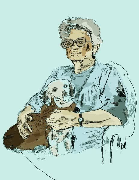
Dreweyes said:Made this for my little sisters birthday of our dog a while back haha:

ha, ha, that dog is crazy happy
Always-honest
Banned
great thread.
here are some of mine. first one was painted. rest is made in illustrator:


here are some of mine. first one was painted. rest is made in illustrator:
Prax
Member
Eh, what happened to that other art thread? Did it retire? XD (NEW NEW something something art thread..?) IS this the new ones now?
OchreHand, your stuff is just as awe inspiring as ever.
Raging Spaniard, love your style and colour choices.
Great work from everyone else too. It's hard to contain jealousy/envy!
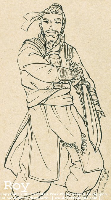
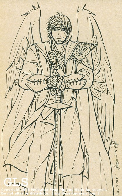
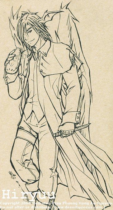
I haven't drawn anything too notable/great lately, which makes me sad, but here's some newish stuff anyway:
Sword's kind of crooked. I'm not good at drawing things like that in perspective. XD
What a boring pose.. I also need to standardize how I draw wings one day. This is wrong.
Awkward leg positioning, which isn't helped by the fact that they are cut off the page. XD
A couple of Mary-Sues/ideal girlfriends created by a couple of my characters XD. What would you define that as? Meta-characters?


I also have had Painter X for a couple of months but I haven't even touched it yet.. I wish I were more ambitious with art!
OchreHand, your stuff is just as awe inspiring as ever.
Raging Spaniard, love your style and colour choices.
Great work from everyone else too. It's hard to contain jealousy/envy!
I haven't drawn anything too notable/great lately, which makes me sad, but here's some newish stuff anyway:
Sword's kind of crooked. I'm not good at drawing things like that in perspective. XD
What a boring pose.. I also need to standardize how I draw wings one day. This is wrong.
Awkward leg positioning, which isn't helped by the fact that they are cut off the page. XD
A couple of Mary-Sues/ideal girlfriends created by a couple of my characters XD. What would you define that as? Meta-characters?
I also have had Painter X for a couple of months but I haven't even touched it yet.. I wish I were more ambitious with art!
spielcaster
Member
...oh to be able to afford photoshop.
spielcaster
Member
Can't get over some of the awesomeness being displayed by GAF-folk in this thread.

Raging Spaniard
If they are Dutch, upright and breathing they are more racist than your favorite player
Big Street Fighter fan, this ones a quickie though, done under an hour.
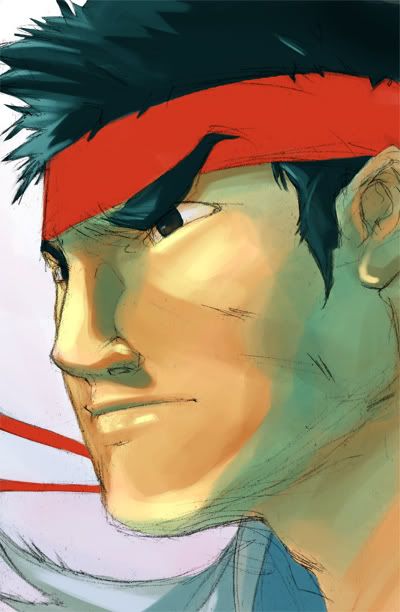
Heres a GAF sized icon too (some people like that)
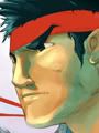
Heres a GAF sized icon too (some people like that)
Raging Spaniard
If they are Dutch, upright and breathing they are more racist than your favorite player
Heres a Chunners to go with Ryu, although Im not happy with this one ... oh well
robertsan21
Member
HOLY CRAP YOU GUYS ARE AWESOME, I do a little paintingmyself but I aint nearly as good as anyone of you guys
Raging Spaniard said:Big Street Fighter fan, this ones a quickie though, done under an hour.

Heres a GAF sized icon too (some people like that)
[IMGhttp://img.photobucket.com/albums/v139/XavierGarcia/Own%20things/ryu_icon.jpg[/IMG]
I hate you for being so skilled at speed drawings. >:I
I spend hours perfecting sketches before even considering anything else.
massive OCD in tha house!
What an awesome thread. Makes me wish I had never stopped drawing as a kid, even though it was just DBZ stuff all the time :lol
Some day, I'm gonna invest in a nice tablet, learn some photoshop skills, and get back into this stuff.
By the way, my brother has done some great stuff, I might have to ask him if I can post some of it.
Some day, I'm gonna invest in a nice tablet, learn some photoshop skills, and get back into this stuff.
By the way, my brother has done some great stuff, I might have to ask him if I can post some of it.


Human_Shield
Member
Prax said:I haven't drawn anything too notable/great lately, which makes me sad, but here's some newish stuff anyway:
Sword's kind of crooked. I'm not good at drawing things like that in perspective. XD
That's awesome. I can never seem to get the expressions right on my works. Everyone just looks angry, or somber.
Raging Spaniard
If they are Dutch, upright and breathing they are more racist than your favorite player
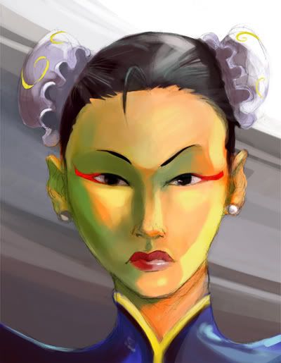
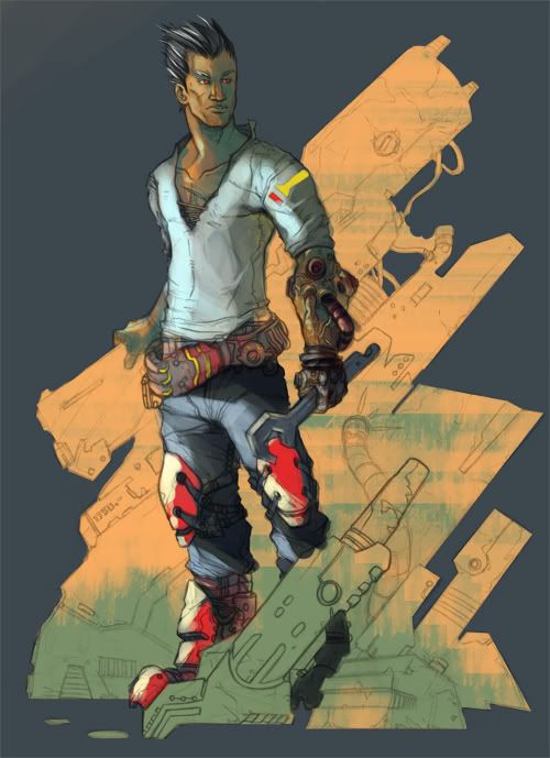
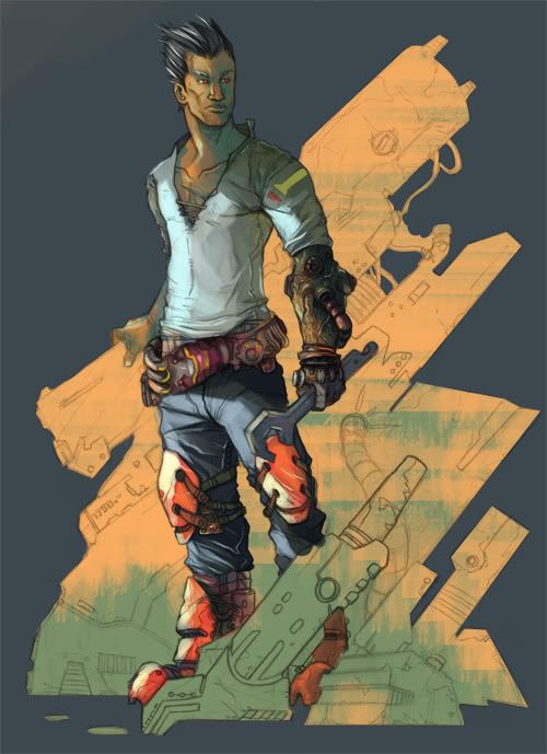
This is a work in progress. Really want to re-vamp my whole character portfolio, I think this type of stuff is the right start
Always-honest
Banned
Raging Spaniard said:This is a work in progress. Really want to re-vamp my whole character portfolio, I think this type of stuff is the right start
What programs do you use?.. what brushes?
You certainly got talent!!!
Raging Spaniard
If they are Dutch, upright and breathing they are more racist than your favorite player
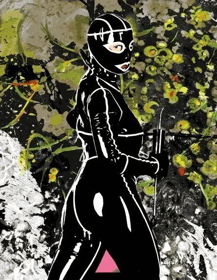
Heres an update on this guy. Cleaned him up some, added more value and fixed some color choices. Taking my time, really
Just the regular Photoshop painting brush. If you look at the dafult brushes in Photoshop, youll see the regular round ones, then the airbrush ones and THEN youll see 3 of them that look like the regular round shape, those brushes are actually really good for coloring since they belnd the colors really well. I use them exclusively at this point.
For the grunge stuff just download some grunge brushes, theyre everywhere. The higher res the better though
Always-honest said:What programs do you use?.. what brushes?
You certainly got talent!!!
Just the regular Photoshop painting brush. If you look at the dafult brushes in Photoshop, youll see the regular round ones, then the airbrush ones and THEN youll see 3 of them that look like the regular round shape, those brushes are actually really good for coloring since they belnd the colors really well. I use them exclusively at this point.
For the grunge stuff just download some grunge brushes, theyre everywhere. The higher res the better though
cmonmanreally
Member
iddqd said:saw mulholland drive thx to the gaf thread
wow, you have some really great stuff!
Raging Spaniard said:Heres an update on this guy. Cleaned him up some, added more value and fixed some color choices. Taking my time, really
this is looking really cool, i like all those shapes you have in his gear and the background. very simplified but interesting at the same time.
DM_Uselink
Member
I've been lurking this thread for a while since I haven't drawn anything worthwhile since that entry to the LittleBigPlanet contest I did.
I wanted to participate again because I've been seeing some really nice stuff recently (special thanks to Raging Spaniard for keeping this thread going, great stuff).
In fact, I got inspired by your Street Fighter stuff and I wanted to contribute this sketch of Ryu.

I wanted to participate again because I've been seeing some really nice stuff recently (special thanks to Raging Spaniard for keeping this thread going, great stuff).
In fact, I got inspired by your Street Fighter stuff and I wanted to contribute this sketch of Ryu.
Bad. Ass.DM_Uselink said:I've been lurking this thread for a while since I haven't drawn anything worthwhile since that entry to the LittleBigPlanet contest I did.
I wanted to participate again because I've been seeing some really nice stuff recently (special thanks to Raging Spaniard for keeping this thread going, great stuff).
In fact, I got inspired by your Street Fighter stuff and I wanted to contribute this sketch of Ryu.
And I mean that in a complimentary way.
OchreHand said:what a feast. so inspirational. here are my contrib...the last one i did last night


NICE!!
I just stumbled across a stobart art book in a used book shop and had to snag it up, he does some really good nautical paintings.
your stuff is rocking too!
Dreweyes said:Made this for my little sisters birthday of our dog a while back haha:
HAHA, that rocks. I saved it.
Raging Spaniard
If they are Dutch, upright and breathing they are more racist than your favorite player
DM_Uselink said:I've been lurking this thread for a while since I haven't drawn anything worthwhile since that entry to the LittleBigPlanet contest I did.
I wanted to participate again because I've been seeing some really nice stuff recently (special thanks to Raging Spaniard for keeping this thread going, great stuff).
In fact, I got inspired by your Street Fighter stuff and I wanted to contribute this sketch of Ryu.
Thats a great sketch, Im tempted to color it
Witchfinder General
punched Wheelchair Mike
DM_Uselink
Member
Raging Spaniard said:Thats a great sketch, Im tempted to color it
That would be quite awesome
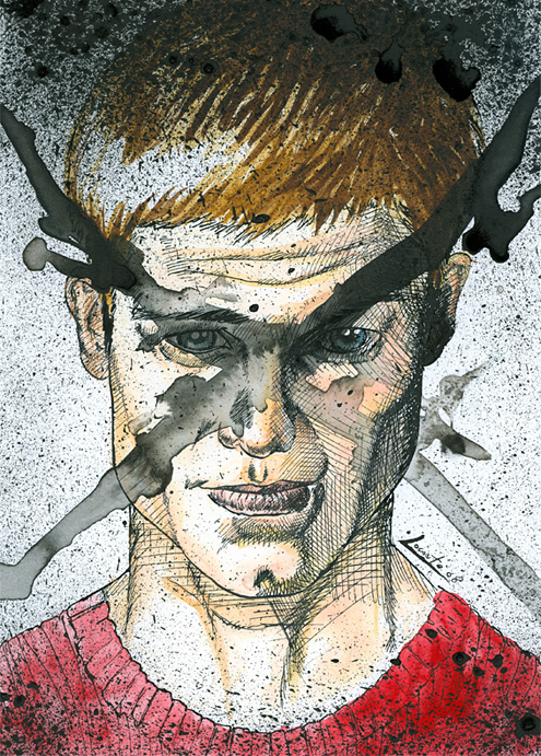
Witchfinder General: very nice inks.

funkmasterb
Member
Always-honest
Banned
very nice!! i especially liked the second halffunkmasterb said:
That's pretty impressive. Your 2006 reel was definitely my favorite. Using the audio from the Pulp Fiction scene was pretty funny, but besides that the animation for that part was really good.funkmasterb said:
Barbacoatl
Banned
Likin' what I see ITT.
Some late night fart from while ago.
-
-
Some late night fart from while ago.
-
-