• Hey, guest user. Hope you're enjoying NeoGAF! Have you considered registering for an account? Come join us and add your take to the daily discourse.

New store layout on xbox one

madmackem

Member
Just logged on there in the uk and noticed the store layout is completely different than it was yesterday. You have a row to the left hand side with options for

All games
Add ons
Search
Use code

Page one is featured then page two is listed new releases and so on. Wonder when this went up has it been like this on us store for a while and we are just getting it? Im in the preview program if that makes any difference.
 

R3TRODYCE

Member
Screenshot please ?


mygreatcapturescreensbxuxg.png

mygreatcapturescreensv2uxs.png

mygreatcapturescreenseou65.png

Snapped a few.
 
Do we really need so many different pictures of the same game?

Can't they just put all SUPER DUPER DELUXE GOLD BOLLOCKS editions behind one image?

I suppose they're just trying to fill space at the moment...
 

masteratt

Member
"Do you want 5 versions of Call Of Duty, or 2 versions of Sunset Overdrive?" - Xbox Store Front.

Agreed with above, stick them under one click-able box that extends into all these versions in a sub menu. So annoying just seeing CoD and BF and Season Pass stuff for a very limited amount of games on store front.
 

JaggedSac

Member
"Do you want 5 versions of Call Of Duty, or 2 versions of Sunset Overdrive?" - Xbox Store Front.

Agreed with above, stick them under one click-able box that extends into all these versions in a sub menu. So annoying just seeing CoD and BF and Season Pass stuff for a very limited amount of games on store front.

They should definitely do this.
 
The tiles are still too big, I don't know what they were thinking.

They made this new cleaner less cluttered look, but the point is you can't fucking see anything. Why do the box arts need to be so big? Halve them and double the amount you can see on the front

Having 4 new releases is pointless when 3 of them are the same fucking title.

1 page, multiple options per game.
Show more titles on new releases (and all the other sections)

Why is there not a specific tab of ID@Xbox games?
 

SEGAvangelist

Gold Member
The tiles are still too big, I don't know what they were thinking.

They made this new cleaner less cluttered look, but the point is you can't fucking see anything. Why do the box arts need to be so big? Halve them and double the amount you can see on the front

Having 4 new releases is pointless when 3 of them are the same fucking title.

1 page, multiple options per game.
Show more titles on new releases (and all the other sections)

Why is there not a specific tab of ID@Xbox games?

Games are games. Wanna make 'em feel first class!
 
Disagree. It's good for the smaller titles to be in the same spotlight IMO.

Right

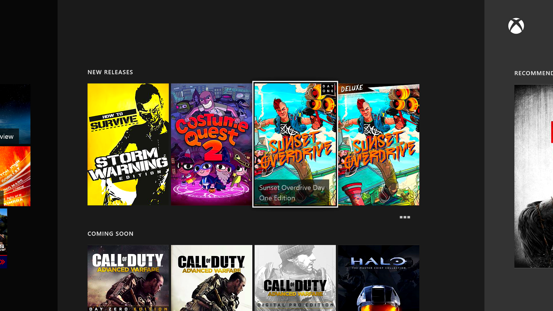
Except that in that spotlight, you look at something like Chariot (ignore its a GwG title, use Kickbeat as a different example if you like), it came out the same week as FH2, which has a whole 4 separate listings on the store... so it will never have been listed as a new release (on the front of the inside of the store) because Shadow of Mordor came out the same week. Theres plenty of other titles that have/will have the same issue.

Now when they fix the issue of multiple pages per game (which is bizarre in itself) it won't be as quite as bad, but when you have lots of titles releasing in a short space of time, it won't be the Call of Duty's, Far Cry 4s etc that go missing because they'll still be elsewhere on the front end (which is fair enough).

If they had their own branding, whether its an ID@Xbox section or some sort of branding "XBL Game" or something to include stuff like Styx and Defense Grid 2 - not ID@Xbox titles, but not retail either you could just switch tabs and get a big section for a whole load of games that people might not know exist because they aren't big enough to have massive marketing campaigns for exposure.

If I remember correctly, the developer of Sixty Second Shooter Prime said that as part of his deal to put the game on Xbox One he wanted a guarantee of the front of the visibility because presumably he knew without that guarantee it would just get buried within about a week.

They don't list the right demos... How to Survive has a trial, but its not listed, entire thing seems disorganised and lacks the ability to promote anything other than the biggest names.

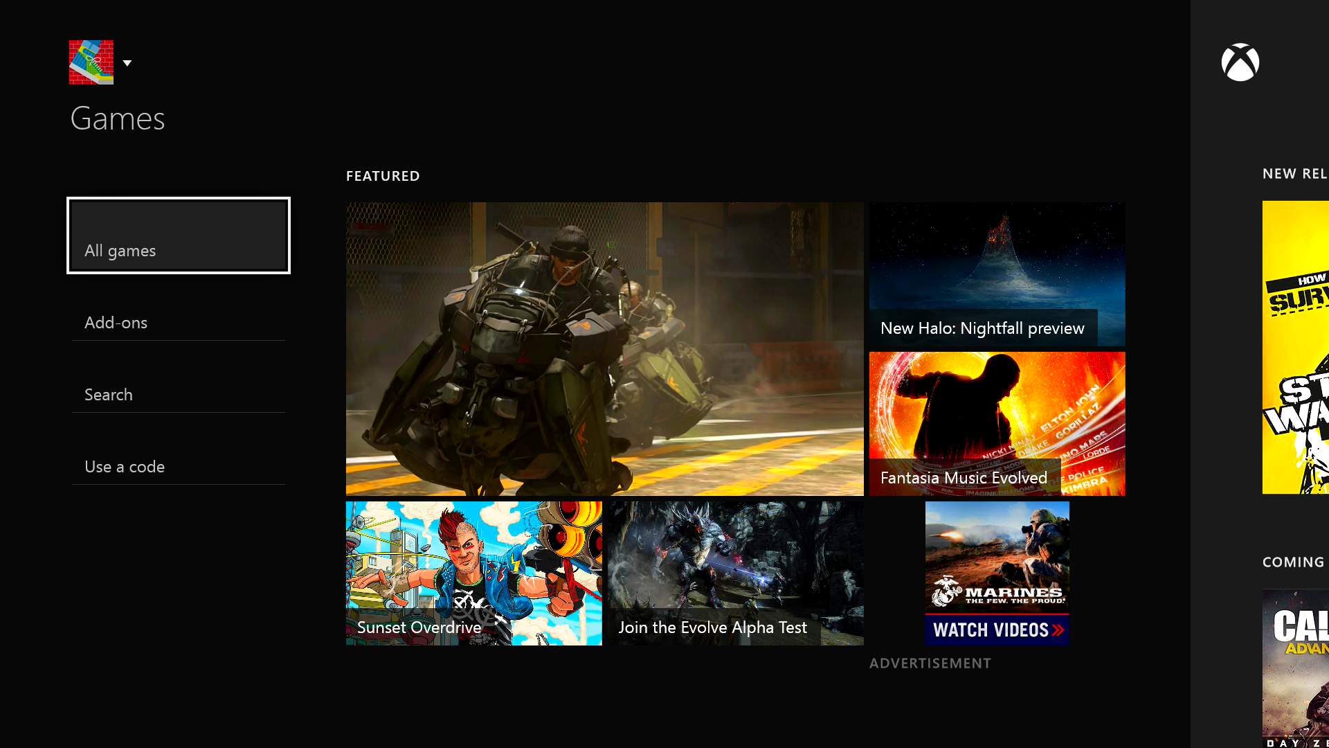
I don't even like the size of the boxes either. I just think it looks like they don't know what to put there, so they've just made everything bigger to hide it.
 

Caayn

Member
Why not introduce a section such as "Download only titles" which Playstation uses. That way you aren't giving games a mark which could be seen as negative while giving them more visibility in the store.

And I agree that a game needs only one spot in the store, not multiple for each separate edition of the game. When I'm browsing the store I don't care about the SUPER ULTRA SCAM edition of your game, put that on the individual game pages in a separate tab called "Editions" or something, just don't clutter the store front with that.
 

RoKKeR

Member
Do we really need so many different pictures of the same game?

Can't they just put all SUPER DUPER DELUXE GOLD BOLLOCKS editions behind one image?

I suppose they're just trying to fill space at the moment...

Yeah this is annoying, and there is no organization to it. There are 4 fucking different versions of the MCC, it's ridiculous. You can only buy one I think but there are 4 separate pages for it.

The update is nice but they still have work to do. I'm glad they kept the "Top Games" around as it's essentially a real-time activity counter, so it's interesting to follow what games are being played the most.
 
Top Bottom