• Hey, guest user. Hope you're enjoying NeoGAF! Have you considered registering for an account? Come join us and add your take to the daily discourse.

Which console's home screen has been the most clean and least cluttered?

Kadin

Member
While I appreciate what Microsoft is trying to do by allowing more and more options on the XB1, their home screen is just a mess. I might be in the minority with this opinion but I just hate how it has evolved. Maybe it's the inclusion of the small ads off to the right but there's simply no real consistency with it to me between the various pages. And even navigating it at times seems hit or miss with what I want it to do. Luckily it's a pretty fast home screen so that's a positive for me.

I remember back to the original blade home screen of the 360 and I really miss that simplicity. Even home screens like the Wii and Wii U are more to my liking.

So what say you GAF, what do you feel has been the cleanest and most organized home screens through the years?
 

Mega

Banned
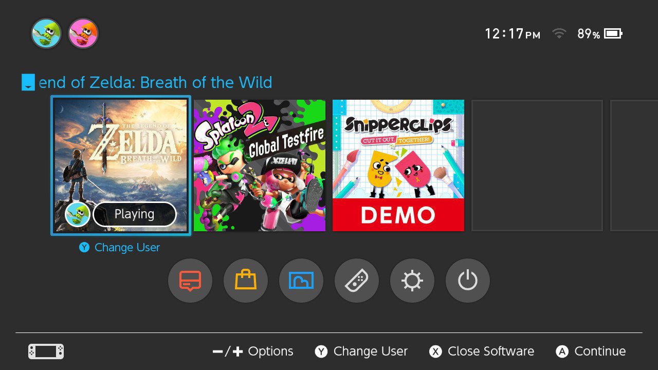
Switch in my experience.

Nintendo-Switch-home-screen.jpg
 

Cels

Member
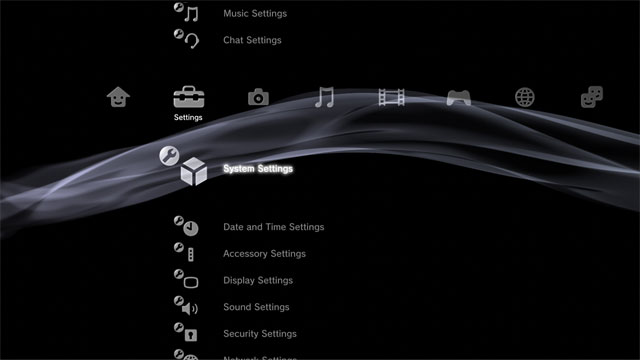
i liked the PS3 XMB before they put a bunch of extra icons on it that you couldn't opt out of

never had a 360 before blades went away but it seemed clean, yeah
 

chitnex

Member
I really liked the ps3's XMB menu. Looked clean and professional.
xmb_manual.jpg


Ps2's towers representing memory card storage was pretty cool too, but a little off topic
 

Kthulhu

Member
Switch in my experience.

Nintendo-Switch-home-screen.jpg

Same. PS4 and Xbox One force way too much info on my screen. I just want to play my games and watch my streaming service of choice. I don't care about communities and all that stuff. I really want them to make those optional things you can remove from your UI.
 
Switch for sure, it's so quick and easy to boot up games. It doesn't have many (or any) media apps but it's certainly the most accessible, clean and least cluttered home screen I've ever used on a console.
 

Kadin

Member
Same. PS4 and Xbox One force way too much info on my screen. I just want to play my games and watch my streaming service of choice. I don't care about communities and all that stuff. I really want them to make those optional things you can remove from your UI.
Yeah I still wait for the day where you can truly customize the screen how you want. Make a ton of widgets and let me place them as I see fit.
 
Uncluttered? I liked the XMB on PS3 just fine and the PS4's is nice but it's definitely got a lot of menus underneath each icon. I'd say any Gen 6 console just for the simplicity.
 

phanphare

Banned
Nintendo in general is always good at this

3DS, Wii U, and Switch all have really good home screens. Switch needs to the option to grid it but I imagine that'll come at some point. it's essentially a modern version of the one row 3DS home screen with the main icons on the bottom instead of the top.
 

Alpha_eX

Member
I love the simplicity and style of the Switch screen, showing absolute bare minimum and it's really quick. I have an Xbox One and PS4 and it just takes so many inputs to get anywhere I want to be.
 

chitnex

Member
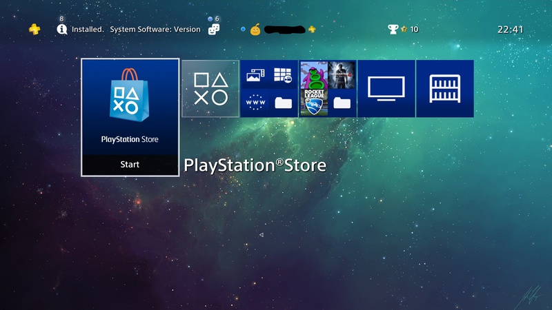
Now with folders the PS4 homescreen is really the best
It really bothers me how the folders maintain a blue background with other themes. It clashes with the colors, but it's a lot better than having tons of icons on the homescreen.
 

Hoo-doo

Banned
Depends on how you organise it. This is how I have my PS4 setup.

Store
What's new
Apps
Games
Media
Library

20170203224140_livujxm.jpg


But Sony, for the love of god let met change the colour of the tiles with the next update. That stuff drives me crazy.
 

Hedgey

Member
Switch/PS4

they're basically the same with the way the main thing is laid out: games.
Switch has very simplified buttons at the bottom right now, but its functionality is also very limited at the moment. I'm curious to see what it will look like in the future as more of the system rolls out.
PS4 settings aren't nearly as visible and it takes a bit of scrolling to get to them.
 
Add Netflix, browser, Hulu, YouTube and every other expected app next to the two games on that menu... it wouldn't be any more cluttered. Still a very clean design.

I love my Switch, but there's no denying its UI is simple due to a paring back of features.

ps4-menu.png


Notice that the PS4 UI is essentially the same, but with added features and information. I agree that the Switch has an overall more appealing look, but those features and most of the information provided in the PS4 simply isn't available at all on the Switch.
 

JOEVIAL

Has a voluptuous plastic labia
Not technically a "console" but I am a big fan of the PSP's simple and straightforward XMB. What I love the most.... no ads!!

l.jpg


It's also nearly identical to the PS3 XMB, which is also stellar :)
 

Tidalwave

Member
Depends on how you organise it. This is how I have my PS4 setup.

Store
What's new
Media
Games
Television
Library

20170203224140_livujxm.jpg


But Sony, for the love of god let met change the colour of the tiles with the next update. That stuff drives me crazy.
Doesn't the game inside the system and or the one played last automatically take up a space though? How did you get rid of that?
 

Hoo-doo

Banned
Doesn't the game inside the system and or the one played last automatically take up a space though? How did you get rid of that?

If a game is assigned to the folder, disc or not, then it'll stay in the folder.

It doesn't just pop out into the front as far as I know.
 
Yeah, I just noticed that the PS4 and Switch have essentially the same UI but the Switch has the menus below the games instead of on top.
 

shiyrley

Banned
Sure it is clean, it doesnt have anything
haha good act of memeing!!!!!!

Add Hulu, Netflix and whatever, as an app.
Add a web browser to those circular icons.

Is it less clean? No.

The design is clean.

I remember the Xbox 360 menu being HORRIBLE. Like, if there are 9 icons on the screen, 6 or so would be ads.
 

Crayon

Member
I'm not picky. Just no ads, please. And try for good response. I appreciate the switch system screen.
 

leroidys

Member
PS3 was the best for having a ton of functionality but still being very uncluttered. PS4 is a complete fucking mess. No, I don't want to scroll through every single disc I've ever inserted.

Edit: at least the store works on PS4 though.
 

Kthulhu

Member
One thing a hated about the later UI for the 360 and the One is how they pushed ads on your home screen. At least Sony keeps it in the storefront.
 

neurosyphilis

Definitely not an STD, as I'm a pure.
The PS4 and Switch UI are basically the same. Only difference is the PS4's has more features, since it has been out longer.
 
Top Bottom