• Hey, guest user. Hope you're enjoying NeoGAF! Have you considered registering for an account? Come join us and add your take to the daily discourse.

Which console's home screen has been the most clean and least cluttered?

haha good act of memeing!!!!!!

Add Hulu, Netflix and whatever, as an app.
Add a web browser to those circular icons.

Is it less clean? No.

The design is clean.

What is this? He's not wrong. I love the Switch's UI, but it's essentially the same as PS4's minus features and information.

Yes, you could argue that it's more visually appealing because of its lack of extraneous features. But there's no arguing that Switch achieves its minimalist UI by stripping down functionality. And it's not just about the apps.
 

F4r0_Atak

Member
Love the switch UI. It won't change much when Netflix, Hulu, etc are added so not sure why anyone is being dismissive.

Well the more Apps and games (and features), it will soon be cluttered. There's no denying in that. I don't want to keep side scrolling to find my games or apps. Unless they allow for folders like on the 3DS, the Switch UI won't be as useful as the other systems. :/
 

SmokedMeat

Gamer™
The Switch shouldn't even count as not even one month old and is missing apps and other features.

I'd still go with Nintendo though, but the Wii U.
 

retroman

Member
MainMenu3.jpg


I get warm and fuzzy feelings just by staring at that menu. Then again, I'm a bit of a SEGA fanboy.
 

Plum

Member
I love my Switch, but there's no denying its UI is simple due to a paring back of features.

ps4-menu.png


Notice that the PS4 UI is essentially the same, but with added features and information. I agree that the Switch has an overall more appealing look, but those features and most of the information provided in the PS4 simply isn't available at all on the Switch.

None of the features under Knack need to be specifically there they can just as easily only show up if you press down on the D-Pad. The adverts for DLC, Season Passes and stuff you get for other games definitely don't need to be there. Essentially what I'm saying is that a UI with lots of features doesn't have to be cluttered.
 

JaseMath

Member
Switch, but in a few years, that might change as Nintendo adds browsers, video services, etc. It'll have to eventually lose some of it's minimalism.
 

shiyrley

Banned
What is this? He's not wrong. I love the Switch's UI, but it's essentially the same as PS4's minus features and information.

Yes, you could argue that it's more visually appealing because of its lack of extraneous features. But there's no arguing that Switch achieves its minimalist UI by stripping down functionality. And it's not just about the apps.
Please point to the exact part of my post, or their post, in where the PS4 is mentioned in any shape or form
 

Hoo-doo

Banned
None of the features under Knack need to be there, they can just as easily only show up if you press down on the D-Pad. The adverts for DLC, Season Passes and stuff you get for other games definitely don't need to be there. Essentially what I'm saying is that a UI with lots of features doesn't have to be cluttered.
This is not the current PS4 UI. I don't think this specific UI ever saw the light of day.
 
Switch is fine, but seems like it will be cumbersome when more games and apps come out for it. It definitely needs some work on the UX side.
 

Persona7

Banned
haha good act of memeing!!!!!!

Add Hulu, Netflix and whatever, as an app.
Add a web browser to those circular icons.

Is it less clean? No.

The design is clean.

I remember the Xbox 360 menu being HORRIBLE. Like, if there are 9 icons on the screen, 6 or so would be ads.

Do you have a screenshot of this?
 

Alpha_eX

Member
I love my Switch, but there's no denying its UI is simple due to a paring back of features.

ps4-menu.png


Notice that the PS4 UI is essentially the same, but with added features and information. I agree that the Switch has an overall more appealing look, but those features and most of the information provided in the PS4 simply isn't available at all on the Switch.

I'd argue that none of those features justify polluting the screen like that, some of them seem to be there just to push you to social channels or the store, away from the actual game.

I like the PS4 over the Xbox but just wish you could turn off all the additional data and keep it clean.
 

shiyrley

Banned
Dude, I'm using it as an example. This thread is about comparing console UIs.
Person 1 says the Switch UI is the cleanest in their opinion.

Person 2 says "sure it's clean, it doesn't have anything"

I say that the fact that "it doesn't have anything" is not the reason: the design would be as clean if more apps are installed on the system.

Now you say he's not wrong because of something-something-PS4, when his argument was solely that the reason the UI is clean is that "it doesn't have anything".

I still don't see your point.
 

Hoo-doo

Banned
I'd argue that none of those features justify polluting the screen like that, some of them seem to be there just to push you to social channels or the store, away from the actual game.

I like the PS4 over the Xbox but just wish you could turn off all the additional data and keep it clean.

Again, that was a pre-release mock-up of the PS4 UI, I believe.
 

Menitta

Member
When organized properly, the 3DS and Wii U can look pretty nice. Disc/cart, Games, VC, extra software that I'll never use, settings, eshop.
 

Plum

Member
This is not the current PS4 UI. I don't think this specific UI ever saw the light of day.

Yeah, since you mention it that isn't what it looks like right now. This is:

ps4-ui-1.jpg


Which, again, doesn't really need to have the extra fluff at the bottom. Why do I need to see the most viewed video, DLC announcements and more?
 
I think PS4 is the best so far. It's clean and to the point. I like Switch's UI quite a bit as well but wouldn't put it over PS4s due to lacking quite a bit of functionality at the moment.
 
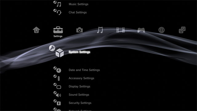
I always liked the PS3 xmb. It was clean and simple.
The only downside was that the menu for games could get a little bit overwhelming with all those PS+ games.

The PS4 one is also great, especially since we got folders.
 
Person 1 says the Switch UI is the cleanest in their opinion.

Person 2 says "sure it's clean, it doesn't have anything"

I say that the fact that "it doesn't have anything" is not the reason: the design would be as clean if more apps are installed on the system.

Now you say he's not wrong because of something-something-PS4, when his argument was solely that the reason the UI is clean is that "it doesn't have anything".

I still don't see your point.

But you're wrong. The design wouldn't be clean if it had more features. It's not just about apps. I brought up PS4 in a thread about comparing console UIs as a point of comparison. If the Switch had as many features as other consoles, it wouldn't be clean.
 

emb

Member
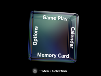
The absolute best in my eyes is the Nintendo Gamecube's.

- By default, you don't even have to see it.
- When you do want to access it, it's fun to do so. You feel in control, you aren't just watching.
- The menu itself is thematic with the system's cube shape design.
- Once in the menu, the functions are simple and easy to use.

Xbox (original) is also pretty good, but in the time I used my Xbox, I never found a way to get there without removing the disc (if there is a way? I'm guessing there is.)

My next favorites would be systems like the SNES or N64 that had absolutely no home screen. That was kind of nice in its own way. Of course, the expectations of a modern video game system make this impossible now.

I like the PS3/PSP a lot. Pretty clean and to the point. Same for the Switch. The original 360 menu with the blades and such felt cool.

Some of the ones I really don't like are:
- Wii: requires you to connect a Wii remote, and if you don't have a classic controller, a sensor bar. This is ridiculous when half the time I'll want to a play a game with a Cube controller or Wiimote without pointing.

- Wii U: buttons only control the menu when it's on the controller. Buttons should work no matter where I'm looking at the menu.

- Xbox One: ads baked right in, and I've always found the squares annoying to navigate. I also really dislike how 'games' is one tab in a list of several, as if that isn't the primary function of the machine (this probably applies to some others, too).
 
I always liked the PS3 xmb. It was clean and simple.
The only downside was that the menu for games could get a little bit overwhelming with all those PS+ games.

The PS4 one is also great, especially since we got folders.

Those warm colors they patched in to the XMB were perfect.
 

shiyrley

Banned
But you're wrong. The design wouldn't be clean if it had more features. It's not just about apps. I brought up PS4 in a thread about comparing console UIs as a point of comparison. If the Switch had as many features as other consoles, it wouldn't be clean.

Except I see some of these features in the PS4 screenshot as clutter. If none of these features can be seen as clutter, then this thread can't be made: Any given winner will be more clean "because it lacks this, it lacks that".

I give you that a big part of the Switch UI being so clean is that it lacks some features. But it's still the cleanest design.

Also, I believe color choices have a big part on it. Once themes arrive, a screenshot of a themed Switch will not look as clean as a screenshot with the basic themes.
 

Hoo-doo

Banned
That's a laughably terrible solution.

No, i'd say your gripe is the thing that's pretty unconventional.

The game is installed on your harddrive. Therefore it's shown in your list of games.

That way you can still manage your saves, your HDD space or your install or do whatever without having to insert any specific game discs. And it's one more reason why digital is simply more convenient, seeing as the discs are only there for authentication.

If you remove the disc from your console, the game doesn't vanish. It's still on your harddrive and will be represented by the icon.
The way it's done right now is pretty much the only way that makes any sense.
 
some conclusion jumping going on here

This really shouldn't be controversial.

Added features and information require screen real estate. What conclusion am I jumping to? That if Switch UI had more features, those features would be displayed on the screen in some fashion?
 
Top Bottom