-
Hey, guest user. Hope you're enjoying NeoGAF! Have you considered registering for an account? Come join us and add your take to the daily discourse.
You are using an out of date browser. It may not display this or other websites correctly.
You should upgrade or use an alternative browser.
You should upgrade or use an alternative browser.
Why did NoA redesign the SNES for the US?
- Thread starter ggx2ac
- Start date
BocoDragon
or, How I Learned to Stop Worrying and Realize This Assgrab is Delicious
Set your game console to full RGB mode
Bruh we don't have SCART inputs over here in North America so I don't even know what you mean >_>
I'm not against colorful boxes... in fact, I love them, Super Famicom gets it right. But I feel that North American SNES boxes nail the aesthetic they're going for: dark/sleek/tech... while the PAL ones just feel like a half-colourful/half-black bar disaster.
Everlya_Apocryha
Banned
the only royalty i associated purple with is the artist formerly known as Prince. (RIP)
-hadouken
Member
Nah, it's not cheaper to commission a new design and to tool-up/manufacture a different set of plastics. One shape for global consumption would have saved them money.Probably $$$. The US design looks cheaper to manufacture.
Robin64
Member
If they ever homebrew the SNES Classic, my incentive to hack my own will not be to add more games, but to change the box art for all the games lol
Haha same.
And the good news is, the guys who did the NES one have already got the SNES Classic interfacing with a PC in the same mode the NES Mini used.
-hadouken
Member
Oooh, where can I read more about this?Haha same.
And the good news is, the guys who did the NES one have already got the SNES Classic interfacing with a PC in the same mode the NES Mini used.
edit: NVM - plenty to read. Can't wait to get Stunt Race FX running on it!
-MD-
Member
I dont get whats so great about the non-US design. It just looks like every other gray ass 80s-90s looking plastic electronic. The US design just looks a little more refreshing compared to all of the other gray shit of the era.
Agreed.
Probably $$$. The US design looks cheaper to manufacture. Reduction in cost is mentioned in the article.
Reducing manufacturing costs was mentioned regarding the NES revision and when NCL took over hardware design worldwide from 1995 starting with the N64.
You wouldn't have two different SNES designs if you were trying to reduce manufacturing costs. You'd have one.
Lance Barr said he designed the US SNES because the Super Famicom wasn't edgy and that he wanted add-ons where you stack the SNES on something else like Sega 32X/CD that it wouldn't look like bags of bread.
Bjoern the Smexy
Member
Reposting this since I was curious what people think of the logos in comparison:
JP/EU use the left logo on the cover art for SNES games.
US uses the right logo on the cover art for SNES games

Puking blue and red Pac-Men for life!
Robin64
Member
Oooh, where can I read more about this?
http://gbx.ru/?showtopic=123317&st=360
It's Russian, but he does vids with subtitles, and there are pics of it showing up in Windows further down.
yanipheonu
Member
I'd admit being a bit blinded by Nostalgia. The US SNES just reminds me too much of my childhood.
But I'm not going to pretend the original version isn't sleeker.
But I'm not going to pretend the original version isn't sleeker.
cantona222
Member
I like how unsymmetrical the Genesis/Mega Drive is.Despite growing up as a SNES kid, I feel that they're both ugly in their own way. The NTSC is boxy and bland, whilst the PAL/SFC is anonymous looking. The Mega Drive on the other hand...

BocoDragon
or, How I Learned to Stop Worrying and Realize This Assgrab is Delicious
Some details about the US SNES design and its carts that I would argue are superior and you PAL peeps might not know them just from pictures:
1. The wide slide-forward power and reset buttons are a unique design interaction. Almost toylike and playful as you slide them forward with multiple fingers and the screen turns on or resets. I have a Super Famicom and its switch and push-in reset button are not nearly as novel.
2. Concave shape on the X and Y buttons gave some variety and feedback as to which buttons you were pushing.
3. The cartridge design in North America is better overall than the SFC/PAL carts. I definitely like the look of SFC/PAL carts, but functionally they are much worse. They just don't stack or line up in any meaningful way due to their curved shape. They tend to flop over even when lined up on a shelf. The SNES designs can not only stack nicely and line up nicely with others on a shelf, they can actually stand up on their own because...
3. ..The cartridges also came with dust caps. Perhaps not as needed as NES dust caps, but they are adorable, preserve your contacts from getting dirty, and as mentioned they allow you to just stand the cart up like it were an Amiibo or something. There's a lot of nostalgic fetish involved in having a nice minty SNES game with its dust cap... the same feeling as an NES game in its sleeve.
4. End labels. So nice to be able to read your collection when the games are stacked up or in an organizer of some sort. It even had a colour-coded line that told you whether the game was first party or third party: Nintendo-published games were red, while third party games were purple.
bruh..........wut...
you can google the meaning behind colors. that's what royal purple is, power and wealth.
To each their own obviously, but to me the purple SNES looks a lot more kiddie then the colored SNES ever could. I mean, the Euro SNES is colorful which some might see as kiddie, sure, but the USA purple SNES looks... bad. Like a 5 bootleg machine you'd find in the toy section of a non-toystore.
the super famicoms dirty grey with colored buttons looks very 80's. at least every time I see one that's the time period I think back to... McDonalds play place in particular for some reason.
the grey used on the snes is much nicer looking... at least before yellowing. there's very little purple on the console, it only there as an accent color to make it pop which it does well without being "in your face".
The design language differences between the SNES and the Super Famicom have always made me think of the design differences between early 90's vehicles in the US and Japan. Japan had switched to sleek curves, and America was still behind with boxy angles. I imagine that angular design language in America is associated with luxury back then.
Y'all acting like we couldn't of had concave and colours on the same controller.
They redesigned the SNES because they wanted to compete with the Genesis in the united states. They couldn't obviously change the form factor too much, so instead they made it more harsh and angular looking (as per style at the time).
Glad they didn't change the PAL release though - that thing is an absolute beaut.
Zomba13
Member
I hate the US SNES design. It's just not pleasing to look at. The EU/JP SNES is a ncie, welcoming thing to look at. It might not be cool and slick and edgy, but it looks nice.
This is coming from a Mega Drive kid so I don't have the nostalgia of a SNES sitting under my TV. The Mega Drive looks sick though, it looks like this powerful machine from space, like you'd see it in the console of a Tie Fighter or something.
This is coming from a Mega Drive kid so I don't have the nostalgia of a SNES sitting under my TV. The Mega Drive looks sick though, it looks like this powerful machine from space, like you'd see it in the console of a Tie Fighter or something.
AtomicShroom
Member
Reposting this since I was curious what people think of the logos in comparison:
JP/EU use the left logo on the cover art for SNES games.
US uses the right logo on the cover art for SNES games
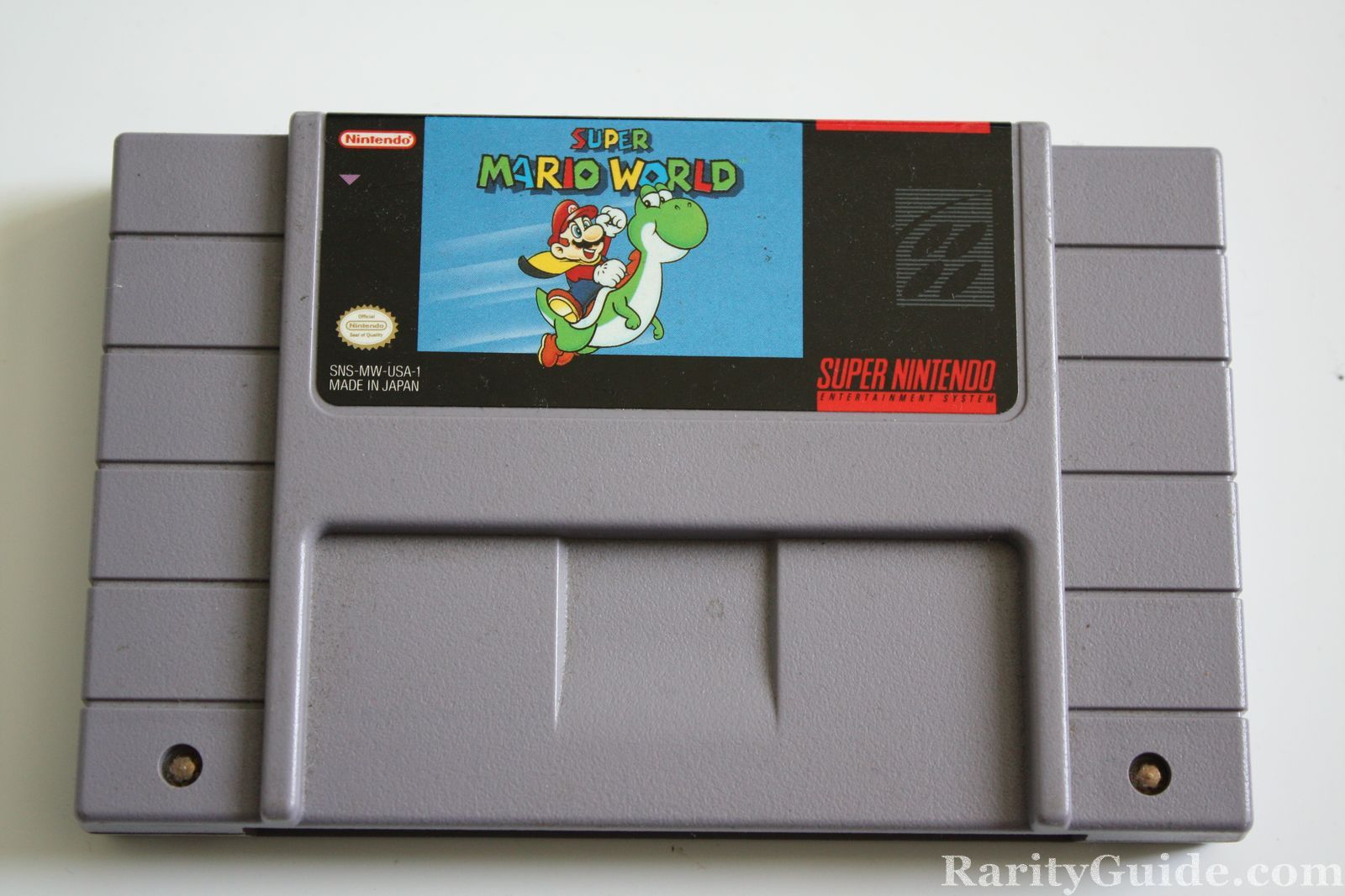
Strangely they forgot to change that when localizing Super Mario World. It took me a very, very long time to understand why this was there:

-hadouken
Member
Exactly - it's the Darth Vader of consoles. Science fiction meets samurai.The Mega Drive looks sick though, it looks like this powerful machine from space, like you'd see it in the console of a Tie Fighter or something.
-shadow-
Member
I will never understand how someone can like the US design over the international design of the system. Even taking nostalgia out of it, design wise, and colour wise, it's just an abomination.
Well that and it gave us needless purple coloured buttons in Super Mario RPG, that they never bothered recolouring for Europe.
Well that and it gave us needless purple coloured buttons in Super Mario RPG, that they never bothered recolouring for Europe.
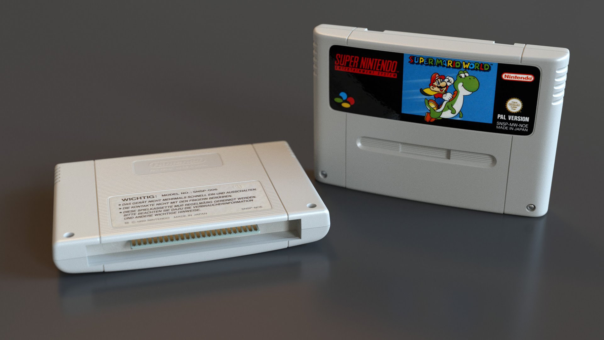
This even extended to the cartridges:
Imo the PAL one just fits the respective SNES design way better than the US one.
Imo the PAL one just fits the respective SNES design way better than the US one.
BocoDragon
or, How I Learned to Stop Worrying and Realize This Assgrab is Delicious
I will never understand how someone can like the US design over the international design of the system. Even taking nostalgia out of it, design wise, and colour wise, it's just an abomination.
I think the Japan/PAL one is better but I'll never understand what drives people to call the US one an abomination.
Well that and it gave us needless purple coloured buttons in Super Mario RPG, that they never bothered recolouring for Europe.
Oh wow. Yeah that does suck. I always thought the game's UI looked superior in the Japanese version.
This even extended to the cartridges:
Imo the PAL one just fits the respective SNES design way better than the US one.
I do think the Japan/PAL ones are better married to the look of their console, if that's what you're saying.
But I love North American cartridges on their own. They're more solid, easier to stack and lineup, have end labels, can stand upright with their exclusive dust caps, etc.
I think it's a great cart design.... and the proper sequel to NES carts with their horizontal line patterns.
Robin64
Member
Well that and it gave us needless purple coloured buttons in Super Mario RPG, that they never bothered recolouring for Europe.
When hakchi3 becomes available for the SNES Mini, one of my actions will be to apply this "PAL" patch to Mario RPG to get the proper colour buttons.
(This patch keeps it at 60Hz, there's another that converts it to 50Hz but you definitely do NOT want that)
I do think the Japan/PAL ones are better married to the look of their console, if that's what you're saying.
But I love North American cartridges on their own. They're more solid, easier to stack and lineup, have end labels, can stand upright with their exclusive dust caps, etc.
Yep, exactly.
What do you mean with the dust caps though? The PAL cartridges could stand upright too.
Razzorn34
Member
Because the original design was ass.
I'm glad this was first post. I couldn't agree more. I always liked the US redesign.
IdreamofHIME
Member
I remember 1st seeing a US SNES on an episode of Roseanne and wondering what the fuck it was.
Ugly little bastard.
Ugly little bastard.
funking giblet
Member
PAL or go home
Except 50hz 
JayBabay
Member
I can't believe how much shit the US SNES gets! I never thought twice about it till I saw all the hate it gets here. For me, because of nostalgia, it will always be remembered fondly and preferable.
As far as the controller goes, even though no one does concave buttons anymore, they were great for the era because many games had you holding down that Y button and your finger rested in it comfortably for extended periods.
Also, the color scheme, in my opinion, looks more mature and modern, even today.
The thing is - the US carts all feature end labels while the PAL/SFC games do not. That is one very useful feature that is often overlooked.This even extended to the cartridges:
Imo the PAL one just fits the respective SNES design way better than the US one.
I don't like to store my SNES games in a box simply because it's a hassle to play them that way so end labels make it possible to quickly identify what I want to play. The US carts also sit better on a shelf next to one another.
Such a weird decision.
US design for the SNES is imo one of the ugliest devices ever created. It looks cheap as hell and the two-tone purple colouring is just dull.
OG Super Famicon/EU SNES on the other hand, is one of the most iconic designs in consumer electronics. Everything about it is pleasing to the eye, and the four-colour buttons are now synonymous with gaming culture.
It's as bad as the JP Famicom vs EU/US NES. Famicon is ugly as sin, NES is iconic and perfect and lovely
Lemonte
Member
There were revisions of both the SNES and Super Famicom late into the generation. This is where they started evening out, though I'm still not a fan of the two concave buttons on the SNES controller.


If you take the controllers away they look like paper shredders.
-hadouken
Member
The thing is - the US carts all feature...
I'm sure I'm not alone in wanting to get your take on the respective designs, John. Spill it!
-shadow-
Member
For me personally, years ago it just just a bad design. But time just hasn't been kind to it and, to me personally, it's not gotten that terrible 90's attitude look about it. And that's an age best left forgotten completely. I will give the designer the hats off for the cartridges though. Seriously, why the hell the end labels are gone outside of America is just...I think the Japan/PAL one is better but I'll never understand what drives people to call the US one an abomination.
At first this actually confused the hell out of me. I was playing with an actual SNES controller and just couldn't wrap my head around why it was the way it was for hours on end. When it finally clicked I felt pretty dumb for taking as long as I did.Oh wow. Yeah that does suck. I always thought the game's UI looked superior in the Japanese version.
This is really cool, here's hoping they manage quickly with it!When hakchi3 becomes available for the SNES Mini, one of my actions will be to apply this "PAL" patch to Mario RPG to get the proper colour buttons.
(This patch keeps it at 60Hz, there's another that converts it to 50Hz but you definitely do NOT want that)
Also, why the hell would someone go through the trouble of making a full 50Hz patch? That just boggles my mind! 😂
BocoDragon
or, How I Learned to Stop Worrying and Realize This Assgrab is Delicious
Yep, exactly.
What do you mean with the dust caps though? The PAL cartridges could stand upright too.

Stable as fuck.
Robin64
Member
Also, why the hell would someone go through the trouble of making a full 50Hz patch? That just boggles my mind! 😂
To run on hardware as it would've. More a curiosity than anything.
Luckily people go the other way, such as this patch that converts Terranigma to 60Hz that I will be using when I load that game on my SNES Classic.
US looks like a Minecraft-character-head.Definitely. That's without even mentioning the colour schemes.
It's wake up time in the UK right now, it will be interesting to see the shift in opinion over the day when different countries have their say.
I know I'll be in the minority here, but I vastly prefer the american snes to the others. The japan/pal version looks like a toy and the color scheme is horrid. The american version shows class and sophistication and the purple works with the lighter gray. Like I said, in the minority, but I liked it.
Still not the best snes design though; that belongs to this beauty:
Not alone. I used to really prefer the JPN model too, but taking an objective approach, I only really loved the colored buttons. The inconsistent switch dials and buttons for power and reset are anything but sleek. Add in the cheap as hell looking black stamp logo compared to the subtle gray logo on the shell of the US. We got a sleeker unit for sure, but I get how ppl would like the slimmer profile and loathe the purple.
I also wanted to point out how NoA also changed the logo.
JP/EU use the left logo on the cover art for SNES games.
US uses the right logo on the cover art for SNES games
US had to change the logo as their controller never had the coloured buttons that the Japanese logo represents.
Auron_Kale
Member
While I do prefer the SFC design a bit more than the SNES, I prefer the functionality of the US design much more.
One of my constant memories as a kid was that I would spend hours past my bedtime playing my SNES (it was connected to the main TV) and when you're playing in the dark, the large sliders for the power/reset and the large eject button were a godsend. I could easily turn my system on/off, reset or eject my cartridges by feel rather than having to look down at what I was doing.
Sure the SFC has a unique switch for power and a regular button for resetting, but for me, I liked how much more tactile the SNES was in comparison.
As for the colors, I'm a fan of both the skittles and the purples.
ScientificPizza
Banned
Anyone who genuinely believes that the US SNES looks better than the JP/EU one should be locked up for life
The thing is - the US carts all feature end labels while the PAL/SFC games do not. That is one very useful feature that is often overlooked.
I don't like to store my SNES games in a box simply because it's a hassle to play them that way so end labels make it possible to quickly identify what I want to play. The US carts also sit better on a shelf next to one another.
Stable as fuck.
Ah, Isee - yep that are both pretty clear advantages.
SmokedMeat
Gamer™
I imported a Super Famicom at launch, and it was much sharper looking then the eventual purple box that arrived.
Red Liquorice
Member
It had no "edge" - so they gave it lavendar/lilac buttons, that most edgy of colours.
TeddyShardik
Banned
Man, I was going in here wanting to say something like "it wasn't edgy enough", but that's what he actually said!
The Pal Snes is one of the best looking consoles released.Because the original design was ass.
I have taken shits which looked better than the US snes
Stable as fuck.
If only the original PlayStation would have panned out so Sony could have brought the stability updates to PAL SNES
Man, I was going in here wanting to say something like "it wasn't edgy enough", but that's what he actually said!
lol