• Hey, guest user. Hope you're enjoying NeoGAF! Have you considered registering for an account? Come join us and add your take to the daily discourse.

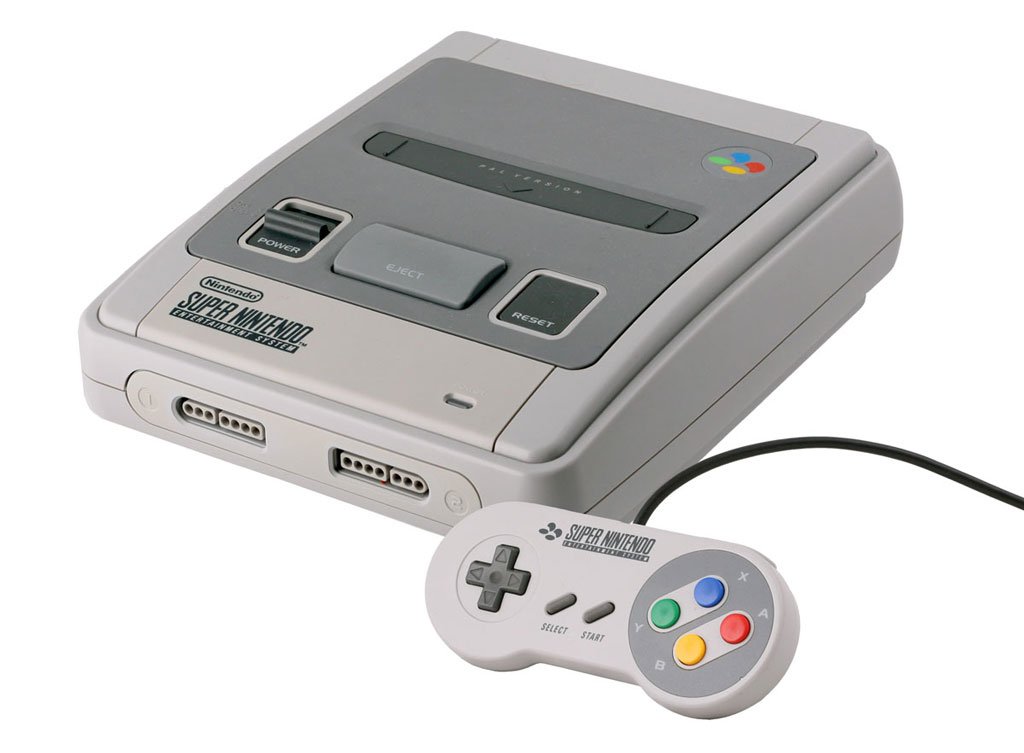
Why did NoA redesign the SNES for the US?

The US design is cleaner and holds up better to me. Though the purple color scheme was a mistake. Everything else is better to me,including the carts

It's not as drastic as the Famicom to NES, which is unequivocally iconic, but it's still better to me. Super Famicom looks generic as hell
 

woopWOOP

Member
I like both

I like US' more boxy shape
I like JP/EU's more use of colours

That redesign SNES looks slick too, but the US one loses its boxy shape, so bleh
 

Rygar 8 Bit

Jaguar 64-bit
My mind just goes "nooooo" to the lefthand ones, and I think the righthand ones are sleek.

with you the pal versions look mishmashed like that zelda box the gold in the zelda logo and the gold around it dont match and makes it look gross the na version is far superior and the black makes the zelda logo pop more
 
Snes design is like the americanized version of Dragon ball Z.

You may have grew up with Bruce Faulkoner music, but it still absolute shit.
 

JCH!

Member
Even though I grew up with the US one and have fond memories of it, there's no denying the UK/JP one is way better looking. I mean, look at that controller.
 

ramparter

Banned
Because the original design was ass.

SNES_Console_lg._V344019168_.jpg
???

It was beautiful... it still is.
 

BGBW

Maturity, bitches.
Yeah, the end labels are a good idea.

Strangely they forgot to change that when localizing Super Mario World. It took me a very, very long time to understand why this was there:

SpecialZone_SMW.png

Kirby Fun Pak has a similar mistake in the opposite fashion.

It describes the controller as grey with purple buttons all while showing a nice graphic of our colourful buttoned controller.
 
The only thing I hated about the NA SNES design was the tendency for the plastic to turn yellow over time. Nothing uglier than a partially yellowed Super Nintendo.
 
The Japanese and Euro SNES is a beautiful looking machine, still my favourite looking console to this day. I always hated the look of the US model, even the purple and lilac buttons on the controller. I also though the US cartridges were uglier too....

*edit* the cartridge end labels were good though!
 

lazygecko

Member
That's an interesting tidbit about the stereo inspiration behind one of the NES prototype designs. I assume it's this one?

The model 1 Mega Drive/Genesis was also designed to look like a stereo system.
 

sugarless

Member
Push comes to shove, the EU SNES is like a beautiful shell hiding a dark, ugly 50Hz heart. I am glad we had the same design as Japan but if you gave me a choice today of the EU and NA ones to play with and I didn't have the option of the Super Famicom, I would have to take the NA unadulterated 60Hz experience. This is why I'm really please the EU SNES Mini (and recent VC releases for that matter) are the US 60Hz versions. (Although I wonder if it means Super Mario RPG's buttons will be miscoloured for the EU Mini...)
 

KORNdoggy

Member
I only saw the US design for the first time a few years ago and I couldn't believe how ugly it was. Aside from odd special editions, it's by FAR the ugliest console Nintendo have released.


It's younger brother was better looking
md_II_s.jpg

probably my favorite looking console ever. can't touch that black and red colour scheme. and the shape is great, unlike the other black and red console around the time that looked awful (jaguar)
 

lazygecko

Member
probably my favorite looking console ever. can't touch that black and red colour scheme. and the shape is great, unlike the other black and red console around the time that looked awful (jaguar)

Not really a fan of how they changed it color-wise, especially those bright plastic red buttons I just find distasteful. My favorite will always be the originnal model 1 JP model with its mixture of black, gold, azure blue and a reddish purple.
 
Look at hardware design of the era. Back in 1991 that was the style. The PAL SNES/Super Famicom are better in retrospect, but at the time the US version is what you'd expect to see.

For some reason.

I was born the year the Super Nintendo came out stateside, so it was a ubiquitous piece of hardware that I saw everywhere for much of my youth. I grew up seeing it alongside VCRs and stereo systems. The SNES didn't look like any of those. I always thought the Super Nintendo looked really weird. I can distinctly remember wondering why it didn't look more like a VCR, which in retrospect, an NES did.

But I thought both were really ugly. The first system I actually liked was the GameCube. As an adult, the overseas versions of both the Famicom and the Super are so much more timeless and cool. I wish we'd been so lucky.
 

Markitron

Is currently staging a hunger strike outside Gearbox HQ while trying to hate them to death
probably my favorite looking console ever. can't touch that black and red colour scheme. and the shape is great, unlike the other black and red console around the time that looked awful (jaguar)

Agreed. I like the original Mega Drive design but the MD2 was so sleek. The OG PS4 is the only design I like more.
 
I don't know why Nintendo changed the design, but the US design is the ultimate nostalgia piece for me.

I love the power and reset switches. I miss those.
 

KaYotiX

Banned
Never cared for the colored buttons.... Love my Purple SNES!

God damn this thing is bringing me back to staying up till 3am in my grandparents basement with cousins playing Mario World. I miss those days..... Such a simpler time as a kid :)
 

KORNdoggy

Member
This problem was not exclusive to NA chassis:

image3c25c.png

yup, something to do with bromine used in the plastics i believe. which wants to turn brown when exposed to light. my DSi is doing the same thing with the shoulder buttons.

what i find weird though...nintendo are the only consoles i own that seem to do it?
 

SKINNER!

Banned
All these "US SNES looks much better" users with their nostalgic rose-tinted glasses on making absolute fools of themselves. The US SNES console design is absolute garbage. We're talking "The Homer in episode "Oh Brother, Where Art Thou?"" bad.

Look at the SFC and Euro consoles closely. Look at the time and consideration it took to design the actual console and colour of the controllers. Then look at that horrible purple block.
 
Taste is subjective, the fact that the NA SNES is an abomination isn't. It's not a problem though, it's alright to be wrong and people associate it with their childhood so I can forgive the rose-tinted helmets as and when they appear.
 

Rlan

Member
I only saw the US design for the first time a few years ago and I couldn't believe how ugly it was. Aside from odd special editions, it's by FAR the ugliest console Nintendo have released.


It's younger brother was better looking
md_II_s.jpg

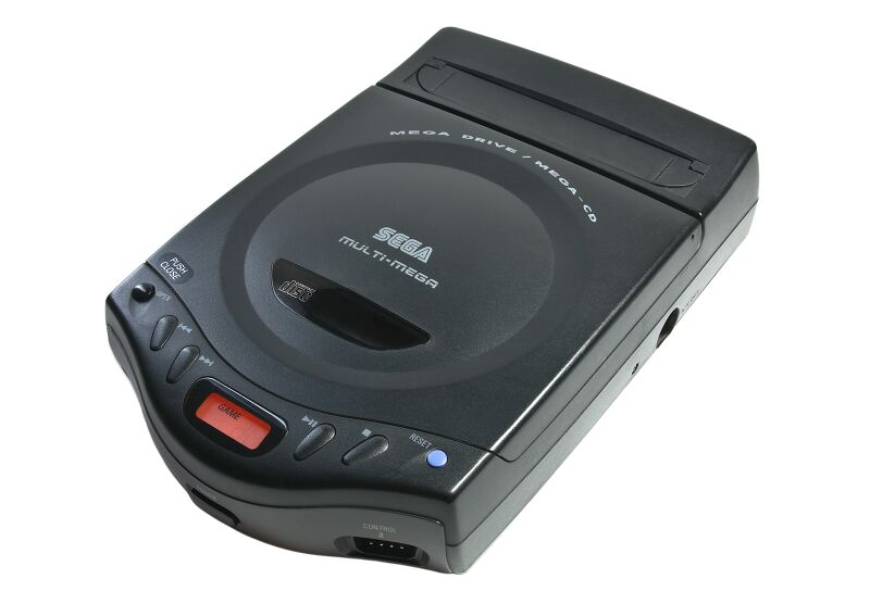
I didn't own one, but the Multi-Mega / CDX is a real beaut.

800px-Multimega.jpg


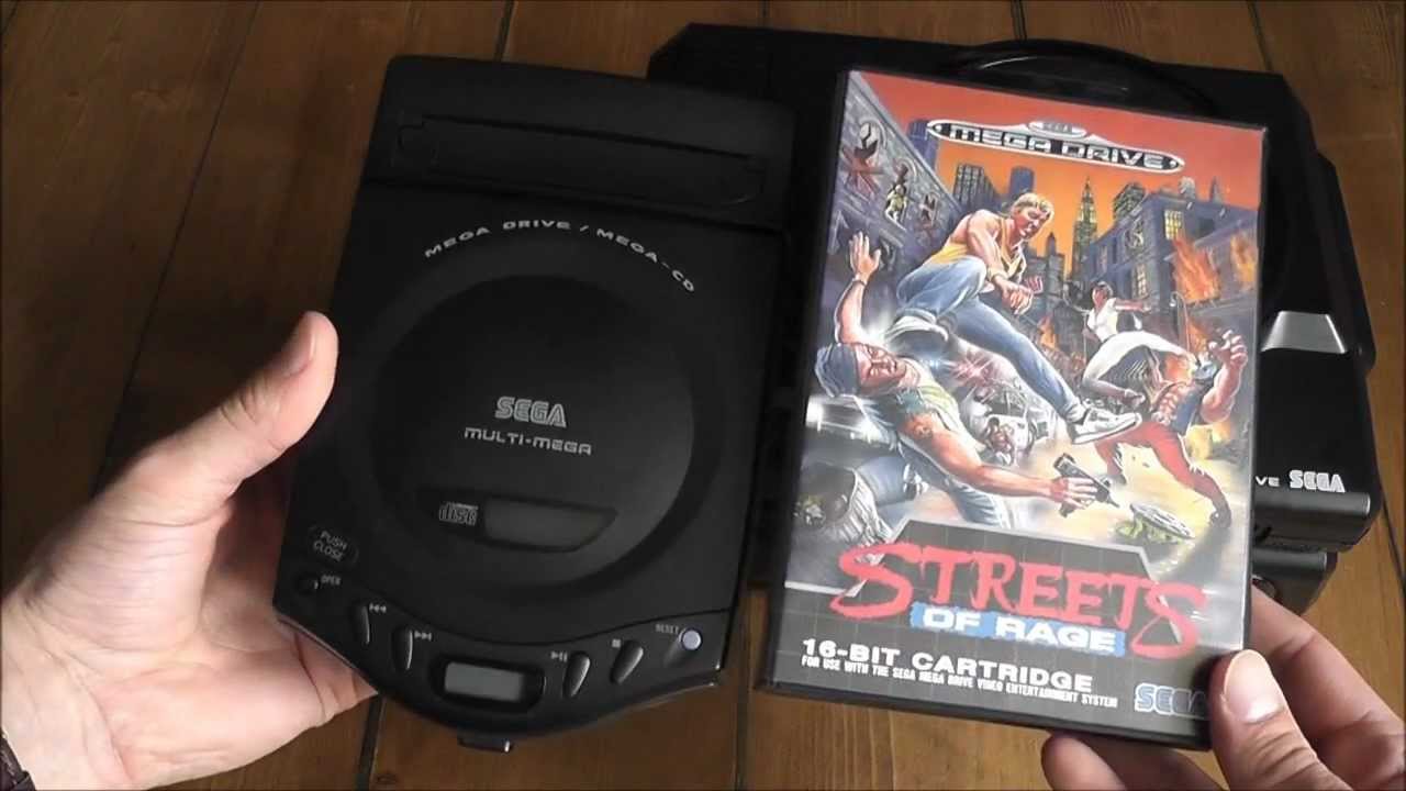
Damn thing is tiny too. I don't know how the hell they fucked up with the 32X and Saturn with this amazing bit of kit out there.

maxresdefault.jpg
 

ggx2ac

Member
The colour scheme of the JP/EU version is tacky and loud, but the boxy design of the US version is ugly too. NoA surely recognized this because they later released the best looking version of them all.

I can't see your quoted image but if it's the revised SNES that was released in 1997, I got some bad news for ya.

NCL designed it: edit: Apparently Lance Barr designed it according to Wikipedia but references a Nintendojo interview that can't be seen so this is confusing.

 
Despite growing up as a SNES kid, I feel that they're both ugly in their own way. The NTSC is boxy and bland, whilst the PAL/SFC is anonymous looking. The Mega Drive on the other hand...

la-mega-drive-aussi-appelee-genesis-aux-usa.jpg

The Megadrive looked like something Sony would have put out at the time. It was very early 90s hi-fi in its appearance, a great looking console for the era.

My word, I really really miss Sega :(
 

bman94

Member
Unpopular Opinion: I love the design of the NA SNES. I prefer way over the Japan and EU one's and I never even had one growing up.
 

buttdiver

Member
I prefer the NES over the Famicom.

But I prefer the Super Famicom over the SNES.

The SNES is still ok with me though, because that's the one I grew up with.
 
The design itself isn't bad imo, it's the purple that kills it. Why on earth didn't they just use red or dark gray power- and reset buttons? Just plonk the original color face-buttons on the controller and it's fine.

Pretty much this.

Very interesting read, OP, thanks for that. Also, does anyone know if this is covered at all in that "Console Wars" book?
 

ggx2ac

Member
Wikipedia says that one was also designed by Lance Barr ... although the source link/interview on Nintendojo doesn't seem to be available any more.

Wow, this is confusing. Because it's probably referencing the interview in the OP and Lance Barr made it sound like NCL were in control of the hardware design from then on in 1995...

Okay, then I'm mistaken. I'll just edit my post to state I'm wrong.
 

MicH

Member
There were revisions of both the SNES and Super Famicom late into the generation. This is where they started evening out, though I'm still not a fan of the two concave buttons on the SNES controller.

wPiBPeu.png

ZgPwGq1.png
I don't like the US SNES but my god it looks like a masterpiece next to these two. Yikes! They have no charm or personality! Honestly look like knock offs.
 

bomblord1

Banned
ITT people who have a nostalgic attachment to a specific design get upset when people who grew up with a different design don't feel the same.
 
Top Bottom