• Hey, guest user. Hope you're enjoying NeoGAF! Have you considered registering for an account? Come join us and add your take to the daily discourse.

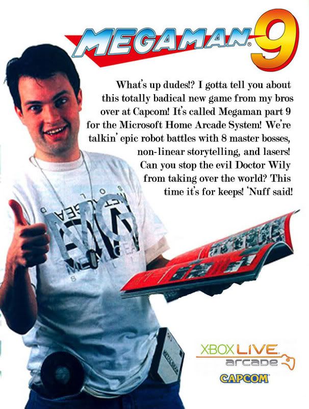
We create "magazine ads" for the hell of it. Now: Two Out Rally

itsinmyveins

Gets to pilot the crappy patrol labors
DigitalA1chemy said:
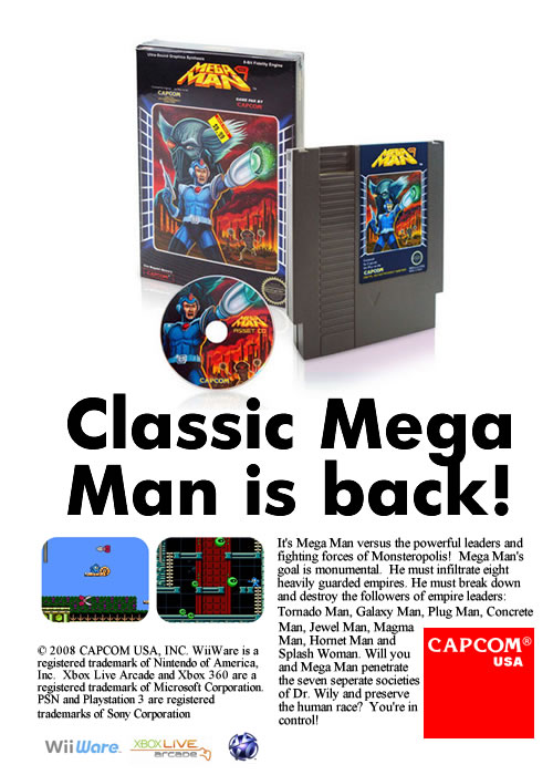
Thank you, kind sir. I thought for sure I would get some comments for even using the old-school Capcom logo, but nothing.

I kinda assumed it was, even if I wasn't sure. But showing the game package with a big fat font, rounded screenshots and that Times New Romanesque font are all nice details. I don't know if was an accident, but seeing that the bottom of the two text blocks don't line up adds to the whole "back in the day when no one knew shit about ads"-vibe :lol

I do think robotnjik deserves som praise for his second ad too, which is the one that looks most professional and current. It doesn't do anything new or interesting, but it's most certainely a solid one.
 

Borgnine

MBA in pussy licensing and rights management
markm_mm-1.jpg
 

rass

Member
im at work making ads for other people at the moment,
will try my hand at this when i get home, good thread!
 

Belgand

Member
DigitalA1chemy said:

Definitely the winner.

Mdk7 said:

And a very solid runner-up.

More than the other ads both of these immediately demonstrate the nature of the game to me and sell me on it. Both also manage to look very professional. I would have no problem seeing either of these as actual, legitimate ads.

One suggestion I would have is to minimize or omit the need to include the listed platforms. This is the sort of thing that tends to make a lot of real-life ads just look cheap and trashy much of the time. Capcom logo? Great. But a bunch of different logos for systems don't quite resonate very well and tend to make the bottom look too busy distracting from the rest of the image.
 

Sidzed2

Member
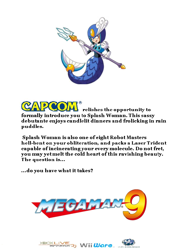
This is more of a concept because I don't hav the tools to pull it off professionally.

I hate the font; I actually would love to use the one which appears in the classic ads, as seen in DigitalAlchemy's concept.

Anyway, all I had was Paint, default fonts, and a 30 minute lunch break!

mm9ad.png
 
Sidzed2 said:
This is more of a concept because I don't hav the tools to pull it off professionally.

I hate the font; I actually would love to use the one which appears in the classic ads, as seen in DigitalAlchemy's concept.

Anyway, all I had was Paint, default fonts, and a 30 minute lunch break!

mm9ad.png
I like it :^)
...and ill take splash woman on a date as well.
 

NaviLink

Member
This thread is just pure awesomeness. Many of the contributions are really great, and could be featured in a magazine.

The one with the technical terms is just perfect.
 

AniHawk

Member
Sidzed2 said:
This is more of a concept because I don't hav the tools to pull it off professionally.

I hate the font; I actually would love to use the one which appears in the classic ads, as seen in DigitalAlchemy's concept.

Anyway, all I had was Paint, default fonts, and a 30 minute lunch break!
That actually turned out pretty good. If you want to check out more fonts, there's the 1001freefonts.com site I posted in the original post. I've been using it for a while now, so I don't think there's any problems with it, but I use a mac.
 

LAMBO

Member
Very good, can't wait to see some SOTC ads.

One off topic question

SNSD-avatar4.gif


What is this gif from? I've been seeing it all over this place latley.
 

MNC

Member
I am seriously loving this thread.

I'm very fond of the total retro ad (A1chemy?) and the "Sucks to be you" one somehow, there's something about the colors and just the void that makes it work! :D
 

Yoshichan

And they made him a Lord of Cinder. Not for virtue, but for might. Such is a lord, I suppose. But here I ask. Do we have a sodding chance?
A Link to the Snitch said:
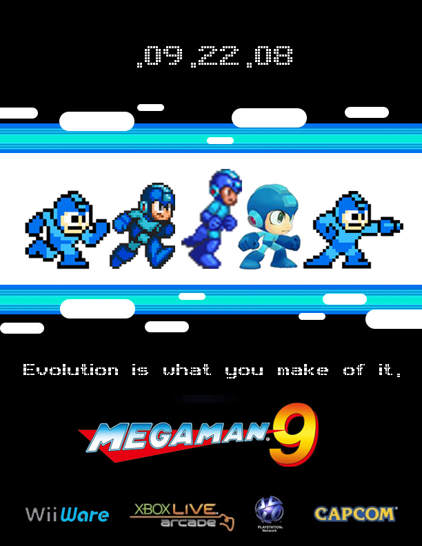
Personally, I would have had the same sprite for the first and last Mega Mans.
I swear I came here to post this.

maScHlVOc.jpg


EDIT: I don't take credit or anything, so don't hit me.
 

OchreHand

Member
DigitalA1chemy: i love that. it looks totally vintage with the type you chose and the layout. i wonder if you do another version by adding paper wrinkles and tint the paper slightly as if it's really pulled from an old magazine?
 
D

Deleted member 30609

Unconfirmed Member
Defuser said:
So photoshop is nerd now? :|
I'd say spending time photoshopping an imaginary magazine ad for a somewhat cult downloadable release on an internet gaming message board counts as somewhat nerdy, yes.

But that's not an insult. It's why this thread is great.
 

Defuser

Member
Rez>You said:
I'd say spending time photoshopping an imaginary magazine ad for a somewhat cult downloadable release on an internet gaming message board counts as somewhat nerdy, yes.

But that's not an insult. It's why this thread is great.
I see it as a way to brush up my skills to do a good portfolio.
 
D

Deleted member 30609

Unconfirmed Member
Defuser said:
I see it as a way to brush up my skills to do a good portfolio.
*shrug*

Good on you then. I wish I had the required skills to join in, I really need to set aside some time one day and get some amateurish skills under my belt. :)
 
Rez>You said:
*shrug*

Good on you then. I wish I had the required skills to join in, I really need to set aside some time one day and get some amateurish skills under my belt. :)
Just do it for fun...no skills required here. Hell i didnt even spell check mine(and it shows), but it was fun.

Go for it damnit!
 

AniHawk

Member
Welp, these are about as finished as they're gonna get. Finally got photoshop back, so the next ones should look better despite my limited talent. Posting them here since I'll remove them from the OP once the next project is underway.

1zxr5fr.jpg


And the second one
 

Haunted

Member
:lol so many good ones!

GAF can be awesome sometimes. <3 Love the thumbnail post, Panther. Should be added to the OP when all is said and done
 
Seiken said:
I swear I came here to post this.

maScHlVOc.jpg


EDIT: I don't take credit or anything, so don't hit me.
It kind of breaks the animation cycle i think he was trying to go after. I thought he was trying to basically have him stopping to pull the buster out, but if you replace the last sprite, it throws it off a bit(from the goal).

I get where you are coming from though, since repeating the first and last sprite signals a return to form.
 

Musashi Wins!

FLAWLESS VICTOLY!
Jesus, this thread went great. Nice work. I can't believe how creative some of you are with your hobby. I hope you get fat paychecks.
 

Bernbaum

Member
Seiken said:
I swear I came here to post this.

maScHlVOc.jpg


EDIT: I don't take credit or anything, so don't hit me.

I too thought this would have made for a better effect, but having the different frame for the last Megaman in the original just flows much better.
 

Sidzed2

Member
Another super quickie (at work)!

Doesn't follow rules because I didn't want to put the Capcom logo in there, and in Paint it looks like crap anyhow.

MM9AD-1.jpg
 
Top Bottom