• Hey, guest user. Hope you're enjoying NeoGAF! Have you considered registering for an account? Come join us and add your take to the daily discourse.

Why did NoA redesign the SNES for the US?

I don't think NA SNES is horrible looking but it was a downgrade from the original. I was following the Japanese import scene closely back then, and it was a little disappointing when they unveiled that re-design.

The PC Engine turning into the TurboGrafx was a much bigger downgrade, though. They said it was because of added RF shielding for FCC rules but I think it was more because they felt the original was too compact and cute for North America.
 

Deraldin

Unconfirmed Member
Never had a SNES myself so I had to make do with the few days at a time whenever we visited family that had one. The SFC buttons just ruin the entire aesthetic of the console for me. Why are there three different button styles used? The switches on the US SNES are much nicer looking and felt fantastic to use.

I do really like the coloured buttons on the SFC, but they would have clashed with the purple power/reset on the US SNES so I'm fine with the purple buttons on the controller too. The concave buttons though were perfect.
 

Bgamer90

Banned
I'll never understand the love for the Super Famicom/PAL design. Beige and gray all over, the multicolor button logo/icon that sticks out like a sore thumb, power switch vs. reset button (therefore making left and right side not uniform)... I feel the North American design holds up far better.
 

Freshmaker

I am Korean.
As we are heading to launch this week of the SNES Mini Classic, I was wondering, why?

I already heard how the NES was designed differently to look less like a toy because of the videogame industry crash in the US but, the SNES didn't really need to be redesigned.

I was trying to look up articles and there's isn't much, there's one here from Nintendolife that references another source which is Nintendojo interviewing NoA employee Lance Barr which can only be found here apparently: https://assemblergames.com/threads/interview-with-the-nes-case-designer.8530/
I remember reading an article on the SNES dredesign processin Nintendo power at one point.

IIRC, the cart slot ended up curved to discourage people from putting their drinks on it.
 

Mr Git

Member
As someone who grew up with the PlayStation: They both look like ass.

One of the Nintendo mags I bought as a teen used to disparagingly refer to the PS1 as 'the Greystation'. I was like wtf man the SNES was literally last week.
 

Joey Ravn

Banned
PAL SNES is terrific. NTSC SNES is terrible.

As someone who grew up with the PlayStation: They both look like ass.

Since when your console loyalty informs your appreciation for the design of a console? SMH. And it's not like the huge grey brick that was the original PlayStation was much better than the NTSC SNES. The PSOne is pretty sleek, though.
 
As someone who grew up with the PlayStation: They both look like ass.

I used to take those stickers from PSM or whatever it was and put them on the PS1 disc drive lid. Those were good times.

Wonder if anyone has a compilation somewhere of all the stickers they sent out?
 

jholmes

Member
The purple-and-grey scheme and the wavy, boxy feel of the SNES is so unquestionably a product of its time. I think the SFC is a better look, but the SNES makes me ache with nostalgia for the early 1990s.

That is, when I don't see one that looks like yellowed garbage, which is never.
 
If the concave buttons are so great as everyone claims, how come we've never seen them on another controller since?

I'm calling bullshit on that one.
 
If the concave buttons are so great as everyone claims, how come we've never seem them on another controller since?

I'm calling bullshit on that one.

They were useful at the time because the transition from 2 button controllers (nes) or single row 3 button in the case of the Sega Genesis to 4 button diamond layout was a pretty drastic jump for a lot of people. The tactile difference was enough so that players didn't have to look down at the controller to make sure their thumb is on the right buttons.

We had the Super Famicom first and there was an adjustment period to get used to the controllers. When we had friends, neighbors and cousins come over to play, they all had to periodically look at the controller for thumb placement. We didn't have that problem with the Snes later.

Nowadays, it's almost an obsolete design because it's so common for nearly every controller to have that 4 button diamond/square layout that pretty much everyone is used to.
Ok so this proves my point that the reason anyone thinks they are superior today is just nostalgia, and not for any functional reason.
 
Reading that interview, I do see some merit to the choices made. At the time, the Genesis was starting to pose a real forthcoming threat to the NES in terms of appealing to older demographics looking for something more "adult," more high-tech. The North American design aims for that customer in a similar way to the Genesis/Mega Drive, but in a brighter, arguably less exclusively masculine color scheme? The NA SNES (a lot like the worldwide PS1 design) to me echoes design trends of something like a gray 1990s desktop computer tower. I think between the Genesis/MD, the NA SNES, and the PS1, for the time, all three of the designs successfully helped to sell the idea of a "state-of-the-art" "next generation" device.

It looks like the kind of device that you might expect to play age-agnostic PC ports like SimCity, Populous, or Lemmings (but for a fraction of the price).

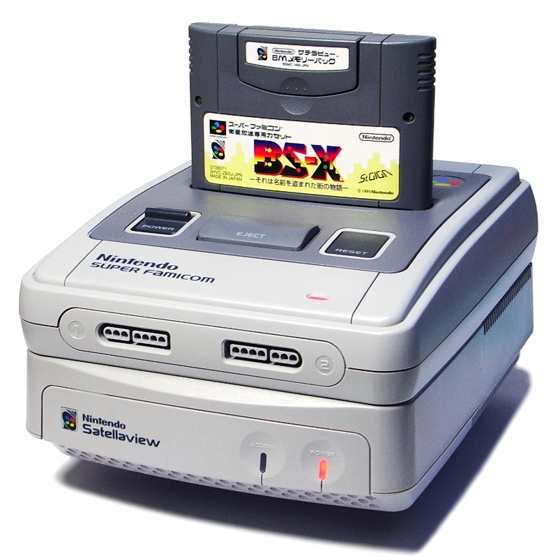
I feel like if Barr was worried about the Super Famicom design looking odd when attached to a hypothetical SNES CD or something like a Satellaview, the ridgey bottom of the NA SNES finally makes some sort of design sense if the ridgey bottom of the SNES was supposed to slide seamlessly into the ridgey top of something else. Now, it doesn't look bad per se, but the almost puffy smoothness of the Super Famicom design with a cartridge sticking out sitting on top of the Satellaview does remind me of a bird nesting for some reason if I think about it. (Of course, designing the NA SNES specifically to connect to something else that it never got is a bit of irony)

Satellaview_with_Super_Famicom.jpg


I will say though, while I love a lot of the Japanese SF box art, the stylish "high-tech" uniformity of the NA box art does -- I think -- hold up especially well. Upon seeing a box on a shelf, you know immediately that it is a Super Nintendo game without it overly diminishing the art and logos for the game itself, and the (not necessarily utilized, depending on the publisher) space on the front cover for a punchy synopsis helped explain to the consumer the contents of an unfamiliar game they were looking at.

(For whatever it's worth, I grew up with the North American SNES, and I like both designs, but wound up settling into the more colorful Super Famicomey stylings of the AsciiPad controller)
 

ghibli99

Member
The moment I turned on my US SNES for the first time and played SMW, I couldn't have cared less what the console itself looked like. JP or US, they looked worse than the first-generation Mega Drive/Genesis, though.
 

Freshmaker

I am Korean.
The moment I turned on my US SNES for the first time and played SMW, I couldn't have cared less what the console itself looked like. JP or US, they looked worse than the first-generation Mega Drive/Genesis, though.

I got one for SF2. Still thought it looked stupid. I never liked the color scheme.
 

Synth

Member
They were useful at the time because the transition from 2 button controllers (nes) or single row 3 button in the case of the Sega Genesis to 4 button diamond layout was a pretty drastic jump for a lot of people. The tactile difference was enough so that players didn't have to look down at the controller to make sure their thumb is on the right buttons.

This makes EU/JP players of the time seem wildly more competent.
 
The jp / eu is one of the best looking consoles to me, while the us version is one of the ugliest I have ever seen, lol.

US one would have looked better with other colors, maybe.
 
They were useful at the time because the transition from 2 button controllers (nes) or single row 3 button in the case of the Sega Genesis to 4 button diamond layout was a pretty drastic jump for a lot of people. The tactile difference was enough so that players didn't have to look down at the controller to make sure their thumb is on the right buttons.

We had the Super Famicom first and there was an adjustment period to get used to the controllers. When we had friends, neighbors and cousins come over to play, they all had to periodically look at the controller for thumb placement. We didn't have that problem with the Snes later.

Nowadays, it's almost an obsolete design because it's so common for nearly every controller to have that 4 button diamond/square layout that pretty much everyone is used to.

I still like it. For people that don't play a system very often, the different colored buttons (Xbox, SNES,etc) and the different feel of them help them out.
 
Being completely honest, this blew my mind. I never even knew the US had a different design for the SNES. Growing up in Australia the jp one is the only one I've ever seen.
 

Link1110

Member
Super Famicom was one of the most beautiful consoles ever. I suppose the fact that the Mega Drive was kind of weird looking compared to the far better looking Genesis kind of made up for it.

Yeah it was just font and placement of the system logo but Mega Drive looks so weird and empty.
 

Kintaco

Member
Design:
Super Famicom/PAL SNES > US SNES

Color scheme:
SNES > Super Famicom
I like the purple and gray personally, plus the gray is a much nicer shade. Not a fan of the dirty gray of the Super Famicom.

Logo:
SNES > Super Famicom
Way sleeker IMO. The PAL and Super Famicom logo seems so uninspired.

Box:
US SNES = Super Famicom > PAL SNES
US and Super Famicom are both pretty iconic and awesome.

Cartridge Design:
SNES > Super Famicom
Being able to stack them and seeing which game is which is a game changer. It was a great way to show off your collection.

Game Boxart:
US SNES > Super Famicom > PAL SNES
Love the uniformity of the US Boxart. The PAL Boxart just triggers my OCD big time with all the mishmash on the box.

BONUS:
Sega Genesis > Mega Drive
Mega Drive looks like a cheap Chinese knockoff with the tiny Mega Drive name almost not visible in the corner.
 

Square2015

Member
NA SNES is the ugliest console hands down. Feel bad for you Americans having to suffer through that.

We didn't consider it bad at the time, we were grateful. By the time the SNES Jr released about 16% of U.S. households had an SNES (16m units sold roughly and 100m households in 1997).
What was the percentage in Europe/UK? Surely much lower.

However most Americans at the time considered the Genesis 2 (Aug 1993 release) way sleeker than the SNES (and thus its neck-and-neck competition).

Edit: for Japan something like 33% (!) of households had a SFC (~15m sales by '97; 45m HH)
 
It's not the slickest looking system, but I didn't mind at all at the time. I still really like the color scheme though. The concave buttons too.
 

RedSwirl

Junior Member
The NA SNES (a lot like the worldwide PS1 design) to me echoes design trends of something like a gray 1990s desktop computer tower. I think between the Genesis/MD, the NA SNES, and the PS1, for the time, all three of the designs successfully

This is what I think too. The North American SNES design looks very much "of its time." It looks like something an American company would have designed in the early 90's. Like a lot style of the time though, it just didn't age well for most people.
 

EvB

Member
This is what I think too. The North American SNES design looks very much "of its time." It looks like something an American company would have designed in the early 90's. Like a lot style of the time though, it just didn't age well for most people.

maxresdefault.jpg
 

SKINNER!

Banned
Stomping all over my childhood memories.

ObIQIdL.png

I still love ya buddy :3 You know you and Acrid are my favourite gaffers right?

Design:
Super Famicom/PAL SNES > US SNES

Color scheme:
SNES > Super Famicom
I like the purple and gray personally, plus the gray is a much nicer shade. Not a fan of the dirty gray of the Super Famicom.

Logo:
SNES > Super Famicom
Way sleeker IMO. The PAL and Super Famicom logo seems so uninspired.

Box:
US SNES = Super Famicom > PAL SNES
US and Super Famicom are both pretty iconic and awesome.

Cartridge Design:
SNES > Super Famicom
Being able to stack them and seeing which game is which is a game changer. It was a great way to show off your collection.

Game Boxart:
US SNES > Super Famicom > PAL SNES
Love the uniformity of the US Boxart. The PAL Boxart just triggers my OCD big time with all the mishmash on the box.

Aside from the cartridge design, I agree with this.

Shame PAL carts are all in 50Hz which is the only reason I buy/collect NTSC SNES carts. Otherwise, I'd avoid the USA carts altogether. PAL/Super Famicom carts look much less boxy.
 

Link1110

Member
Cartridge Design:
SNES > Super Famicom
Being able to stack them and seeing which game is which is a game changer. It was a great way to show off your collection.
This so much. I'll never understand why not only did Japan never get labels on top of cartridges but they actually had the courage to take them away in America during the n64 era
 

Neith

Banned
I have no idea why people hate the SNES US design. It's very competent. I think the purple is fine. I also like the other one as well, though, I'm not super huge on yellow buttons! Both are different and great in their own way.
 

SKINNER!

Banned
Man, sega was so much better at design.

I don't know about that. I personally don't like the first gen Mega Drives and Master Systems.

Btw, Japanese famicom would have been great if the controllers weren't attached to the console. Whoever designed that was insane. and whoever didn't agree to greenlight a revision model with detachable controllers is also insane. Famicom AV is great and all but I wish I had a original famicom with detachable controllers.
 

v1oz

Member
I also wanted to point out how NoA also changed the logo.

JP/EU use the left logo on the cover art for SNES games.

US uses the right logo on the cover art for SNES games
I always wondered what the meaning was behind the US logo.
 

Chittagong

Gold Member
I think the US system is much more cohesive in branding. The angular shapes, stripes, logo, icon, color scheme, cartridge shape and stripes, box art, typography... all belong together. It looked like a powerful machine.

Super Famicom, on the other hand, is a a combination of nice design ideas, but not as cohesive as a brand.

PAL is just a senseless hodgepodge of US branding designed for the angular Super NES, slapped on a Super Famicom shape, and slapped on with the Super Famicom logo icon.
 

BGBW

Maturity, bitches.
I want the four colors and two convex and two concave buttons. Best of both worlds. Hell, make the dpad purple.

Cs5eXWj.gif


Go to bed Gravis.

I'll never understand the love for the Super Famicom/PAL design. Beige and gray all over, the multicolor button logo/icon that sticks out like a sore thumb, power switch vs. reset button (therefore making left and right side not uniform)... I feel the North American design holds up far better.
You do realise beige is the result of sun light right? The same thing happens to the American model too.

This so much. I'll never understand why not only did Japan never get labels on top of cartridges but they actually had the courage to take them away in America during the n64 era
End labels are useful, but clearly an American only thing (well, we had them with the NES in Europe, since we shared the same design as the Americas).

Japan never had them. Famicom - front only, SFamicom - front only, GameBoy - front only. So once we got to N64, where everyone received what Japan designed, we got front only. And it continues to this day with 3DS and Switch.
 
Wow y'all think the purple and grey SNES is worse? It's so much sleeker and doesn't have random squares and grey blobs everywhere. And that nice smooth curve gives it an iconic look. Glad I live in America where we apparently have better taste in design.
 
Top Bottom