-
Hey, guest user. Hope you're enjoying NeoGAF! Have you considered registering for an account? Come join us and add your take to the daily discourse.
You are using an out of date browser. It may not display this or other websites correctly.
You should upgrade or use an alternative browser.
You should upgrade or use an alternative browser.
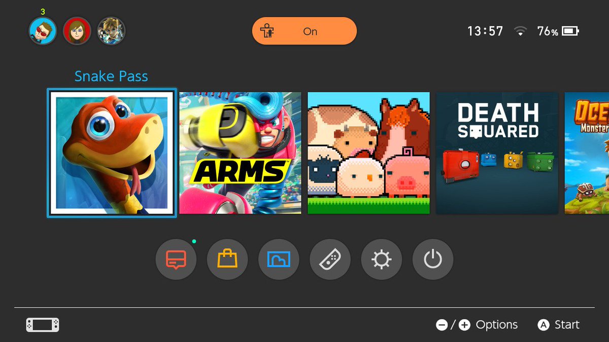
Snake Pass, and how a bad home menu icon drags down my enjoyment of a game
- Thread starter Neiteio
- Start date
- Status
- Not open for further replies.
Mech.E. Risarovi
Neo Member
I totally understand you, OP. In fact, I was thinking about buying the game on sale (today is the last day I think) and I am not doing it.
I hate this kind of thing. I can get that if it's a great game doesn't matter, but... It matters to me, at least.
I hate this kind of thing. I can get that if it's a great game doesn't matter, but... It matters to me, at least.
Would you say the same about vinyl records album covers?
Given that many games (including snake pass?) are never released as a physical box and many of our 'collections' are nothing but an array of square icons, i do find a game's icon not all that unimportant. Especially on the Switch, a console with a very minimal UI.
I don't buy games to "collect" them, I buy them to play them. So it doesn't matter to me what the icon is, once I'm in the game the icon is gone. It could be a block of text that says SNAKE PASS and I'd be A-OK with it.
I also don't really care about album covers, just if the music is good. Once the music is playing the physical trappings it was delivered in is moot for me. (Although I'm digital only outside of very rare occasions.)


KratosEnergyDrink
Member
That this icon would slide back to the left when you start this game has really stopped me from starting it yesterday.
At the moment many people want to see my Switch and I don't want a cheap "mobile game icon" on the start screen.
At the moment many people want to see my Switch and I don't want a cheap "mobile game icon" on the start screen.
Gravy Boat
Member
That this icon would slide back to the left when you start this game has really stopped me from starting it yesterday.
At the moment many people want to see my Switch and I don't want a cheap "mobile game icon" on the start screen.
This is sad.
GAF > Internet > GAF
The circle of life.
Starwolf_UK
Member
Better stay away from Planterra as well:I feel the same way with my Switch home screen. It had a nice flow to it but now the Snake Pass icon is just glaringly out of place imo.
*found in a one of the tweets about Snake Pass*
On another note I played the Steam version of Planterra and there were no horses there.
At this point I wonder do Nintendo have Home Icon guidelines as it seems most games have gone for including game logo rather than the mobile app style.
Wtf what is this?Mess

Snake Pass is case study of how an innocuous change like this icon, that has absolutely no impact on the product itself, can still have a significant impact on the perceived user experience.
I'd be interested in seeing if there's any impact seen in the sales.
Personally, I also found the new icon egregious when I first saw it after the previous patch, I much prefer the old one (title motif helps to identify game at a glance, plus the new blue color scheme feels artificial compared to the old jungle background).
I wonder if Nintendo has any publishing rules about this? Microsoft does with Xbox, a number of games (Fallout 4, Advanced Warfare, Mirrors Edge Catalyst) all had icons completely different to the boxart with no logo when they released that were later changed in a patch to be the boxart or at least art with a logo.
Pretty sure Microsoft has rules on what art the icon can be and it HAS to have the games logo in the icon art. Seems the opposite has happened with Snake Pass though.
Pretty sure Microsoft has rules on what art the icon can be and it HAS to have the games logo in the icon art. Seems the opposite has happened with Snake Pass though.
Zaraki_Kenpachi
Member
This is the most awkward complaint thread I think I've seen. I just don't understand how this impacts your enjoyment from playing a game.
DangerJuice
Member
The game already ruined my enjoyment, sucks that the home menu is ugly now too.
Finale Fireworker
Member
I love that Neiteio is now news.
Power to the vox populi!
Power to the vox populi!
Sora the Cat
Member
I agree OP, they need to fix it ASAP. I totally get what you mean, it looks like a cheap mobile game now..
TheGreatMightyPoo
Banned
It's just a fucking icon.
Wtf what is this?
A stage collapsed at a state fair and killed five people. Not a nice gif to use really.
PhantomThief
Banned
I agree, the older icon was much better. Even on ps4. Not sure why they changed it  . McBradders help us! ^_^
. McBradders help us! ^_^TheGreatMightyPoo
Banned
They changed it because they made a new patch and could.I agree, the older icon was much better. Even on ps4. Not sure why they changed it
See Mr. Shifty.
Well, given that we're posting on the gaming section of a video game forum, the term "first world problems" is the obviousness of the century. We're not talking about hunger in Africa here.
Yeah but even by GAF standards this is fickle on a phenomenal level. The guy owns the game and knows what it is and has played and enjoyed it in the past, why would a change in icon stop him from enjoying the base game?!
I mean, game icons are there to entice people who have no idea on games and this is their only exposure to the game. But GAF has reviews, it has player impressions, it has tons of threads about the game, it's one of the Switch's better games. And you're telling me a sizable contingency of its users not only won't touch the game because of a changed icon, but will refuse to play it anymore until it's fixed even though they own it and have played it and enjoyed it in the past? Or even DELETED the game in protest?!
ultrazilla
Member
The game already ruined my enjoyment, sucks that the home menu is ugly now too.
Savage
You'll go far here Junior!
Perhaps this is the thread that starts the movement for game developers/publishers to provide different designs for home screen icons.
Or not
PhantomThief
Banned
They changed it because they made a new patch and could.
See Mr. Shifty.
I understand. I just don't understand why they'd think the new icon was better in any way.
I really like Noodle too.
QuantumSquid
Member
The old icon was way better. I can't say it would affect my enjoyment of the actual game though, it just kinda ruins the aesthetic of the home menu.
I laughed when I saw the thread title but they have a point.
The problem is that all the other images are actual box art. They're the covers you would see on a retail shelf, so you have your digital library full of conventional looking box art and then you have something which is clearly not box art. You would never walk into a store and see a game with that on the cover, not least because it doesn't even display the title. It looks cheap and unfinished in comparison.
I think that's the crux of it. It's just jarring.
Phife Dawg
Member
For real? Why would anyone use such a GIF?A stage collapsed at a state fair and killed five people. Not a nice gif to use really.
FlaygletheBagel
Banned
The new icon looks like it was designed for a much smaller screen, like the kind of icon you'd see for a mobile app. I concur that it looks ugly on the Switch home menu, OP.
FYI: They just updated it again

aaaaaaaaaaa
brokenbeans
Banned
How the shit was this thread worthy?
The game has an OT and devs are active on social media.
The game has an OT and devs are active on social media.
TheGreatMightyPoo
Banned
Speaking of icon changes, I plead for the developers of the Switch version of NBA Playgrounds to change the icon of the game when the first patch actually comes out to this:

jacob armitage
Banned
Old icon is much, much better. Perhaps just tweet the devs? In fact, i think one of them is on Gaf?
PhantomThief
Banned
How the shit was this thread worthy?
The game has an OT and devs are active on social media.
You do know Thread whining is a bannable offense right? Watch out duder! Read the faq if you must
Would you say the same about vinyl records album covers?
Given that many games (including snake pass?) are never released as a physical box and many of our 'collections' are nothing but an array of square icons, i do find a game's icon not all that unimportant. Especially on the Switch, a console with a very minimal UI.
I understand being disappointed, but having it impact my desire to play the game is baffling. If it were an album cover change I might hate the new cover, but it would never impact my desire to listen to the music.
TheGreatMightyPoo
Banned
.I understand being disappointed, but having it impact my desire to play the game is baffling. If it were an album cover change I might hate the new cover, but it would never impact my desire to listen to the music.
Gamers can be fickle and petty as fuck.
And I say this thinking the old icon looked much better and more thought out.
.
Gamers can be fickle and petty as fuck.
And I say this thinking the old icon looked much better and more thought out.
I've seen meltdowns over even more petty stuff.
pretty done
Member
I don't mind the look of the game itself so much; the unorthodox resolution just makes the vibrant colors and stylized art look more painterly.
Hahahaha
I mean this whole thread is hilarious for all the wrong reasons, but this takes the cake. What a character.
I can understand not liking the new icon, I definitely prefer the old one as well, but not wanting to play the game because of it makes no sense to me. I'm still seeing Spider-Man Homecoming despite the awful posters and will still play games that have shitty box art.
Jawmuncher
Member
I do think the minimal style icons are pretty shitty.
Jawmuncher
Member

GitarooMan
Member
I can't tell if this thread is one big joke or if people are serious about not playing/buying the game for this reason.
- Status
- Not open for further replies.