-
Hey, guest user. Hope you're enjoying NeoGAF! Have you considered registering for an account? Come join us and add your take to the daily discourse.
You are using an out of date browser. It may not display this or other websites correctly.
You should upgrade or use an alternative browser.
You should upgrade or use an alternative browser.
Atlus has a new logo: /|TLUS
- Thread starter FluxWaveZ
- Start date
Dark Octave
Banned
Whoever made that logo was laughing their way to the bank, no doubt.I guess they did that in house - otherwise subtle changes like these remind me when our German Employment Agency changed logos.
Old one and new one:

That change did cost a confirmed 100.000 Euros and the estimated cost for all agencies to implement it was 10.000.000 Euros.
dark_prinny
Banned
First you region lock P4 Arena. Then you give to fucks about releasing SMTIV. And now this?
How the mighty has fallen /ITLUS...
How the mighty has fallen /ITLUS...
Black Door
Banned
Change makes me angry
As does logos
As does logos
dark_prinny
Banned
Allow me to submit my logo proposal

I feel it fits the company philosophy much better
10/10.
D
Deleted member 13876
Unconfirmed Member
Clearly the lack of separated letters means they will finally release their games worldwide. I am so happy now.

Aquamarine
Member
I miss the old one. How long did they have it for? I remember seeing that on games since I was really young.
A very, very, VERY long time. Here is the opening logo to the 1992 SNES game Shin Megami Tensei:


8 X 11 Printer Paper
Member
Curse you SEGA! You have ruined our beloved Atlus!
toythatkills
Member
It just destroys my OCD. The letters are too far apart, the A is too wide, nothing makes sense any more.
Hold me.
Hold me.
Honey Bunny
Member
Atlus just shot themselves in the foot.
I don't know how much the rest of you know about Japanese culture (I'm an expert), but honor and shame are huge parts of it. It's not like it is in America where you can become successful by having a boring minimalist logo. If you screw up your logo design in Japan, you bring shame to yourself, and the only way to get rid of that shame is repentance.
What this means is the japanese public, after seeing this new logo with the letters too far apart, is not going to want to purchase Persona 5 for any system, nor will they purchase the stupid spinoffs like Dancing All Night. This is HUGE. You can laugh all you want, but Atlus has alienated an entire market with this move.
Atlues, publicly apologize and cancel the logo redesign or you can kiss your business goodbye.
Giraffe Keighley
Member
I like it
Much better than the old one. The lines were completely unnecessary.
Much better than the old one. The lines were completely unnecessary.
Fine Ham Abounds
Member
Caret Red-T Lus
Kinda looks like SLUT UP backwards
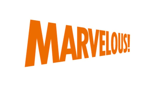
Tough to complain after seeing that new Marvelous logo
My deepest condolences, Euro brethren
Kinda looks like SLUT UP backwards
Tough to complain after seeing that new Marvelous logo
Allow me to submit my logo proposal
I feel it fits the company philosophy much better
My deepest condolences, Euro brethren
Atlus just shot themselves in the foot.
I don't know how much the rest of you know about Japanese culture (I'm an expert), but honor and shame are huge parts of it. It's not like it is in America where you can become successful by having a boring minimalist logo. If you screw up your logo design in Japan, you bring shame to yourself, and the only way to get rid of that shame is repentance.
What this means is the japanese public, after seeing this new logo with the letters too far apart, is not going to want to purchase Persona 5 for any system, nor will they purchase the stupid spinoffs like Dancing All Night. This is HUGE. You can laugh all you want, but Atlus has alienated an entire market with this move.
Atlues, publicly apologize and cancel the logo redesign or you can kiss your business goodbye.
This joke never gets old. (I'm an expert) kills me every time.
Definitely looks better then
I actually like this one
â Narayan
Member
I don't like it.
BolognaSoup
Member
All preorders cancelled.
Fine Ham Abounds
Member
I'm not even a Sega fanboy, but I love that font
XANDER CAGE
Member
I like it fine, although it still looks like a logo for an airline.
Perfect Cha0s
Member
Kind of a sidegrade. The slight simplification is good and I like the new "A" but the rest is kind of dated generic. I probably would have gone with a thinner font if they were going to go in this direction. Maybe something closer to this:

I piggy-backed off of yours:

The A is a little messed up since I squished it, but it gets the idea across.
Edit: Made the U more like the old logo.

Always-honest
Banned
Both not that great imo...
MarcoZombieCannon
Member
This is one great, I really liked the notches in the logo before, it was part of the character, you know? The actual new logo is pretty bleh though. Not great but not horrible.
buddha0991
Member
I mean, I don't really like the new logo, but its just a logo, some of the responses in here are hilarious. It is not even that different from their old one!
Red The Hunter
Member
I'm indifferent to the new logo, it's not that great, but it's not awful either, just very average. I've seen worse company logos *cough*Gap*cough*, this one is alright.
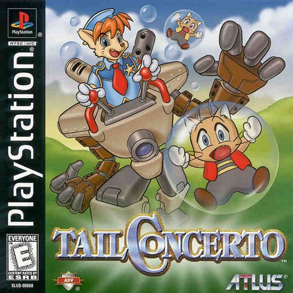
Though it's pretty amusing to find this gem of a logo from ATLUS US branch from the PS1 days.
Though it's pretty amusing to find this gem of a logo from ATLUS US branch from the PS1 days.

Danny Dudekisser
I paid good money for this Dynex!
FONTS
Because creativity is for fossils.
Because creativity is for fossils.
Allow me to submit my logo proposal
I feel it fits the company philosophy much better
Good job, GAF. I laughed.Atlus just shot themselves in the foot.
I don't know how much the rest of you know about Japanese culture (I'm an expert), but honor and shame are huge parts of it. It's not like it is in America where you can become successful by having a boring minimalist logo. If you screw up your logo design in Japan, you bring shame to yourself, and the only way to get rid of that shame is repentance.
What this means is the japanese public, after seeing this new logo with the letters too far apart, is not going to want to purchase Persona 5 for any system, nor will they purchase the stupid spinoffs like Dancing All Night. This is HUGE. You can laugh all you want, but Atlus has alienated an entire market with this move.
Atlues, publicly apologize and cancel the logo redesign or you can kiss your business goodbye.
I'm indifferent to the new logo, it's not that great, but it's not awful either, just very average. I've seen worse company logos *cough*Gap*cough*, this one is alright.
Though it's pretty amusing to find this gem of a logo from ATLUS US branch from the PS1 days.
I really like Tail Concerto. It's a real cute game, the game has that kind of sincere vibe that it's hard to find nowadays.
I remembered that I wished the cats are the good guys though.
zerokoolpsx
Member
I genuinely laughed at this. Never gets old.Atlus just shot themselves in the foot.
I don't know how much the rest of you know about Japanese culture (I'm an expert), but honor and shame are huge parts of it. It's not like it is in America where you can become successful by having a boring minimalist logo. If you screw up your logo design in Japan, you bring shame to yourself, and the only way to get rid of that shame is repentance.
What this means is the japanese public, after seeing this new logo with the letters too far apart, is not going to want to purchase Persona 5 for any system, nor will they purchase the stupid spinoffs like Dancing All Night. This is HUGE. You can laugh all you want, but Atlus has alienated an entire market with this move.
Atlues, publicly apologize and cancel the logo redesign or you can kiss your business goodbye.
Pie and Beans
Look for me on the local news, I'll be the guy arrested for trying to burn down a Nintendo exec's house.
You KNOW, and I mean, down in your plums, that some marketing loony bin said the old logo's breaks "sends out the wrong message, a fractured company/liable to break apart" and so on and so forth, and then citing every single other company that swerved to generic fonts in the current decade.
I can hear their voice saying it all right now. That fucking annoying nasally cuntfuck voice!
I can hear their voice saying it all right now. That fucking annoying nasally cuntfuck voice!
I don't like it.
Solid letters suck.
Needs more gaps:

Much better.
Shin Megami: To be this good it takes SULTA
Pie and Beans
Look for me on the local news, I'll be the guy arrested for trying to burn down a Nintendo exec's house.
Shin Megami: To be this good it takes SULTA
I'm feelin' pretty sulta over SMT4 right now!
Andodalf
Banned
Atlus just shot themselves in the foot.
I don't know how much the rest of you know about Japanese culture (I'm an expert), but honor and shame are huge parts of it. It's not like it is in America where you can become successful by having a boring minimalist logo. If you screw up your logo design in Japan, you bring shame to yourself, and the only way to get rid of that shame is repentance.
What this means is the japanese public, after seeing this new logo with the letters too far apart, is not going to want to purchase Persona 5 for any system, nor will they purchase the stupid spinoffs like Dancing All Night. This is HUGE. You can laugh all you want, but Atlus has alienated an entire market with this move.
Atlues, publicly apologize and cancel the logo redesign or you can kiss your business goodbye.
And we're done! lets go home folks!
GeekyDad
Member
please be April fools. It's hideous.
My sentiments exactly.
Allow me to submit my logo proposal
I feel it fits the company philosophy much better
This is simply amazing