-
Hey, guest user. Hope you're enjoying NeoGAF! Have you considered registering for an account? Come join us and add your take to the daily discourse.
You are using an out of date browser. It may not display this or other websites correctly.
You should upgrade or use an alternative browser.
You should upgrade or use an alternative browser.
I can't believe this is the actual box art. WORST COVER EVER.
- Thread starter Dartastic
- Start date
MisterLuffy
Member
not really related but never forget

What kind of monster is that?
Scalpel Knight
Member

this is still the worst imo
Speaking of that, anyone has that gif which is an endless spiral of that box art? That had me in stitches back in the day.
Angry Puppy
Member
I think it needs more accolades
Shadow Hog
Member
I like this. Now change the blood on his wrist to Heinz® Tomato Ketchup, which he just applied from a fresh bottle. To his wrist.

Gameboy415
Member

...yes this needs it's own thread.
What could possibly make it better?
Change the "Batman" logo in the background to an IGN watermark.
BobTheFork
Member
lol I just realized that MegaMan 3 has him staring and shooting directly at the robots crotch.
Silly.Mikey
Banned
its the pretty much the same thing when they re-release movies that got Oscar nominations.
IceDoesntHelp
Banned
not really related but never forget
Just letting everyone know how bad it is, rather thoughtful of them really.
What kind of monster is that?
Vagina mouth monster
IrishNinja
Member
Just letting everyone know how bad it is, rather thoughtful of them really.
this is truly the ugliest thing in this thread
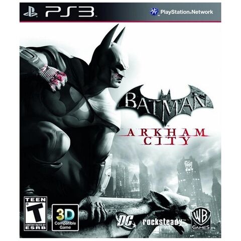
Actually from a design standpoint it isn't that bad. It utilizes the red in the artwork for the text and the type is actually worked into the artwork rather than just slapped on where it would fit. The use of the tear to show the bonus content is also pretty well done. In other words, the artist did the best he/she could do with what was handed to him/her. I've had enough "Hovering art director" moments and "the client wants this" situations to see that this designer probably gave it a shot.
I wouldn't have used the Batman logo twice personally.
I wouldn't have used the Batman logo twice personally.
Speaking of Arkham City, did anyone who was missing materials in the 360 collector's edition actually receive replacement materials? I received an email from WB Support stating that they'd mail me a copy of Gotham Knights on Blu-ray as well as cards of some sort, but they never actually arrived and every subsequent email to their support address has been met with silence.
Mauricio_Magus
Banned
I would honestly NOT buy the game just because of that, it's fucking horrible...
YOU have the WHOLE back of the box to fill of crap, don't do it in the front.
YOU have the WHOLE back of the box to fill of crap, don't do it in the front.
funkystudent
Member

ZombiePlatypus
Member
Holy fuck. It's like they found someone that does promo flyers for douchey night-clubs and made them in charge of the game's cover.
10 out of 10
...yes this needs it's own thread.
Weird I never heard of that game, but the Batman magazine seems to like it
AwayFromInfinityx
Member

IceDoesntHelp
Banned
this is truly the ugliest thing in this thread
Hey now, Verbal is not ugly. Just look at that smile.
Penumbra: Black Plague was, and still is, better
To Far Away Times
Member
They actually made it uglier than the Arkham Asylum GOTY cover.
These box covers are some shit i don't LIKE.
I would honestly NOT buy the game just because of that, it's fucking horrible...
YOU have the WHOLE back of the box to fill of crap, don't do it in the front.
So if the game is good (which it is), you wouldn't buy it or play it because of a printed sleeve that you'll see maybe half a dozen times in your life?
I'm not a collector or someone who gives a second thought to packaging since it ends up in the recycling bin anyway, so I'm not understanding the outrage.
Ramocalypse
Member
omg, that poor graphic designer, i know exactly how this kind of shit happens....
here is the word doc of all the shit our marketing department wants to be on the box, and oh the 10 out of 10 should be in font size 10,000, everyone and their grandma needs to see it!
here is the word doc of all the shit our marketing department wants to be on the box, and oh the 10 out of 10 should be in font size 10,000, everyone and their grandma needs to see it!
Adam Prime
hates soccer, is Mexican
Speaking of that, anyone has that gif which is an endless spiral of that box art? That had me in stitches back in the day.
Hell, everytime I see the Konami boxart posted I always hope someone will post that .gif
WILL SOMEONE END OUR SUFFERING!?
faceless007
Member
I can't even tell what the thing in front is. Is it his right arm and he's wiping off his face? If so his hand's bigger than his head.

YOU have the WHOLE back of the box to fill of crap, don't do it in the front.
Don't do it in the front, do it in the back. Story of my life
PixyJunket
Member
This is one of the very rare few times where an internet claimed BEST/WORST EVER has actually delivered on the promise.
NullPointer
Member
Looks like Batman is getting clobbered by all those bursts.
http://media.giantbomb.com/uploads/0/3693/646756-castledosbox1.jpg[IMG]
this is still the worst imo[/QUOTE]
It actually took me a second
"This just looks like normal box art...
Is it how the characters are placed?
Wait...
What's that red line up ther-OH GOD"
VeryGooster
Banned
I would honestly NOT buy the game just because of that, it's fucking horrible...
YOU have the WHOLE back of the box to fill of crap, don't do it in the front.
So if the game is good (which it is), you wouldn't buy it or play it because of a printed sleeve that you'll see maybe half a dozen times in your life?
I'm not a collector or someone who gives a second thought to packaging since it ends up in the recycling bin anyway, so I'm not understanding the outrage.
But I wonder if someone would see that on display at a store and make the same judgment and thus a sale is lost.
RoadHazard
Gold Member
Copy Cat

That's not even 1/10 as bad.
robotzombie
Member
I just threw up in my mouth a little.
This phrase has to be stopped. I mean seriously, why does everyone in the world have to say this exact same thing over and over again and expect it to still be funny?
Oh and that is one horrible boxart
Copy Cat
You know how bad they fucked up when this looks good in comparison.
NullPointer
Member
I mean seriously, why does everyone in the world have to say this exact same thing over and over again...
...that is one horrible boxart
I lol'd
(I'm easily amused at the moment, don't mind me)
This phrase has to be stopped. I mean seriously, why does everyone in the world have to say this exact same thing over and over again and expect it to still be funny?
Actually, I really think he threw up in his mouth a little.
NoirVisage
Banned
Cant wait to play 10 OUT OF 10
i want to believe this isn't the final art..
because the 10 out of 10 definitely looks like the title of the game and that's ridiculous.
plasticpassion
Member

RiderKairuu
Member
this is still the worst imo
Best Capcom game ever.
I suggest a Photoshop contest where we GOTYify covers of other games.
This!
RPGCrazied
Member
Thank god I own this:
Have no desire for challenge maps, and I'll just separately buy the Harley DLC by itself.
Have no desire for challenge maps, and I'll just separately buy the Harley DLC by itself.