-
Hey, guest user. Hope you're enjoying NeoGAF! Have you considered registering for an account? Come join us and add your take to the daily discourse.
You are using an out of date browser. It may not display this or other websites correctly.
You should upgrade or use an alternative browser.
You should upgrade or use an alternative browser.
Custom Cover Art - Minimalist, clean, or alternative box arts for your favorite games
- Thread starter demosthenes
- Start date
corrosivefrost
Member
Android18a said:I've been trying to keep mine minimal whilst still being 'box arts'. I've tried to keep the logo prominent and quite large where possible, and kept the spine informative. I don't think the back not having a blurb or screenshots hurts it in most cases. I'm sometimes unsure whether or not to add company logos, though.
That's the thing -- this thread is for custom covers. If, as the cover artist, you deem it to be a cover and that's what you intend the piece for, so be it, great, thanks for the contribution. I don't think we ever set any particular guidelines -- they just kind of evolve as people up the bar in certain areas. For those of us who want something specific style-wise or for a game that hasn't been done, we make it and if others like it and use it, awesome.
People are certainly entitled to their opinions on the artists' works, but necessarily see the need to criticize a particular style of cover. If you don't see the cover you want in a style you like either (1) make it yourself or (2) request it and one of the nice artists who contribute to this thread may make it for you. (Example: your awesome Queen Singstar cover
--
Nice job, Ricky_R!
The way it's distributed makes Lazarevich the MC.Ricky_R said:Well my cover isn't clean, minimalist nor finished, but here it is...
I decided to post at least the front in low res, which is the only thing I've done so far. If anybody likes it then I'll finish it quick.

corrosivefrost
Member
kayos90 said:The way it's distributed makes Lazarevich the MC.
I can see your point, but in the same vein, if he currently has the two good guys on the left and the two good girls on the right. If he switched Drake with Lazarevich, it wouldn't quite be right because of the grouping/affiliation.
kayos90 said:The way it's distributed makes Lazarevich the MC.
Yeah, that definitely went through my head when I was doing it, but like the one above said, he is central due to him being the only villain. I also got inspired by posters and covers from movies and games that use the villain in the higher background or in the center.
I'm giving him too much attention though, I agree... But I like how his face look.
enzo_gt said:I'm.. I'm not quite sure what your trying to say here. Do you simply dislike the concept of an image stretching over to the back unless it has something significant on it?
basically, yes. there's more room to play with a box because there are basically three sides to it (although the spine can be ignored). instead a lot of these are essentially posters with the name of the game and system it's on slapped on top. in a lot of cases it makes the text hard to read, which is doing a disservice to both the artwork and the logos.
the only other one i can remember off the top of my head was an alan wake one, which had a flashlight illuminating stuff on the spine and the cover, but you wouldn't know it was a flashlight unless you looked on the back of the box. not sure if that was the intention, but it worked with all sides.
L.A. Noire 360
Click HERE for High Res

L.A. Noire PS3
Click HERE for High Res

Medal of Honor 360
Click HERE for High Res

Medal of Honor PS3
Click HERE for High Res

Click HERE for High Res

L.A. Noire PS3
Click HERE for High Res

Medal of Honor 360
Click HERE for High Res

Medal of Honor PS3
Click HERE for High Res

U2NUMB said:
Hotness. Mind doing a PC one (that version comes out soon I think)?
Oh, and you got the PS3 URL mixed up with the MoH one.
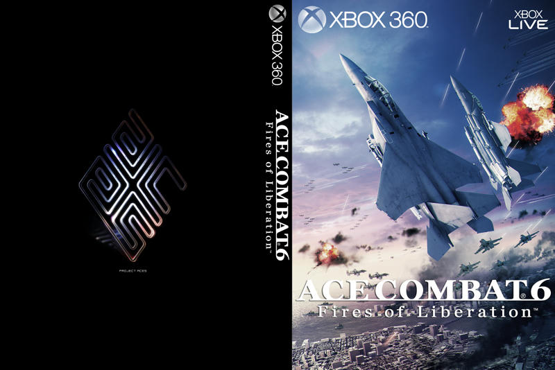
Ace Combat 6
EDIT: Screwed up the cover. I'll re-upload it later this evening.
Assault Horizon is a work-in-progress. Can't find anything high res enough to put on the back.
I'm also starting to re-do some of my earlier work to fit the newer formats, but it may take a while and I'm still not sure if I'm going to host all the updated versions. Maybe on an on-request basis.
I also still need help getting my Gamecube covers to work wtih a 3D template in CS2. It'd be nice if someone just made a GCN 3D template and script in the earlier style.
Just starting to catch up on this thread and filling some requests:
Castlevania: Lords of Shadow - PS3 (Alternate)

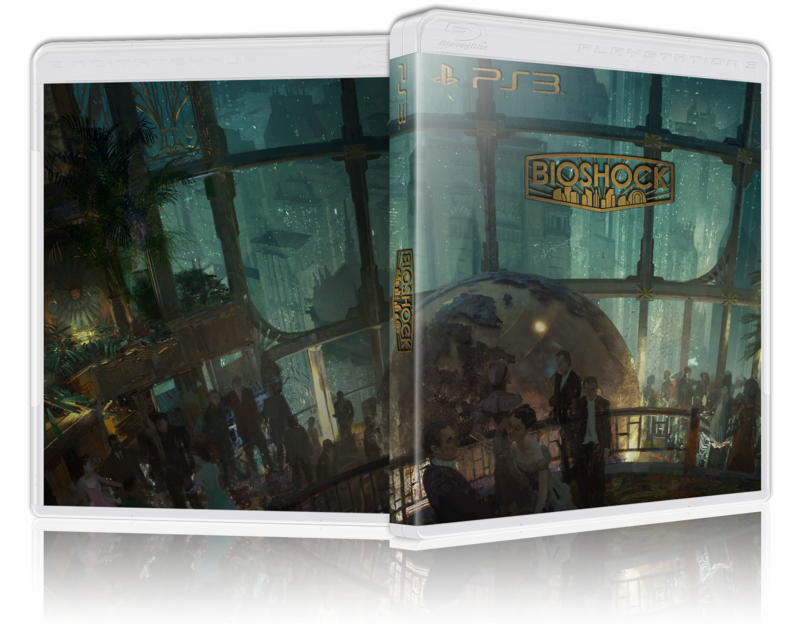
Bioshock - Xbox 360

And a new one:
The Elder Scrolls V: Skyrim - PS3
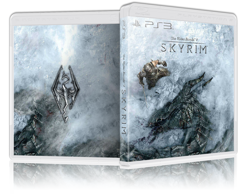
The Elder Scrolls V: Skyrim - Xbox 360

The Elder Scrolls V: Skyrim - PC

The bug has been fixed, I had to replace the scripts for the 360, PC and Wii 3D templates. You'll need to redownload those to get the latest scripts. The original mediafire links should refer to the latest packages.
Thanks!
Castlevania: Lords of Shadow - PS3 (Alternate)

Bioshock - Xbox 360

And a new one:
The Elder Scrolls V: Skyrim - PS3

The Elder Scrolls V: Skyrim - Xbox 360

The Elder Scrolls V: Skyrim - PC

alr1ghtstart said:i put 800 (default) and it came up 704x602. Source was 3242x2164. AR was correct.
The bug has been fixed, I had to replace the scripts for the 360, PC and Wii 3D templates. You'll need to redownload those to get the latest scripts. The original mediafire links should refer to the latest packages.
Thanks!
Rengoku said:
This on PC would be awesomesauce
UnluckyKate
Member
Blackheim said:I bought Mobile Suit Gundam Crossfire (PS3) used a while back and it didn't come with a cover. I didn't see a custom cover in this thread for it, would it be possible to have one made up by some ambitious soul?
Crossfire isn't Dynasty Warriors Gundam right ? Because There's one for DWG
UnluckyKate said:Crossfire isn't Dynasty Warriors Gundam right ? Because There's one for DWG
Unfortunately no, I saw the DWG3 cover and got excited at first heh. That's another game I need to get sometime in the future though...
IamMikeside said:This on PC would be awesomesauce
Here you go:
Rengoku said:
Rengoku said:Here you go:
Absolutely printing this out, thanks very muchly!
If only I was getting a physical copy, so I could put something in this box....ahh well!
Ricky_R said:Yeah, that definitely went through my head when I was doing it, but like the one above said, he is central due to him being the only villain. I also got inspired by posters and covers from movies and games that use the villain in the higher background or in the center.
I'm giving him too much attention though, I agree... But I like how his face look.
Remove sully, insert Flynn, switch drake and Lazaravich.
Besides. Sully's barely in UC2.
Rengoku said:
Thank you so much!
Rage W/Freak PC
Click HERE for High Res

Rage Clean PC
Click HERE for High Res

------
Rage W/Freak 360
Click HERE for High Res

Rage Clean 360
Click HERE for High Res

-------
Rage W/Freak PS3
Click HERE for High Res

Rage Clean PS3
Click HERE for High Res

Click HERE for High Res

Rage Clean PC
Click HERE for High Res

------
Rage W/Freak 360
Click HERE for High Res

Rage Clean 360
Click HERE for High Res

-------
Rage W/Freak PS3
Click HERE for High Res

Rage Clean PS3
Click HERE for High Res

MiY4MOTO USAGi
Member
Some truly incredible pieces on here.
I've been looking for something like this for a while now, and have just stumbled across a goldmine.
Has anyone thought of doing a 'triptych' piece or similar for those trilogies out there? A matching 3 piece set for the Gears of War, Mass Effect, Uncharted etc.
Or even just complementing covers for games with sequels. Doing something across multiple spines would look sweet.
Just an idea, I would love to replace those mis-matched covers on my shelf with something much better!
Got really excited about the news that this is coming to the US,
so I made a cover art based on the Miyazaki japan bluray covers!
What does everyone think?
Click to download!
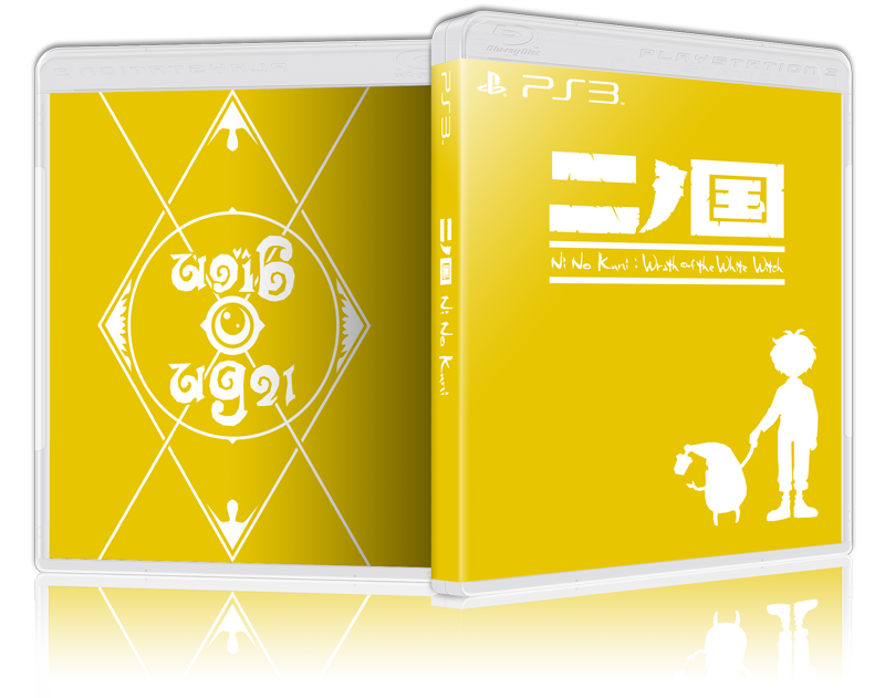
EDIT: I can make alternate color versions if anyone likes.
All of the official artwork, including the Ni No Kuni PS3 and whatnot, all feature gold, so that's why I chose the color I did.
Dark brown could also work, and blue (but Nausicaä's cover is already that color)
so I made a cover art based on the Miyazaki japan bluray covers!
What does everyone think?
Click to download!

EDIT: I can make alternate color versions if anyone likes.
All of the official artwork, including the Ni No Kuni PS3 and whatnot, all feature gold, so that's why I chose the color I did.
Dark brown could also work, and blue (but Nausicaä's cover is already that color)
IceDoesntHelp
Banned
What game is that :/Dreweyes said:Got really excited about the news that this is coming to the US,
so I made a cover art based on the Miyazaki japan bluray covers!
What does everyone think?
By the way it looks great!
First one in a week.
Thought I'd do a S.T.A.L.K.E.R.: Shadow of Chernobyl cover art. Hopefully I'm not the only one with a physical copy d:

I should be doing hw
Member
Any Shadows of the Damned love in here? That game needs some treatment bad.
Also, paging mik from the previous thread:
http://i.imgur.com/h2cFA.jpg
Would you, or anyone else be able to flip this cover around? Making that back image the front and vice-versa, please? Also removing that R1 logo if at all possible.
I finally got Nier so I would like to packaging to have some style.
IceDoesntHelp said:What game is that :/
By the way it looks great!
First one in a week.
Thought I'd do a S.T.A.L.K.E.R.: Shadow of Chernobyl cover art. Hopefully I'm not the only one with a physical copy d:
http://i.imgur.com/WNnuK.png[IMG][/URL][/QUOTE]
It's Ni No Kuni: [URL="http://www.gametrailers.com/game/ni-no-kuni-shiroki-seihai/13455"]Videos Here[/URL]
And that looks terrific! :)
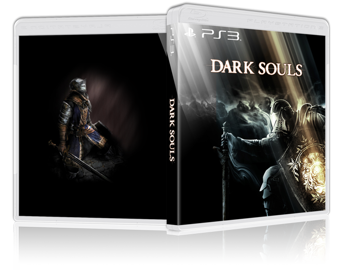
[QUOTE=alr1ghtstart][B]Dark Souls[/B]
[URL=http://www.mediafire.com/imageview.php?quickkey=d5a55bsyy9varve&thumb=5][IMG]http://www.abload.de/img/darksouls_2h01m.png[IMG][/URL][/QUOTE]
Lookin good!
I should be doing hw
Member
Looks great, I feel it's missing a little Studio Ghibli logo somewhere though. Possibly the spine?Dreweyes said:Got really excited about the news that this is coming to the US,
so I made a cover art based on the Miyazaki japan bluray covers!
What does everyone think?
Sure, I haven't got anything better to do right now.RedSwirl said:Give me that Mega Drive Collection cover for 360. Do it now.
And can you change it to say "Genesis"?
Genesis 360 version
Mega Drive 360 version
Genesis PS3 version
360 cover had enough room for an extra screenshot!
Just made one for Xenoblade. Didn't have a clue what to put on the back, so uh yeah..

Didn't spend much time on it, but the front cover is cool. Anyway, here's a HQ link for anyone who wants it:
http://www.mediafire.com/i/?s5c3n2agtzavp7u

Didn't spend much time on it, but the front cover is cool. Anyway, here's a HQ link for anyone who wants it:
http://www.mediafire.com/i/?s5c3n2agtzavp7u
Ryu Elessar
Member
RedSwirl said:Hotness. Mind doing a PC one (that version comes out soon I think)?
Sorry just saw your post. Did a quick PC version
LA Noire PC
Click HERE for High Res

Assassin's Creed: Revelations
(Links now lead to covers with white title instead of black title like you see on the 3D images below)


Also, here are the raw links for the three Gamecube covers I did a while ago. Hopefully someone else here can correctly post them in 3D without spoiling the names of the games because I don't really have the tools with me to properly adjust the dimensions for Gamecube cases.
(Links now lead to covers with white title instead of black title like you see on the 3D images below)


Also, here are the raw links for the three Gamecube covers I did a while ago. Hopefully someone else here can correctly post them in 3D without spoiling the names of the games because I don't really have the tools with me to properly adjust the dimensions for Gamecube cases.
Android18a
Member
RedSwirl, you can't really read the "Assassins Creed" part of the logo, just the "Revelations" bit. Like with the Epic Mickey cover that was posted earlier, I'd suggest making that part white instead of black to make it more readable.
Android18a said:RedSwirl, you can't really read the "Assassins Creed" part of the logo, just the "Revelations" bit. Like with the Epic Mickey cover that was posted earlier, I'd suggest making that part white instead of black to make it more readable.
The links above now lead to adjusted covers (but the 3D images are the same).


