• Hey, guest user. Hope you're enjoying NeoGAF! Have you considered registering for an account? Come join us and add your take to the daily discourse.

IOS music app is ruined for me - IOS 11

first world problems I know when i played music in IOS 10 in the lock screen i used to see this
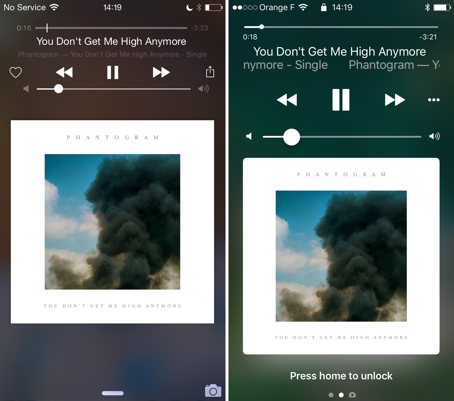
Lock-screen-love-new-apple-music.png


now I just see this

ios_11_lockscreen_now_playing_music


how do i change it back
 

giga

Member
Old version was pretty but new version is more functional. Big ass clock is now always big and airplay/output controls directy accessible.
 

Tobor

Member
Old version was pretty but new version is more functional. Big ass clock is now always big and airplay/output controls directy accessible.

Agreed. It’s also nice that you can access the music controls by swiping down from any screen.

Yes, there is a small version in control center, but the lock screen/notifications controls are better.
 

see5harp

Member
Yea it’s most useful now. Same with control center. But it begs the question why it was like that in the first place
 
The way you can see your notifications and also the music controls makes the new version much better

Seriously. There are some occasions where I have to have a timer running and I also have my music playing. On iOS 10, I couldn’t see the timer on the lockscreen thanks to that godawful player taking up that entire space. Now on iOS 11, I can see that timer and all other important notifications as they come in. Much better experience.
 

Katori

Member
Whaaaaaat? I haven't updated yet but that looks worse overall. I liked the big album artwork. What I didn't like was that you couldn't see things like the current timer when music/sound was playing, which you can normally see on the lock screen. Did they fix that?
 

borghe

Loves the Greater Toronto Area
previous display was clever..... for a music player. for my primary computing device it made the lock screen useless. so maybe I am missing the problem?
 

CorrisD

badchoiceboobies
Old version was pretty but new version is more functional. Big ass clock is now always big and airplay/output controls directy accessible.

I hated at first but when I was out walking and could see both my notifications and my music controls it actually seems like a great idea.

The control centre controls still suck ass though, the control centre in general should be way more customisable than it currently is. But the lock screen music controls is what should be on the control centre too.
 

RoadHazard

Gold Member
Looks like they've gone the Android route? It also changed from full-screen media controls on the lock screen to a media notification a few years back. Didn't like it at first either, but it's grown on me (and they've also made it better).
 

blamite

Member
Agreed. It’s also nice that you can access the music controls by swiping down from any screen.

Yes, there is a small version in control center, but the lock screen/notifications controls are better.
Doesn't always work though, I'm listening to a podcast right now (in Overcast) and it isn't showing up on either my lock screen or when I swipe down.

The audio thingy the control center is kinda busted too, it has a play button even though it's already playing and I have to hit it a couple times to get things working properly.
 
Agreed. It’s also nice that you can access the music controls by swiping down from any screen.

Yes, there is a small version in control center, but the lock screen/notifications controls are better.

protip: You can 3D Touch on the Control Center music area to get a larger widget.
 

Tobor

Member
Doesn't always work though, I'm listening to a podcast right now (in Overcast) and it isn't showing up on either my lock screen or when I swipe down.

The audio thingy the control center is kinda busted too, it has a play button even though it's already playing and I have to hit it a couple times to get things working properly.

Works just fine with the Apple Podcasts app. :p

protip: You can 3D Touch on the Control Center music area to get a larger widget.

If you do that you basically get the same controls as you get in Notification Center. So it’s one swipe down vs. one swipe up + 3D press.
 
If you do that you basically get the same controls as you get in Notification Center. So it’s one swipe down vs. one swipe up + 3D press.

Yeah, but swiping from the top during one-handed use is a pain. Anyway it's just another option. I like the fact that most of the Control Center controls have 3D Touch options like that, even though I think the CC looks like bad programmer art.
 

blamite

Member
Works just fine with the Apple Podcasts app. :p
Ah yes, the app I was perfectly satisfied with until it changed in this update, hence why I'm using a different app in the first place... Great.

It doesn't work with Spotify either; the time remaining stops updating a few seconds into a song, even though it's correct in the Control Center tile.
 

RDreamer

Member
I guess the new version is more functional but like the OP I vastly prefer the old.

I don't get why they couldn't combine the two, really? Like, couldn't the album art slowly transition/squish down to what we have now when you scroll downward to see other notifications?
 

Nowise10

Member
I've always hated how hard it is to hit the play next button. I'll be driving trying not to look at my phone to change the song but I swear to god you have to be pixel fucking perfect with your finger in order for it to actually register the button press.
 

Imbarkus

As Sartre noted in his contemplation on Hell in No Exit, the true horror is other members.
How I've felt about Apple Music for a while now:

1SiA2FH.gif
 

kiguel182

Member
I like the way Android puts the whole cover as background too. I miss that on iOS.

That said, the new system doesn’t bother me.
 
Top Bottom