If that space is only reserved for the status bar what's the problem?
but it's not. the only UI guidelines are that devs can't hide the space. devs are free to display to that area for their apps.
If that space is only reserved for the status bar what's the problem?
Burn-in most frequently manifests itself as an "image" in the screen, but what it actually is are parts of the screen wearing at a different rate than other parts.
So the black parts that are turned "off", wear slower than the parts that are constantly on. The result would be that the main display area would be "burned in", thus seeing demarcation lines along the status bar.
If that space is only reserved for the status bar what's the problem?
see my post above. over time that would create burn-in (well reverse burn-in effectively, but the end result is the same)
It's already in the Developer TOS that you're not allowed hide or recolor the ears.

but it's not. the only UI guidelines are that devs can't hide the space.
Right, I'm talking about a hypothetical scenario where they decide not to use that space for anything else.
and again.. landscape?Should just be a black bar at top for everything, with of course the notification icons/time going up there.
If that space is only reserved for the status bar what's the problem?
Right, I'm talking about a hypothetical scenario where they decide not to use that space for anything else.
Landscape would just put a bar at the top and that area would be just black. It would be fine.that is a pretty drastic change for UIkit. and would look like shit in landscape mode..
and again.. landscape?
that is a pretty drastic change for UIkit. and would look like shit in landscape mode..
and again.. landscape?
I don't think Apple would want part of the screen to be permanently 'ruined' that way.
If they decided to use these top 'ears' for UI purposes at a later point in time, users who owned an iPhone X from day 1 would have a very distinct line where the screen had previously been used to only show the status bar.
Landscape would just put a bar at the top and that area would be just black. It would be fine.
I don't see why it would look like shit. It would just look like a black bezel in landscape mode, which thus far most people seem to prefer over allowing UI elements in the notch space.
Landscape would just put a bar at the top and that area would be just black. It would be fine.
Exactly. Nothing wrong with having only a black bar for photos/videos when in landscape mode. The way it is implemented now is very un-Apple like. Part of the photo/video is cut off which is just insane.
Jobs okay'd a ton of stupid, goofy shit. The idea massive black plastic around the screen is Jobs approved but a small notch at the top is too much is just so silly.
Anyone else think this is how apple should have used the notch?

It should look more like a seemless status bar rather than how they're doing it now.
i think the screen's taller without even having a notch. I'm not a fan of the screen wrapping around the sides as it'll generate glare.
I actually consider the screen of the S8, while very pretty, to be incredibly detrimental to content consumption.
I think its pretty clear they intend it to be a branding/style element, much like the camera hump. They even put a little chrome piece around the hump!
so basically permanently assign that area.
which as was just pointed out above, would permanently kill that area from ever being used for anything else as over a very short time it would have a distinctly different appearance than the main area of the screen.
I mean the phone will be 100% usable. Nothing will be lost. Apple gets their distinct look. The reactions are hilarious, and pretty "par for the course" for an apple keynote.
Godspeed to the Apple engineers. May they be the first to hide all sensors and speaker below the screen without compromise. Jony will certainly ditch the notch for good when they get there.Yeah, which might actually be the worst thing in all of this since since it probably means we're stuck with this horrible design for years to come.
They want this to be an iconic look.
so basically permanently assign that area.
which as was just pointed out above, would permanently kill that area from ever being used for anything else as over a very short time it would have a distinctly different appearance than the main area of the screen.
I mean the phone will be 100% usable. Nothing will be lost. Apple gets their distinct look. The reactions are hilarious, and pretty "par for the course" for an apple keynote.
but switching between landscape and portrait is something iphone developers have had to take into account forever (and especially more so since the 5)Now if they do have plans to use that area, sure that changes things, but then you get into the same issues of orientation where when you switch to landscape, those notches won't be in the same spot so that could be problematic too depending on how they utilize the space.
I think the notch is fine, but I am disappointed they are being restrictive about how developers need to work around it. I'm sure they will relax these requirements in a year or two. I also really dislike their stretched full screen solution for media. But then, stretched media is off-putting any way it's implemented.True. They want people using an iPhone X to be seen using an iPhone X. More importantly, the people paying $1000+ want to be seen using an iPhone X.
Plays into the exclusivity. iPhone became so popular, it was no longer a "thing" to be seen with one. They would like it to be that way again.
(I still think using it for anything other than status bar is ugly, though.)
The extra screen near the earpiece reminds me of Apple's inclusion of the Touch Bar on higher end MacBook Pros. I really wonder about the utility of having such a thing.
the video is ONLY cutoff if you crop/zoom the video. in which case the cropping is way more egregious of an act than anything with the notch.
It's already in the Developer TOS that you're not allowed hide or recolor the ears.
No worries, it looks like developers are already fixing UI issues.

Have an MBP with touchbar, it's fucking useless.
Anyone else think this is how apple should have used the notch?
It should look more like a seemless status bar rather than how they're doing it now.
I would be so distracted by the camera/sensor sticking out if I was watching a movie full screen on that phone.both have a 16:9 screen.
The iPhone X has a taller screen and will have a pillar box when displaying 16:9 content.
It will, however, have a larger picture with smaller black bars (on top and bottom) when displaying 2.35:1 cinematic content
To create the narrative that the iPhone X is in any way shape or form WORSE for content consumption than the iPhone 8 is ridiculous.
It offers exactly the same image size for 16:9 video
and it can display a bigger picture when displaying 'widescreen' content.
Have an MBP with touchbar, it's fucking useless.
Have an MBP with touchbar, it's fucking useless.
I would be so distracted by the camera/sensor sticking out if I was watching a movie full screen on that phone.
Agree with some, but touch sensors on the back are awkward and shitty.Apple's stubbornness is weird. For years they resisted large-screened phones for no reason other than because Jobs didn't like 'em. Then OLED because Samsung made them. Now this stupid notch because they don't want to look like a Galaxy and the removal of touch id because they don't want to put the sensor on the back like Android.
Agree with some, but touch sensors on the back are awkward and shitty.
Agree with some, but touch sensors on the back are awkward and shitty.
I would be so distracted by the camera/sensor sticking out if I was watching a movie full screen on that phone.
Yes and I'm fucking shocked they didn't. So stupid. You've got an OLED screen, apple!
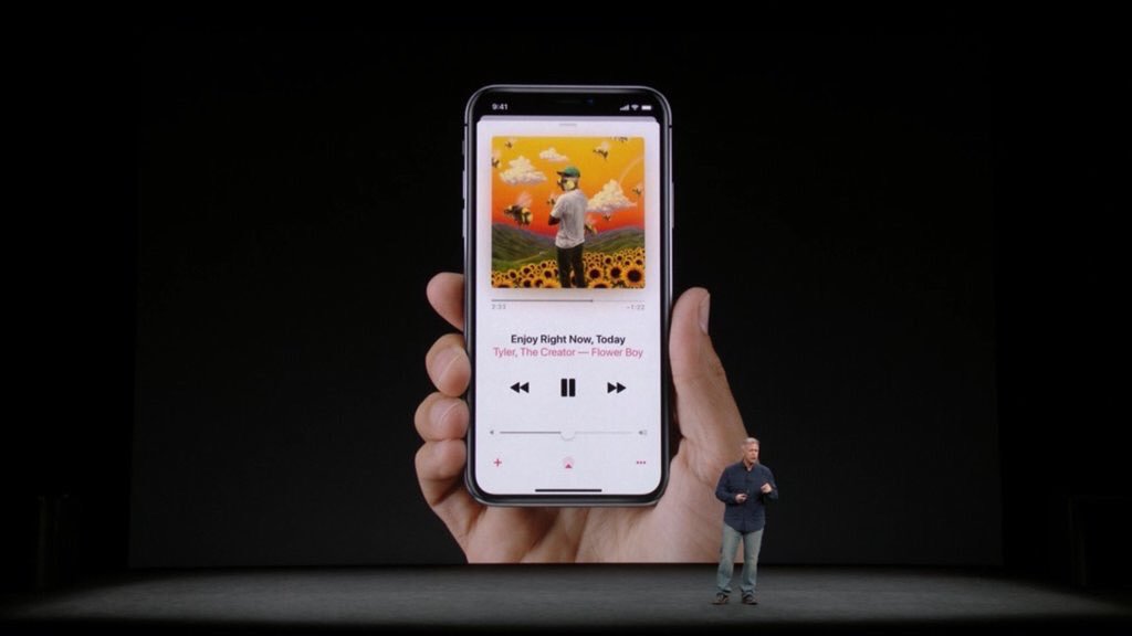
They sorta do it here in the music app at least:
Agree with some, but touch sensors on the back are awkward and shitty.
Agree with some, but touch sensors on the back are awkward and shitty.
Agree with some, but touch sensors on the back are awkward and shitty.
They should have done what Sony did with their fingerprint scanner on the Xperia phones; Put it on the power button.
Agree with some, but touch sensors on the back are awkward and shitty.
I would be more distracted by the fact that entire pieces of the movie are cut off because you're zoomed in like an animal.
This looks perfect. Hope more apps do this.
Whenever I had a phone with a fingerprint sensor on the back it felt completely natural.. well, other than the samsung where the scanner is at the top next to the camera. I had a ZTE Axon 7 for a bit and sensor was right where my finger would normally rest. With the new trend of minimal bezel phones, having the sensor on the back allows minimal bezel while still being able to have the convenience of being able to use your fingerprint for security.
Anyone else think this is how apple should have used the notch?
It should look more like a seemless status bar rather than how they're doing it now.