Wolfgang Jr
Banned
What else would they use for a SFIV expansion?
Seriously, it's not the same art style.Because the special moves still do the same watercolor stuff, and the models themselves are VERY much the same style.
Same designs with different proportions and facial structures in a completely different rendering style.
I'm more worried about giant hands and feet than the watercolour stuff.
This looks awesome!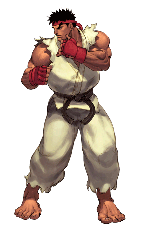
This would've been cool, but it isn't in line with how they do things anymore.
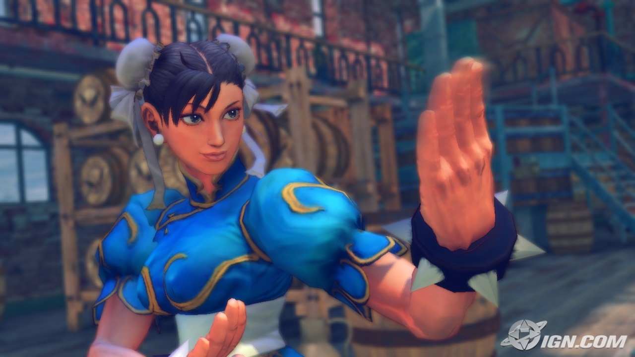
It looks like SF4:HD Remaster. Which is kind of disappointing considering SF4 looked gross anyways. Each new mainline SF game generally had a new style, easily identifiable from a mile away, and it kind of sucks that they are sticking with this one.
I guess the fighting genre as a whole is what you're talking about? Because Street Fighter is king of its genre.next gen sf had so much potential
oh well, can't expect much from a dying franchise
Difference is definitely noticeable. It's still in early stages though so I expect it to change more by release.Ryu has ink effects. Chun-Li has distinct water effects. Other characters will likely have different themes. It isn't a watercolor style like IV, which carried through the textures and designs.
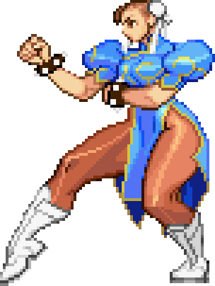
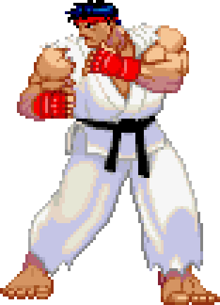
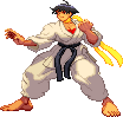
And are you serious? Look at Ryu's head. In IV his head looks like a damn jelly bean. In this game he looks far more similar to III. Everything about the character models is closer to III. You're going to have to elaborate on what exactly is VERY much the same style. Muscles don't count. I could make the same argument for III.
Edit: Go:

I'm talking about trash visuals which Marvel vs. Capcom 3 is entirely made of with the murky colors and Poser like figures:
Compared to MvsC2:
https://www.youtube.com/watch?v=HA26pxd5qQ0
You guys just proved my point, why would Capcom put any effort into the style? They don't have to.
I'm talking about trash visuals which Marvel vs. Capcom 3 is entirely made of with the murky colors and Poser like figures:
Compared to MvsC2:
https://www.youtube.com/watch?v=HA26pxd5qQ0
You guys just proved my point, why would Capcom put any effort into the style? They don't have to.
While it looks amazing, I think it's not suited for 2.5D.
This would've been cool, but it isn't in line with how they do things anymore.

Still early, they have plenty of time to change it. All the watercolor and ink motifs need to go. It needs its own visual identity.
SF5 looks completely different from SFIV.
It looks like SF3 in 3D to me.
Also it's not even finished.
This would've been cool, but it isn't in line with how they do things anymore.
This looks 10 times better than SF4's strange chunky art style. SF5 would interest me a lot more if it looked something like that, seriously. They at least need to fix SF4's wonky proportions.
This would've been cool, but it isn't in line with how they do things anymore.
Indeed. It's so 'terrible' that it's the #1 fighting game in the world.
How they do it:
- Anime-flavour cel shading.
- Animate characters more-or-less at 24fps. Character motion and physics still runs at 60fps, keeping gameplay smooth and toight.
- Orthographic projection to stop that pesky frustum from gumming up my anime experience.
- Hand-model motion smears into the character keyframes. This is made feasible by the fact that the character assets animate at 24fps.
This looks 10 times better than SF4's strange chunky art style. SF5 would interest me a lot more if it looked something like that, seriously. They at least need to fix SF4's wonky proportions.

More realistic-shaped character models would be nice. MvC3 had it just about perfect. Ryu should be lean, not hulked-out. Don't imagine the dude eats much.
Are the PS3/360 versions of SFIV 60 FPS?
His eyebrows are so huge they extend upward, overlapping with his headband. Looks much more pronounced than his model for SFIV or SFV.
That does look better now that I see the models side by side. I think an even leaner look would suit the character though.They did. I did a compare and contrast.
Ryu looks more in line with his SF3 sprite.
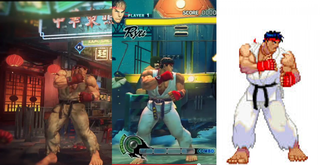
SFV so far looks like they took SF4, removed any cool filters, applied a more bog standard lighting shader and increased the polys.
The rigging looks pretty much the same, chun li's foot still looks dislocated sometimes.
When you compare the visuals of SF1, 2, 3 & 4 they all changed (ignore turbo and super editions) but 5 looks like 4.