• Hey, guest user. Hope you're enjoying NeoGAF! Have you considered registering for an account? Come join us and add your take to the daily discourse.

Best and worst graphic design (art, UI, etc.) in games

KORNdoggy

Member
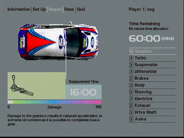
sadly Dirt 3's menu's have a habit of being more style over functionality. they usually take forever to transition and load. which is the last thing i want in a racer.

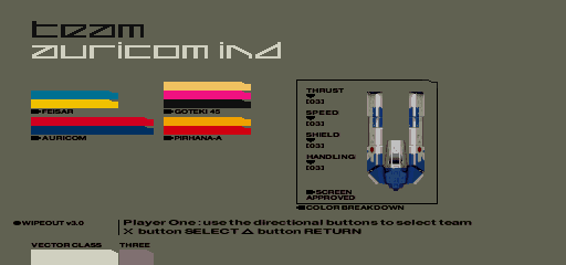
for me in regards to racers i loved driveclub and wipeout HD/Fury and Wipeout 2048. simple and minimal design, nice looking, and most importantly...FAST. for me DiRT1 was their best menu. it may not have had the animated craziness of 3 or the "extreme" nature of 2. but it was simple, clean and faster.
 

Azzawon

Member
I agree with OP, Codemasters do generally make some great UIs
after they realised how bad DiRT 2 was
. Also, gotta give a nod to Halo Reach, I loved that UI.

Staying on the theme of Codemasters though, here's another example of good with GRID Autosport:
2014-10-08_00001-jpg.66662
But here's an example of bad with F1 2013 (same goes for '14):
Some of the ugly cars don't help either
 
RE5 has an absolutely beautiful UI, at least in my opinion.


The menu, right off the bat, had me interested in the game.


Then, you're given this as a screen to manage your inventory. It's simple and straightforward. It even had good shortcuts for the items you already own. There's a button to quickly sell, upgrade, check your inventory, check your treasures, and an option to sell all of those treasures.

Not to mention the way the inventory plays out in game. In my eyes, it is THE best co-op inventory system.


Then, when you've got to select a chapter you're presented with this. This is perfection. You get a summary of your times for the sub chapter, the chapter, and the entire game for that difficulty. You get to see exactly where you need to shave time off at, where you need to get BSAA emblems, and what chapters you need to "S" rank yet.

Seriously, RE5 is a beautifully designed game. It's definitely earned it's spot in my favorite game list.
 
It was the same style they used in Brawl, except worse because shit in Smash 4 is way less logically placed. And the style isn't unique either, the general aesthetic also is similar to Kid Icarus Uprising.

I don't want to insult Sakurai's wife or anything, but she needs some inspiration to be able to make a new UI from the ground up. It looks like she really enjoyed the Brawl UI and just keeps using it over and over.


qZV4Pis.png
 
Gran Turimso 5 is a clusterfuck imo when it comes to UI, looks like a webpage from the 90's:

gran-turismo-5-interface-257n4v5.jpg


Made me miss the city maps from the previous games.
 

nkarafo

Member
Dirt games have good UI and menu designs, what?

I find them as some of the worst in the industry. They are confusing, over stylish and SLOW.

I mean ok, Dirt 3 was an improvement over the previous game i admit, but its still slow. But Dirt 2? I actually stopped playing that game only because of it's menus. Imagine having to "work" to get to the options you want and wait 5 or 10 seconds every time you just want to select one, say from selecting a mode, to the exit game option. That's exactly how it feels with Dirt 2. Because of all these walking animations you can't skip (or the voiced instructions and suggestions) it takes years to make your selections. And after the 50th time you have to walk into your trailer in order to reach some other options or even the "exit game" option... well no thanks.

I mean, you know that the game menus are bad when you'd rather use alt+f4 to close it.
 

FluxWaveZ

Member
Personally, I don't really have a problem with Smash's menus. I think for the most part, I know where to find everything. But I understand that they're a bit "form over function".

My comment about Persona 5 was about that. The items may be on a list, but the way they animate and become part of the dense amount of visual information on the screen is an even bigger push in the direction of "form".

Given the history of the series and the UI design of previous games, the Persona 5 menus will probably be comprehensible, despite going for an abundance of style. It is in no way comparable to SSB4's menus, which neither have form nor function.
 
How sexy was that Wipeout HD Fury menu? Too damn sexy.

VyZOsSQ.jpg


Needs music for full appreciation: https://youtu.be/uOjjJBx8eTU?t=2m47s

i'm a graphic designer so this thread is relevant to me.
here's some super slick UI from WipEout 2048 done by Edd Wainwright


as for bad UI:


I love the game to death but that's just really bad

I'd add Wip3out to the mix, one of the first games to use minimalism in game menus. Still looks awesome to me.

Great choice! R4's menues are sublime and slick.


The WipEout series has always had great design and art direction.

WipEout 2097/XL menues are easy to navigate and clearly presented, with type of race, ship and track, then a simple start button to get going.

wipeout_2097_illus1.jpg


WipEout 3 also had very minimalistic, but simple menues to navigate:

tumblr_nhixroC9Gn1qdzoq5o1_500.jpg


208787-wipeout-3-playstation-screenshot-all-menus-in-the-game-are.png

tDR does great work in Wipeout. The logo design is great in addition to the UI and menus.

92GOkzN.jpg

I adore all of the art, music and design in the Wipeout games. They're just all so gorgeous, clean and sexy.

I also remember finding the menus and interface for Colin McRae Rally 2.0 on the PS1 to be really pretty and functional.

4453-8.jpeg

playstation-57252-41407596264.jpeg

cmr207.jpg


And that style was really consistent, right down to its box art:
11493_front.jpg


EDIT - ha; same suggestion as above!

And I've just started playing Killzone: Shadow Fall and I think the HUD and UI is gorgeous. There's a lot of info on the HUD but it's clean and minimal and uncluttered, but still manages to convey a good amount of information:

10815320203_ef2ca01b0c_o.jpg

killzone-shadow-fall-forest.jpg
 
Halo Reach.


Some of the submenus in Firefight for example got messy, but the simplicity of the title screen still is amazing.
I shit you not, I actually know someone who called the Reach menu a confusing, unusable mess. And he was dead fucking serious. Among numerous other bizarre complaints he seriously couldn't wrap his mind around the "Continue Campaign" shortcut on the start screen.
 

shark sandwich

tenuously links anime, pedophile and incels
Worst UI of all time? Xenoblade Chronicles 3DS.
B066tDZ.jpg


It was already terrible on Wii but on 3DS it's even worse for a couple reasons.

Even though they moved some of the clutter to the bottom screen, it seems like enemy names, health bars, etc take up a greater proportion of the screen than before. You can barely see what's going on if you have more than 2-3 enemies on the screen. And even though this game is played on an LCD (e.g. no overscan to compensate for) they didn't bother pushing all the UI elements all the way to the edge like they should've.

But wait, it gets worse if you turn the 3D on. All the UI elements (health bars, etc) aren't at the same depth as the enemies themselves. They're all displayed at the front of the field of view, so everything is basically floating in front of the game world and blocking out your view. You have to constantly shift your focus back and forth.

This is the closest a poor UI has ever come to ruining a game for me.
 

martino

Member
I feel kinda weird bringing this up as an example of best since it isn't out, but Persona 5:

In terms of presentation and style, Persona 5's menus and general UI is some of the best I've seen. P Studio games, in general, have fantastic UI.

F

54037-Thats-brilliant-gif-cxnC.gif
 

KORNdoggy

Member
In terms of UI, Dead Space easily, it was amazing how they integrated all the info you need in your suit & gadgets.


The worst is (despite my love for them) the Souls game, although Bloodborne cleaned up the majority of the UI.


& who can forget the monstrosity that was the first Mass Effect?

wait. the worst UI you can think of is...dark souls? i wish i had your UI life experience lol. sadly i've played the likes of oblivion, and dragon age inquisition and the first mass effect. so dark souls is like design perfection next to those...lol
 
& who can forget the monstrosity that was the first Mass Effect?

Dear God, I had forgot that! Man I remember having so much shit in that list and me and friend would just go "omni-gel that shit!"

I adore all of the art, music and design in the Wipeout games. They're just all so gorgeous, clean and sexy.

I also remember finding the menus and interface for Colin McRae Rally 2.0 on the PS1 to be really pretty and functional.

4453-8.jpeg

playstation-57252-41407596264.jpeg

cmr207.jpg


And that style was really consistent, right down to its box art:
11493_front.jpg


EDIT - ha; same suggestion as above!

Great example, CMR2 had great menues!
 

Aureon

Please do not let me serve on a jury. I am actually a crazy person.
Amplitude (Endless *) is really something else at UI design, at least graphically.

True UI mastery is seen in 4x, since there's so much information to convey, and only so much space. Even the mighty Civilization struggles with it, and ended up divvying information in a billion non-standardized screens that are reached in too many different ways.

Is that supposed to look good? But you're right, maybe there are a few exceptions but most of them are awful.

It really doesn't.
 

Seanspeed

Banned
wait. the worst UI you can think of is...dark souls? i wish i had your UI life experience lol. sadly i've played the likes of oblivion, and dragon age inquisition and the first mass effect. so dark souls is like design perfection next to those...lol
Souls games have some pretty terrible HUD's. Ugly and take up way more space than necessary. On PC, you can at least mod/configure them to be more minimalistic or smaller, but the standard HUD is rubbish.

The menus aren't terribly great, either. They seem to use different buttons to navigate than most people are used to and aren't completely intuitive.

Oblivion's menus were a case of crappy navigation, but I thought it at least looked really nice.
 

jett

D-Member
R4 definitely had the best racing art design of all time, and I say that while acknowledging the cyberpunk loglo bliss of the Designer's Republic. Namco was literally insane not to make that aesthetic their eternal brand. I'd pay out the ass to see it in HD.

A kinda similar fan-made frontend, mixing R4 with RR7

I can only imagine that the graphic designer that worked on R4 went to other places after that game shipped.

Up/down and right/left on the right stick has uses. The left stick goes through tabs, the right stick goes between inventory and vendor. Up and down on the right stick can be used to scan long lists, and up in the inventory will return you to the tabs.

OMG I've been playing this game for 100 hours and I did not know this. Damn it.
 
J

JoJo UK

Unconfirmed Member
While I agree with some that Destiny is a good looking UI I don't think it's the most user friendly. Why use a curser which has to move across the screen rather than just pressing in the direction of the option you want to highlight? I get it on a PC with a mouse but not on consoles.

EDIT: Forgot about CMR2, great looking UI!
 

KORNdoggy

Member
Oblivion's menus were a case of crappy navigation, but I thought it at least looked really nice.

didn't oblivions inventory waste most of the avaliable screen space? the rest was just empty crap and a giant model of your character? i didnt even like the way it looked. the old scrolls aesthetic. eh.

i mean, dark souls isn't exactly amazing. but compared to others out there it's great. especially in regards to in-game UI. i mean, sure things are large. but it's predominantly a console game, played on a couch a fair few feet away. the last game that tried to make things PC-level-small in the UI was the witcher 3 and guess what everyone complained about and is going to be patched?...lol on a PC though i can see why it could be seen as quite obnoxious
 

Seanspeed

Banned
didn't oblivions inventory waste most of the avaliable screen space? the rest was just empty crap and a giant model of your character? i didnt even like the way it looked. the old scrolls aesthetic. eh.

i mean, dark souls isn't exactly amazing. but compared to others out there it's great. especially in regards to in-game UI. i mean, sure things are large. but it's predominantly a console game, played on a couch a fair few feet away. the last game that tried to make things PC-level-small in the UI was the witcher 3 and guess what everyone complained about and is going to be patched?...lol on a PC though i can see why it could be seen as quite obnoxious
The HUD is large even by console game standards, though. I also wasn't asking for it to be TW3-level small. There is a whole world in-between that most games seem to get right.
 

Subaru

Member
I love Street Fighter ZERO 3 UI:

PSX_Street_Fighter_Alpha_3_02.jpg


The character screen is amazing with this huge and beautiful artwork behind the character, I love all the rolling texts, even the "Round 1, FIGHT" or "KO" "YOU WIN" are beautifully designed.

=================

I HATE KOF Neowave:

king-of-fighters-neowave-20060505060645424.jpg


Everything in this game is ugly, the HUD, the artwork, the character select screen... argh
 

KORNdoggy

Member
I was about to post this, also the music really suits it.

Seems like a lot of PS1 games from that era had the minimalist menu down to T, I wonder if they are inspired by WipEout or RR4.

could just be that clean and minimal was better for readability on the hardware. now we have more pixels to play with they seem to like to make things messy becasue they can.
 

McBradders

NeoGAF: my new HOME
I love Street Fighter ZERO 3 UI:

PSX_Street_Fighter_Alpha_3_02.jpg


The character screen is amazing with this huge and beautiful artwork behind the character, I love all the rolling texts, even the "Round 1, FIGHT" or "KO" "YOU WIN" are beautifully designed.

Yeah this is probably my favourite of all time after Persona 4.
 

Alo0oy

Banned
wait. the worst UI you can think of is...dark souls? i wish i had your UI life experience lol. sadly i've played the likes of oblivion, and dragon age inquisition and the first mass effect. so dark souls is like design perfection next to those...lol

Souls games are my favorite by far, maybe that's why I'm more critical of them? There are worse UIs out there maybe, but when a masterpiece is hampered by shitty UI, that tends to sting more.
 

Orayn

Member
While I agree with some that Destiny is a good looking UI I don't think it's the most user friendly. Why use a curser which has to move across the screen rather than just pressing in the direction of the option you want to highlight? I get it on a PC with a mouse but not on consoles.

EDIT: Forgot about CMR2, great looking UI!

Destiny uses a lot of pop-out elements to save on screen space, and they'd be a lot more awkward to navigate with a d-pad.
 
Dirt games have good UI and menu designs, what?

I find them as some of the worst in the industry. They are confusing, over stylish and SLOW.

I mean ok, Dirt 3 was an improvement over the previous game i admit, but its still slow. But Dirt 2? I actually stopped playing that game only because of it's menus. Imagine having to "work" to get to the options you want and wait 5 or 10 seconds every time you just want to select one, say from selecting a mode, to the exit game option. That's exactly how it feels with Dirt 2. Because of all these walking animations you can't skip (or the voiced instructions and suggestions) it takes years to make your selections. And after the 50th time you have to walk into your trailer in order to reach some other options or even the "exit game" option... well no thanks.

I mean, you know that the game menus are bad when you'd rather use alt+f4 to close it.

I was like wtf when i saw the OP too, dirt 2 and 3 have terrible UI designs, animations should never get in the way of menu transitions.

Dirt Rally's UI is superior is every measurable way.
 

Ty4on

Member
WIP3OUT has already been posted so i'll post my other favourite (Also from tDr)

Colin Mc Rae Rally 2

url

playstation-57252-41407596264.jpeg

That one was really slick. I first played the game in like 2010 and was really surprised at how the good menus looked.

Edit: Probably not the best, but I have good memories of NFS 4 :p
I loved clicking on the arrow for the drop down menu and clicking on the selection for more details and options like traffic (track) color or roof (vehicle).
 

Haunted

Member
Iga said they didn't have time to pretty up the Symphony of the Night menu and just kept using the debug/default system menu style, and it shows.

SOTN-E3MainMenu.png


It feels completely disconnected from the rest of the game. No elegance, no extravagance, it's just just plain and ugly... well, by default.

On that note, I'd add pretty much every S-E (FF and most other) SNES era RPG menu to that list. I remember the Secret series trying something different with their menu design, and even if the ring menus were a bit of a disaster in their own right, at least they were more inspired than the default white text on blue background spreadsheet presentation.
 

Oppo

Member
I really dislike the Japanese habit of loading the screen up with a zillion different typefaces.

It's like their definition of "cool" often means "ultra busy". Like those Persona shots.

DiRT and Colin McCrae both look pretty amazing. As does Wipeout but that's always been true. In fact those McCrae shots look a lot like Wipeout 3's stark menus.
 
Top Bottom