-
Hey, guest user. Hope you're enjoying NeoGAF! Have you considered registering for an account? Come join us and add your take to the daily discourse.
You are using an out of date browser. It may not display this or other websites correctly.
You should upgrade or use an alternative browser.
You should upgrade or use an alternative browser.
Best gaming company logos
- Thread starter PassiveObserver
- Start date

I know people may not be fond of the name change but this is the current most badass logo.

I literally as a gear in it, so I suppose they're doomed/destined to make Gears of War games until they perish?
DOBERMAN INC
Member


JimmyJones
Banned
What is this supposed to be? It always reminded me of an armadillo.

What is this supposed to be? It always reminded me of an armadillo.
an armadillo
This has always been one of my favorites.
Lightning Count
Member
GustyGardens
Banned
The original one was cool, but I've always liked the Genesis NBA JAM logo.
I really hate how they dont use this anymore. Its soo fking good.
Old Koei logo was awesome

Older logo, lets you know you're in for a good historical sim.
anexanhume
Member


Lightning Count
Member
Muffdraul
Member
As bland and boring looking as all their game
(they need artist in this studio. They are god tier of gameplay but godamn they good look so dull or bad)
It looks much better when animated with the multicolored stars moving inside it. Someone oughta gif that shit.
OdysseusVA
Banned


Lightning Count
Member
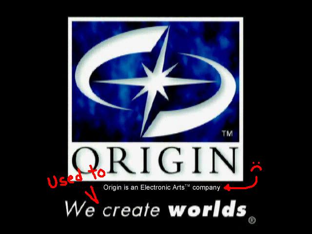
I always liked EA's 80s-90s logo

That was before they became total sellouts, now it's all yearly release sports titles and a few outsourced good games that they slap their branding all over.
IdreamofHIME
Member

Maybe people thinking about this company and then their logo is why there's so much hate towards the LGBT community...


Vulcano's assistant
Banned
What is this supposed to be? It always reminded me of an armadillo.
It's an armadillo. This is an older logo which is also quite nice.

Mad Season
Banned
I prefer the old one
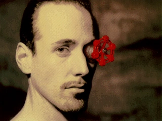
always wanted to know. is this some guy at Valve? Any explanation of who this guy is?


HAL Labs has a great one.
this, i don't know why, but i always loved this logo


They have a cool thing going on with their series, different colours for different franchises.
that's really cool. don't own a playstation so I never really noticed this when playing
Is that meant to follow on from the PS2 start up screen?
That was before they became total sellouts, now it's all yearly release sports titles and a few outsourced good games that they slap their branding all over.
the edge.
Dreadnought
Member
I'll be the first
Hibiki Kurosawa
Member
Yeppers!I like the old Atlus


MadClacker
Member
Tony Hawks Pro Skater 2

Melchiah
Member

This would be one of my choices as well.
They have a cool thing going on with their series, different colours for different franchises.
It's a neat idea, but I still like their old logo more.