• Hey, guest user. Hope you're enjoying NeoGAF! Have you considered registering for an account? Come join us and add your take to the daily discourse.

Worst looking sports team logos

Status
Not open for further replies.

MMarston

Was getting caught part of your plan?
Thread title is self-explanatory


Exhibit A:
s815696016504254551_p1_i4_w1365.jpeg

Everytime I see this logo, it's like looking at a high-school design stuck in the 80s.
 

Lambtron

Unconfirmed Member
Still can't figure this out to this day

c1rtoegrxgkq4zd9kvjq7g1df.gif
Jesus Christ. Red on the left is an E. Blue on the right is a B. Whole thing is shaped like an M. Montreal Expos Baseball. this is one of the very best logos.

Chief Wahoo and any other racist logos are the worst looking ones to me. The current Timberwolves brand is god awful, though.
 

OnPoint

Member
Jesus Christ. Red on the left is an E. Blue on the right is a B. Whole thing is shaped like an M. Montreal Expos Baseball. this is one of the very best logos.

I'm sorry... what? Montreal Expos Baseball?!

I guess I forgot about the hidden B in the New York Yankees Baseball logo.

Nobody includes the name of the sport in the logo.

Awful logo.
 

MMarston

Was getting caught part of your plan?
I'm sorry... what? Montreal Expos Baseball?!

I guess I forgot about the hidden B in the New York Yankees Baseball logo.

Nobody includes the name of the sport in the logo.

Awful logo.

Even then, when 90% of people don't get what the hell you went for with that logo, you know you fucked up.
 

OnPoint

Member
While this does have some good reasoning for it, I can only see "elb" when I see this.

I think the fact that you see ELB makes it bad. The fact that you have to explain all of the reasoning is horrible. It's like having to explain a joke -- if you have to explain it, it isn't good.

The Eagles having an E hidden in their crest is clever. The Milwaukee Brewers mitt logo is a better example of what this Expos logo is going for. It's just trash to me.
 
I'm sorry... what? Montreal Expos Baseball?!

I guess I forgot about the hidden B in the New York Yankees Baseball logo.

Nobody includes the name of the sport in the logo.

Awful logo.

I never knew what it stood for but it is still the best logo around
 

OnPoint

Member
This is not a thread for the best logos

Right. That's why I posted it.

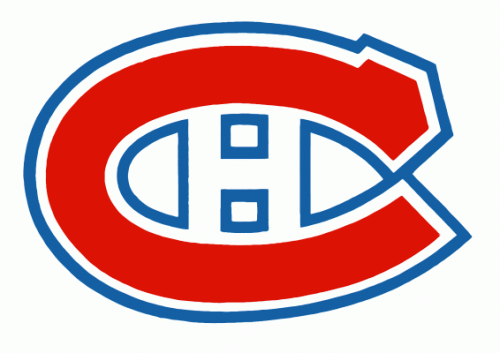
Nope, Habitants is a nickname, shortened to Habs, for the team.

Also, what about every soccer(football) team with FC in their name/logo?

I know what Habs stands for. I just figured they worked it in.

Dunno, don't watch/follow/care for soccer, so my knowledge base on that is low. But of the major four sports in the US (which is where my admittedly limited knowledge of sports logos/team names is centered), not one team does that I can think of.

The Buffaslug

Everybody tried so hard to accept it but we all knew we were lying through our teeth.

Honestly, it was just nice to be off of the red/black/white and back on yellow/blue that it kind of softened the blow. But it's all OK now. We got the good crest back.
 
Status
Not open for further replies.
Top Bottom