• Hey, guest user. Hope you're enjoying NeoGAF! Have you considered registering for an account? Come join us and add your take to the daily discourse.

Game fonts: The Good, The Bad, The Ugly

cj_iwakura

Member
So fonts may not be a huge deal, but they go a long way towards making all that reading palatable.
(I assume this is going to be a largely JRPG-centric thread, but western games can apply too, I'm sure)

Here's some good font examples, IMO:
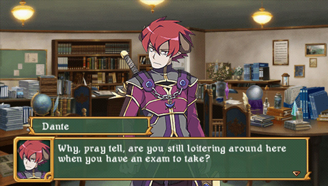
Practical_Exam1b.jpg

(Class of Heroes 2)

4-gl2_u5_004.jpg

(Growlanser II: The Sense of Justice)
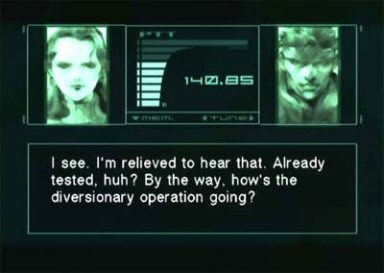
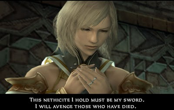
growlanser-heritage-of-war-20071026070437846-000.jpg

(Growlanser V)

997793_20121018_screen003.jpg

(Etrian Odyssey IV)


And some less good:

(Uh, hate to seem like I'm targeting a certain company, but these gave me the thread idea, and they've done good fonts as seen above.)

p2is3.jpg

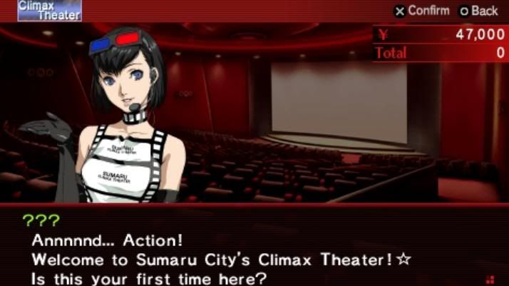
(Persona 2: Innocent Sin)

Compare to Innocent Sin fan translation:

anima-mundi.png


VnFiC.png

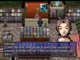
(Devil Summoner: Soul Hackers)
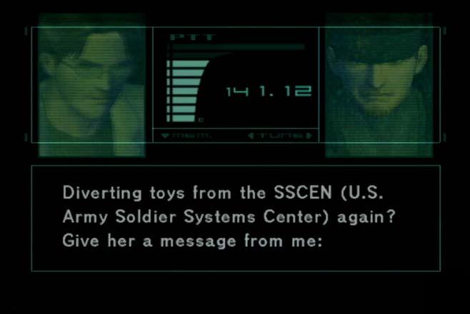
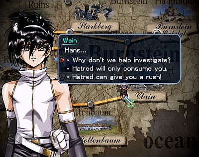
I don't give a crap if this uses Comic Sans, I buy this regardless.

629093_20120619_screen007.jpg

(Growlanser IV)

Personally they seem too bubbly in SH's case(doesn't fit the game's tone much) and thin(for lack of a better word) in Growlanser IV's case.


So any other examples of good/bad fonts? Which ones do you like, and hate seeing in use?
 
The Nintendo DS font (supposedly the default font used in the dev kits) is very infamous. Each letter is at most 4 pixels wide, and specifically Ms and Ws look like hot messes.

Edit:

zSpVfe0.png


Poor progranner...
 

bernardobri

Steve, the dog with no powers that we let hang out with us all for some reason
Metal Gear Solid series got great dialogue fonts. I don't remember their names, though... :(

Metal_gear_solid_codec.jpg


Sons_Of_Liberty_%28Codec_Screen%29.jpg


mgs42.jpg
 

mollipen

Member
Hmm... the only example I like from your "good" list is Growlanser II. *laughs* I think the rest are terrible. Meanwhile, I like P2: IS's official font. Same for Soul Hackers.

I think too often, companies go for style over readability, which I hate. At the same time, you then have things like that Etrian Odyssey IV font, which just feels like somebody photoshopped some text onto an image.
 

Het_Nkik

Member
I honestly never pay attention to fonts. I just don't think about them at all while reading. If I can read the words it's a good font.

HOWEVER, the fonts (really the entire UI) used in Android/iOS Final Fantasy games look crazy bad to me. You have this 16-bit sprite work overlaid with super sharp text and it just clashes really bad.

7IxmY1z.jpg
 
Yesterday I was at an academic symposium and a Japanese lady had a PowerPoint presentation in Comic Sans. Surely some games have been dumb enough to do the same
 

mollipen

Member
It fits perfectly though.

For me, it's the perfect example of style over substance. When a font actively works against the player in terms of readability, the font has failed.


HOWEVER, the fonts (really the entire UI) used in Android/iOS Final Fantasy games look crazy bad to me. You have this 16-bit sprite work overlaid with super sharp text and it just clashes really bad.

I actually think fonts like that might not look as bad if the UI wasn't such garbage. Mobile games really have the worst, cheapest, laziest UIs ever.
 
I hate the Xenoblade text. Can't find a good picture of the text with the hit damage. But that's specifically what I mean
 
Metal Gear Solid series got great dialogue fonts. I don't remember the name of them, though... :(

http://images4.wikia.nocookie.net/__cb20080306193846/metalgear/de/images/2/20/Metal_gear_solid_codec.jpg[IMG]

[IMG]http://images3.wikia.nocookie.net/__cb20080619081460/metalgear/es/images/3/38/Sons_Of_Liberty_%28Codec_Screen%29.jpg[IMG]

[IMG]http://www.blogcdn.com/www.joystiq.com/media/2008/06/mgs42.jpg[IMG][/QUOTE]

I came to post this exact thing. The fonts in the MGS aren't fancy, but they're readable and instantly recognizable to me.
 

Muffdraul

Member
So far the worst thing I can say about Dead Space 3 is that I hate the new font they decided to use on most of the menus and interfaces. I think it's ugly in general, and in a lot of cases it looks... I dunno, not blurry really, but... "soft". Like a low res sprite that's been upscaled to the point where it looks worse than it normally would.
 

Detox

Member
That 'classic' image of COD sucks because the game has a perfectly fine UI that millions of players have no issues with. I don't care if they use loads of different fonts and effects, it works.
 
Diablo 2's font fits the theme, but definitely falls under ugly. I can't count the number of times I had to think, "hold on, is that a five or a six?".

statsscreendi8.jpg
 

Zeranium

Member
Echoing the dislike for NDS font.

I wasn't too fond of the font used for the first 2 Wild Arms.
25118-wild-arms-2-playstation-screenshot-this-screenshot-really-doesn.jpg


I think they were also used for the Arc the Lad games on PS1.
 
VS's font works just fine for me on a CRT without uprezzing at 15ft.


426UD.jpg


Sting to Activision: "Get on our level, son."

Sting has the busiest UI's I ever seen, yet there is something charming about that.

Like a child who must use every crayon on a single picture in his coloring book for no reason.
 
I don't know what it is that bugs me about Innocent Sin; it's something about the capital letters not meshing with the rest of the line.

SMT: Strange Journey did text right. I know the dialogue font isn't unique to this game, but it's clean, easy to read, and nicely spaced:
cJEll.png
rSvur.png
 
I hate super-serif'd fantasy fonts so much. Say what you will about Skyrim's terrible UI, but at least they ditched the faux-handwritten Oblivion font.
 

DocSeuss

Member
Looking at every one listed as "good" in the above post leaves me shaking my head.

No.

None of those are good.

But I'm the guy who would prefer it if all fonts used Gill Sans Light.
 

Emitan

Member
That 'classic' image of COD sucks because the game has a perfectly fine UI that millions of players have no issues with. I don't care if they use loads of different fonts and effects, it works.

Just because people don't care about a bad UI doesn't make it not bad.
 

Kazerei

Banned
Gungnir is Sting's absolute triumph in their goal to put as much useless shit on the screen at one time.

I dunno, I'd say Knights in the Nightmare still has that crown. When there's bullets and gems flying everywhere, it's craziness.

986091_20101006_screen005.jpg
 
Top Bottom