It's completely awesome.Bernbaum said:
-
Hey, guest user. Hope you're enjoying NeoGAF! Have you considered registering for an account? Come join us and add your take to the daily discourse.
You are using an out of date browser. It may not display this or other websites correctly.
You should upgrade or use an alternative browser.
You should upgrade or use an alternative browser.
The GAF Collection Weekend Photoshop Thread
- Thread starter Pringo
- Start date
Visualante
Member
One would hope that after SomethingAwful, 4chan, GiantBomb and now GAF (among others, no doubt) have done this that it would be the end of bad boxart for re-releases.


SpacePirate Ridley
Member

SpacePirate Ridley
Member
Jocchan said:<3 <3 <3
Also...

Awesome!
Tetris one is brilliant.
I really don't like this one, but spent too much time on it not to post it. It's amazing how the better ideas are normally the quickest to get to 'work'.
crappy.jpg[IMG]
EDIT: Okay, realised that it works way better without the fake-looking hook and just leaving the shadow. Anyone that saw the original, would you kindly erase all memories of it :P
[IMG]http://i40.tinypic.com/ajkrki.jpg
crappy.jpg[IMG]
EDIT: Okay, realised that it works way better without the fake-looking hook and just leaving the shadow. Anyone that saw the original, would you kindly erase all memories of it :P
[IMG]http://i40.tinypic.com/ajkrki.jpg
This thread has made me realize how much of a wasted opportunity that 'Platinum' or 'Greatest Hits' box art is, especially the hideous yellow vomit adorning PS3 games with otherwise majestic artwork.
Publishers, if your game is a greatest hit, then it's already established itself in the market. Why not give the successful title a second lease of life with a new, simple but suitable cover sleeve to celebrate the achievement?
Publishers, if your game is a greatest hit, then it's already established itself in the market. Why not give the successful title a second lease of life with a new, simple but suitable cover sleeve to celebrate the achievement?
Bernbaum said:Wow, this is addictive. Here is my last one for the day, and my personal favourite.

:O
Awesome!
Oh wow, looking at some of those, that's what I always thought Collector's Edition boxarts should look like.
It would be cool if a HD link became kinda standard, for those who would like to switch them with the actual covers. It would clean the thread from the "HD LINK PLZ" posts.
Oh my god. Genius.
It would be cool if a HD link became kinda standard, for those who would like to switch them with the actual covers. It would clean the thread from the "HD LINK PLZ" posts.
McBacon said:Last one

Oh my god. Genius.
Bernbaum said:Wow, this is addictive. Here is my last one for the day, and my personal favourite.
incredible. looks way better than the LE cover art.
Gagaman said:Higher resolution versions of a couple of mine. Click em:


Oh wow. Too bad it's too big for a DS box


Raging Spaniard
If they are Dutch, upright and breathing they are more racist than your favorite player
Fantastic thread! Heres a couple Ive made with some fanart I made a while back
Raging Spaniard
If they are Dutch, upright and breathing they are more racist than your favorite player
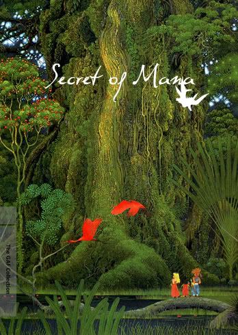
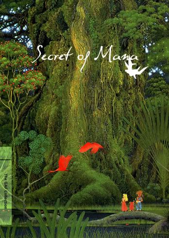
El Papa said:Here's a Secret of Mana one. The white thing next to the title is Flammie.
There are some really great ones posted in here. Keep it up!
Id put some color behind the gaf collection text so its easier to read. But I really like your choice of font
Thanks, it's called Dali. I had thought about the color thing but didn't bother since no one is going to print this out and use it for anything.Raging Spaniard said:Id put some color behind the gaf collection text so its easier to read. But I really like your choice of font
flabberghastly
Member
Wow, nailed it!Jocchan said:tetris.jpg
For my next one, I loved the original (Japanese and PAL) boxart -- the way it used the painting by Ueda himself -- but I wanted to try something entirely different with a minimalist style. It's kind of a wish fulfillment thing: I wish Greatest Hits versions did something similar, rather than adding garish colors to the original design.

B_Rik_Schitthaus
Banned

I messed up on this.
VGChampion
Member
I'll come up with some better one's later today. :lol

sixteen-bit
Member
niceflabberghastly said:
VGChampion said:I'll come up with some better one's later today. :lol
http://i43.tinypic.com/n6ul8k.jpg[IMG][/QUOTE]
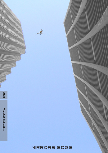
I like the concept very much, but maybe you'd want to add the title somewhere.
It requires people to know it's Mirror's Edge, but this isn't a given.
[QUOTE=painey]just used the assets from my old poster, I liked the minimalistic approach.
[IMG]http://farm4.static.flickr.com/3578/3414686613_d7d128cc11_o.jpg[IMG][/QUOTE]
Perfect.
The point of the Criterion Collection is that they are for people who are already massive fans of the (in this case) game. so, I think the ones that are most true to the spirit of that packaging are the ones that are a wink/nod to something that only a fan would recognize. They're intended to make the owner feel like they're part of the "in crowd" for that game. You could argue that they work better without including the game's name.Jocchan said:I like the concept very much, but maybe you'd want to add the title somewhere.
It requires people to know it's Mirror's Edge, but this isn't a given.
I really like this one. It captures what the game's about while still remaining quite minimalist. I was thinking about doing a Mirror's Edge cover since the game is just so darn stylish, but I couldn't think of one that would do the game justice. Good job.painey said:just used the assets from my old poster, I liked the minimalistic approach.
flabberghastly
Member
While you might be correct to a certain degree, it isn't entirely accurate: a quick check of my Criterion DVDs and of their website reveals that seemingly every one of them has a title.mik said:The point of the Criterion Collection is that they are for people who are already massive fans of the (in this case) game. so, I think the ones that are most true to the spirit of that packaging are the ones that are a wink/nod to something that only a fan would recognize. They're intended to make the owner feel like they're part of the "in crowd" for that game. You could argue that they work better without including the game's name.
Yes, these are all artistic covers that would fail to appeal the mass market. They're indeed destined to a crowd that knows exactly what to expect... but at the same time I feel there's still a need not to be too cryptic.mik said:The point of the Criterion Collection is that they are for people who are already massive fans of the (in this case) game. so, I think the ones that are most true to the spirit of that packaging are the ones that are a wink/nod to something that only a fan would recognize. They're intended to make the owner feel like they're part of the "in crowd" for that game. You could argue that they work better without including the game's name.
An example could be something iconic like Alistairw's Yoshi's Island boxart: it lacks a title, but it's instantly recognizable and it doesn't need one. I couldn't say the same about that Mirror's Edge entry, in my opinion adding one would be an improvement.
But yeah, just my opinion here
New one:

EDIT:
Didn't see your reply: yes, I agree completely.mik said:I'm not saying they shouldn't. I'm just saying that you shouldn't worry about someone knowing what it is without the title. If the design is iconic enough, you can definitely get away without it.
EDIT 2: whoops, I forgot to change the year to 2008 :lol
polyh3dron
Banned
I've bought a couple Criterion movies almost exclusively because of the covers when I hadn't even seen the movie before.mik said:The point of the Criterion Collection is that they are for people who are already massive fans of the (in this case) game. so, I think the ones that are most true to the spirit of that packaging are the ones that are a wink/nod to something that only a fan would recognize. They're intended to make the owner feel like they're part of the "in crowd" for that game. You could argue that they work better without including the game's name.
SpacePirate Ridley
Member
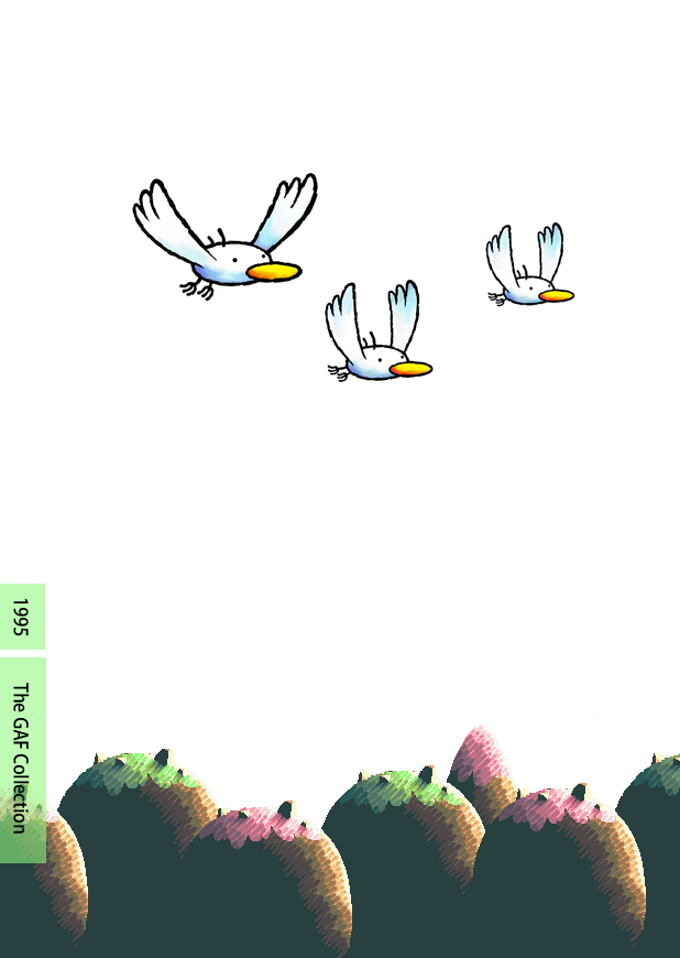
Better versions. Corrected the colors of the feather and the background.


High Resolution:
http://i40.tinypic.com/2dajclu.jpg
http://i44.tinypic.com/kbta1s.jpg
High Resolution:
http://i40.tinypic.com/2dajclu.jpg
http://i44.tinypic.com/kbta1s.jpg
somnific said:
I jazzed all over the place
CloakedPuppet
Member
Didn't manage to get this quick one in before the Mirror's Edge one :lol
VGChampion
Member
Jocchan said:I like the concept very much, but maybe you'd want to add the title somewhere.
It requires people to know it's Mirror's Edge, but this isn't a given.
Yeah, I originally had the title in there but I just couldn't find a good spot for it. It was weird for me. Couldn't find a spot where I liked the title but didn't really like it without the title. I was originally looking for the footprint but a quick search resulted in nothing. :lol
The first thing that came to my mind was "cutout filter", but I really like the idea and compositionCloakedPuppet said:Didn't manage to get this quick one in before the Mirror's Edge one :lol


SpacePirate Ridley
Member
BOSS.Jocchan said:A weird DKC one:
