• Hey, guest user. Hope you're enjoying NeoGAF! Have you considered registering for an account? Come join us and add your take to the daily discourse.

Artist website ( mine ) would love to get some feedback unless you say it totally sucks, because I’d be a little hurt.

Status
Not open for further replies.

highrider

Banned
I don’t want to violate any self promotion rules so mods nuke if you must, but I remember dudes posting art openings here before so I thought hey.

It’s just a free site me and my sister did, I know we have a pretty web savvy gang here and I’d love to get some feedback/constructive criticism. I’m going to be adding some better quality images and mural work shortly, would like to get some clothing stuff going as well.

https://www.artbydavidcreyke.com/
 
Last edited:

Ailynn

Faith - Hope - Love
I don’t want to violate any self promotion rules so mods nuke if you must, but I remember dudes posting art openings here before so I thought hey.

It’s just a free site me and my sister did, I know we have a pretty web savvy gang here and I’d love to get some feedback/constructive criticism. I’m going to be adding some better quality images and mural work shortly, would like to get some clothing stuff going as well.

https://www.artbydavidcreyke.com/

I think your artwork is beautiful! I can easily see it hanging in someone's living room or office for a sophisticated style. Thank you for sharing, and I wish you great success!
 
Last edited:
I dunno if it was a server thing or the high amount of images, but the site took a long time to load. Like minutes on my mobile phone. I almost just gave up and had to refresh a few times.

I’m not very good with abstract art so I have no worth while comments on it.
 

Papa

Banned
Don't know anything about web design but just wanted to say I think the art looks awesome.
 

olimariOA

Banned
I'm not really a fan
I see that it takes a lot technical skill, but aesthetically I find it to be too busy with clashing colors and lazy ideas
I feel like you need a vision or some kind of cohesion between works


This just looks like you went ham in the PS filter gallery and now it's some HACKERS 1993 background image
IMG_3852.JPEG

Here's an artist I follow doing somewhat similar stuff, but I like it
https://www.instagram.com/lynzymakesartthings/
 
Last edited:
Something is wrong with it - it took insane amount of time to load properly. Also top banner is way too huge it covers like 1/3 of the screen on my laptop.
 

Ownage

Member
2018 7, 11 and 12 are great. I would hang an oil /acrylic of 12 in my home.

The 2018 collection is more mature than your earlier works. I like the direction it's moving towards.
 
Last edited:

highrider

Banned
Thanks guys, and even for the criticism and I agree it is often busy and lacks cohesion but I actually like the blown out photoshop 1993 look sometimes 😂. Appreciate the feedback on load times, I’ll talk with admin ( my sister ) about it lol.
 
Last edited:

haxan7

Volunteered as Tribute
Hmmm.

Art and site are both good. Some of the pieces of art have a 90s digital art-inspired look. The banner at the top reflects this. It all works together well.

I would say don't sell out and streamline/modernize the site. It's cooler the way it is. But there are ways to modernize and sell out.
 

wipeout364

Member
I like it but I don’t like your website. Too much stuff on the main page. Maybe break up the art into themes or time(years or seasons) then put one piece from each section on the main page to link to the rest of the gallery for that section. I am viewing on mobile FYI.
 

neobiz

Member
I think you need to clean the site up a bit. The "home/gallery/etc/etc/etc" is sitting over the "Art by David Creyke" making it a bit unreadable. I had to look at the domain name to spell your last name for this post.
 

highrider

Banned
what is it? filtered photos, or painted?
Mostly drawn digitally then I also use photos and draw over them in kind of a layered thingy. And I do physical work on paper and canvas in spray enamel/acrylic.

Appreciate the feedback guys, I’m liking all of your posts more to acknowledge that I read them as well 👍
 
Last edited:
It looks like the image viewer is pre-loading some or all of the images, which makes the initial load really slow. Might be more performant if you just have a representative sample on the home page, then have a separate gallery page. It would be nice to have a gallery that shows thumbnails of all the works at once too, for browsing purposes.

It would be more work, but being able to sort by color is pretty big if you're selling art, especially in a style that doesn't have explicit subjects. People like to support artists, you gotta make it easy for them to find something that works for them.

Cool stuff though, keep it up!
 

Chittagong

Gold Member
I think you are certainly talented as an artist, OP. My main impression of the current body of work is that it feels like you are still searching for your voice and identity. There are many things in your gallery that could bcome that backbone of a style.

It’s normal for artists to go through that, I’ve witnessed one very famous illustrator discover his style, a surreal take on slavic childrens art, after experimenting with manga, 3D, infographics and what not. He went through a variety of things in 1995-2001, until he found a thing that clicked for him in 2002. Then he doubled down on it, and has been doing an evolution of that ever since, for the last 16 years. Now he gets commissioned by fashion labels who want that particular style, and he has his own label as well.

I think a good way to get a feel of what a cohesive body of work looks like is to look at well curated collections of artists, and trying to decipher the commonalities and differences within the work of a single artist.

For street art, I particularly like Nelly Duff’s curation. They have a very wide range of street artists, but each one of them has a particular concept of their own. Jorge Gerada, Tom French, might be topical for the abstract, collage space you seem to be going for:

https://www.nellyduff.com/artists

Another great place for inspiration is Big Active. Since you seem to work mostly in a digital workflow, collage artists who only use stock imagery might be relevant, like one of my all time favourites, Mat Maitland:

https://www.bigactive.com/artists/mat-maitland/

Hope you post new things here as you evolve!
 
Last edited:

TFGB

Member
Nice. Unusual and not what I’d really associate with graf (I was a writer back in the late 80s/early 90s).

Do you have any pieces/burners/outlines containing lettering and/or characters?
 

highrider

Banned
Nice. Unusual and not what I’d really associate with graf (I was a writer back in the late 80s/early 90s).

Do you have any pieces/burners/outlines containing lettering and/or characters?

Not really, my main traditional style graffiti work I did during the early 80s and most of the work I’ve done since is more abstract, consciously moving away from Vaugn Bode characters and wildstyles. I’m more inspired by Futura, Dondi, El-Kay and Phase 2 of course, Futura in particular as it was modern and didn’t look like typical graffiti art. I’d still love to do traditional style, but more on a commission basis, it’s costly to do murals.

Chittagong Chittagong , ArchdukeChocula ArchdukeChocula , really appreciate the feedback and advice. 👍
 
Last edited:

TFGB

Member
Yea Futura 2000 was way ahead of his time, much like the Chrome Angelz were on our side of the pond.

I only follow the graf scene now and then these days, but Can Two’s stuff is always stunning.
 

highrider

Banned
Yea Futura 2000 was way ahead of his time, much like the Chrome Angelz were on our side of the pond.

I only follow the graf scene now and then these days, but Can Two’s stuff is always stunning.

Yup, there’s more graffiti in Europe now imo, at least quality wise. Futura dropped the 2000 several years ago, a mistake imo 🤔
 

highrider

Banned
I'm not really a fan
I see that it takes a lot technical skill, but aesthetically I find it to be too busy with clashing colors and lazy ideas
I feel like you need a vision or some kind of cohesion between works


This just looks like you went ham in the PS filter gallery and now it's some HACKERS 1993 background image


Here's an artist I follow doing somewhat similar stuff, but I like it
https://www.instagram.com/lynzymakesartthings/

Also, I thought your criticism was accurate but I took a gander at the artist you liked on Instagram. I really found that stuff to be the epitome of lazy design and themes. I know dozens of printmakers and canvas artists and they pretty much do the exact same thing, take a few nice colors and do an attractive abstraction, brush strokes, circles, there’s nothing even recognizable in it. But hey, different strokes 👍
 

olimariOA

Banned
Also, I thought your criticism was accurate but I took a gander at the artist you liked on Instagram. I really found that stuff to be the epitome of lazy design and themes. I know dozens of printmakers and canvas artists and they pretty much do the exact same thing, take a few nice colors and do an attractive abstraction, brush strokes, circles, there’s nothing even recognizable in it. But hey, different strokes 👍

I don't disagree with you. I just wanted to post something I like that's both busy and pleasing.


I won't turn this into an art thread.
The biggest thing you should take away from my post is that I think you have a lot of technical skill.
 

DunDunDunpachi

Patient MembeR
A suggestion for the site itself: since you have a ton of photos (but not much else), consider using a CDN (content delivery network) to speed up site loading time. CDNs like Cloudflare even offer a free option.
 
I think you're obviously very talented and creative, but I can't say that your work really resonated strongly with me. That is in no way meant to be an indictment of your art - I didn't hate it or love it on the whole. It just didn't hit me personally, but that's ok. The thing about art is that there is no right or wrong. Self-expression and creativity will appeal to some and not to others. In my view, you should create what you are moved to create, unconcerned with how it will be received.

I did really enjoy this piece, fwiw.

30835_FBF_BC44_47_C4_9689_4_B9_C3_F084_DC1.jpg


I also liked the use of color in this piece:

49_EF33_A1_B821_404_C_BBC6_94177_DBB8006.jpg
 

SaviourMK2

Member
I'm not much of a fan of this kind of art, so I can't give fair criticism. However, I will say, after going through all the images, I did find some I genuinely liked and wouldn't mind framing if I owned it. I typically listen to music/look at art that inspires my own projects/work. You did a good job regardless of how you interpret my response.

Here are the images I personally liked.

3_ABAF926_531_A_487_B_976_D_F87_C151109_C4.jpg


40_E4856_E_55_A8_42_EC_90_B4_DDCD774_A8489.jpg
 

Osukaa

Member
It's not my type of art that I usually look at so I can't really say much as far as criticism or art style etc. I will say though that those designs would rock on clothing lol. Keep it up :)
 

Lister

Banned
Loading a lot of images at once is bad, especially on mobile. Took a while to load on my wifi amd on a galaxy s9. Hit me up if you want me to see if i can help you out, im a fullstack developer.

The art looks great imho, but im no artist.
 
Last edited:
I’m not very knowledgeable about Art but I think a lot of your stuff looks really cool. But be warned, I also think large neon signs that read Live Nudes is cool... especially if they are flickering.
 
D

Deleted member 713885

Unconfirmed Member
I enjoyed your stuff quite a lot.

3rd pic down (what resembles a city scape...turned on its side lol) was simplistic but nice. Something about it pulled me in immediately.
 

Jae Mara

Member
Hey highrider highrider , hope you dont mind if I fire some of my honest opinions your way.

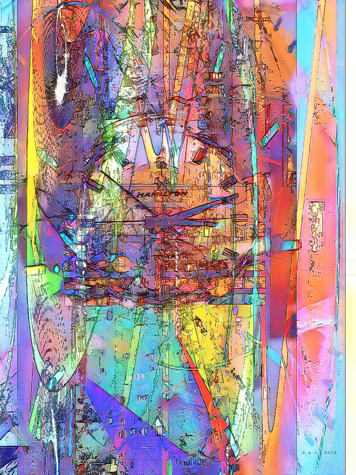
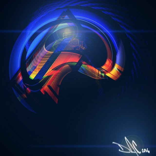
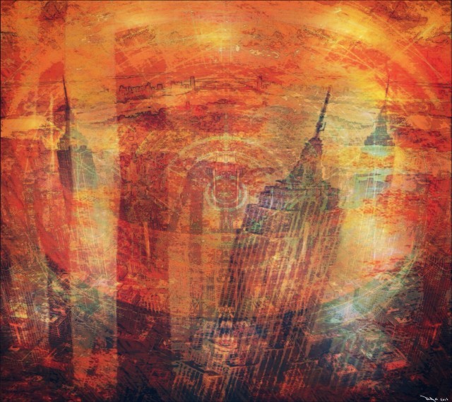
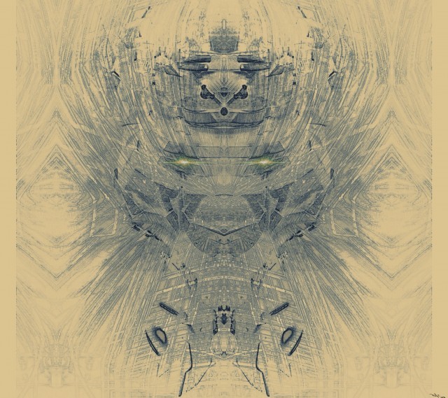
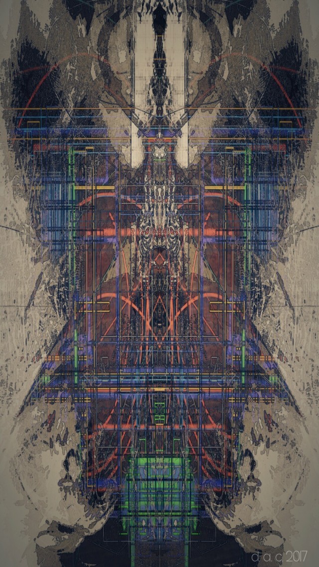
First of all my favourites of yours that I enjoyed. 2018 Fall 11,6, Spring 3, 2017 Summer 4 and 2016 Spring 1. I appreciate you sharing your work. It can always be tough.

I worked super briefly in front-end dev before deciding to go back to animation but there are few things I would like to point out.

Ok, As dumb and as obvious as it sounds your site represents your art and who you are. Think of it as an actually physical gallery of sorts and the front page is how you would like people to view your galley as they walk through the door. Make it a clean experience as possible. Perhaps you already curate your work but it is never recommend to have so many images in one place/page. I would say pick your best 30 and update, replace and curate at least for the front page. Most people will not go onto a site and click through all 143 images. You can tell people if they would like to see more to check out the instagram or an archive page etc and most will if interested.

Over all the phone version shows everything a lot better besides the fact it tries to load up all images. You can amend things like this with either reducing the amount of images on the page or using some sort of lazy loading script for your site.

The site itself, comes across more as a fixed site (made for specific set resolutions) rather than responsive (flexible in all modern resolutions). For instance I am on a 1440p monitor at work and your name in the banner is being covered up by the navigation bar. Not ideal. (Going back to why it seems designed better for phones rather than desktop).

Unfortunately your banner/footer image is blurry and pixellated. Not a good first impression! If there was anything to take from this I hope you fix this! (hope thats the better quality image you are talking about). The text is not handling the scaling very well either for larger screens as mentioned above. A general rule of thumb is to never have text as such in an image, it will scale pretty badly. You can do it with standard web text and it would look a lot better.

I would match your desktop version to the phone where I could see more of the thumbnails than just 6. I think if you pick the 30ish above thats a nice size for a site to scroll through and perhaps link to archive/instagram for more?

Some super smalls things for the desktop version, I would sit the navigation bar on the bottom of the header banner, its floating a little and the text is not centering in the navigation bar, closer to the top of the bar, small things like this makes it look a little untidy. Perhaps the text size needs increasing a little when it comes to your Bio info. I would also add a copyright thing at the bottom of the page too. Not sure if it actually does anything but makes things more legit.

Anyway hope you dont mind the criticism and most of it is just my subjective eye picking up on things but hoping it will be constructive. Thanks again for sharing.
 
Last edited:

iconmaster

Banned
Mostly drawn digitally then I also use photos and draw over them in kind of a layered thingy. And I do physical work on paper and canvas in spray enamel/acrylic.

There's no need to destroy your hard work in Photoshop. You don't want people to see your stuff and think "oh, that's that one filter / blend mode."

I like synchronicity synchronicity 's pick because it's not obvious how you did it.

30835_FBF_BC44_47_C4_9689_4_B9_C3_F084_DC1.jpg


More like that. Less Poster Edges.
 

fatty

Member
Just some quick comments after visiting for the first time today (from a desktop):
  • Overall very clean and easy to read, clicking on the 'magnify icon' gave a good image size to get a better look. I would have preferred a bit bigger but also understand that you probably don't want people just right-clicking and saving to use as a background or making the prints themselves.
  • Not really sure why the need for the archive yet. Maybe if there were a lot more to choose from I can see the point in highlighting your most recent stuff but I would opt to have all of the gallery pics in one spot to make it clearer for the purchaser.
  • This would require a lot of work I realize, but being able to click on one of your gallery prints, and then have the option to choose material and size, would be more intuitive and streamline the process to make it easier for ordering. Having this be more automated and being able to click and buy without having to engage in dialog with someone could mean the difference with some people ordering. Unfortunate, I know, but this is now the world we live in and that is the way many people prefer. I know this might not work for custom stuff but for your gallery work I would work toward this as your website grows.
  • Under pricing, your formatting is off under the 11x14 and 20x30 columns because it appears the column widths are too narrow causing text wrapping.
But I do like your art, you have some nice stuff there. Good luck and I hope it does well, I really enjoy people who take that chance and become entrepreneurs. I am working toward this goal.
 

Jae Mara

Member
Hey I’ve made a few changes, tell me what you think when you get a chance 👍

Hey man. Just on my holidays at the moment so I just have access to the mobile version. I think overall its looking nice and clean. Good work!

For the mobile version I just have one quibble. A sticky navigation or sticky header. It's basically a navigation bar that sticks to the top of the screen when scrolling down a page. Gaf has its mini "header" with that "burger icon" top left on mobile (using new gaf theme the old theme does not have this, recomnend checking it out). Not sure if this might be technically possible on your end though.

As fatty mentioned about the archive and looking back to what i said, I think its an ineffectual word to use. Sorry about that. My bad. I stick to the principle of showing your best on the home page though. Perhaps "Collection" might be a better word for the "archive" page? I think the word archive might make people think that the work is perhaps inaccessable to buy? I would make sure to have all your work in here too.

Once I'm back home (7 days) I'll check the desktop version and let you know if I spot anything. Once again just my subjective opinions on the matter, as you know when it comes to design there is a lot of back and forth with ideas to get them to work and its no different when working on a website. :messenger_winking: Keep it up!
 

StreetsofBeige

Gold Member
That Customized Photo part with the guy with the guitar. That looked really good.

The pricing section looks kind of odd. The prices are in wildly ranging amounts. Maybe round all prices to the nearest 5, 9 or 0. Or does art normally have pricing that seems all over the place? And some things like Paper Prints at biggest size costs the most, but at smaller sizes, Custom Photos cost more?
 

Dirk Benedict

Gold Member
I don’t want to violate any self promotion rules so mods nuke if you must, but I remember dudes posting art openings here before so I thought hey.

It’s just a free site me and my sister did, I know we have a pretty web savvy gang here and I’d love to get some feedback/constructive criticism. I’m going to be adding some better quality images and mural work shortly, would like to get some clothing stuff going as well.

https://www.artbydavidcreyke.com/

I want to ask if you have any experience with graff art?
I see graff work in this and was curious. I used to try different variations of 'wild style' and it formed into a handwritten type of font that I used for awhile till I came of age and moved on to things non-art.
 

highrider

Banned
I want to ask if you have any experience with graff art?
I see graff work in this and was curious. I used to try different variations of 'wild style' and it formed into a handwritten type of font that I used for awhile till I came of age and moved on to things non-art.

Yeah I did graffiti art from the early 80s up until the early 2000s. A lot of my best stuff I did when I was stationed in Germany, was a big, enthusiastic group of artists there. I think that it is the foundation to everything I do, even though I ultimately lost interest in doing traditional name/character graffiti. I still do commissions of graffiti style stuff, but doing a mural is fairly expensive so it’s not really a impulse thing anymore, kid, responsibilities etc.
 
Status
Not open for further replies.
Top Bottom