-
Hey, guest user. Hope you're enjoying NeoGAF! Have you considered registering for an account? Come join us and add your take to the daily discourse.
You are using an out of date browser. It may not display this or other websites correctly.
You should upgrade or use an alternative browser.
You should upgrade or use an alternative browser.
Evolution of the Batman logo, 1940 to present
- Thread starter dmr87
- Start date
- Status
- Not open for further replies.

NYCmetsfan
Banned
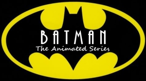
I can't decide which is my favorite. Why is there none from the animated cartoon (90s) though?
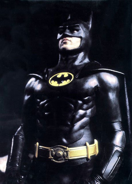
This is the one I grew up on
This is the one I grew up on
Jedeye Sniv
Banned
superman & batman vs alien & predator
wat
It was really really bad.
My fave would be the 98 Chronicles logo, it's just classic.
superman & batman vs alien & predator
wat
yah what is this.
probably not as cool as hellboy and batman
Gorsh, even the Batman & Robin logo was homoerotic.
You know what, it actually kinda is.
TangoAlphaLima
Member
Nevermind.
George Oscar Bluth II
Banned
Chuckie
Member
Nevermind.
That's Batman Returns
Edit: Wow beaten AND a ninja edit
superman & batman vs alien & predator
wat
I KNOW!!! Need to get me a copy of that!!!!
SonicMegaDrive
Member
I can't decide which is my favorite. Why is there none from the animated cartoon (90s) though?
This is the one I grew up on
Yeah, that's the one usually found on t-shirts as well as movie posters from around the time the 1989 movie came out. Strange that they omitted the most famous one.
DeaconKnowledge
Member
They fucked up the 1989 Logo.

Best Batman Logo.
Best Batman Logo.
I KNOW!!! Need to get me a copy of that!!!!
amazon doesn't even seem to carry it... must be pretty bad to have that little demand. a few third party venders have it though
Chuckie
Member
They fucked up the 1989 Logo.
Best Batman Logo.
It is. But he isn't using it in the movie :O
like I said..my mind is blown.
George Oscar Bluth II
Banned
No Frank Miller Fatman? Or Year One? Interesting.
NYCmetsfan
Banned
Yeah I have a shirt with it on it. (I also have a Fleur de lis designed like that logo which I love)Yeah, that's the one usually found on t-shirts as well as movie posters from around the time the 1989 movie came out. Strange that they omitted the most famous one.

water_wendi
Water is not wet!
I had some toys and games from the 89 movie, so thats my favourite by far, its not the one in the Op though
Yea the 89 logo on the chart is different from what i remember.

George Oscar Bluth II
Banned
They fucked up the 1989 Logo.
Best Batman Logo.
It's on the DVD and Blu-Ray covers as well.
2003 Gotham Knights is my favourite by far.
Same. Not sure why, but it just feels right.
spindashing
Banned
Gorsh, even the Batman & Robin logo was homoerotic.
LOL
StoppedInTracks
Member
This made me realize that the Batman 89 Film logo is not actually the same as the logo he was wearing on his chest :/

Iconic.
The Dark Knight one was originally used in Batman Begins. In fact, that logo was used far more than whatever the hell they've got for BB there.
Edit: Oh, I guess that's what was on his chest in-film? It's inconsistent because it's not clear whether these are the marketing logos or his chest plate. Obviously the AA, AC, Batman and Robin, and TDKR ones aren't his chest plate in the product itself but then they go with the chest plate for B'89 and BB and skimp on the more iconic logos from the marketing?
Edit: Oh, I guess that's what was on his chest in-film? It's inconsistent because it's not clear whether these are the marketing logos or his chest plate. Obviously the AA, AC, Batman and Robin, and TDKR ones aren't his chest plate in the product itself but then they go with the chest plate for B'89 and BB and skimp on the more iconic logos from the marketing?
ManDudeChild
Member
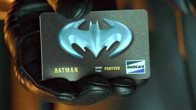
Even in 1997 it wasn't exactly rocket science to find out who owns a credit card.
Aaronology
Member

This made me realize that the Batman 89 Film logo is not actually the same as the logo he was wearing on his chest :/
http://www.comicsbulletin.com/main/sites/default/files/column-covers/Batman-Logo.jpg[IMG][/QUOTE]
Yeah. Same deal with Batman Begins.
You know, when I first saw the redesigned emblem for MoS, I hated it. But the more I see it, the more I like it. As opposed to making everything slimmer, flatter and more Metro, it does away with all that and still looks good. Kudos to whoever designed it.Reminds me of this.
SilentRacoon
Member
I always liked the Batman DE, maybe because it's not too overdone, simple and yet elegant.
Tatsumaki Senpuukyaku!
Member
Fun fact: DC created the bat logo with yellow behind it because they couldn't copyright the original one
weekend_warrior
Banned
1992 Batman Returns is best.
Ephemeris
Member
Hard to say what's my fave, but if I had to be stuck with one symbol forever, it would probably be 2003 GK.
I've surprisingly never seen this before.
Reminds me of this:
I've surprisingly never seen this before.
Pop-O-Matic
Banned
superman & batman vs alien & predator
wat
Fuck Justice League, THIS should be DC's next film after Batman VS Superman. Co-directed by Zack Snyder and Paul WS Anderson.
- Status
- Not open for further replies.