-
Hey, guest user. Hope you're enjoying NeoGAF! Have you considered registering for an account? Come join us and add your take to the daily discourse.
You are using an out of date browser. It may not display this or other websites correctly.
You should upgrade or use an alternative browser.
You should upgrade or use an alternative browser.
First Epic Mickey 2 Gameplay Footage
- Thread starter GameE
- Start date
magicalsoundshower
Member
It appears to look pretty much exactly like the first game at this point. Yeah, I'm being a huge Negative Nancy, I know.
Looking at it again, even the jumpy pointer seems to be back.
Looking at it again, even the jumpy pointer seems to be back.
What is striking to me is that the game seems to be designed to be as inaccessible to the legions of Disney fans as possible. Oswald may be the coolest character ever created by Walt Disney, but if you're making a co-op Walt Disney game, why on earth would you make Oswald the number 2 character? I've only just started the first game so far, but there seem to be a lot of missed opportunities like this. Disney gives you a lot of money in an attempt to make the Pixar of video games, and you make some indie retrospective? I don't understand it.
RoadHazard
Gold Member
Still doesn't look like the amazing original artwork. 
GitarooMan
Member
Lol at Spector using "next-gen consoles" to describe 360 and PS3 in 2012. Anyway it look alright, I'm a sucker for Disney so I know I'll play it, but it doesn't seem very ambitious, sticking very close to the formula. It feels like they are saying, "well we knew the first game had a lot of problems, so here's another version that is actually more like what we wanted to make."
Exactly what I thought.Lol at Spector using "next-gen consoles" to describe 360 and PS3 in 2012.
Barack Lesnar
Banned
Looks pretty lame. Why did the first one get so much hype and attention
Alexios
Cores, shaders and BIOS oh my!
I don't see the problem with that, the visuals weren't among the first game's real issues. That camera however still doesn't look good, especially considering single-screen co-op mode (unless that was single player and the co-op does split screen)...It appears to look pretty much exactly like the first game at this point. Yeah, I'm being a huge Negative Nancy, I know.
Although they could have chosen better color schemes, even the cheery areas look kinda bleak, the purples and greens just make me think of those weird post apoc-ish WoW areas. But hey, that's their intended look so eh, as long as the game's good this time...
Q
qizah
Unconfirmed Member
Looks pretty much like the first one, in terms of visual style. I was hoping the bump to HD consoles would mean a more realized visual style. I owned the first one for a bit, I got it as a gift but I couldn't bring myself to play more of it. Hope this one turns out better.
Very interesting.
The shots at 45 seconds is obviously Wii version since you can see the cursor waving around. We also know that's not the PS3 version+move because it looks nothing like this:
But the 360 footage at 55 seconds doesn't look any different from the wii version. The lighting in the off screen shot above looks so much better than any of the footage in that video.
The shots at 45 seconds is obviously Wii version since you can see the cursor waving around. We also know that's not the PS3 version+move because it looks nothing like this:

But the 360 footage at 55 seconds doesn't look any different from the wii version. The lighting in the off screen shot above looks so much better than any of the footage in that video.
Vinterbird
Member
Looks pretty lame. Why did the first one get so much hype and attention
Because of a few simple things:
- Warren Spector
- Mickey Mouse
- Warren Spector
Plinko
Wildcard berths that can't beat teams without a winning record should have homefield advantage
What is striking to me is that the game seems to be designed to be as inaccessible to the legions of Disney fans as possible. Oswald may be the coolest character ever created by Walt Disney, but if you're making a co-op Walt Disney game, why on earth would you make Oswald the number 2 character? I've only just started the first game so far, but there seem to be a lot of missed opportunities like this. Disney gives you a lot of money in an attempt to make the Pixar of video games, and you make some indie retrospective? I don't understand it.
THIS RIGHT HERE.
It makes absolutely no sense.
I'm still waiting for a return to the days of Castle of Illusion, Quackshot, Magical Quest, etc. The characters are there.
magicalsoundshower
Member
Even for a Wii title, it doesn't look overwhelming or great.
Judging from the button prompts (time to mash that green A button!), what they're showing seems to be 360 footage...
I don't see the problem with that, the visuals weren't among the first game's real issues. That camera however still doesn't look good, especially considering single-screen co-op mode (unless that was single player and the co-op does split screen)...
Although they could have chosen better color schemes for sure.
I wasn't really referring to the graphics (which were indeed sometimes quite beautiful in the first game), I meant the way the game seems to feel and behave. The camera indeed still looks as questionable as in the first game.
Skiesofwonder
Walruses, camels, bears, rabbits, tigers and badgers.
Damn, when Geoff quoted him I just figured he meant Wii-U.Lol at Spector using "next-gen consoles" to describe 360 and PS3 in 2012. Anyway it look alright, I'm a sucker for Disney so I know I'll play it, but it doesn't seem very ambitious, sticking very close to the formula. It feels like they are saying, "well we knew the first game had a lot of problems, so here's another version that is actually more like what we wanted to make."
I said in the other thread, but it looks extremely similar to the first one, which worries me considering the first was such a mess. GTTV better bring something interesting!!
Barack Lesnar
Banned
Because of a few simple things:
- Warren Spector
- Mickey Mouse
- Warren Spector
Spector for sure, but Mickey Mouse...really?
Spector for sure, but Mickey Mouse...really?
Mickey is huge. Lots of people have similar fond memories as spector of mickey and his games in the 16 bit era. Plus the concept art for the game looked spectacular.
So yes, Mickey Mouse. Really.
Vinterbird
Member
Spector for sure, but Mickey Mouse...really?
I like Mickey, he's fun. And I think the leaked artwork from way back also did a lot to build up hype among the enthusiasts about the game (and also resulted in massive backlash when they found it wasn't used and they took the game in another direction)
Barack Lesnar
Banned
Was that the artwork where it looked darker/Tim Burton-y? That was pretty good
People had a different concept of what the game was going to be like.Looks pretty lame. Why did the first one get so much hype and attention
Was that the artwork where it looked darker/Tim Burton-y? That was pretty good
Yeah. It's a shame the sequel isn't more reminiscent of that early artwork. From what I understand, it was stated in an interview that they originally planned for Mickey to visibly change depending on the choices he made. He'd become darker, more abstract, and almost evil if the player repeatedly made selfish choices. It was eventually scrapped because they didn't want to alter the perception of mickey or something along those lines. Damn shame.
BattleMonkey
Member
Looks pretty lame. Why did the first one get so much hype and attention
System exclusive
GitarooMan
Member
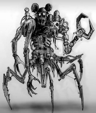
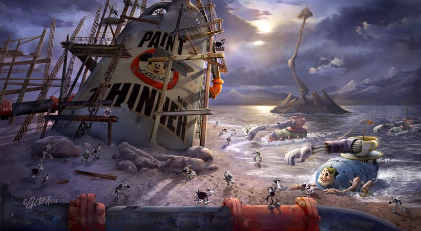
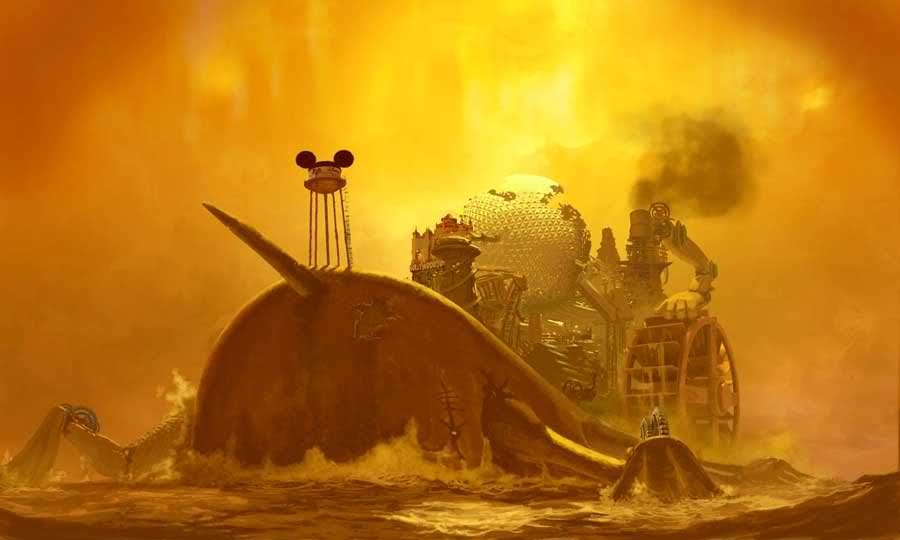
I remember being blown away by that decaying Spaceship Earth, etc., on the whale in the concept art and thinking of all the possibilities stemming from that (which went completely unrealized).
Barack Lesnar
Banned
Oh wow steampunk and dark, that does look great. I'd bet the publisher had a hand in what we ultimately got.
Because of a few simple things:
- Warren Spector
- Mickey Mouse
- Warren Spector
Also:
- Big-budget, third-party Wii exclusive
- Dat early concept art
It was on the proverbial "This game will save the Wii" chalkboard.
BattleMonkey
Member
Oh wow steampunk and dark, that does look great. I'd bet the publisher had a hand in what we ultimately got.
It was probably more to do with Disney's involvement in the project. They probably were not keen on the concept art
Lol at Spector using "next-gen consoles" to describe 360 and PS3 in 2012. Anyway it look alright, I'm a sucker for Disney so I know I'll play it, but it doesn't seem very ambitious, sticking very close to the formula. It feels like they are saying, "well we knew the first game had a lot of problems, so here's another version that is actually more like what we wanted to make."
Obviously this means that the there is a Wii U version in the works
michaeltraps
Member
Looks exactly like the last one, no thanks.
Barack Lesnar
Banned
It was probably more to do with Disney's involvement in the project. They probably were not keen on the concept art
True, it was prob the suits at Disney who know nothing about games.
Barack Lesnar
Banned
What do they need to learn when the first game sold a million (something huge like that) in its first month? and that was just one platform. They were never going to change anything... just PR babble.
Vinterbird
Member
Oh wow steampunk and dark, that does look great. I'd bet the publisher had a hand in what we ultimately got.
Disney actually encouraged the style, but Spector and the Art Director wasn't fond of it, and felt it wasn't in style with the Disney vibe they wanted to get across. At least that's how the evolution of the visual style is explained in the artbook.
StevePharma
Member
That concept art was so amazing, if they made a point and click adventure with that artstyle (like Machinarium or Lucasarts titles) I would squee with glee.
But alas, we got a generic Mickey Mouse game. A shame the sequel doesn't look like it's going to be any different.
On a side note, why do Wii games still look like this in 2012? 700 people working on this? I laughed. When I put RE4 in my GameCube it still blows nearly anything on the Wii out of the park. If the Wii really is 2 GameCubes taped together, then I was expecting more Epic visuals from Epic Mickey 2.
Barack Lesnar
Banned
Disney actually encouraged the style, but Spector and the Art Director wasn't fond of it, and felt it wasn't in style with the Disney vibe they wanted to get across. At least that's how the evolution of the visual style is explained in the artbook.
Wtf? That's not the Warren we grew up with.
People had a different concept of what the game was going to be like.
I think the first and second image look pretty much like the game. The game is pretty dark too and textures are painted. At the GDC this year I found an Epic Mickey artbook (didn't buy it though) which contained a lot of concept art for the game, most things I could immediately recognize from the game. Perhaps people didn't expect that they'd make the game look that close to the concept art in terms of rendering, they expected more.
crazy monkey
Banned
Looks pretty lame. Why did the first one get so much hype and attention
It is micky mouse.
What do they need to learn when the first game sold a million (something huge like that) in its first month? and that was just one platform. They were never going to change anything... just PR babble.
edit: it did sell 1.3 million in its first month, then flatlined.
You don't even need to look back at such a high watermark, Mario Sunshine eats this for breakfast. A look at the Wii version's water, it's some PS1 crap.That concept art was so amazing, if they made a point and click adventure with that artstyle (like Machinarium or Lucasarts titles) I would squee with glee.
But alas, we got a generic Mickey Mouse game. A shame the sequel doesn't look like it's going to be any different.
On a side note, why do Wii games still look like this in 2012? 700 people working on this? I laughed. When I put RE4 in my GameCube it still blows nearly anything on the Wii out of the park. If the Wii really is 2 GameCubes taped together, then I was expecting more Epic visuals from Epic Mickey 2.
This looks dreadful. How they managed to screw up color in a Mickey Mouse game is beyond me--everything looks murky and disgusting. Yuck...
They ain't in Toontown they are in the paint thinner fueled Wasteland.
Talking of the sequel did 'play style matter' actually have any importance - I just remember the amount of fetch quests.