• Hey, guest user. Hope you're enjoying NeoGAF! Have you considered registering for an account? Come join us and add your take to the daily discourse.

Fuse Box Art revealed

Ploid 3.0

Member
Yes, I enjoyed it, but remember that while there is action, it's a platformer first and foremost.


You should check out Sacred 2. 4-player RPG.

I nearly got that game, tried finding it at one point but in 2010 or 2011 I kept waiting for Diablo 3 :(. D3 pretty much forced people to play solo, even with all the patches it seems like it don't matter if you group up. I got Guild Wars 2 though, it's pretty nice, I'm looking forward to expansions and elementalist fixes.
 
a glimpse into the far flung future of probably this time next year

oRdEu.jpg

Someone needs to tweet Insomniac this pic.
 

Whompa

Member
You had an art school class that taught you this crap?

It's color theory. All schools that have any semblance of creativity involved teach it. You're calling it crap because you see it often, but it's actually based behind the actual theory behind complementary color use. It's effective whether you like it or not.

That being said, this cover art for Fuse is a complete joke...and not just color-wise. The composition is absolutely horrible. Their crotches are the CENTER OF THE COVER...why is there so much empty space below the picture?! Why does nobody have a face! It's deliberate but it's not good design.
 
I wonder how close Jstevenson has come to posting in this thread.


I guess its for the best he stays away but a "you guys are assholes lol" would be nice.
 
Hah, thanks to Wario64 's twitter for directing me back here. This thread had already delivered, but the shop with the clearance sticker and the kel pic were just too good.
 

JAY the BIRD

Neo Member
Am I the only one that simply loved Resistance 3, as well as all the Ratchet games?

The first 2 Resistance titles were a little off, but 3 nailed it.

I'm optimistic about what Insomniac can do.
 

ymmv

Banned
Am I the only one that simply loved Resistance 3, as well as all the Ratchet games?

The first 2 Resistance titles were a little off, but 3 nailed it.

I'm optimistic about what Insomniac can do.

Actually I think there's still a good game in Fuse too. But the marketing of this game is beyond awful. Fuse has become the John Carter of gaming. The change from Overstrike to Fuse made it clear either EA doesn't know how to promote this game and this has become the talking point whenever someone mentions the game. This would never have happened if Insomniac had stuck to their guns and simply made the game they wanted to make.
 

HoodWinked

Member
w/e at the boxart for me personally, seems like any other game

but they should just change it to gain some good faith from hivemind gamer mentality.
 

Goldrusher

Member
It's color theory. All schools that have any semblance of creativity involved teach it. You're calling it crap because you see it often, but it's actually based behind the actual theory behind complementary color use. It's effective whether you like it or not.
I call it crap because it is crap.
Don't simply color half your image blue, only because "orange needs blue". Which is what our art school friend suggested they do.

If you want blue, find some artwork with blue already in it or where blue makes sense.
 

Himself

Member
Am I the only one that simply loved Resistance 3, as well as all the Ratchet games?

The first 2 Resistance titles were a little off, but 3 nailed it.

I'm optimistic about what Insomniac can do.


Resistance is really the only straight forward FPS I enjoyed this gen. Had a great time with them. I had fun with the Ratchet games, Crack in Time ruled, but with FFA that makes five friggen Ratchet games this gen. Way too many to keep a high level of quality throughout. I'd like to have faith and I'll try the demo, but there really isn't much to get excited about with Fuse for me.
 

Mista Koo

Member
I call it crap because it is crap.
Don't simply color half your image blue, only because "orange needs blue". Which is what our art school friend suggested they do.

If you want blue, find some artwork with blue already in it or where blue makes sense.
Or color the main elements of your game - that you would like to feature on the box art - orange and blue from the get go.

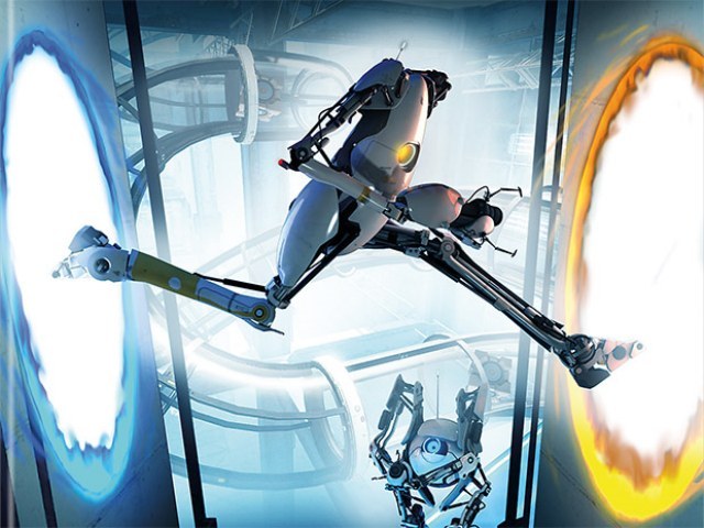
portal-2-caja-800x600fzu3w.jpg


Someone needs to tweet Insomniac this pic.
I think the one Raging Spaniard made caused enough damage:

Nrhz.png
 

Angry Fork

Member
Man, this thread is pure, unadulterated cruelty.

Just came across it now, feel really bad about it. I don't think people realize how much time and effort is put into games, they're developers babies and forums rip them apart. Some are deserved but people should at least wait until a demo comes out especially for a company gamers generally like.

A crack in time was the shit, I hope they go back to single player Ratchet like that in the future but I don't know if it sold well. I hope this game doesn't bomb but things aren't looking up.

Also tired of seeing the revisionism when it comes to the 'old' overstrike design being this unique breath of fresh air and the new fuse being generic and meh. A LOT of people me included thought the overstrike design was nothing to write home about either. Looking back now the trailer was more colorful than Fuse but it's nowhere near the interesting fun cartoony sensibilities of something like TF2 to deserve kind of label.
 
I love my Insomniacs, but man. Wasn't this supposed to be sort of humorous? Reminded me a bit of the Incredibles. Maybe it's another Bulletstorm affair in that the marketing tells a very small part of the story, at least I hope that's the case.
 
R

Retro_

Unconfirmed Member
It's color theory. All schools that have any semblance of creativity involved teach it. You're calling it crap because you see it often, but it's actually based behind the actual theory behind complementary color use. It's effective whether you like it or not.

That being said, this cover art for Fuse is a complete joke...and not just color-wise. The composition is absolutely horrible. Their crotches are the CENTER OF THE COVER...why is there so much empty space below the picture?! Why does nobody have a face! It's deliberate but it's not good design.

I think the cover wants us to focus on their weapons

Problem is that they're glowing the same color as the background of the box, so your eye isn't even drawn to them at first glance, but rather to the floor.

and even when you do notice you're not even sure what you're looking at. Especially with Dalton's weapon which is almost completely obscured by its glow.(I thought it was the Sun the first few times I looked at it)

It definitely needs a redesign

or not I guess. It's definitely loud enough to draw eyes browsing any store shelf
 

I'm an expert

Formerly worldrevolution. The only reason I am nice to anyone else is to avoid being banned.
Fuckkkkkkkk this thread just reminded me how much I loved Kenan and Kel.. which reminded me how much I loved My Brother and Me.

=(
 
Top Bottom