• Hey, guest user. Hope you're enjoying NeoGAF! Have you considered registering for an account? Come join us and add your take to the daily discourse.

god damn this DOOM box art is bad

antitrop

Member
It's not that big of one. Plenty of popular games have extremely generic covers.

I never said it was a great cover, I'm just saying people are being hyperbolic about how bad it is.

Well yeah, I mean... it's DOOM. It's gonna get attention. It's one of gaming's most legendary franchises. There's a lot to live up to.
 
Someone do a box art from this screen cap off the trailer, better than the official boxart.

vn5BM45.jpg
 

mclem

Member
Lol @ all the Master Chief comments.

Doom did the generic green visor'ed space marine before some on here were born, apparently.

I'll have to look to double-check, but I don't think Doom's space marine was green visor'd. I think it was green body armour with a white helmet with... I'm not sure there was any visible visor, I think it was just very translucent?

Edit:

fLM5j7I.png


Not too bad, for memory.
 
I think the word alone with an atmospheric black background would be awesome! Less can sometimes be more. It's not bad, but not great either.
 

Woo-Fu

Banned
brooding big guy walking away from the bad times.

Actually that could be a toddler. There is nothing in the image to nail down how large/small anything is. Certainly that looks like a shotgun but it could be any gauge whatsoever.
 

sjay1994

Member
It doesn't offend me, it just seems pretty standard.

Then again, I have no nostalgia or experience with DOOM, so I think I understand where some of the vitriol is coming from, since this it seems like this series has significant meaning with people here.
 
Original DooM guy has a grey visor, you can also check Quake 3 for his armor colours.
Phobos was a better looking marine in quake 3
 
At this point even this looks better.
816PdUzUPLL._SY550_.jpg

To be honest, at this point the Doom franchise is so well known, distinctive and iconic this box-art would be plenty good. The name sells itself, no need for anything else.

It's like how all you need is the Batman icon for people to know something badass is coming, same applies to the Doom logo.
 

CamHostage

Member
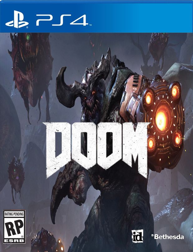
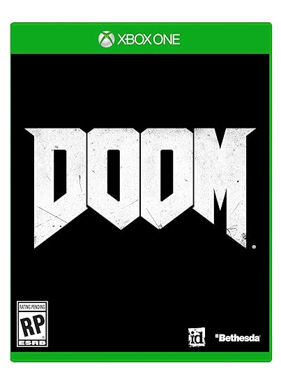
Agreed. Generic boxarts are a dime a dozen ... but the reason why it's especially bad for Doom is that Beth/id's been trying to market the game as a return to form. That's not to say it needs to have the exact same aesthetic, but at the very least it needs to look and feel inspired. They're definitely trying to get away from the reputation that Doom 3 left (a much more generic shooting experience).

Right, it is just box art, and at the end of the day it doesn't matter a whiff what's on the box as long as what's in the box is awesome...

But great games tend to get all the details right, up and down the line. When the box is bad, you wonder what else the producer didn't care about.

(*There are exceptions, of course; Ico and Mega Man for instance have boxes so bad they've required fans to campaign to get the word out about the quality of the actual game. Do note though that in both of those cases, it was the outside publisher putting its interpretation of branding on the product once handed something they needed to market, whereas nowadays the keyart is drafted as part of the production and sometimes even comes from the in-house design team; the guys who make the game are a part of deciding what image will represent their game.)

Mostly, who cares. But after following the travails of Doom 4 for 8 years now, it sadly did not surprise me to see the game going to market with a cover so generic and lifeless and tired. Every single indicator big or small has whispered, "Don't get your hopes up."

Substance trumps style, but style can reflect substance.
 

Alebrije

Member
It's boring and does not gives the feeling of a Doom game , if you erase the Doom name you won't have a clue about what game is.

Just put DOOM letters on its red color and you have a better cover.
 
I don't get the obsession over the 90's art design. I don't want that. Any of that.

I'm not crazy over the new Doom's box art, but I surely don't hate it as much as you folks. It could be better, but the thing I absolutely don't want is 90's styled box art.
 

fade_

Member
I never noticed that one legged guy in the original's box art in the background. I must know who he is!
 

xxracerxx

Don't worry, I'll vouch for them.
This is the game I instantly thought the dude on the cover should be in:

4lYUZ4e.jpg


I would buy the fuck out of that game.
 
Top Bottom