Where can you get that texture patch?I NEED SCISSORS said:Play the Gamecube version with the Dolphin emulator + high-res patch applied.
-
Hey Guest. Check out your NeoGAF Wrapped 2025 results here!
You are using an out of date browser. It may not display this or other websites correctly.
You should upgrade or use an alternative browser.
You should upgrade or use an alternative browser.
HD Zelda
- Thread starter apana
- Start date
DieH@rd said:Its already made:

WTF, I have it on the 360, and Darksiders doesn't look THAT good. Total bullshot.
Metalmurphy
Member
Game came out on the PC.
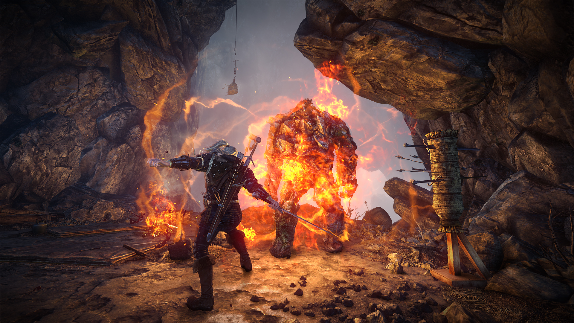
the witcher 2Summary Man said:Wow, this looks amazing. What game is it?
Speevy said:Nintendo uses even the best of its own technology economically.
I seriously doubt they're going to create a Zelda that looks like Uncharted 2. Let's be realistic.
Making a good looking game doesn't necessarily break the bank. I'm sure Ueda is finding a way to keep the costs for Last Guardian very manageable and working with a small team. That game looks amazing so far. Witcher 2 is also comparitively low budget to the big blockbusters.
Holy Order Sol
Member
If a Zelda game could look like the artwork for Zelda SS that would be great.
Really?Summary Man said:Wow, this looks amazing. What game is it?
That is probably the worst and most blurry screenshot released of Witcher 2 and that impresses you?
I never cease to be amazed at the kind of screenshots that get a positive reaction from GAF.
Meanwhile, Risen and Two Worlds II are already out with fantastic fantasy visuals and get ignored.
Raging Spaniard
If they are Dutch, upright and breathing they are more racist than your favorite player
DennisK4 said:Really?
That is probably the worst and most blurry screenshot released of Witcher 2 and that impresses you?
I never cease to be amazed at the kind of screenshots that get a positive reaction from GAF.
Meanwhile, Risen and Two Worlds II are already out with fantastic fantasy visuals and get ignored.
Theres more to a screenshot than blurryness. The composition is great, the MOOD is awesome, the architecture is nice and it gives a great sense of scale. Its getting praised for that, not by it being sharp or not.
eXistor
Member
Zelda needs to be colorful. I agree that if they go the Wind Waker route again that it should be a seamless world, not one loading screen or transition in there. I do hope they won't make the world too big though, that usually translates to vast, empty plains.
A more gritty, realistic Zelda can definitely work, but it's low on my list to be honest. I want my Nintendo games to me a happy feeling, not angsty. There are a shit-ton of other games that go that way already, let Zelda do its own thing.
A more gritty, realistic Zelda can definitely work, but it's low on my list to be honest. I want my Nintendo games to me a happy feeling, not angsty. There are a shit-ton of other games that go that way already, let Zelda do its own thing.
None of the things you mention are true of that particular shot though. Its a bad screenshot.Raging Spaniard said:Theres more to a screenshot than blurryness. The composition is great, the MOOD is awesome, the architecture is nice and it gives a great sense of scale. Its getting praised for that, not by it being sharp or not.
This here is good one from Witcher 2
TheBanditKing
Member
My vote for HD Zelda is Skyward Sword style visuals with HD textures and lighting. Yeah its a little on the tame/lame side but for me Link belongs in a highly colorful world like Wind Waker and Skyward, heck Link to the past if you want to go old school. Zelda would just not look right all "next-gen" and devoid of color, so what ever they do I want some color to it. I think the visuals should stay closer to the space world demo and less like games like CastleVania LOS, its not that Castlevania is not a beautiful game (because it is) but I just don't think I would like that kind of design for a Zelda game, heck Twilight Princess was a little to dark and melancholy for my tastes.
Raging Spaniard
If they are Dutch, upright and breathing they are more racist than your favorite player
DennisK4 said:None of the things you mention are true of that particular shot though. Its a bad screenshot.
This here is good one from Witcher 2
Im familiar with the game and that other shot is pretty nice too. How are any of the things I said untrue? How could you look at that shot and say it doesnt give a sense of scale? or convey mood?
TheBanditKing said:My vote for HD Zelda is Skyward Sword style visuals with HD textures and lighting. Yeah its a little on the tame/lame side but for me Link belongs in a highly colorful world like Wind Waker and Skyward, heck Link to the past if you want to go old school. Zelda would just not look right all "next-gen" and devoid of color, so what ever they do I want some color to it.
None of the pictures I posted were devoid of color. Actually if you look at Twilight Princess, it's probably not very cute or cartoony compared to most PS2/Gamecube fantasy games. I think people are confusing certain themes with certain art styles. Oil painting look doesn't mean Zelda will become God of War 3.
No, I don't want Zelda to look like the Witcher 2. That is in reference to a mini-debate on screenshot quality.A.KU.MU said:If you want Zelda to become just another generic adventure game... *sigh*
Sorry to have confused you.
DennisK4 said:None of the things you mention are true of that particular shot though. Its a bad screenshot.
This here is good one from Witcher 2
That screenshot amazes me every time I see it. I really, really need to get a new PC before I buy that game.
DennisK4 said:No, I don't want Zelda to look like the Witcher 2. That is in reference to a mini-debate on screenshot quality.
Sorry to have confused you.
What do u want Zelda to look like?
1080p Wind Waker is my knee-jerk reaction to your question.apana said:What do u want Zelda to look like?
Dascu said:Random thought: I've always liked snowy landscapes, blizzards, mountains, etc. I hope there's a nice snowy area in the next Zelda. Heck, I'd love an entire game set in such an environment.
I want the next Zelda to have chaging weather patterns. One day Hyrule could be covered with snow, and the next day it melts and fills up dry river beds. I've always liked the idea of a world that is alive.
AbsoluteZero
Banned
So who's gonna start up the "HD Mario" thread?
I am willing to bet that the first generation of games will pretty much look like this on the new Wiisajj316 said:Twilight Princess + high res pack. If Nintendo is going for the "realistic" look.

AbsoluteZero said:So who's gonna start up the "HD Mario" thread?
I think Mario will look like he always has, just with extra HD power.
Medalion said:I am willing to bet that the first generation of games will pretty much look like this on the new Wii
I'd prefer it didn't. If I had to rank my favorite ideas right now it would be
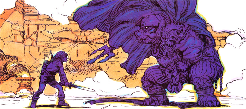
David and Goliath Image 2
Last Guardian
David and Goliath Image 1 (except cartoony Link and without head pulling)
Anticitizen One
Banned
Every Zelda game other than wind waker graphically looks like shit to me. So I'm excited at the prospect of a Zelda game with good graphics.
Raging Spaniard said:Theres more to a screenshot than blurryness. The composition is great, the MOOD is awesome, the architecture is nice and it gives a great sense of scale. Its getting praised for that, not by it being sharp or not.
Yup. The second shot Dennis posted looks nowhere near as impressive to me as that first one. (I also find Two Worlds II to be pretty bland visually and Risen merely ok, so I guess Dennis' eyes and mine just do not align.)
AbsoluteZero
Banned
apana said:I think Mario will look like he always has, just with extra HD power.
So why wouldn't Zelda be the same?
traveler said:Yup. The second shot Dennis posted looks nowhere near as impressive to me as that first one. (I also find Two Worlds II to be pretty bland visually and Risen merely ok, so I guess Dennis' eyes and mine just do not align.)
I agree, I really liked the first one.
Baroque is a really cool art style but I don't know how well that would translate to video games and Zelda especially. Baroque uses heavy contrast of light and dark that might be hard to translate in a dynamic environment. I guess they could do something similar to fog of war.
Also Baroque is distinctly dark and serious. How will the lighter moments of Zelda be taken lightly when the lighting that sets up the mood is dark and mysterious?
Also Baroque is distinctly dark and serious. How will the lighter moments of Zelda be taken lightly when the lighting that sets up the mood is dark and mysterious?
AbsoluteZero said:So why wouldn't Zelda be the same?
Zelda team does a lot of experimentation with art styles and it is a fantasy game so there are a lot of different options they could choose from. They won't play around with Mario too much for fear of backlash, and trust me the backlash would be of unbelievable if the art style for the next Mario game was quirky.
Medalion said:I am willing to bet that the first generation of games will pretty much look like this on the new Wii
This might breach too real for Nintendo. I am genuinely hoping that Nintendo shifts a bit toward realism but I can certainly understand where others are coming from with retaining the kid friendly appearance. To this day, Wind Waker is still stunning artistically.
Medalion said:Nintendo are not known for pushing the limits of their systems, so their first batch games will look like Wii games just in higher res and better textures
How did Wind Waker not push the gamecube? Nintendo absolutely push the limits of their own system. It's just that once they do they will re use the work that they have put in:
Ocarina--->Majora
Wind Waker---->Twilight Princess
Mario Galaxy 1---->Mario Galaxy 2
Vinci said:Every page in a "HD Zelda" thread has a pic from a realistic, gritty video game not titled Zelda... why?
Cause people have their own opinions and even Nintendo looks to western fantasy art for inspiration.
apana said:Zelda team does a lot of experimentation with art styles and it is a fantasy game so there are a lot of different options they could choose from. They won't play around with Mario too much for fear of backlash, and trust me the backlash would be of unbelievable if the art style for the next Mario game was quirky.
I think there is room for improvement with Mario with the extra polygons. Consider the evolution of Mario ...

Oh .. found the evolution of Link, up to I think TP.

apana said:Cause people have their own opinions and even Nintendo looks to western fantasy art for inspiration.
Because people seem unaware of what target audience Zelda is created for?
sajj316 said:I think there is room for improvement with Mario with the extra polygons. Consider the evolution of Mario ...
Yeah but no one was really surprised when they saw the look of Sunshine/Galaxy as compared to Mario 64. I do agree there is major room for improvement still, but it will be an evolution.
If Nintendo wants to return to the original non-linear progression of pre-AlttP Zelda I again hope they use this art style.

I'll always post this image until Nintendo does it damn it! Giving it a soundtrack that feels like the world is grand and keep the old-timey anime style will make me so happy.
I'll always post this image until Nintendo does it damn it! Giving it a soundtrack that feels like the world is grand and keep the old-timey anime style will make me so happy.
Pink hair in aitch-dee. Make it so, Nintendo!sajj316 said:
Vinci said:Because people seem unaware of what target audience Zelda is created for?
Zelda will mostly be judged by it's content. As long as Link isn't chopping heads off and swearing, people will accept a lot of different looks for the character.
Raging Spaniard
If they are Dutch, upright and breathing they are more racist than your favorite player
Actually you know what, gimme something that ressembles this in any sort of fashion and I'll buy ten copies


you are horrible. You havent even played the game if you truly think these.JoeFenix said:Darksiders was absolutely horrible, people comparing it to Zelda always make me laugh.
Bad artstyle, bad tech, janky mechanics and completely boring level design. They get points for trying but they didn't even come close to getting it right.
NeonZ
Member
sajj316 said:I think there is room for improvement with Mario with the extra polygons. Consider the evolution of Mario ...
The last Mario is from Smash Bros though. The actual Mario games don't use that design and stay with the blue clothes, rather than denim overalls.
Always-honest
Banned
thank god.NeonZ said:The last Mario is from Smash Bros though. The actual Mario games don't use that design and stay with the blue clothes, rather than denim overalls.