-
Hey, guest user. Hope you're enjoying NeoGAF! Have you considered registering for an account? Come join us and add your take to the daily discourse.
You are using an out of date browser. It may not display this or other websites correctly.
You should upgrade or use an alternative browser.
You should upgrade or use an alternative browser.
Link's pink hair
- Thread starter lazygecko
- Start date

PixyJunket
Member
I *might* still have the collection of Pink Hair Link avatars I and others made a few years ago somewhere on my home PC.
sixteen-bit
Member
i saw a wind waker mod with pink hair once
TheMoon
Member
Yeah, it's weird. Would be nice if someone asked Miyamoto or Aonuma about it.
Aonuma had nothing to do with ALTTP. Didn't touch Zelda until OoT.


Simbabbad
Member
To me the yellow version looks like he has a crown or metal band around the head. The pink looks better IMO.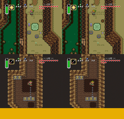
did one myself. below the screens is the color I used for the hair. very poor contrast.
spazchicken
Member


The only thing you can salvage into a 16-bit game from Amano's mess is that the character has a ponytail.
Tawney Bomb
Member
I never once noticed the pink hair as a kid, didn't realize it until someone on here brought it up years ago. I still don't notice it when I replay it. I'd be down for more pink hair though.
Hispanic! At the Disco
Member
Main characters usually had weird color hair to make sure the main character was immediately recognizable and stood out in a group of enemies or npcs.
Besides, blonde hair would look strange when he has his blue tunic and yellow hat on.
Besides, blonde hair would look strange when he has his blue tunic and yellow hat on.
When I was little I always assumed it was the lip of his cap or something. I knew he wouldn't have pink hair because the drawing of him in the manual didn't have any pink hair.
I don't think I actually even really thought about it until I went online much later in life and people were talking about it.
I don't think I actually even really thought about it until I went online much later in life and people were talking about it.
I think it was a deliberate decision, possibly made for colour palette, and contrast reasons.
I remember an interview with Super Play magazine I believe, with Shigeru Miyamoto about A Link to the Past, and he showed a little model of Link they made for the sprite designers to study at different angles...

Thats cool
Salty Rice
Member
Link has always the same hair color but the Zelda universe has the same problem like the Jojo universe were colors get swapped all the time.
Links iconic green tunic is in reality pink.
Links iconic green tunic is in reality pink.
IceDoesntHelp
Banned
You have an issue with Pink hair?
Fight me.
Fight me.
Prototype Viktor
Member
His hair is pink because if it was blue there would be nothing for Zelda to do
I think it was a deliberate decision, possibly made for colour palette, and contrast reasons.
I remember an interview with Super Play magazine I believe, with Shigeru Miyamoto about A Link to the Past, and he showed a little model of Link they made for the sprite designers to study at different angles...
I want this Amiibo.
Messofanego
Banned
Stop pinkshaming
Valjean Lafitte
Banned
They're gloves.Yeah, it's weird. Would be nice if someone asked Miyamoto or Aonuma about it.
So Yoshi's arms are supposed to be orange?
Sparrowhawk
Member
I've always kind of dismissed it and it's never bothered me. In fact, I kind of like it.
Pyrrhus
Member
Keep in mind though that his is not the way sprites looked on people's 19 inch CRT tv's over RF signal in 1992.
Precisely. It didn't look pink on early '90s TVs over RF. The colors blended over that fuzzy signal to look more like the reddish brown hair Link had back then in the concept art. Blonde Link didn't show up until Ocarina of Time.
Poltergust
Member
It's funny that Toon Link's LttP costume in Smash 4 has the hair color the artwork but an otherwise similar color palette to Link's in-game sprite.
Earthpainting
Member
This was not uncommon in the old days. Displays and connections were of a poor, unreliable quality, making it sometimes hard to "read" a sprite. Colours and shapes could easily get distorted. Just take a look at how much colours could bleed over on Quickman's boomerang for instance, even penetrating solid black lines that were multiple pixels thick.

Using high contrast colours in small sprites makes it easier block off segments of a sprite, and thus easier to interpret. Pink was a nice shade since it is practically on the opposite side of the colour wheel of the green, and stands out enough from the light orange-brown skin tone, The pink was already part of the water splashing and bunny sprites as well, which share Link's palette. Most important of all, the pink also helps Link's head pop on the screen, which is a nice bonus for an action game.
Translating concept art into functional designs for sprites was a pretty key element for artists back in the day. I even recall that this used to be one of Tetsuya Nomura's duties back in his early days. Yoshitaka Amano's art was highly unusable in the state he delivered it, so someone had to be tasked to make his ideas practical and distinct. This usually involves drastic palette changes, minimalising design elements, and accenting other parts. It's how you end up with a green-haired Terra for instance.
To bring it back to Nintendo, Mario underwent several of such palette redesigns too. Mario's blue-on-red palette was decided upon because it provided the most contrast with the black background of the original Donkey Kong game. When it became time to make Super Mario Bros 1 however, they noticed that this may not have been ideal for coloured backdrops, and it would be hard to recycle that palette for other assets due to how much those colours pop. Mario's shirt became brown, and his overalls turned red. His in-game design changed back once more when they were working on Super Mario Bros 2 (USA), by changing the black outlines to dark blue ones. The artwork for SMB2 USA would still be using the inverted colours however, and this wouldn't be fixed until SMB3, which changed Mario's overalls back into black for the in-game sprite.
These changes may seem a little bit silly in 2016, but they had a big impact on the playability of these games back when they were released.
Android18a
Member
I'm fairly sure it's because of colour bleed, and the tv tech at the time. It just makes the hair more distinct on the sprite.
JinjoUnchained
Member
I think it's just supposed to make the sprite standout a little more.
Keep in mind though that his is not the way sprites looked on people's 19 inch CRT tv's over RF signal in 1992.
Agreed. You need a color further away on the spectrum to contrast with the green/brown/yellow. Red would clash TOO much, but pink seems to be the right offset. All of these mocked-up alternate sprites with lighter hair don't give the sprite enough definition.
I never played a Legend of Zelda game so I figured I'd start with Link to the Past. I was legitimately confused the first 30 minutes of playing: "Why does he have pink hair? Who thought this was okay"?
Were you really? Seriously?
This is what Link looks like in the Link to the Past romhack The Legend of Zelda: Parallel Worlds.
![34381-Legend_of_Zelda,_The_-_A_Link_to_the_Past_(USA)_[Hack_by_Euclid+SePH_v1.0]_(~Legend_of_Zelda,_The_-_Parallel_Worlds)-4.jpg](http://199.101.98.242/media/images/34381-Legend_of_Zelda,_The_-_A_Link_to_the_Past_(USA)_[Hack_by_Euclid+SePH_v1.0]_(~Legend_of_Zelda,_The_-_Parallel_Worlds)-4.jpg)
![34381-Legend_of_Zelda,_The_-_A_Link_to_the_Past_(USA)_[Hack_by_Euclid+SePH_v1.0]_(~Legend_of_Zelda,_The_-_Parallel_Worlds)-3.jpg](http://199.101.98.242/media/images/34381-Legend_of_Zelda,_The_-_A_Link_to_the_Past_(USA)_[Hack_by_Euclid+SePH_v1.0]_(~Legend_of_Zelda,_The_-_Parallel_Worlds)-3.jpg)
![34381-Legend_of_Zelda,_The_-_A_Link_to_the_Past_(USA)_[Hack_by_Euclid+SePH_v1.0]_(~Legend_of_Zelda,_The_-_Parallel_Worlds)-6.jpg](http://199.101.98.242/media/images/34381-Legend_of_Zelda,_The_-_A_Link_to_the_Past_(USA)_[Hack_by_Euclid+SePH_v1.0]_(~Legend_of_Zelda,_The_-_Parallel_Worlds)-6.jpg)
![34381-Legend_of_Zelda,_The_-_A_Link_to_the_Past_(USA)_[Hack_by_Euclid+SePH_v1.0]_(~Legend_of_Zelda,_The_-_Parallel_Worlds)-7.jpg](http://199.101.98.242/media/images/34381-Legend_of_Zelda,_The_-_A_Link_to_the_Past_(USA)_[Hack_by_Euclid+SePH_v1.0]_(~Legend_of_Zelda,_The_-_Parallel_Worlds)-7.jpg)
Looks like bananas.
Link Masters.
