-
Hey, guest user. Hope you're enjoying NeoGAF! Have you considered registering for an account? Come join us and add your take to the daily discourse.
You are using an out of date browser. It may not display this or other websites correctly.
You should upgrade or use an alternative browser.
You should upgrade or use an alternative browser.
My Little Pony FiM Community [OT3] Surely You Saw This Coming
- Thread starter Rhomega Beta
- Start date
Best ponies get best writer and artist? Day one.
Andy probably fought to get the chance to do this one, as AJ is his pony, and Rarity is his wife's.
Rhomega Beta
Member

Rhomega Beta
Member
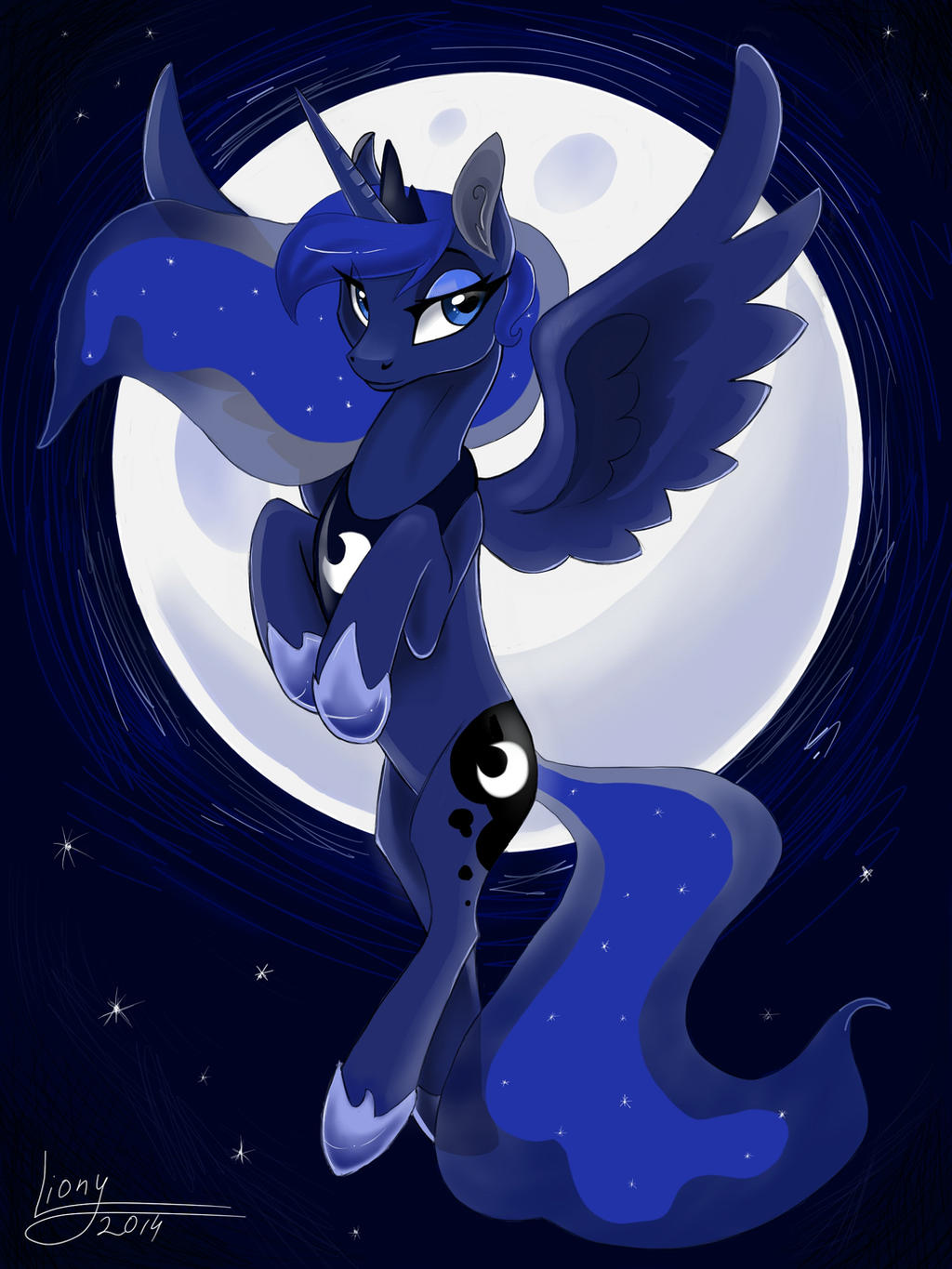
Thanks to Myke for my birthday present...even if my birthday was in February. We never figured out what we wanted to do at first, but now he drew this:

Myke Greywolf
Ambassador of Goodwill
Kudos to the individual who is first able to tell where I made a blatant mistake in that picture.
DrForester
Kills Photobucket
No ripple effect on the falling star, as such it's about to obliterate Luna?
Myke Greywolf
Ambassador of Goodwill
That was indeed a mistake, but not the one I am referring to.No ripple effect on the falling star, as such it's about to obliterate Luna?
That's a perspective thing.Blue-Ace not having a reflection? Or is that a perspective thing?
")
Kudos to the individual who is first able to tell where I made a blatant mistake in that picture.
Do you want me to be nice or do you want an actual critique?
Myke Greywolf
Ambassador of Goodwill
I just realised noone has ponified this. Pretty shocking.
Aiight.
I ussually don't comment on the colored horse pictures, but I really like doing space art so Imma say some stuf

So First off obviously the moon and space stuff are at an age that is visually confusing with the water effects you are trying to have going one. But whats is also possibly at a weird angle is the ripples in the water, if they are ripples. The ripples are at an angle and ar a color that make me think that they are clouds being illuminated by the moon, and at that angle it looks like the boat is kind of sitting in jello. That fish dying a stationary death.
Next the space part, so I see you tried to portray a very large collection of stars and tried to erase the middle to give a milky way kinda feel I think a more smaller condenced sett of stars fading into the night sky instead of that bulk works a lot better. It kinda just looks like spray paint, especially with obvious Photoshop eraser brushing in the middle. Try a low opacity soft spray paint eraser brush in this situation , it works wonders. Also just a suggestion, throw some colors in there besides blue for space, throw a little green or some red mixed in there, photoshop has gradients that fade into nothing, neat ways to add colors into space using that and lowering opacity layers.
The coloring on the pone's and the background lilipads and flowers and stuff is a bit different , but i actually really like what you did with the lilly pad stuff. Its one of my favorite parts of the picture, even though the angling on some of the lili pads look like they exist at another angle so they look upside down.
The picture is cute and I enjoy it and it some ways its artistically invigorating it makes me wanna draw even though I just did , and its actually edging me closer to actually drawing a colored horse. Closer anyways.
Feel free to brush all this off as a weird guy talking about your art on the web, these are just my opinions and are by no means to be taken as Gospel
I ussually don't comment on the colored horse pictures, but I really like doing space art so Imma say some stuf
So First off obviously the moon and space stuff are at an age that is visually confusing with the water effects you are trying to have going one. But whats is also possibly at a weird angle is the ripples in the water, if they are ripples. The ripples are at an angle and ar a color that make me think that they are clouds being illuminated by the moon, and at that angle it looks like the boat is kind of sitting in jello. That fish dying a stationary death.
Next the space part, so I see you tried to portray a very large collection of stars and tried to erase the middle to give a milky way kinda feel I think a more smaller condenced sett of stars fading into the night sky instead of that bulk works a lot better. It kinda just looks like spray paint, especially with obvious Photoshop eraser brushing in the middle. Try a low opacity soft spray paint eraser brush in this situation , it works wonders. Also just a suggestion, throw some colors in there besides blue for space, throw a little green or some red mixed in there, photoshop has gradients that fade into nothing, neat ways to add colors into space using that and lowering opacity layers.
The coloring on the pone's and the background lilipads and flowers and stuff is a bit different , but i actually really like what you did with the lilly pad stuff. Its one of my favorite parts of the picture, even though the angling on some of the lili pads look like they exist at another angle so they look upside down.
The picture is cute and I enjoy it and it some ways its artistically invigorating it makes me wanna draw even though I just did , and its actually edging me closer to actually drawing a colored horse. Closer anyways.
Feel free to brush all this off as a weird guy talking about your art on the web, these are just my opinions and are by no means to be taken as Gospel
Kudos to the individual who is first able to tell where I made a blatant mistake in that picture.
The angle of the viewer compared to the reflection of the moon and shooting star on the water's surface does not match up with where Luna and Blue Ace appear to be looking.
But that's not a mistake, because they're obviously looking at something else. They're looking at another shooting star, and this one is significantly larger than the one seen in the reflected water, because the shooting star reflected in their eyes is much beefier than the one reflected in the water (eye-reflections are tiny compared to water reflections).
Oh my gosh! Yay.
My Little Top Gear - Friendship is Ambitious but Rubbish
Why does this mashup work so well?
But wait, there's more! Top Gear actually commented on the video!
And on that bombshell, it's time to end this post. Good night!
My Little Top Gear - Friendship is Ambitious but Rubbish
Why does this mashup work so well?
But wait, there's more! Top Gear actually commented on the video!
Top Gear said:Someones been interfering with ponies. Luckily, theyre not real ones this is a worryingly well-executed video mashup of the My Little Pony cartoon and Top Gear. It is deeply, deeply odd.
Jeremys morphed into Rarity, Hammonds Fluttershy, James is
Pinkie Pie and the Stigs Twilight Sparkle. Which, coincidentally, is what they call each other in the office.
Click on to watch The Mane 6 wearing a hat, Photo Finish doing something else and Twilight Sparkle listening to the Bee Gees. You will be troubled. You have been warned.
And on that bombshell, it's time to end this post. Good night!
Myke Greywolf
Ambassador of Goodwill
Good try, but that's not it.The angle of the viewer compared to the reflection of the moon and shooting star on the water's surface does not match up with where Luna and Blue Ace appear to be looking.
But that's not a mistake, because they're obviously looking at something else. They're looking at another shooting star, and this one is significantly larger than the one seen in the reflected water, because the shooting star reflected in their eyes is much beefier than the one reflected in the water (eye-reflections are tiny compared to water reflections).
Actually, you guys have it easy now, since Village used the corrected version in his post. It's just a matter of finding the difference between that one and the one that Rhomega posted.
Ah, right. You had the stars reflected on top of the boat reflection. Didn't notice that until there was a comparison available.Good try, but that's not it.
Actually, you guys have it easy now, since Village used the corrected version in his post. It's just a matter of finding the difference between that one and the one that Rhomega posted.
So dA does versioning? That's kind of neat, think I ran into that with one of mine, too.
Owlowiscious
Member
Well the Scootaloo in the front has a horn for some reason.Kudos to the individual who is first able to tell where I made a blatant mistake in that picture.
Omg I'm so adorableeeeeeeeeeeeee

Rhomega Beta
Member
Rainbow Dash's father now has a name. Image from season 5?
Possibly.
Myke Greywolf
Ambassador of Goodwill
Kudos for you, detective.Ah, right. You had the stars reflected on top of the boat reflection. Didn't notice that until there was a comparison available.
So dA does versioning? That's kind of neat, think I ran into that with one of mine, too.
S3 Rankings
The Crystal Empire - Part 2: (5*0+4*2+3*2+2*0+1*0)/4 - 3.50
The Crystal Empire - Part 1: (5*0+4*2+3*1+2*1+1*0)/4 - 3.25
S1 and S2
Where did these figures come from? Are they new?
Rhomega Beta
Member
Where did these figures come from? Are they new?
Yes, just today, actually.
Yes, just today, actually.
Wait, are we doing a re-watch?
Slamtastic
Member
look at those stockings on celestia
what a whore
DrForester
Kills Photobucket
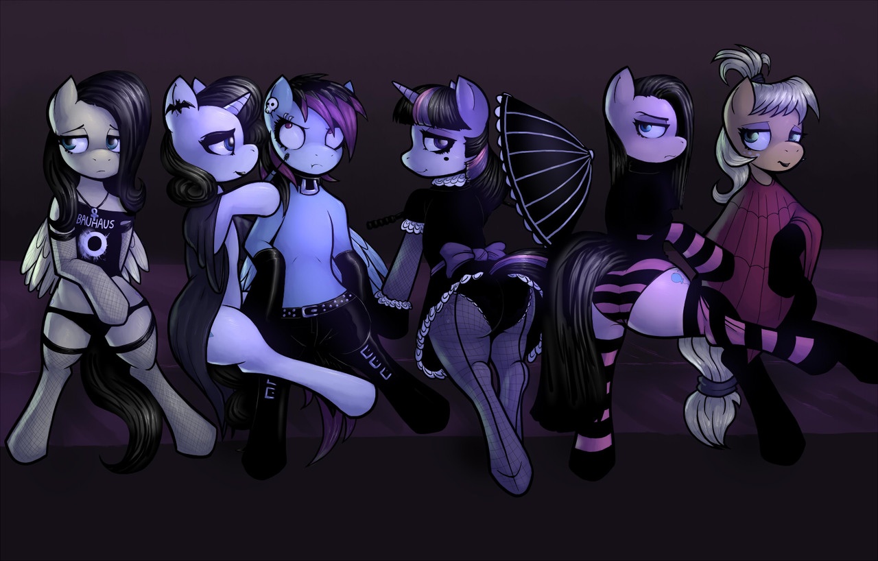
Why do an goth pony set, when they could have done an evil twin set based on the comics...
Not to mention they all look hideous. And how does Celestia get a figure in the goth pony set instead of the Princess of the Night?
Not to mention they all look hideous. And how does Celestia get a figure in the goth pony set instead of the Princess of the Night?
look at those stockings on celestia
what a whore
It's so weird that this exists. I guess it isn't a world away from Burlesque Pinkie, but that at least had some in-story justification. This on its own is just... weird.
look at those stockings on celestia
what a whore
All that fan art is canon now.
Slamtastic
Member
How About No
Member
Why god
And yay Belle Eve is still a thing!
And yay Belle Eve is still a thing!
DrForester
Kills Photobucket
Everyone knows Celestia is too good for Goth. She was into rock!

The only thing there that isn't crap is the AJ Beetlejuice reference.
crap]
The only thing there that isn't crap is the AJ Beetlejuice reference.
DeadPhoenix
Member
Damn it... I actually like it. I could do without the poses though.
(omg my first post in the new topic. now to wait another 3-6 months for my next one,,,)
(omg my first post in the new topic. now to wait another 3-6 months for my next one,,,)
Rhomega Beta
Member
look at those stockings on celestia
what a whore
We've had 4 seasons, and they're still using that prototype design for Celestia for the boxart...
look at those stockings on celestia
what a whore
Everyone knows Celestia is too good for Goth. She was into rock!
The only thing there that isn't crap is the AJ Beetlejuice reference.


DrForester
Kills Photobucket
Wait, are we doing a re-watch?
do you even irc mate
do you even irc mate
Not often enough, apparently
EDIT: Myke just got a personal call-out over on EQD!
Slamtastic
Member
DrForester
Kills Photobucket


Yo I think gaf blocked deviant art or something.
Yep it is. I'd make a topic but I'm afraid I'd get banned for it.
Myke Greywolf
Ambassador of Goodwill
That makes me quite sad.Yo I think gaf blocked deviant art or something.
That makes me quite happy!
Technically neat, but I really don't like the kind of art that reduces the characters like that. They're not housecats.