-
Hey, guest user. Hope you're enjoying NeoGAF! Have you considered registering for an account? Come join us and add your take to the daily discourse.
You are using an out of date browser. It may not display this or other websites correctly.
You should upgrade or use an alternative browser.
You should upgrade or use an alternative browser.
New FFXV screenshots from 4Gamer
- Thread starter Balls
- Start date


KZXcellent
Member
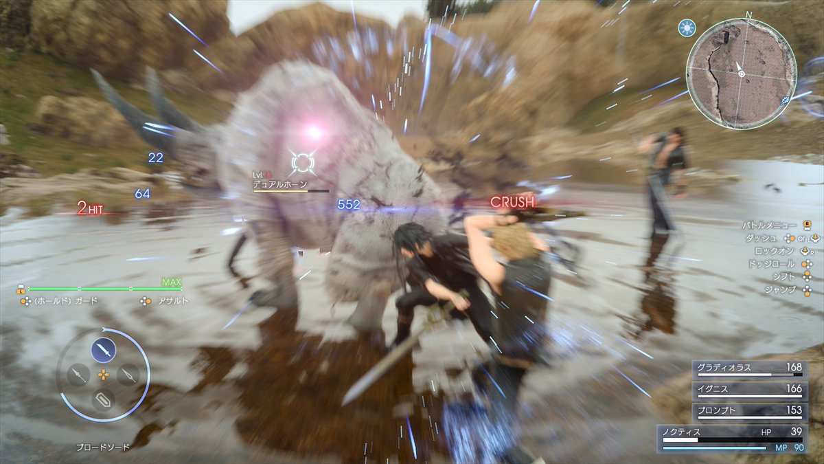
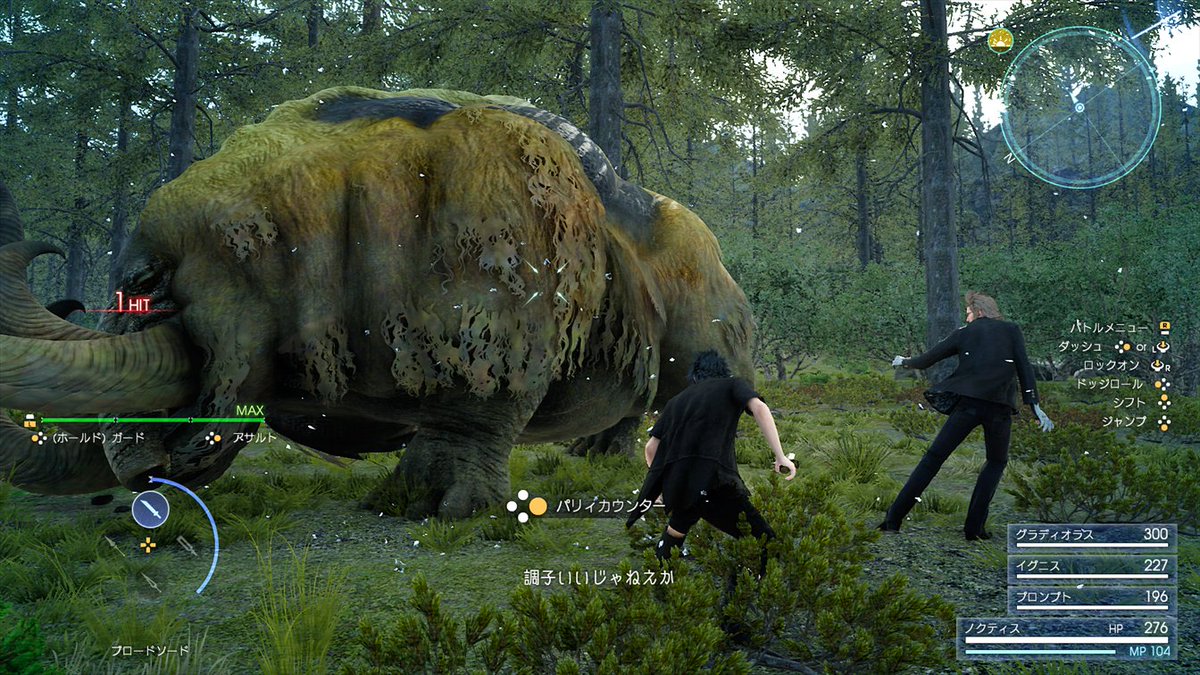
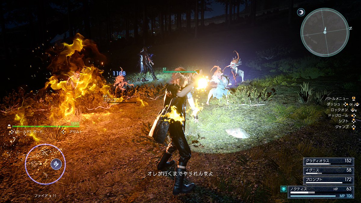
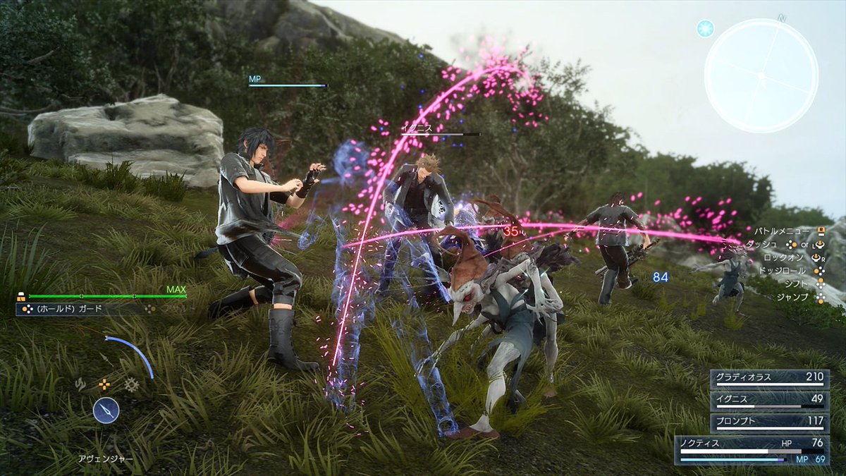
Love the attacks from the imps. Nice vibrant color to it.
Blackleg-sanji1
Banned
Man September can't come soon enough!
Man September can't come soon enough!
Same, can't wait to play it!
MrChocolate
Member
So, PC version confirmed? Unless it was previously confirmed....
The R ist just right thumbstick.I can't see Sony button icons (generic "R" button suggests PC build) so these probably don't represent how the game will look on consoles in September.
Maybe they just generalized Xbox and Sony buttons into one? It's stil refering to clear positions on a gamepad (which face button, which directional button, thumbsticks)
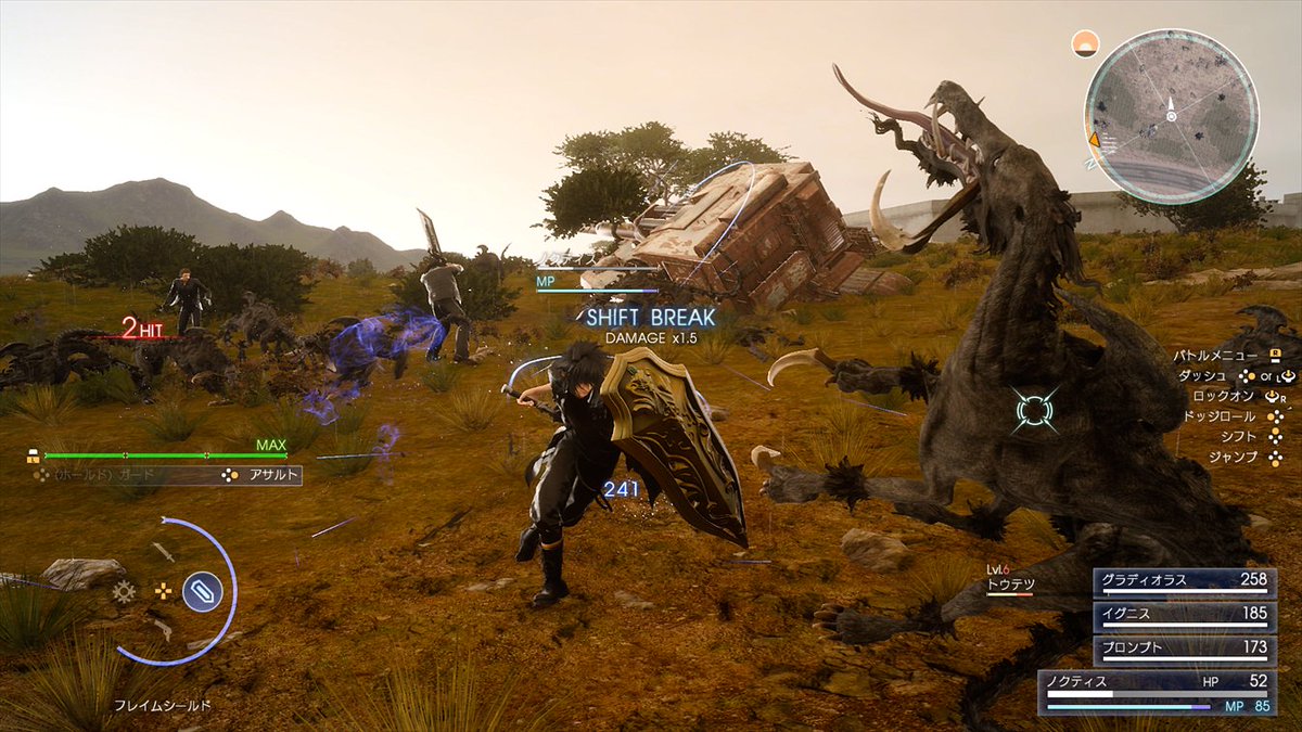
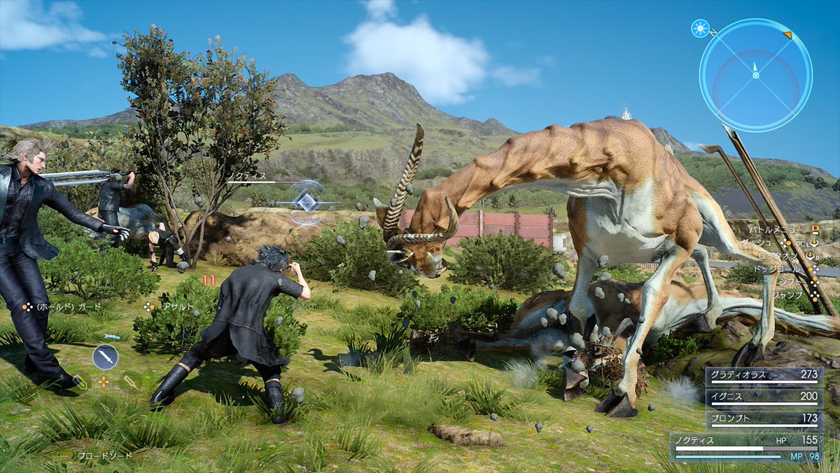
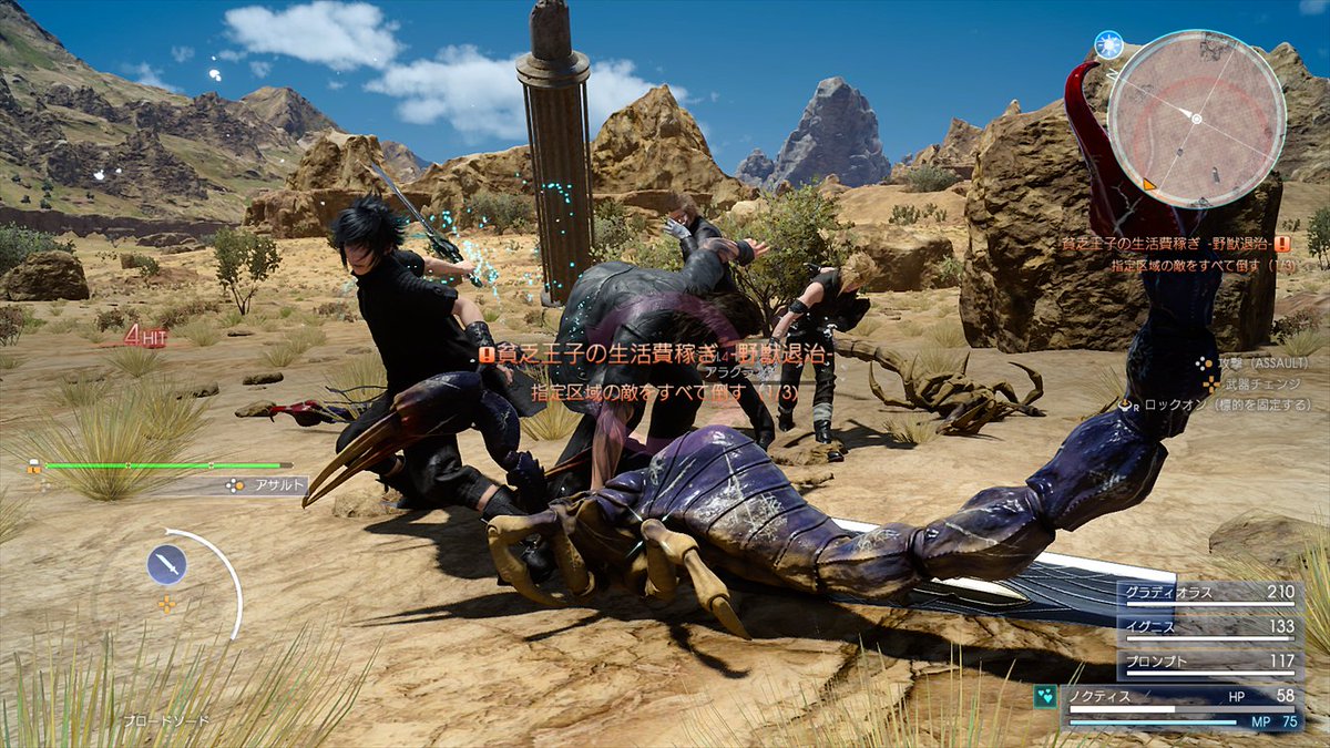
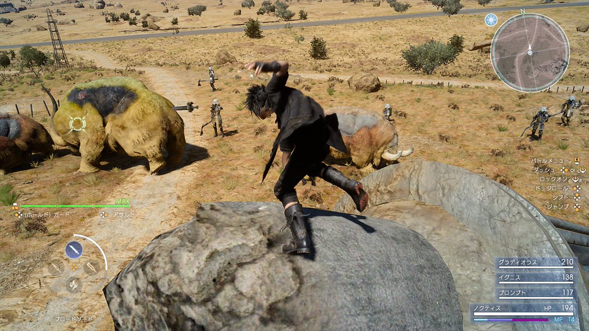
Is this game 90% killing animals?
Aren't all final fantasy's, to some extent?
DarkLordMalik
Member
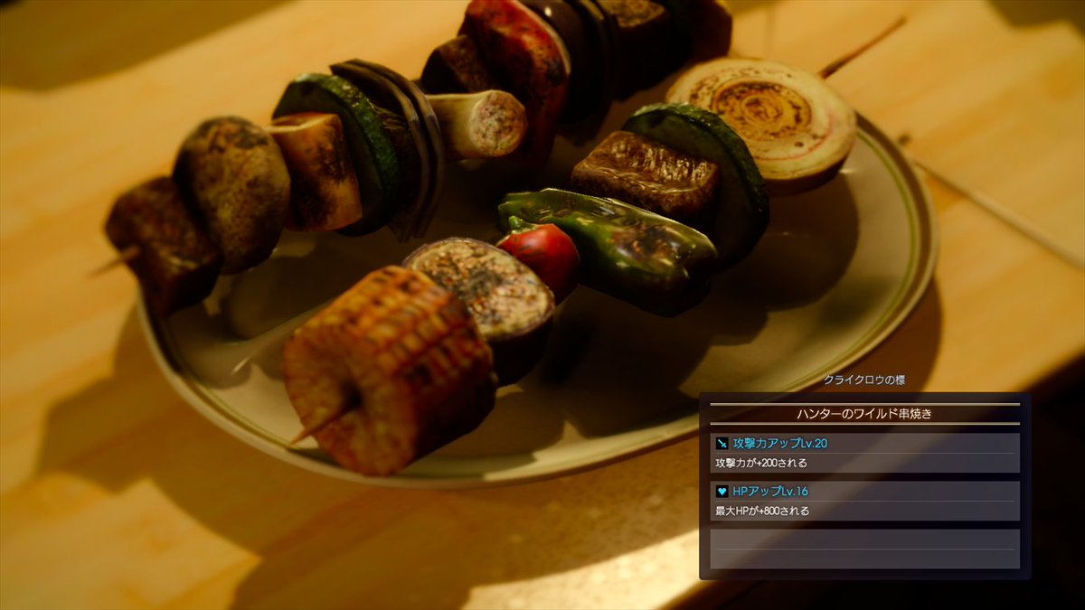
Looks delicious
ãInaba Residentã
Banned
Is this the first time Square has released "not garbage" screenshots for this game?
Anyway, these look great. can't wait to play
Anyway, these look great. can't wait to play
LordOcidax
Member
Some textures and geometry looks like a PS2 game... Other than that looks really good.
Moor-Angol
Banned
Is this game 90% killing animals?
it's called monster hunter...
wait, those pictures are not from a monster hunter game ???!?!?!?!
OnionPowder
Member
At least we know these probably aren't bullshots:

That being said the lighting system in this game is amazing.
That being said the lighting system in this game is amazing.
darthkarki
Member
The game itself looks pretty good in these shots. Hopefully they can do something about the aliasing and dithering we've seen before. The gameplay in the Platinum demo was pretty boring, but I'm still interested in seeing what the final game will be like.
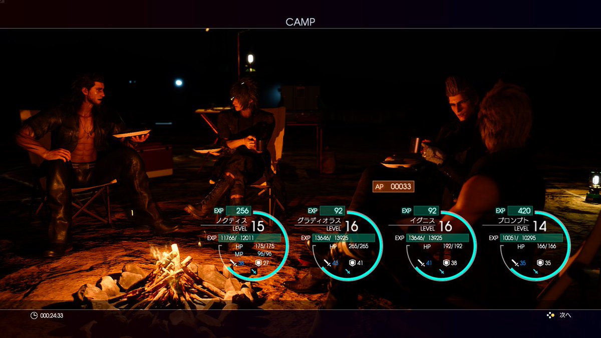
However, what I just cannot get past is the absolutely awful UI/menu design. It's just abysmal. There is just crap all over the screen, there's no way to focus on anything and take in all the information you need. Personally I think the aesthetic is just kind of terrible too, but it's the lack of functionality that really drags it down. I can't believe they're still stuck in the PS1 era with their terrible UI and menus. And those sounds the menus make. Ugh.
Hopefully the game is good enough I can look past that.
DarkLordMalik
Member
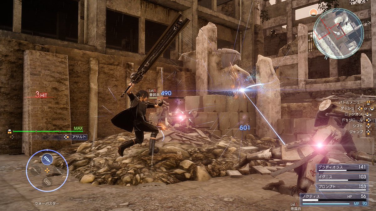
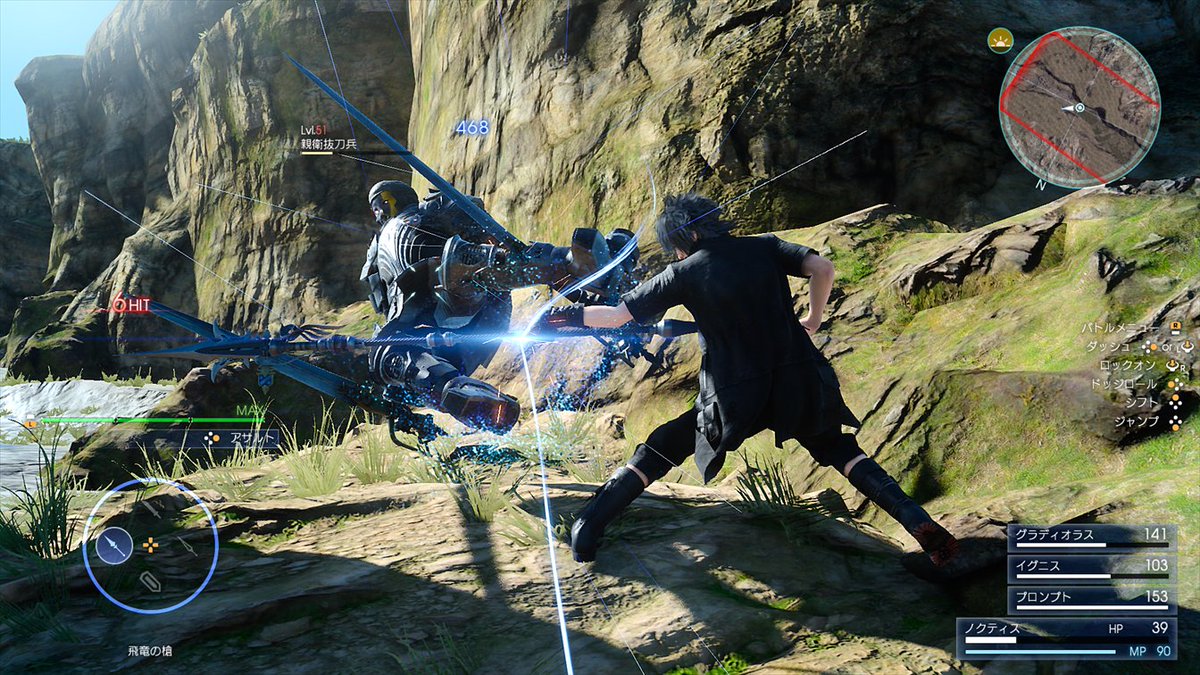
These screenshots are apparently from the first two hours judging from the enemy and locations here. Probably PS4 version.
『Inaba Resident』;208107145 said:Is this the first time Square has released "not garbage" screenshots for this game?
Anyway, these look great. can't wait to play
Yeah I think so lol. These are miles ahead from what we got the past year and a half haha.
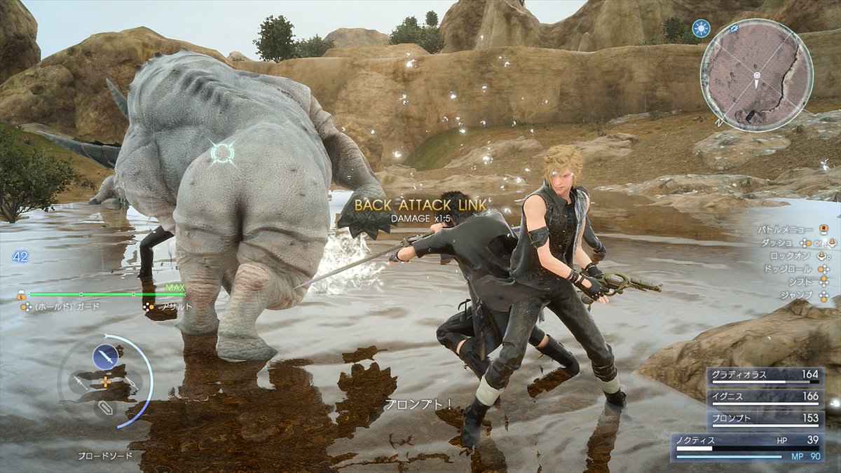
Thank goodness he's not shoving his arm into that rhyno's butt.
These screenshots are apparently from the first two hours judging from the enemy and locations here. Probably PS4 version.
Probably PC development build, actually. And they're from 4Gamer, not Famitsu.
ãInaba Residentã
Banned
Probably PC development build, actually. And they're from 4Gamer, not Famitsu.
Definitely PC. IQ is a dead give away
WickedLaharl
Member
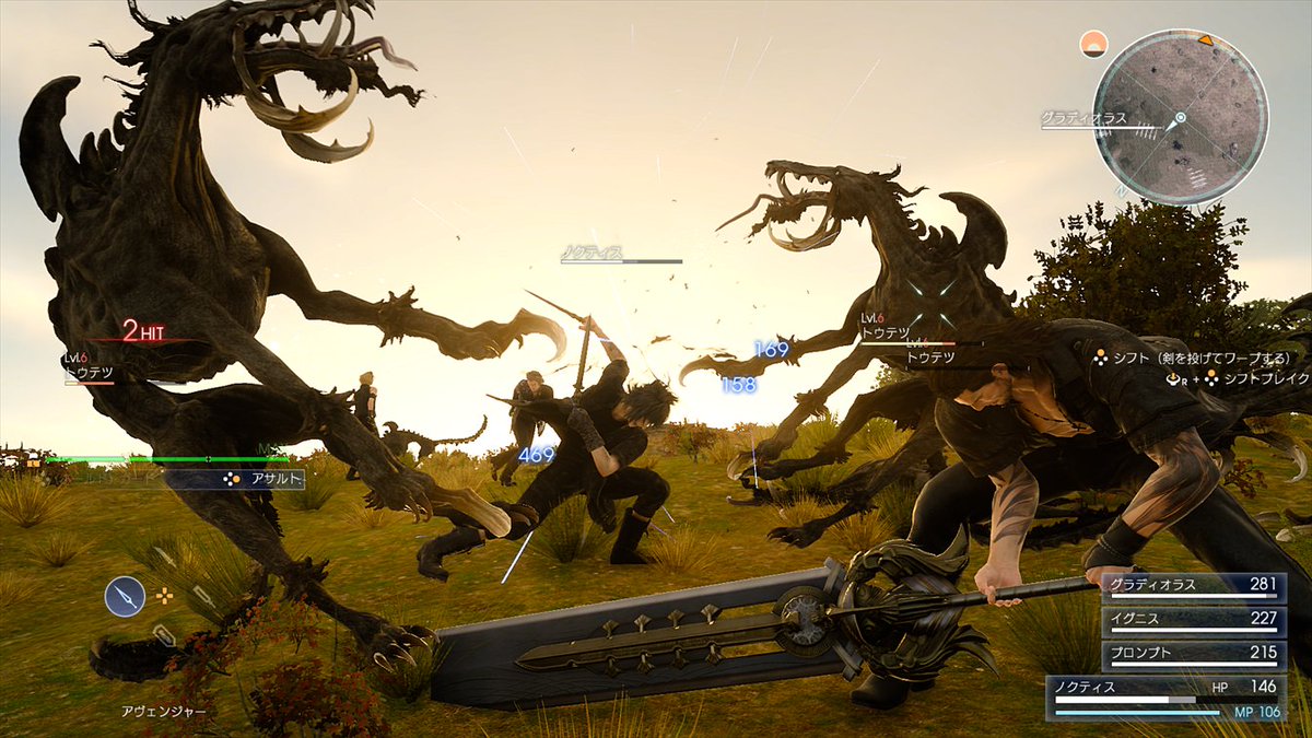
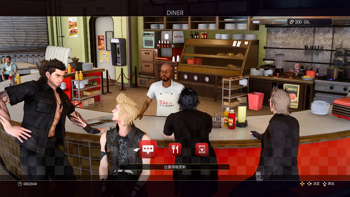
They need to stop taking pictures of these areas. shit is all the show and it's about time they release screenshots of more varied and exotic locations.
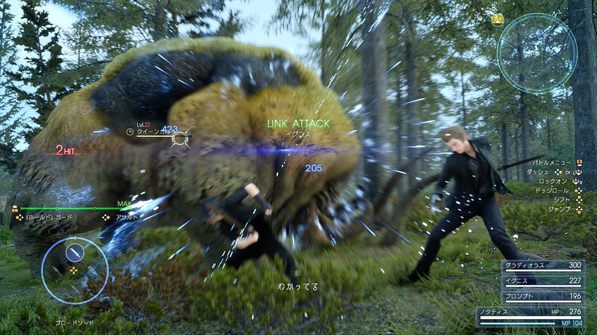
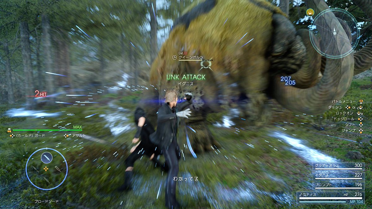
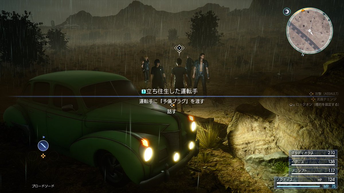
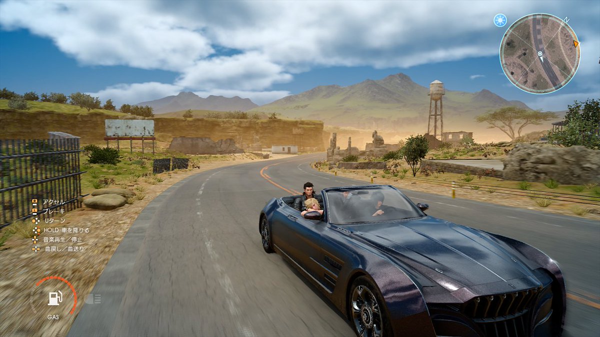
Desert area
Forest Area
yawn
Desert area
Forest Area
yawn
The game itself looks pretty good in these shots. Hopefully they can do something about the aliasing and dithering we've seen before. The gameplay in the Platinum demo was pretty boring, but I'm still interested in seeing what the final game will be like.
However, what I just cannot get past is the absolutely awful UI/menu design. It's just abysmal. There is just crap all over the screen, there's no way to focus on anything and take in all the information you need. Personally I think the aesthetic is just kind of terrible too, but it's the lack of functionality that really drags it down. I can't believe they're still stuck in the PS1 era with their terrible UI and menus. And those sounds the menus make. Ugh.
Hopefully the game is good enough I can look past that.
They're doing a revision of the UI again so hopefully it fixes the clutter. Besides Tabata said you can turn off the hud. Not sure if individually so if someone can correct that'd be great.
qualitydisc
Member
However, what I just cannot get past is the absolutely awful UI/menu design. It's just abysmal. There is just crap all over the screen, there's no way to focus on anything and take in all the information you need. Personally I think the aesthetic is just kind of terrible too, but it's the lack of functionality that really drags it down. I can't believe they're still stuck in the PS1 era with their terrible UI and menus. And those sounds the menus make. Ugh.
Hopefully the game is good enough I can look past that.
FWIW, Tabata said you can turn the UI off if you prefer.
There is just crap all over the screen
Don't forget what the last main FF looked like
Hippopuncher12
Member
Is this game 90% killing animals?
I mean it's an RPG....isn't that the normal thing to do?
...IQ looks way too clean
We sure this is on console?
Beginning to think their capture system/image compression just sucks.
Samurai G0SU
Member
Graphics looks good! Except the ground textures, but that is almost expected with every game these days.
These PC screens?
These PC screens?
They need to stop taking pictures of these areas. shit is all the show and it's about time they release screenshots of more varied and exotic locations.
Wouldn't you rather discover those places for yourself?
exmachina64
Banned
So beautiful.

DarkLordMalik
Member
The Japanese magazines might have similar hands on with the first two hours hence these screens. No one has yet to see the full game from start to end, which is reportedly 40-50 hours.They need to stop taking pictures of these areas. shit is all the show and it's about time they release screenshots of more varied and exotic locations.

stargateheaven
Member
Graphics looks good! Except the ground textures, but that is almost expected with every game these days.
These PC screens?
probably PC screens, yes.
NoctisVsStar
Member
looks worse than last year, downgrade?
What
Dat rhino ass
That's a big booty.