Hero of Legend
Member
HA!!!
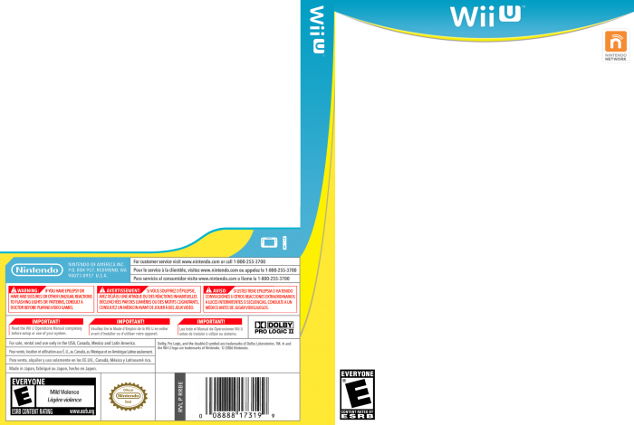
I just picked up on something! Nintendo has LIGHTLY adjusted their logo on boxes.
Here's Sochi and Rio Wii U:
The logo on Rio is white but with a very light shadow on it, likely for when the art would be too bright without it and they'd just go with grey or black previously.
Pokken still uses grey, but Rio is after April 1st so maybe any after in thew new FY will use this now?
Edit: Star Fox Guard is still grey, but maybe it's among the last with it? Dunno.
I just picked up on something! Nintendo has LIGHTLY adjusted their logo on boxes.
Here's Sochi and Rio Wii U:


The logo on Rio is white but with a very light shadow on it, likely for when the art would be too bright without it and they'd just go with grey or black previously.
Pokken still uses grey, but Rio is after April 1st so maybe any after in thew new FY will use this now?
Edit: Star Fox Guard is still grey, but maybe it's among the last with it? Dunno.
")