• Hey, guest user. Hope you're enjoying NeoGAF! Have you considered registering for an account? Come join us and add your take to the daily discourse.

Non-minimal user interfaces that you actually like

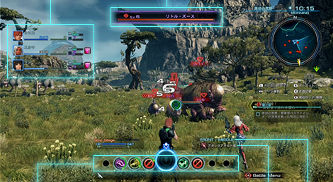
I feel like the trend in many games these days is to go for a very minimal user interface in order to increase immersion and lessen the amount of stuff on screen. This, in general, is a good thing.

However, I feel there are a number of user interfaces (especially in older games) that might be considered "crowded" by modern standards but are actually pretty good, and added certain notable touches to the game experience.

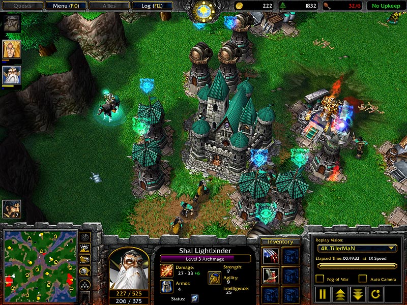
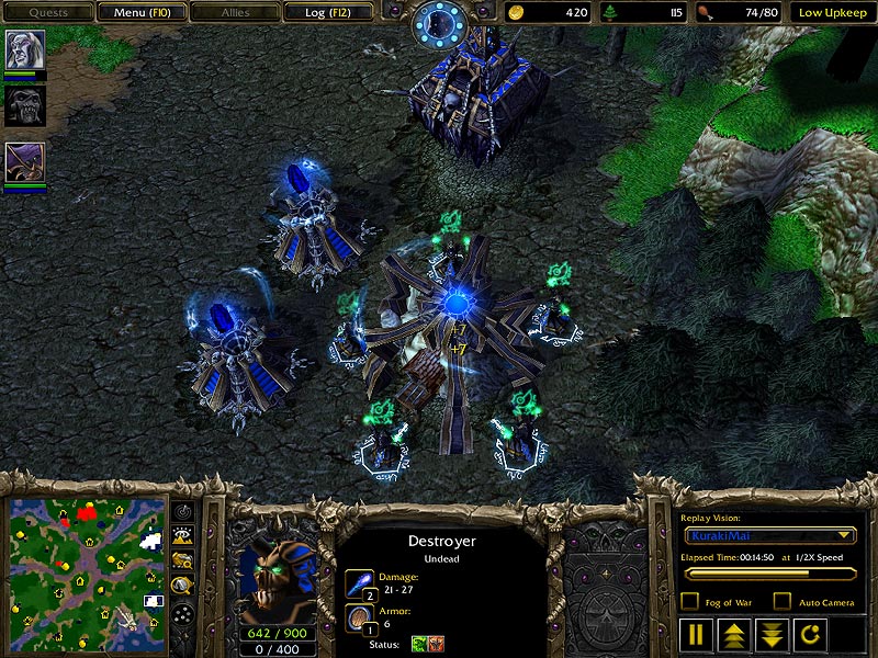
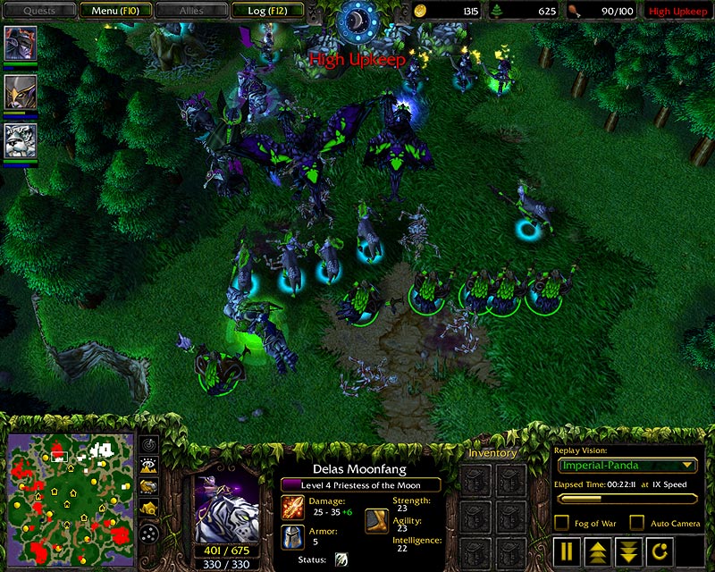
For example, I cannot imagine playing Warcraft 3 without the big HUDs on the bottom that were distinct for each race. Seeing how the HUD changed from the castle Human backdrop to the bony frost borders of the Undead to the leafy Night Elf edges was one of my favorite subtle touches as a kid.

ss007.jpg

ss009.jpg

ss024.jpg


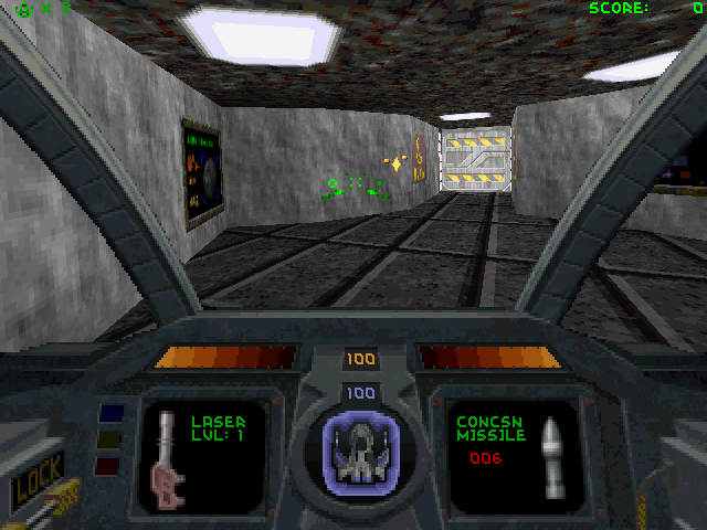
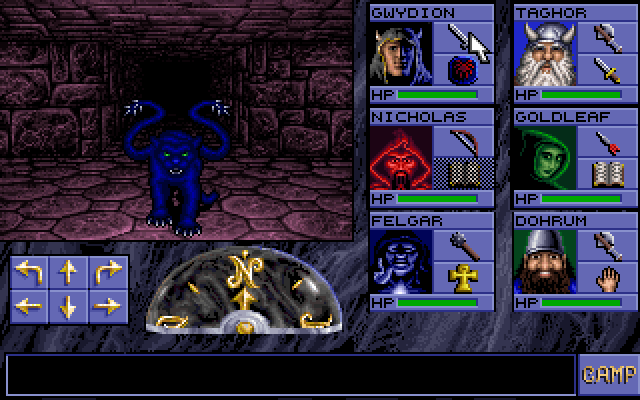
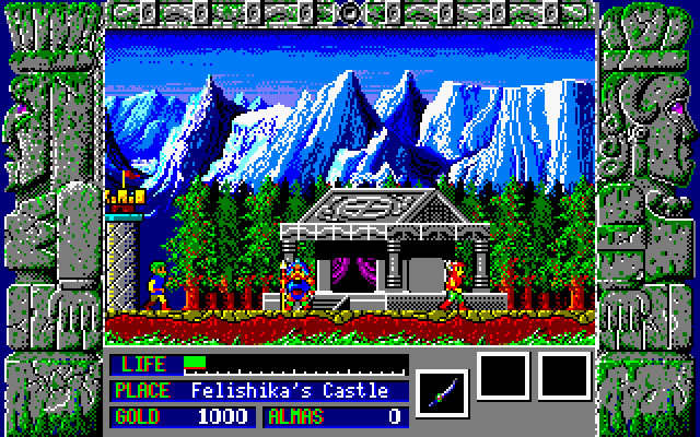
I also quite like the chunky borders/side bars that are prevalent in certain older RPGs. Western games like the Ultimas had stuff like this, and I think it can work quite well to create tension and the sense of a limited view in a dungeon crawler. While this certainly won't work for every genre, seeing a border wrapped around the screen reminds me of old games where a sense of imagination was needed to complement minimal graphics, and you sorta felt that while playing the game, you were looking into an ancient book or a painting. It's that nostalgia talking, I guess.

(Ultima Underworld)
klasik-ms-dos-oyunlari-yeniden-hayat-buldu.jpg


(Eye of the Beholder)
Eye_of_the_Beholder_-_DOS_-_Gameplay_2.PNG


(Zeliard)
zeliard-2.jpg


(Knights of Xentar - technically a hentai game, so beware if you Google)
769988-knights-of-xentar-dos-screenshot-this-guy-is-tough-luna-is.png


As we migrate away from interface designs like this in the modern era, what are some of your old favorites? And are there any new games that have had UIs which might be considered "clunky" that you've liked?
 
I often see complaints about Persona 5's UI being messy and too busy.

I think it's fan-fucking-tastic

Yyyyyyyyyyyep. My favorite UI in any game.

I'll also nominate System Shock 2. It hss a really busy interface, but I love its versatility in every way. On mobile though.
 
^Darkest Dungeon's is really well done for such a large interface, and also fits the 'tabletop dungeon crawling' theme perfectly.

I think it's hard to get away with that with regular 2D or 3D gameplay nowadays but for that sort of linear side scrolling it was perfect.

WarCraft 3 is a great choice for the OP, too... Back in the day, that was PC RTS perfection. The production values, I mean. It's not particular special in terms of mechanics, and serviceable as any Age of Empires UI, but it was one of the big reasons why, right from the opening minute of gameplay, WC3 just oozed polished presentation.


I'm a pretty big 'no HUD' player, but another one that I like are the modern Deus Ex games. Mankind Divided, in particular, can get pretty darn intrusive once you upgrade the remote hacking, all the radars and maps, etc. So much so that TBH ..... even though it made sense for the story (a rare case where the HUD is actually the canon POV) I still played a 'no HUD' playthrough hehe. But that said, I could still appreciate how well crafted (to look 'canon' for Jensen's actual POV) the HUD is.

Darkest Dungeon probably my favorite example of games I have on PS4 though... I think most everything else I play mostly HUD less haha.
 

Terrorblot

Member
I actually really like the Final Fantasy XIV UI even though it's pretty bloated, I like how nearly every action can be mapped to the hotbar such as opening specific menus, placing markers, jumping, target cycling, etc.

Edit: aaaand of course I accidentally uploaded an image that doesn't show any of that off and picked a bland one instead. whoops.
 

CHC

Member
For what it's worth I LOVE the default UI in World of Warcraft - it's just such a perfect visual match for the game world itself, and it's so immediately satisfying to use. The sounds, the feedback, the responsiveness.... Even (semi)recent additions like the Dungeon Journal are wonderfully integrated. It's so good.

I often see complaints about Persona 5's UI being messy and too busy.

I think it's fan-fucking-tastic

Yeah that's a great one, maximalist and over the top in all the right ways.
 
I actually really like the Final Fantasy XIV UI even though it's pretty bloated, I like how nearly every action can be mapped to the hotbar such as opening specific menus, placing markers, jumping, target cycling, etc.


Edit: aaaand of course I accidentally uploaded an image that doesn't show any of that off and picked a bland one instead. whoops.

I was customizing my own UI in FFXIV last night (trying to find the perfect healer layout) and came up with the idea for this thread, actually! Great minds think alike. I also quite like the UI though it can get *extremely* busy with text colliding on top of text on top of hotbars on top of quest details. I guess that's par the course for MMOs, though, since there's so much information you have to keep track of. (Is there even a successful MMO out there with a sleek and minimal HUD...?)
 

Syril

Member
I always liked the cockpit HUD in Descent.
2-HUD-1.png


Though something to keep in mind is for older first-person games like that a giant HUD was also practical, because it hid the fact that it was only running the game in part of the screen to improve the performance.
 

Kent

Member
I actually really like the Final Fantasy XIV UI even though it's pretty bloated, I like how nearly every action can be mapped to the hotbar such as opening specific menus, placing markers, jumping, target cycling, etc.


Edit: aaaand of course I accidentally uploaded an image that doesn't show any of that off and picked a bland one instead. whoops.

The worst thing about seeing other peoples' hotbars is that it feels like I'm taking crazy pills, as I cannot understand what the logic is behind the order of buttons you have on your bar.
 

Feep

Banned
Man. Knights of Xentar is such a blast from the past. One of the very first PC games I ever played (the non-18+ version, anyway).
 
Wing Commander.

u8SAN7y.jpg

I have not actually played Wing Commander 1, but looking at screenshots of the cockpit view makes me want to.

I think I've zeroed in on an aspect of these big UIs that I like - the fact that they are often integrated into the game world and look consistent with the rest of the graphics. Whether its the tiny leaves around the Night Elf menu in Warcraft 3, the gothic tabletop look of the Darkest Dungeon HUD or the cockpit view from Wing Commander, all of these user interfaces look like logical extensions of the game.
 
Remembered a few more of my faves, from yesterday's adventure games.

(King's Quest VII)
48938-roberta-williams-king-s-quest-vii-the-princeless-bride-windows.gif


(Torin's Passage)
gfs_43143_2_1.jpg


(The Secret of Monkey Island)
guybrush.gif


(Simon the Sorcerer II)
simon2-9.gif


I think with games like this it's certainly possible to not have a big bar at the bottom of the screen displaying all the icons and such, but it certainly made things easy and accessible, especially for the LucasArts adventures.
 

ASaiyan

Banned
Kirby 64 had multiple different graphical styles the choose from for its HUD

[/QUOTE]
[I]Whaaaaaaat[/I].

I have been playing this game for nearly two decades and somehow I never, ever knew this. This an absolute revelation to me right now, lol.
 
Top Bottom