Kdad
Member
Ah... the old 2 PlayStation SKU theory.That logo will look awesome on the second most powerful console on the market.
Ah... the old 2 PlayStation SKU theory.That logo will look awesome on the second most powerful console on the market.
For us that lived through the original logo....it can't look 'futuristic'...A sharper logo like the PS2's would've looked cooler and more futuristic. Rounded designs bore me now.
I don't mean the same design, I mean make a new logo but have it sharp like the PS2's logo was. I "lived through" the original logo too.For us that lived through the original logo....it can't look 'futuristic'...
And 112 year old Xbox fans will sarcastically say, "Oh, isn't that going to be confusing to consumers??"My guess is they'll come full-circle and it'll be called PSX.
Yeah some people were bitching about Spiderman font. Mostly Xbox fantards making big deal about a logo. So they changed the ps3 logo to this style. It's also when the 299 slim came out and Kevin butler ads.Still the same since ps3 generation. I remember when ppl complained about it.
And that is a good thing, dont change what is not brokenThey all look the same.

This logo alone will run AAA games in 8K60.
Probably the most successful logo reveal in history. I feel they deserve a Guinness World Record or some other kind of award. It truly was an amazingly awesome reveal.Seems like the logo reveal was a success.
Well played Sony.
Pretty sure that the only people who really care about this are the people who actually don't like Sony or Playstation.Sony announced a logo, current gen sales, a few next gen features that were already announced....and a car (?!!!)
So all it takes now is a logo to rile up the Sony ponies? Hmmm...sounds about right.
Sony already used PSX for its DVR with in-built PS2:now I wonder, will it be the PS10 one day or the PSX

One thing led to another and I created this
Which led to even more thingsOne thing led to another and I created this

Here's the leaked PS6 logo:
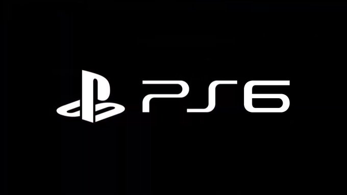

Funny, because apparently both PS5 AND PS6 designs have just been leaked:
One thing led to another and I created this

The market leader as well, annihilating the competition. I agree.That logo will look awesome on the second most powerful console on the market.
Can't imagine it. Red has traditionally been the colour of "budget" for Sony.I'm actually down for purple. But I think it will be red to distinguish it immediately from PS4's blue.

Can't imagine it. Red has traditionally been the colour of "budget" for Sony.

What the fuck you on about? Stop what?
jesus fucking christ... stop!
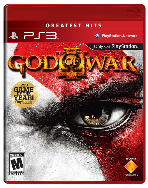
Sony's budget covers have always been so fucking ugly... I always avoided these things like the plague!
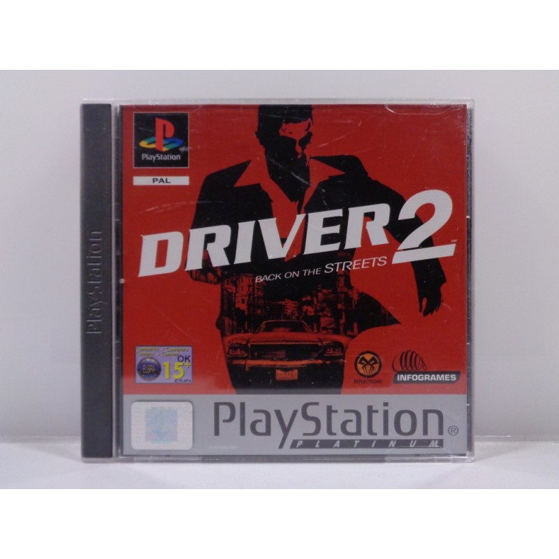
their only good budget design was the PAL PS1 Platinum covers, whose actually looked kinda nice and the first PS1 game I bought myself was Driver 2 Platinum. (I was freaking 11yo at the time and the game is USK 16 but the lady at the store I bought it never looked at the age rating and sold everything to kids lol)
What the fuck you on about? Stop what?


Open your fucking eyes and read before you post.so you think those greatest hits designs look good?
well these aren't the worst I guess
Open your fucking eyes and read before you post.
I said nothing about the design of those covers. Only making the point about why Sony won't use the colour Red as their signature colour next gen.
You need to get your eyes checked.

OKI never said you did, I jokingly said stop posting them because they are ugly as fuck
Agreed, I've never bought one. They're shite.God, the expression on Donald's face made me lolsnort.