Metaledgeking
Neo Member
Greninja looks badass, I think I found my starter when the games drop.

Still nope. It has a nice face I guess, better than Quilladin lol.
What's wrong with the design?
And I'll just laugh at you. Hahahahaha!

And I won't care, because hey, opinions can have opinions too!You can keep laughing till you die and my opinion wouldn't change. I don't care about the theme or any other "logical" reason you'll try to bring to this subjective point of view. It's a pokemon design, and I think it's ugly just because I think it is ugly.
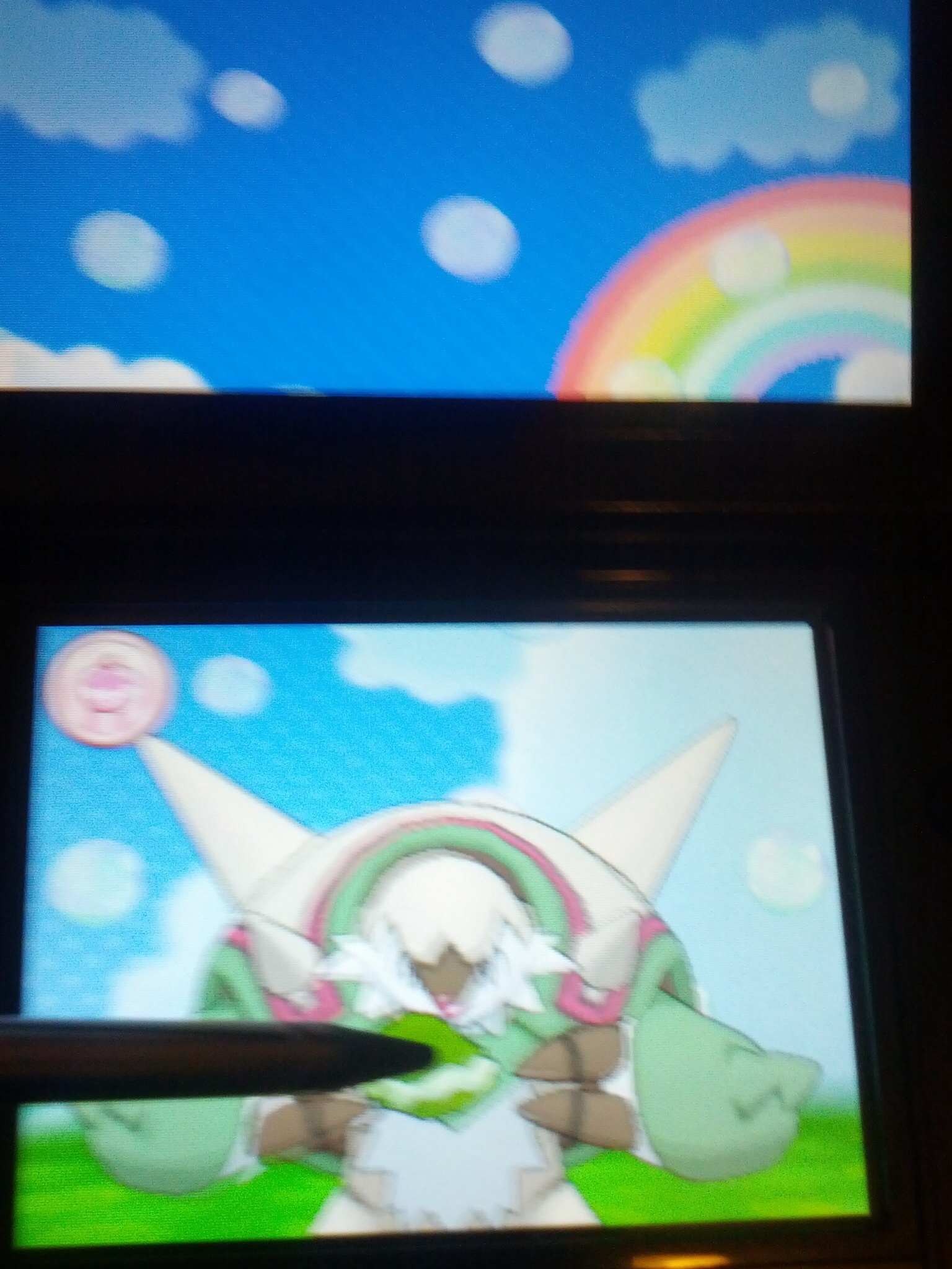
Very inconsistent with Chespin and Quilladin. I think this is like Dewott to Samurott levels of inconsistent. The colors are also somewhat inconsistent. It would have been cool if they just made the shell white only and have the main body brown/green so it is like a chestnut. I don't like how long its arms are. Not saying Pokemon shouldn't have long arms or anything, but it doesn't seem good for Chesnaught.
But I agree, that is a more flattering shot of Chesnaught.
Really? The white part (arms, torso, legs) seems like the body with green spiked braces.
I know its scaled, but the way the top connects to the body piece reminds me of a full body chainmail.
http://www.medievalweaponinfo.com/wp-content/uploads/2012/09/chainmail.jpg
