-
Hey, guest user. Hope you're enjoying NeoGAF! Have you considered registering for an account? Come join us and add your take to the daily discourse.
You are using an out of date browser. It may not display this or other websites correctly.
You should upgrade or use an alternative browser.
You should upgrade or use an alternative browser.
Quantum Break Gameplay Teaser, delayed to 2015, debut at Gamescom
- Thread starter Sendou
- Start date

Many websites promoted this game as 2014 release. For example
http://www.joystiq.com/2013/07/09/quantum-break-preview-xbox-one/
http://www.gamespot.com/articles/ne...v-may-come-to-video-game-awards/1100-6416292/
Yh I saw was just pointing out it was referenced officially(Well at least from MS not remedy) as that before.
Yeah, this can only mean one thing: Alan Wake 2 is coming
I wish XD
Summer 2039
Could anyone do me a solid and update me on what's left on the exclusive front for 2014? Thanks.
Sunset Overdrive
ComputerMKII
Banned

Gray Matter
Member
Also has anyone noticed that the unnamed guy with the black leather jacket looks a lot like Mark-Paul Gosselaar. You might know him as zach from saved by the bell.
if it's not him, we'll hear from him demanding some compensation for using his "likeliness" without permission lol.
I'm a bit confused about that as well. The gamescom conferences are usually a lot smaller than their E3 counterparts. You'd think they put this on the greatest stage possible.Pretty shocked that the game isn't getting some air time at E3. It does look good though based on that small amount of footage, and I'll always love me some Remedy... so yeah, maybe I'll purchase me an Xbox One at some point next year when this comes out.
Maybe they'll do some "All the games we show today will release in 2014" shtick at E3
Ol No Bones
Banned
Graphics look excellent. The only similar playing game on consoles with better graphics thus far is probably the Order.
FUGGIN SAVED!
SlickShoesRUCrazy
Member
Damn, bummer this won't be out till next year.
SlasherJPC
Banned
No E3 because Alan Wake 2 announcement incoming? A man can dream. Though this is 2015, still looking great. 2015 should be a interesting year for these new consoles.
LukasTaves
Member
Quantum Break definitely looks like it has a more advanced version of the 'every light is a volumetric light' engine from Alan Wake.
For instance if you look at this screen:
The muzzle flash from the guy hiding behind the crate in the background looks like a volumetric light.
Yeah, it really seems like it.
Some tidbits showing a big city on the background when Sam lake is talking also looks like their open world engine, even if they are still using it to deliver a linear experience again.
Also has anyone noticed that the unnamed guy with the black leather jacket looks a lot like Mark-Paul Gosselaar. You might know him as zach from saved by the bell.
if it's not him, we'll hear from him demanding some compensation for using his "likeliness" without permission lol.
You mean the Main Character? His name is Jack Joyce played by Phil Spencer
Looks as good as the best looking games seen so far. Cinematic is a word remedy never uses, I don't like them using it now. The character looks like a super hero in this and remedy's gun play is some of the best so I want it.
The game has a stylized look and a stylized shader similar to Metal Gear 5. Just glad this is another game that isn't trying to hide that the look of the game is stylized.
The game has a stylized look and a stylized shader similar to Metal Gear 5. Just glad this is another game that isn't trying to hide that the look of the game is stylized.
EmCeeGramr
Member
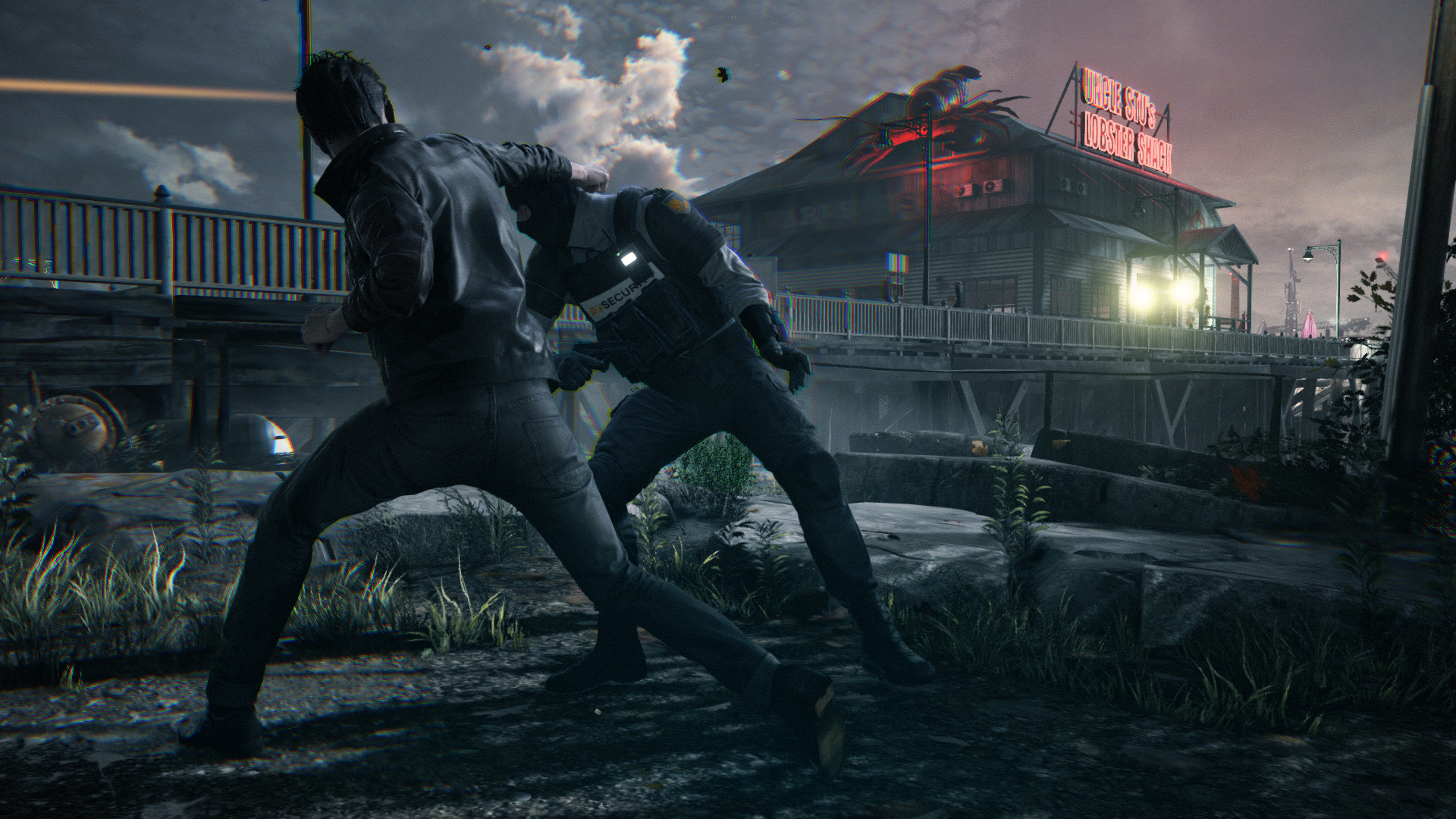
Maybe I need to see more, but my first impression based on the screenshots is that the game doesn't... look... that good? It looks pretty nice, but the chromatic aberration and fucked up foliage and weird inconsistent AA and blurriness really looks ugly to me, especially in this shot:
The "film grain" also makes it look like a magazine scan to me and less like an actual film.
EDIT: I think it's less film grain and more some bizarre dithering that reminds me of PSP screenshots.
The "film grain" also makes it look like a magazine scan to me and less like an actual film.
EDIT: I think it's less film grain and more some bizarre dithering that reminds me of PSP screenshots.
shacklesmcgee
Member
You mean the Main Character? His name is Jack Joyce played by Phil Spencer
This has really "ruined" the game for me actually. I can't see anyone but him now, and I just giggle that it's like his secret plan to be in every game now that he's head of xbox.
Green Yoshi
Member
So glad that I live in Cologne. ")
Gray Matter
Member
You mean the Main Character? His name is Jack Joyce played by Phil Spencer
Phil has time to run Xbox and do mocap for quantum break?
BruiserBear
Banned
The time freezing mechanic looks so cool. I really want to see what the moment to moment gameplay looks like.
I'm really worried about the TV show part of this though. If it's executed poorly it could really mess up what is otherwise a great game.
I'm really worried about the TV show part of this though. If it's executed poorly it could really mess up what is otherwise a great game.
KainXVIII
Member
Maybe I need to see more, but my first impression based on the screenshots is that the game doesn't... look... that good?
Also bad texture filtering (no AF?).
1.21Gigawatts
Banned
Very stylish looking.
Can't wait to see more.
I adore the time freeze effect.
More games should have something like that.

Can't wait to see more.
I adore the time freeze effect.
More games should have something like that.
I mean to say as far as that original demo compares the lighting seems to have taken a massive downgrade, the image quality and perhaps even the models too. Sorry if that wasn't clear.
What? The lighting situation in the original trailer was different. That trailer had more intense like and a lot of mirrors reflecting things. A scene like that is going to look impressive on the lighting front.
SlipperyMoose
Member
Are you sure it is a timed exclusive?
IP is owned by M.S.
HassanJamal
Member
Sam Lake.
Sam Lake? This man, I'd like to shake his hands.
Sadly, that's "Jack Joyce". I was really excited for this game when Sammy Lakey introduced its protagonist as Chuck Choice - it sounds like the exact kind of Remedy Stupid I want from them. His actual name isn't nearly as good.
Jack Joyce? Screw it, Im calling him Jack Choice.
Maybe I need to see more, but my first impression based on the screenshots is that the game doesn't... look... that good? It looks pretty nice, but the chromatic aberration and fucked up foliage and weird inconsistent AA and blurriness really looks ugly to me, especially in this shot:
The "film grain" also makes it look like a magazine scan to me and less like an actual film.
I think the screenshots are not great. The stuff in-motion looks a lot better though.
The grain, aliasing and CA do these shots no favours.
DoktorEvil
Banned
Subbed.
I'm so happy Sam Lake stayed with Remedy.
I love his writing styles when it comes to narrative driven games.
Plus, this looks very stylized.
I'm so happy Sam Lake stayed with Remedy.
I love his writing styles when it comes to narrative driven games.
Plus, this looks very stylized.
SEGAvangelist
Gold Member
Am I the only one who wouldn't be surprised to see a PC version on 2016?
MS hasn't been doing the Xbox to PC thing very often lately for AAA titles, so I doubt you'll see a port.
Game looks so good.
MGSVPP and this next year. Lawd
Halo
The Order
Uncharted
maybe Zelda
This why I could never own one console it's impossible
Am I the only one who wouldn't be surprised to see a PC version on 2016?
MS is in no position be doing that.
Jack Joyce? Screw it, Im calling him Jack Choice.
I support this. Jack Choice it is.
Okay since this is directly from Microsoft's website and listed as posted by their staff, I'm reverting the title.On whether if it was delayed or not. I did find that MS was at least referenced it as a 2014 title once
"Tonight at VGX 2013, the next generation of Spike TVs annual Video Game Awards, Microsoft and Remedy Entertainment revealed a brand-new trailer for the Xbox One exclusive Quantum Break, giving fans a glimpse at all-new gameplay footage and the creative vision behind one of 2014s most anticipated blockbusters. "
OT - Those screenshots look amazing. The environment details are top notch.
Halo
The Order
Uncharted
maybe Zelda
This why I could never own one console it's impossible
Holy shit, couple that with The Witcher 3, FFXV and possibly Beast Soul's and you're right, it could be a legendary year for gaming.
cyberheater
PS4 PS4 PS4 PS4 PS4 PS4 PS4 PS4 PS4 PS4 PS4 PS4 PS4 PS4 PS4 PS4 PS4 Xbone PS4 PS4
Really? I think people forget what the lighting actually looks like in those top tier games. QB isn't quite there yet. Just a quick rough comparison.
Anyway, different strokes.
Yeah. Maybe I need to have another look at those games.
Perhaps a comparison to another non-open world, 2015 title like The Order would be more apt.
I would bet that the play areas in this are much bigger than The Order and Ryse. Pictures look like they will have big play areas like they did in Alan Wake.
SniperHunter
Banned
Holy shit, couple that with The Witcher 3, FFXV and possibly Beast Soul's and you're right, it could be a legendary year for gaming.
FFXV will probably be a 2016 title IMO
The original trailer wasn't running in real-time and never will. I'd put it, just comparing the graphics, between Watch Dogs and inFAMOUS: SS, leaning more to the former.What? The lighting situation in the original trailer was different. That trailer had more intense like and a lot of mirrors reflecting things. A scene like that is going to look impressive on the lighting front.
2015 release date was expected.
quickwhips
Member
Between this and Gears 2015 - 2016 are going to be good years to own an Xbox One.
I think the lighting and animation it top notch on this. The Order looks great as well but not as good as this. I think the lighting in this is better.
And you kept a straight face in the process? Blimey.
CassidyIzABeast
Member

the truck Jack time freezes

is the same as this one
Louis Cyphre
Banned
2015 is already shaping up to be a huge battle.
LightOfTruth
Member
Graphics look awesome and the gameplay looks badass, it really gives off a next-gen vibe. My worry is the story.
Pound_lb003
Member
This game looks really cool actually.
Loved that snap of martial arts and time stopping.
Loved that snap of martial arts and time stopping.
ComputerMKII
Banned
Maybe I need to see more, but my first impression based on the screenshots is that the game doesn't... look... that good? It looks pretty nice, but the chromatic aberration and fucked up foliage and weird inconsistent AA and blurriness really looks ugly to me, especially in this shot:
The "film grain" also makes it look like a magazine scan to me and less like an actual film.
EDIT: I think it's less film grain and more some bizarre dithering that reminds me of PSP screenshots.
Holy shit, you're right. That goddamn chromatic aberration. It needs to stop.
On whether if it was delayed or not. I did find that MS was at least referenced it as a 2014 title once
"Tonight at VGX 2013, the next generation of Spike TV’s annual Video Game Awards, Microsoft and Remedy Entertainment revealed a brand-new trailer for the Xbox One exclusive “Quantum Break,” giving fans a glimpse at all-new gameplay footage and the creative vision behind one of 2014’s most anticipated blockbusters. "
OT - Those screenshots look amazing. The environment details are top notch.
Yea, I wouldn't have imagined all media pitting it as a 2014 title on just a whim, at least not every single media publication out there. I've noticed that generally, some of the outlets just put TBA and do not assign a year unless they have some sort of information or understanding otherwise.