-
Hey, guest user. Hope you're enjoying NeoGAF! Have you considered registering for an account? Come join us and add your take to the daily discourse.
You are using an out of date browser. It may not display this or other websites correctly.
You should upgrade or use an alternative browser.
You should upgrade or use an alternative browser.
Slim PS3 ...good fake or...
- Thread starter bloke
- Start date
- Status
- Not open for further replies.
H_Prestige
Banned
Tiduz said:am i the only one who really wants a WHITE ps3slim?
that would look hot.
Your wish will be granted.
In Japan.
I don't know why I'm so hyped for the Playstation 3 Slim when I already have a 80GB (BC) Playstation 3. I'll be picking up the Slim on day one and giving my 80GB to my little brother.

I'll be purchasing all of that and am currently waiting for the TV I ordered to arrive on Friday.
http://www.amazon.com/dp/B001UV6P1Q/?tag=neogaf0e-20
All of this for the slim...HYPE!
P.S. Before anyone says monoprice, I know. I'm just crazy like that where I have to buy name brand items.
I'll be purchasing all of that and am currently waiting for the TV I ordered to arrive on Friday.
http://www.amazon.com/dp/B001UV6P1Q/?tag=neogaf0e-20
All of this for the slim...HYPE!
P.S. Before anyone says monoprice, I know. I'm just crazy like that where I have to buy name brand items.
Mr. Wonderful
Member
We've given it a name now?iceatcs said:You mean Phil?
Sold to MS Indian man.
Please don't refer to our Philip as "it". Thanks.Mr. Wonderful said:We've given it a name now?
Phil = Philippines. 
cornerman said:I know now, and knowing is half the battle. I've got the 60GB and already knotch on Sony's post console-wise, so I haven't done as much research as others might. I saw that on the way to the warehouse, and figured I throw it out there. Is the slim font drastically different? Are we talking the spider-man font?
well...yeah
spider-man font

PS3 with PS2 font

slim font
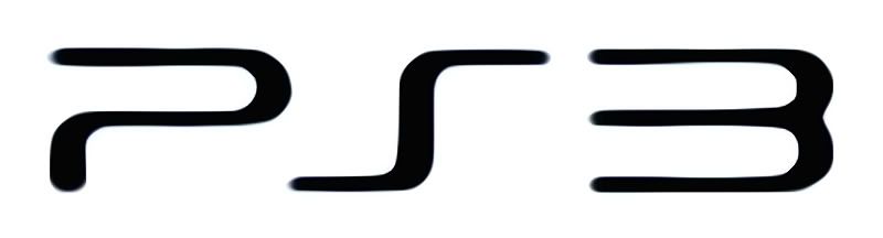
as you can see it's more curvy , and unlike spidey you cant misread the letter S for 5 , it's not P53 anymore
Totobeni said:spider-man font
http://i606.photobucket.com/albums/tt148/AKNJ/Capture.png[IMG]
PS3 with PS2 font
[IMG]http://farm3.static.flickr.com/2523/3765673597_5cfbc1a306_o.png[IMG]
slim font
[IMG]http://i21.photobucket.com/albums/b267/samusxaran/PS3slimlogo2.jpg[IMG]
as you can see it's more curvy , and unlike spidey you cant misread the letter S for 5 , it's not P53 anymore :p[/QUOTE]
Nice slim logo, who made that?
H_Prestige
Banned
Totobeni said:well...yeah
spider-man font
PS3 with PS2 font
slim font
as you can see it's more curvy , and unlike spidey you cant misread the letter S for 5 , it's not P53 anymore
ps2 font > spidey font > slim font
This.Egmont said:I actually really like that new logo. It matches the PS3's more... curvaceous nature.
Fixed.H_Prestige said:slim font > ps2 font > spidey font
Epic Tier 3 Engineer
Banned
You really have too much money to burn.Spy said:I don't know why I'm so hyped for the Playstation 3 Slim when I already have a 80GB (BC) Playstation 3. I'll be picking up the Slim on day one and giving my 80GB to my little brother.
I'll be purchasing all of that and am currently waiting for the TV I ordered to arrive on Friday.
http://www.amazon.com/dp/B001UV6P1Q/?tag=neogaf0e-20
All of this for the slim...HYPE!
P.S. Before anyone says monoprice, I know. I'm just crazy like that where I have to buy name brand items.
God Bless America, though. I kinda envy you.
p_xavier
Authorized Fister
I would say why not the SOCOM bundle instead of the standalone headset?Spy said:P.S. Before anyone says monoprice, I know. I'm just crazy like that where I have to buy name brand items.
Graphics Horse
Member
Totobeni said:samusx post #2036 of this thread.
It's good but the ends of all the lines should be squared off instead of curved.
(To resemble how it looks on the casing, rather than my artistic opinion or anything.)
Edit:

Sentry said:Agreed, but the ends of all the lines in that pic are too fat;
It's hard to be sure on that as the box is tilted, I think it's pretty close to this:
http://i6.photobucket.com/albums/y247/Wollan/PS3_Slim_5.jpg
Graphics Horse said:It's good but the ends of all the lines should be squared off instead of curved.
http://i26.tinypic.com/1746ix.gif[IMG][/QUOTE]
Agreed, but the ends of all the lines in that pic are too fat;
[img]http://i6.photobucket.com/albums/y247/Wollan/PS3_Slim_2r.jpg
"PLAYSTATION 3" in the spidey font looks cool IMO, but just "PS3" in spidey looks horrible for some reason.
But as said they're just easing the transition to the curved PS3 font.
But Sony have messed up their branding big style though....you only have to look at a PS3 box for proof...they have 3 different PlayStation fonts going on; "Only On PlayStation" "PlayStation Network" and "PLAYSTATION 3" are in different fonts.
It looks a mess compared to the 360 games boxes.
Stupidity is not a mental illness.Spy said:P.S. Before anyone says monoprice, I know. I'm just crazy like that where I have to buy name brand items.
HUELEN10
Member
To be fair, the official audio cable is unsurpassable. Fits very snug compared to others.scobur said:Stupidity is not a mental illness.
offshore said:"PLAYSTATION 3" in the spidey font looks cool IMO, but just "PS3" in spidey looks horrible for some reason.
But as said they're just easing the transition to the curved PS3 font.
But Sony have messed up their branding big style though....you only have to look at a PS3 box for proof...they have 3 different PlayStation fonts going on; "Only On PlayStation" "PlayStation Network" and "PLAYSTATION 3" are in different fonts.
It looks a mess compared to the 360 games boxes.
I agree. It's even worse with the back of the boxes now too. If they have that "PlayStation Network" stuff on the front of the box then that means that on the back there'll be another one and it lists all the features of the PSN that work with that game. Which is a nice idea but there's also a ton of shit on the bottom of the box. I hope that with this rebranding they rebrand the PS3 boxes too. I know that collectors with OCD will hate it but the boxes have got to get cleaned up too.
Me too. I think even with the shortened "PS3" logo it still looks cool and modernish.°°ToMmY°° said:spidey font is the best. i don't get the hate, i really like it.
Here's hoping the PS3 slim to be unveiled with an updated "PS3" spidey logo similar to what's been used in recent ads/trailers. Spidey font ftw!
yellowjacket25
Member
I think the slim font looks the best. The spidey font has always been a little weird to me.
yellowjacket25 said:I think the slim font looks the best. The spidey font has always been a little weird to me.
i think it has to do with the fact that it constantly reminds us about spider-man (the movie), but it isn't by any mean a bad font.
°°ToMmY°° said:i think it has to do with the fact that it constantly reminds us about spider-man (the movie), but it isn't by any mean a bad font.
Homoarakhan font was there years before Spiderman movies .
but the third movie was pure garbage shit , and it was Sony Picture's fault ( not Sam Raimi I wuv the man ) Sony Picture is sister company of SCE , and SCE used Homoarakhan font on PS3 too , so we Spiderman 1/2 fans can blame and hate the font on PS3 because the shit that was Spider-man 3 , this is pure logic .
Goldrusher
Member
But Kutaragi designed the console around that font.yellowjacket25 said:I think the slim font looks the best. The spidey font has always been a little weird to me.
HomerSimpson-Man
Member
Not feelin' the new font. Just stick to the original. I wonder how much money and time was spent pointlessly thinking up a new front. It's not like the full "Playstation" insignia on games would likely change too.
:|offshore said:
That is what they should have gone with from the start. If it ain't broke, don't fix it.
It's good though that they look as if they're gradually dropping the blue, yellow and turquoise PS logo, this thing looks woefully out of date...black and white looks more modern.
Also, going by the last few posts...Sony shouldn't even have a logo.
HUELEN10
Member
No one can say for sure when it is coming out. It is real though, at least it HAS to be. I know I am waiting, and I suggest everyone else to the same. Worst thing that can happen is waiting in vain, that'll cost you nothing. You have nothing to lose!Gio_CoD said:I know Sony hasn't come out and confirmed this yet, but is this pretty much "confirmed" that it's coming? I ask because I'm thinking about getting a second PS3 as an upstairs Bluray player/media center client, and if this is coming out in September, I'll obviously wait.
Gio_CoD said:I know Sony hasn't come out and confirmed this yet, but is this pretty much "confirmed" that it's coming? I ask because I'm thinking about getting a second PS3 as an upstairs Bluray player/media center client, and if this is coming out in September, I'll obviously wait.
it wont be confirmed until it comes, but yeah, expect it...
offshore said:pic
That is what they should have gone with from the start. If it ain't broke, don't fix it.
It's good though that they look as if they're gradually dropping the blue, yellow and turquoise PS logo, this thing looks woefully out of date...black and white looks more modern.
Wow that's terrible.
Well it wasn't intended as bonafide, but you get the idea....it's meant to follow on from the PlayStation 2 print that was on the front on the front of the PS2, the front of the game boxes, on the discs, the game boot up screen, etc, etc.
There was no need to change to the spidey font...as evidenced by the fact that they've got so many PlayStation fonts that it looks stupid.
There was no need to change to the spidey font...as evidenced by the fact that they've got so many PlayStation fonts that it looks stupid.
BruceWayneIII
Member
offshore said:
Oh God, I'm laughing soooooo hard right now! :lol :lol :lol
HUELEN10 said:To be fair, the official audio cable is unsurpassable. Fits very snug compared to others.
It's a fucking optical cable... I have about 5 different kinds and they all fit fine. If he wants to waste $20 on a $1 cable, he's insane.
HUELEN10
Member
I don't know, I tried some from monoprice, but it just isn't that snug...alr1ghtstart said:It's a fucking optical cable... I have about 5 different kinds and they all fit fine. If he wants to waste $20 on a $1 cable, he's insane.
Is it that wrong to throw the guy a bone?
My order of preference just as shown in your post -Totobeni said:well...yeah
spider-man font
PS3 with PS2 font
slim font
as you can see it's more curvy , and unlike spidey you cant misread the letter S for 5 , it's not P53 anymore
Spidey > PS2 > Slim.
New font looks FUGLY.
Bam Bam Baklava
Member
iceatcs said:I am really curious if it is real logo but what will happen to game boxart when the spidey one stop production?
It's all gonna change once the slim comes out.
iceatcs said:I am really curious if it is real logo but what will happen to game boxart when the spidey one stop production?
Not only the boxart, but also the "Playstation 3" intro/chime screen that pops up when you play a game.
That's what I wondered, after all the "PLAYSTATION 3" spidey font is right on the cover of every box... maybe they will keep that logo and use the 'PS3' slim font at the same time? The PlayStation 2 was always written out with normal text alongside the edgy 'PS2' logo/font.. perhaps that will happen?iceatcs said:I am really curious if it is real logo but what will happen to game boxart when the spidey one stop production?
Kinda confusing..
-viper- said:My order of preference just as shown in your post -
Spidey > PS2 > Slim.
New font looks FUGLY.
Agreed
Machado said:you are arguing over a logo??? WTF it doesn't do shit. if it didn't have a logo it'd still play ps3 games which is the most important thing.
Hell, we need something to talk about, even if it is completely superfluous. :lol
Sony sure isn't giving us anything.
- Status
- Not open for further replies.