• Hey, guest user. Hope you're enjoying NeoGAF! Have you considered registering for an account? Come join us and add your take to the daily discourse.

The "NES-era covers with gorgeous airbrushed art and beautiful typography" thread

Chittagong

Gold Member
Beautifully composited, airbrushed artwork.

Meticulously kerned and hand crafted typography.

Those were the days - before any retard could do box art with Photoshop and Illustrator. No layer effects. No tacky bewels. No bad composites. No lazy renders.


smb3box_1.jpg


guardian-legend.jpg


festerquest.jpg


256px-Startropics_box.jpg


250px-Faxanadu_NES_US_box.jpg


"If the logo and typography are good enough, they can be in solid color and still look great"
 

Fuzzy

I would bang a hot farmer!
Chittagong said:
Those were the days - before any retard could do box art with Photoshop and Illustrator. No layer effects. No tacky bewels. No bad composites. No lazy renders.
Yes, but we also got some real turds.
 

Chittagong

Gold Member
Kuroyume said:
Had they released it over there, they would have probably banned this box art in Japan because he looks too masculine.

Ironsword_Box.jpg


Back when box art didn't suck... Not that I give a shit anyway...

Even that box, however hilarious, is beautifully composited and the colors are extremely well balanced between the detailed background and the main motif.

Reason being that one of those things took probably weeks to paint, mask, composite - you'd sketch it perfect before starting. No "uh... let me pull this layer here... and that there... and now a bit of radius 100 hardness 0 eraser... done?"
 

beelzebozo

Jealous Bastard
256pxcastlevanianesboxagc3.jpg

cv3ciq1.jpg

so awesome.
just wish konami would have taken all the labelling garbage off the cover and let the art stand on its own.
actually, castlevania is one of the few series that has had relatively good box art since then (not the animu stuff--speaking specifically about lament of innocence and aria of sorrow, tbh)
 

elostyle

Never forget! I'm Dumb!
NES boxes are so great. The form factor, weight with the game in in, cover art et al. All great. I like how the background color usually goes around the side and back as well.
 

beelzebozo

Jealous Bastard
elostyle said:
NES boxes are so great. The form factor, weight with the game in in, cover art et al. All great. I like how the background color usually goes around the side and back as well.

i bought dragon quest 8 for ten bucks simply because it came in a cool cardboard case that reminded me of an nes game.

it was totally worth it.
 

gkryhewy

Member
This thread reminds me again how cool it would be if the Wii VC interface included the original box arts (both in the shop and once the games have been downloaded). The title screens are sort-of pointless, as the player sees those again 5 seconds later.
 

Chittagong

Gold Member
More Konami awesomeness with great compositions and typography. I love the subtle submarine styling in the Silent Service logotype.

the%20goonies%202%20av.jpg


Silent%20Service%20av.jpg


Top%20Gun%20av.jpg
 

john tv

Member
beelzebozo said:
actually, castlevania is one of the few series that has had relatively good box art since then (not the animu stuff--speaking specifically about lament of innocence and aria of sorrow, tbh)
I'm going to start banning people who use tbh in cases where it's completely unnecessary and/or wouldn't be used in real conversation. JUST FYI.
 

Dirtbag

Member
Chittagong said:
Beautifully composited, airbrushed artwork.

Meticulously kerned and hand crafted typography.

Those were the days - before any retard could do box art with Photoshop and Illustrator. No layer effects. No tacky bewels. No bad composites. No lazy renders.


"If the logo and typography are good enough, they can be in solid color and still look great"

Hello there, fellow type-junkie.
I totally agree. Just curious, how do you feel about the Half-life orange/black covers. I personally love'em, but still admit they could have been even stronger with some more work.

(As a friend, you must buy Gotham Rounded, it was released a few months ago, and its risen to my top ten of font families.
 

john tv

Member
beelzebozo said:
i wouldn't have typed it unless it came to my head that way.
but thanks for the heads up, i suppose
Sorry, that wasn't really fair of me to pick on your post in particular. I'm just really tired of seeing it used so often where it's not actually necessary. I don't want to derail this thread so let's get back to nice covers. :)
 
I always thought Konami and Ultra games had the coolest box art. Back in the days where buying a good NES game was pot luck, the covers really helped me decide that the Konami games were the ones to go with.

http://www.atarihq.com/tsr/nes/bayoubilly.jpg
http://www.atarihq.com/tsr/nes/bladesofsteel.jpg
http://www.atarihq.com/tsr/nes/cvania2.jpg
http://www.atarihq.com/tsr/nes/gradius.jpg
http://www.atarihq.com/tsr/nes/defendercrown.jpg
http://www.atarihq.com/tsr/nes/gyruss.jpg
http://www.atarihq.com/tsr/nes/snakesrv.jpg
http://www.atarihq.com/tsr/nes/tmnt.jpg

They had a nice design that you automatically knew was from them. Nice example of keeping a good brand identity.
 

Chittagong

Gold Member
Dirtbag 504 said:
Hello there, fellow type-junkie.
I totally agree. Just curious, how do you feel about the Half-life orange/black covers. I personally love'em, but still admit they could have been even stronger with some more work.

(As a friend, you must buy Gotham Rounded, it was released a few months ago, and its risen to my top ten of font families.

Cool. HTF fonts rock overall - I love Knockout and Champion families. Probably the best font family on earth.

Sidetracking my own thread. As for Half-Life Orange and Black, I sort of appreciate what their creative solution for the hard problem was, I just don't really agree with the design arrived at. There are very few designers who can pull off a design only using Helvetica Bold - it requires massive attention to not only tight kerning, but also spacing between words, rows as well as placement of the type on the layout overall, plus color and texture in the piece. If not done by such a person, a design using only Helvetica Bold looks cheap, only like somebody typed stuff out in Word with no design. This is, in my opinion, bit of the problem with the Half-Life Orange box art.

013-SP01.gif


An excellent example of the few designers who can master "design only by Helvetica Bold" are The Designers Republic. Thier work for Funkstörung is close to what could have been achieved with Half-Life Orange.

D50570F31T6.jpg
 

Dirtbag

Member
Chittagong said:
Cool. HTF fonts rock overall - I love Knockout and Champion families. Probably the best font family on earth.

Sidetracking my own thread. As for Half-Life Orange and Black, I sort of appreciate what their creative solution for the hard problem was, I just don't really agree with the design arrived at. There are very few designers who can pull off a design only using Helvetica Bold - it requires massive attention to not only tight kerning, but also spacing between words, rows as well as placement of the type on the layout overall, plus color and texture in the piece. If not done by such a person, a design using only Helvetica Bold looks cheap, only like somebody typed stuff out in Word with no design. This is, in my opinion, bit of the problem with the Half-Life Orange box art.

An excellent example of the few designers who can master "design only by Helvetica Bold" are The Designers Republic. Thier work for Funkstörung is close to what could have been achieved with Half-Life Orange.
^ ^ BUTTER ^ ^

didn't those guys do the wip3out stuff?


Favorite Font Families

1). Interstate (weird preference I know)
2). Univers
3). Gotham / Gotham Rounded
4). Knockout
(i usually add a default kern of like 10-15 for the thin faces in body copy - looks really classy)
5). Ms. Eaves
6). Helvetica Neuve
7). Garamond
8). Helvetica
9). Mason / exoset ( never for body copy)
10). Affair
 

MoxManiac

Member
beelzebozo said:
256pxcastlevanianesboxagc3.jpg

cv3ciq1.jpg

so awesome.
just wish konami would have taken all the labelling garbage off the cover and let the art stand on its own.
actually, castlevania is one of the few series that has had relatively good box art since then (not the animu stuff--speaking specifically about lament of innocence and aria of sorrow, tbh)

That was back when belmonts actually looked like badasses! Not this prissy animu stuff that's infected the recent releases.
 

Ikael

Member
Luis Royo had some freaking awesome game covers back in the day and from time to time he recieve some work from the videogaming industry:

portada.jpg
 
I think this thread is ignoring the hundreds of awful covers of the NES era and the hundreds of great covers over the last few years.
 
beelzebozo said:
256pxcastlevanianesboxagc3.jpg

cv3ciq1.jpg

so awesome.
just wish konami would have taken all the labelling garbage off the cover and let the art stand on its own.
actually, castlevania is one of the few series that has had relatively good box art since then (not the animu stuff--speaking specifically about lament of innocence and aria of sorrow, tbh)
I came here to post just that.
 
This is really cool -- when I saw the thread title, I didn't have any picture in my mind of what you meant, but after opening it up, you guys have posted some great box arts :)
 

Datawhore

on the 15th floor
The primitive graphics these games had necessitated better imagery & composition in their packaging. It's sad the same level of thought doesn't go into it today.
 

Lapsed

Banned
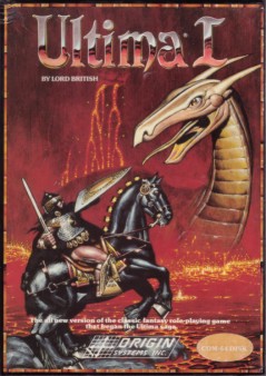
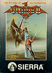
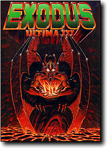
I really liked the Ultima boxart (Ultima packaging, including trinket, cloth map, etc. is the best I've seen of any game).

Ultima_1_box.jpg
Title_U2Sierra.png
u3box.jpg
421px-Ultima_IV_box.jpg
437px-Ultima5box.jpg
423px-U6cover.jpg
usebox.jpg
umdbox.jpg
250px-Ultima-underworld-box.jpg
250px-Ultima-underworld-II-box.jpg
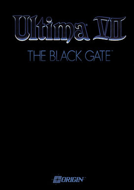
Ultima_VII_Black_Gate_box.jpg


After a series of spectacular box art, Origin decided to put out a box that was completely black hahaha.
 
Top Bottom