Chittagong
Gold Member
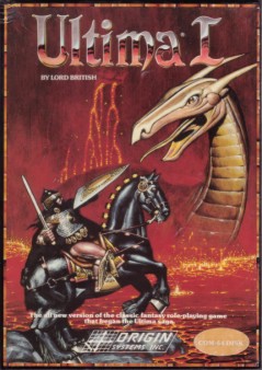
Beautifully composited, airbrushed artwork.
Meticulously kerned and hand crafted typography.
Those were the days - before any retard could do box art with Photoshop and Illustrator. No layer effects. No tacky bewels. No bad composites. No lazy renders.


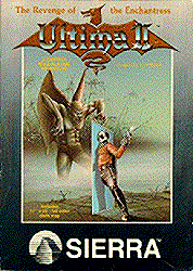
"If the logo and typography are good enough, they can be in solid color and still look great"
Meticulously kerned and hand crafted typography.
Those were the days - before any retard could do box art with Photoshop and Illustrator. No layer effects. No tacky bewels. No bad composites. No lazy renders.
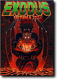
"If the logo and typography are good enough, they can be in solid color and still look great"


")


.jpg)