-
Hey, guest user. Hope you're enjoying NeoGAF! Have you considered registering for an account? Come join us and add your take to the daily discourse.
You are using an out of date browser. It may not display this or other websites correctly.
You should upgrade or use an alternative browser.
You should upgrade or use an alternative browser.
Stardew Valley Switch Icon + Download Size
- Thread starter Vanillalite
- Start date


Interfectum
Member
Congrats Neiteio.
TechnicPuppet
Nothing! I said nothing!
Perfect. I think it's the same on my Xbox.
Phillips455
Member
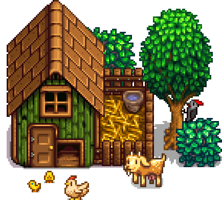
That k God it's not a zoomed In version of the chicken that the pc version uses.
Really looking forward to playing this for the first time.
Heard a lot of good things.
U will like it for sure! I stopped playing PC version and waited for this one too.
purseowner
Member
Neiteio wins again.
CharminUltra
Member

Crisis averted.
Dangansona
Member
icon shoulda been
I'm triggered.
TheGreatMightyPoo
Banned
Both icons are garbage but Ill probably get both games.
Wait, Wargroove? Is that a review copy or what..? That game doesn't seem that close to release
The publisher of Stardew Valley is the dev of WarGroove.
MindCollizion
Member
Are we going to have a thread for all Switch icons now because of the Switch icon "situation"? Icon doesn't look like anything special nonetheless.
CaptainofIndustry
Member
Im so happy to see all this Switch support. I fucking love this system.
Are we going to have a thread for all Switch icons now because of the Switch icon "situation"? Icon doesn't look like anything special nonetheless.
You already know the answer.
LOL I was just trying to remember what the PC icon was... and there it is.a shame it wasn't this just for the reactions

")
ThanksVision
Member
looks like it doesn't match our decided standard for switch icons. icons NEED the title of the game AND some sort of imagery referring to the artstyle of the game. This obviously lacks the latter, so I will not be picking it up. They should have condensed the physical release art into an icon. it's a shame because I really wanted to get this and put 200 hours of fun into it, but it looks like chucklefish is out of my $15
moltonasty
Member
NOW AIN'T THAT A BEAUT
gross, should've been this


BocoDragon
or, How I Learned to Stop Worrying and Realize This Assgrab is Delicious
I'm a designer and I hate you all for suggesting that the only good icon is one with the logo.
I'd say it effectively conveys an escape from city life (and the name of said place). The game begins with your character working a miserable office job; his sudden inheritance leads him to turn over a new leaf in the countryside, seen here among rolling green hills under a starry sky. <3Since icons are all the fuss nowadays I may as well say the icon doesn't exactly scream out 'town planner / life sim game' to me.
Let's all be thankful we didn't get the chicken icon that the PC version apparently has. :-O
Nitty_Grimes
Made a crappy phPBB forum once ... once.
Cant wait to look at this icon all the time and not play the game.
TheGreatMightyPoo
Banned
Well, thats one way to embellish a completely bland and amateurish icon.I like how the sky fades into stars over the lush green mountains and inviting wooden letters, conveying the folksy small-town feel of the game.
Man, this and Golf Story and SteamWorld Dig 2, all lined up in the home menu and rotating in play... So good! <3
Ever think of going into games PR???
gross, should've been this
NeoGAF: Looks great! Effectively conveys what the game is about. Why are people complaining?
Vampirolol
Member
I must be the only one who liked the minimal icons without text.
ThatsMytrunks
Member
Lost opportunity.

Lost opportunity.

NOOOOooooooooo
Lost opportunity.
Could have been greatness
FloweryMarston
Member
are people seriously saying the icon is good just because of the logo?
TheGreatMightyPoo
Banned
Yes.are people seriously saying the icon is good just because of the logo?