• Hey, guest user. Hope you're enjoying NeoGAF! Have you considered registering for an account? Come join us and add your take to the daily discourse.

GAF, what's the best-looking font?

Status
Not open for further replies.
Personally, I adore Futura, Rockwell, and Helvetica (of course.)
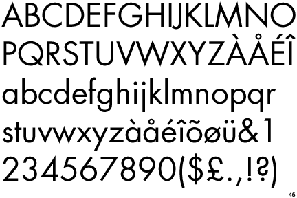
Futura
Futura.gif


Rockwell
Rockwell.gif


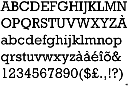
I like that the fonts have near-perfect circles for their Os, Ps, etc., and the uniformity in weight is very pleasing to me.

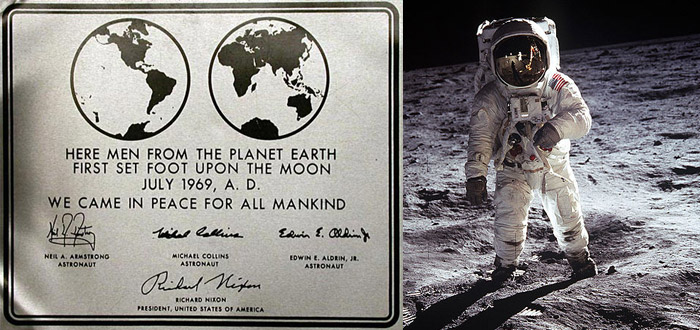
Also, Futura had the honor of being the first typeface on the moon, chosen for a commemorative plaque left by the astronauts of Apollo 11 in 1969.

Apollo11Plaque.jpg


Iconic filmmaker Stanley Kubrick used Futura religiously in many of his films, notably 2001: A Space Odyssey and Eyes Wide Shut.

"It was Stanley's favourite typeface. It's sans serif. He liked Helvetica and Univers, too. Clean and elegant... I was always trying to persuade him to turn away from them. But he was wedded to his sans serifs."

- Tony Frewin, on working with Stanley Kubrick​


What fonts do you guys like?
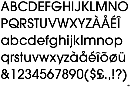
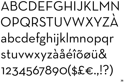
 

GraveRobberX

Platinum Trophy: Learned to Shit While Upright Again.
spindashing said:
comic sans

THIS. You tell em' spinny!

Especially when you are an owner of a Basketball team and your top player drops you like a bad habit, and you get scornful like an Ex-GF
"Just Business, Brah!"
 

usea

Member
There is no best font. All good fonts have their place, and also places where they aren't a good fit.

This thread could be a great discussion about the ways in which different types of fonts are effective, or it can just be a list thread where people dump their favorite and then leave. The thread title makes the latter more likely.

I would get it started in the better direction, but honestly I don't really know enough about the topic.
 
spindashing said:
comic sans
damn I forgot to put inb4comicsans in spoilers in the OP. :/

Also, I love Avant Garde and Neutra Text. Both are also gorgeous fonts.

Avant Garde
AvantGardeGothicMedium.gif


Neutra Text
NeutraText.gif


EDIT: Oh, Nevis is nice! Thanks!

And yea, I realize this will likely become a link/image dump, but I hope some of you do dive into the specifics of why you like certain fonts and what you would use them for. Also, do you guys find it harder to read paragraphs with serif or sans-serif fonts?
 
WEGGLES said:
What's so great about it? Neves is p slick looking too

Simple, Visible, Minimal. It was the first widely used sans-serif font and became very popular. I's a product of it's time, though and is now pretty over saturated. Check out the Documentary "Helvetica" On netflix. It's really interesting.
 
I also like Georgia. It will always hold a special place in my heart, because when Myspace [lol] started allowing you to customize your font on your posts, I always used Georgia because it was a nice clean serif font.
 

WEGGLES

Member
TheWiicast said:
Simple, Visible, Minimal. It was the first widely used sans-serif font and became very popular. I's a product of it's time, though and is now pretty over saturated. Check out the Documentary "Helvetica" On netflix. It's really interesting.
Oh, so it's just nice looking? :p

I've always thought it was nice looking, but was wondering if there was more to all the love for it.
 
Drazgul said:
[IG]http://spoonplanet.com/oldengfont.jpg[/IMG]

Old English, the most metal of all fonts.
If you're planning to get a tattoo on your back? Sure.

Anything else? Hell to the no.
Bgamer90 said:
I love Eurostile.

[MG]http://iloveeurostile.com/images/eurostile-perfect.png[/IMG]
Ha, I remember when the sports wallpaper community I used to be a part of started using this font. It got abused like crazy. I hate the font now because of it. Same thing with Asenine, Bauhaus, and Steiner
 

gokieks

Member
It may well just be because of how often I see it, but I've always liked Tahoma a lot amongst sans-serif fonts (also Verdana, but I prefer Tahoma in most situations between the two):

220px-Tahoma.png


And I've come to grow fond of Segoe as well:

220px-Segoe_UI_font.svg.png


And for calligraphic font, LainieDaySH is one that I really liked but have no idea the origins of:

lainiedaysh.gif
 
Just to name a few that I like.

Gotham:
http://www.typography.com/fonts/font_overview.php?productLineID=100008

Knockout:
http://www.typography.com/fonts/font_overview.php?productLineID=100013&path=head

Whitney:
http://www.typography.com/fonts/font_overview.php?productLineID=100026&path=head

Museo:
http://new.myfonts.com/fonts/exljbris/museo/

Klavika:
http://new.myfonts.com/fonts/processtype/klavika/

Futura:
http://new.myfonts.com/fonts/adobe/futura/

Univers:
http://new.myfonts.com/fonts/agfa/univers/

Lubalin Graph:
http://new.myfonts.com/fonts/adobe/itc-lubalin-graph/

Avant Garde Gothic:
http://new.myfonts.com/fonts/adobe/itc-avant-garde-gothic/
 

Doytch

Member
Menlo. It's easy making a nice font when you've no restrictions; making a nice monospaced font is more impressive.
 
I actually sort of found Calibri on my own, and as I read this thread I understand it's a new microsoft standard(Calibri was cool before it was mainstream, etc.)? But yeah, <3 Calibri.
 

SnakeXs

about the same metal capacity as a cucumber
Bulbo Urethral Baggins said:
I've never ventured outside of arial and times new roman. As far as I'm concerned, nothing else needs to exist.

Bulbo Urethral Baggins said:
If I get an email in helvitica, I change the font before I reply. Hate it with a passion.

Filth.
 

Ridli

Member
I'm just happy as long as I dont get emails in serif'd fonts. For some reason, I'm really bugged by serifs in a digital format.

In print I think they look fine, but I always get an irrational scowl when I see it in an email or IM.
 
Londa said:
Well the most used in design is Helvetica.
I have actually made a vow to never use Helvetica in my designs because it's used way too damn much.

In this design that I produced I used both Lubalin Graph and Avant Garde Gothic. When trying to convey a message to someone in sea of Helvetica these two typefaces standout.
H6ltL.jpg


Fight the good fight and don't use Helvetica.
 
Altazor said:
Papyrus.

Futura, Helvetica, Arial (though I think it looks better smaller), sometimes Verdana.
Papyrus is without a doubt my most hated font currently in existence.

Font_Style_4_PAPYRUS.JPG


It's so hideous. Worse still, it's overused as fuck. All new age/homemade/hippy crap always has a damn label with that atrocity scrawled all over it.
 
Status
Not open for further replies.
Top Bottom