-
Hey, guest user. Hope you're enjoying NeoGAF! Have you considered registering for an account? Come join us and add your take to the daily discourse.
You are using an out of date browser. It may not display this or other websites correctly.
You should upgrade or use an alternative browser.
You should upgrade or use an alternative browser.
Which Final Fantasy art style is your favourite?
- Thread starter Wazzy
- Start date

fuzzyreactor
Banned
FFXII & FFVIII are top tier
FFXI & FFVII are mid tier (FFVII would be top tier if more of the game looked like midgar)
FFX and FFXIII are bottom tier
FFIX is garbage tier
FFXI & FFVII are mid tier (FFVII would be top tier if more of the game looked like midgar)
FFX and FFXIII are bottom tier
FFIX is garbage tier
6, 7, 9, 10, 12, 14, and soon to be 15
The best? It's really a tossup since the styles change pretty drastically on some of them.
I think the pre-production artwork for 6 and 12 is fucking phenomenal, whereas the 3d executions of 10, 14, and 15 look absolutely awesome. I would love to see all the pre-production work for 15.
I'd have to say overall style would probably go to 7 since the steampunk-y world feels so lived in and atmospheric. Character designs are good but definitely a product of the time where more outlandish designs were in. The environments are where it's at.
I wonder how shit they look on iOS/Android.Final Fantasy VI's enemy design is gorgeous.


Glass Rebel
Member
XII of course. To this day, Ivalice is my favourite FF world and FFXII had some fantastic designs for most of the characters and creatures. There's just something very appealing about the desert setting and the Judges and different races give it a very unique flavour.
Garcia
Member
I wonder how shit they look on iOS/Android.
That would break my heart to watch. . . 16-bit all the way.
Games that are out
Toss up between 12,7, and 14 for me
Games that aren't out,included
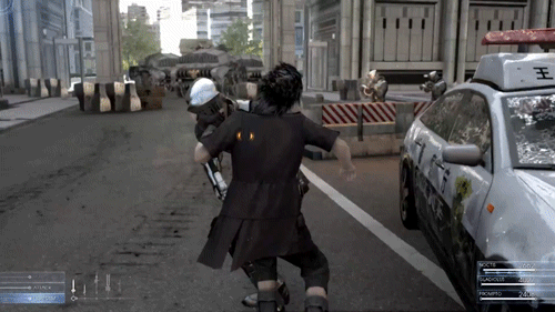
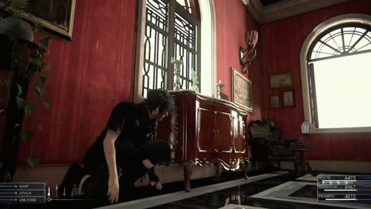
XV is the clear winner
This game needs to exist sooner than later.
Redesign Is better
Toss up between 12,7, and 14 for me
Games that aren't out,included
XV is the clear winner


This game needs to exist sooner than later.

Appeals to japanese and western audiences.
Redesign Is better
fuzzyreactor
Banned
nvm
I'd love to see either (a) a black female, or (b) an older female character (30-40 range).
Me too. We've already gotten three black males(VII, VIII and XIII) so now they should do a female.
HiddenWings
Member
I wonder how shit they look on iOS/Android.
If it's anything like the FF5 on iOS/Android, the redone enemies are actually great. The characters not so much.
On topic, I think I like most of what Yoshida has done, with my favorite probably being FF14. Most of the pieces I would post are already in the thread.
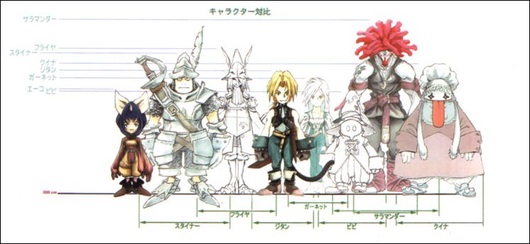
I wouldn't say I hated the art style completely rather I hated how the people were realized in that game.FF12 easily for me. The only art style I didnt like, strangely, was 9 even though i loved almost everything else about it.
I like the Dissida zidane WAY more than normal zidane.


revolverjgw
Member
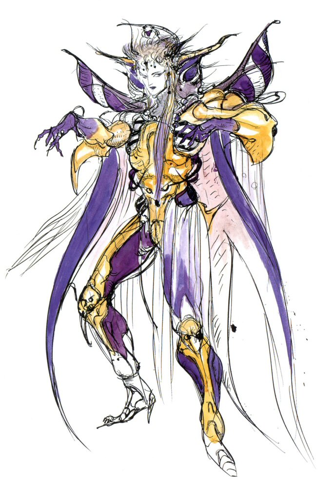
6. Still some of my favorite pixel art. Nice deep, rich colors and of course Amano's enemy and portrait art.
You say childish, I say fairytale and classic stylish design. And that was what the story was, a medieval fairytale with great characters. Adult themes can go well with any any artstyle. Doesn't need to have silly japanese pop anime full of belts characters with adult proportions.
Okay, childish is not the world that's fair. Let's say 'storybook'ish. The reason why I do not fully care for it it because the style is so different from previous FFs (even the lesser ones) and greatly conflicts with Amano's awesome designs of FF past.
That being said, I would kill to see a FF with Amano shaded characters. /droll.
edit: Zidane in Dissidia does indeed look so much better.
Dark_castle
Junior Member
Everything but Nomura.
Nothing by Nomura.
Nothing by Nomura..


Ragnorok64
Member
VIII Is my absolute favorite.
Final Fantasy VI's enemy design is gorgeous.
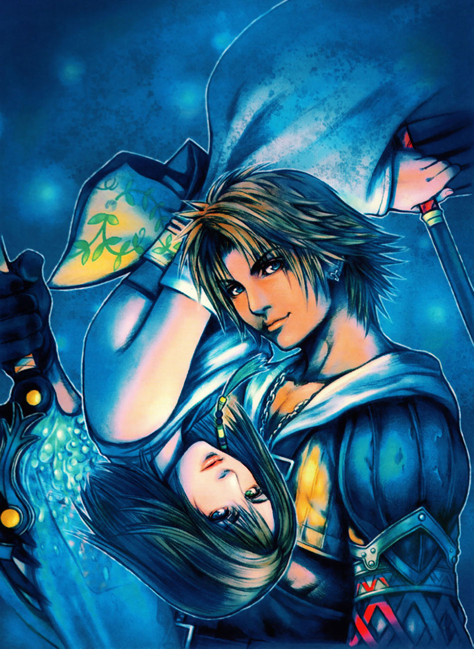
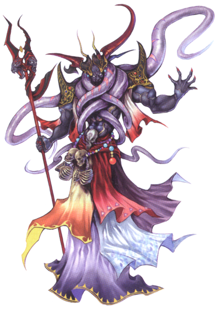
Artwork done by Tetsuya Nomura.
Dice//
Banned
Them ribs: Poor girl is starving to death.
AND HER HAIR IS GREEN DAMMIT! ;_____;
(jk)
I love all of them.
Amano, Nomura & Yoshida each bring their own flavor to the series
Amano, Nomura & Yoshida each bring their own flavor to the series


chaobreaker
Member
I have a feeling that this post is going to get crapped on but I really digged the Tactics Advance series artstyle.
They just look so whimsical and fun.
The generic unit designs are the best as well. They just leak personality and charm compared to other Final Fantasy games with job systems. I think adding different playable races that aren't just blue skinned humans was the best thing this series had.
Same goes for A2:
And yeah I get that the designs can be a little
...elaborate, but I that's exactly why I love them. Look at those giant pizza cutter swords. These kids aren't fucking around. They just want to have crazy adventures without politics, alcoholism, albinism, or crippling diseases getting in the way.
They just look so whimsical and fun.

The generic unit designs are the best as well. They just leak personality and charm compared to other Final Fantasy games with job systems. I think adding different playable races that aren't just blue skinned humans was the best thing this series had.

Same goes for A2:


And yeah I get that the designs can be a little


...elaborate, but I that's exactly why I love them. Look at those giant pizza cutter swords. These kids aren't fucking around. They just want to have crazy adventures without politics, alcoholism, albinism, or crippling diseases getting in the way.

Shogun1337
Junior Member
Either
or
Yes, and yes.
MagnaderAlpha
Member
Probably the only redesign I DON'T like. Mesh shirts =/= good FF design.Redesign Is better


Glass Rebel
Member
Nomura redrawing/reinterpreting Amano designs is his best work by a good country mile
qualitydisc
Member
I have too many conflicting answers for the OP's question. I love many of the different styles and happy that they all exist.
Amano, though, wow. I was happy that I got to meet him last year. And he drew a sketch of FF4's Kain for me. Scratch one off my bucket list.
VIII always stuck me as the most "prototypical" of modern FF style. And yeah, that means a heavy Nomura influence. But I see the most consistent legacy of art direction in this style through VIII, X, XIII, and XV.
XV's art direction looks balls-to-the-wall amazing. Can't wait for it.
Amano, though, wow. I was happy that I got to meet him last year. And he drew a sketch of FF4's Kain for me. Scratch one off my bucket list.
VIII always stuck me as the most "prototypical" of modern FF style. And yeah, that means a heavy Nomura influence. But I see the most consistent legacy of art direction in this style through VIII, X, XIII, and XV.
Maybe I'm in the minority on this but I'm kind of indifferent about Stella's redesign. Yeah, her beta version looks more humanized but I don't think it's a travesty or anything. Plus we only have the 1 CG render from a split-second of trailer to make judgments with.I get bugged-out how they made Stella look more like a 16 year pop idol than her more beta-versions indicated

XV's art direction looks balls-to-the-wall amazing. Can't wait for it.
Lee Chaolan
Member
Tactics and 12. Just so good. Love all the official art of the jobs classes in Tactics.
Not Spaceghost
Spaceghost
The classic sorta watercolor style is always going to be my favorite FF art style.
Earthpainting
Member
I can't tell if we're talking about the art style in-game or in promo art, but going by the answers, I'll assume it's the latter. I really like the look of IX and Crystal Chronicles the most in either case.
I don't like the designs of XII or XIV, but their promotional and concept artwork is usually gorgeous to look at.
I don't like the designs of XII or XIV, but their promotional and concept artwork is usually gorgeous to look at.
MHWilliams
Member
Akihiko Yoshida is my go-to guy. Shame he's gone freelance.
terrisus
Member
Them ribs: Poor girl is starving to death.
AND HER HAIR IS GREEN DAMMIT! ;_____;
(jk)
Never mind that, just think of what those shoes are doing to her foot structure.
Probably the only redesign I DON'T like. Mesh shirts =/= good FF design.
If it wants to be a true Final Fantasy design, it needs more belts and zippers.
Ugh, post-6 designs are just horrible in general
Dice//
Banned
I liked Nomura's older stuff. These days he just looks like he's out of practice and obviously doesn't devote himself to "just the creative" aspect anymore since he's moved up in the company.
Ho hum.
@ MagnaderAlpha
Just remember, FF7 was made in the 90s...Mesh shirts were the
fad of that era. 
I love Berrets redesign, but I agree about the mesh, it's dumb n' ugly.
@Raven777
I love the design too...just wish it moved faster across the world map. >:[
Ho hum.
@ MagnaderAlpha
Just remember, FF7 was made in the 90s...Mesh shirts were the
best/worst
I love Berrets redesign, but I agree about the mesh, it's dumb n' ugly.
@Raven777
I love the design too...just wish it moved faster across the world map. >:[
Dark_castle
Junior Member
I liked Nomura's older stuff. These days he just looks like he's out of practice and obviously doesn't devote himself to "just the creative" aspect anymore since he's moved up in the company.
Depends on how you define older.
Dissidia 012 and Type-0 came out in 2011.
/thread
Although XIV: ARR has some really nice artwork, I can't say no to IX artwork.
MagnaderAlpha
Member
I think Nomura was more creative back in the day. Maybe it had something to do with him being younger and having more to prove. I mean, you just don't see FF monsters that look like these anymore:I liked Nomura's older stuff. These days he just looks like he's out of practice and obviously doesn't devote himself to "just the creative" aspect anymore since he's moved up in the company.
Ho hum.
FFVII was made in the 90s. Advent Children wasn't. Though, I think Barret's original look is superior. Don't care for his new vest, nor his fake looking prosthetic arm. Something seemed more gruff and rugged regarding his original look that just fit.]@ MagnaderAlpha
Just remember, FF7 was made in the 90s...Mesh shirts were thefad of that era.best/worst
I love Berrets redesign, but I agree about the mesh, it's dumb n' ugly.
Vangu Vegro
Member
The art style of the Tactics PSP cutscenes is my favorite. I would do almost anything to get a Zelda game in that style...
Probably the only redesign I DON'T like. Mesh shirts =/= good FF design.
Better than his old one for multiple reasons, more thought, less racist ect ect.
FFVII was made in the 90s. Advent Children wasn't. Though, I think Barret's original look is superior. Don't care for his new vest, nor his fake looking prosthetic arm. Something seemed more gruff and rugged regarding his original look that just fit.
I don't
" hey we need a black guy"
" lets just make him mr. t, thats totally not kind of racist "
Also his body is like... better portioned, he has like a cyborg arm, they actually put some thought and effort into the design and made it original rather than just base it on that one black guy they saw on the tv , generally everything is better in the new design. IMO.
Sanctuary
Member
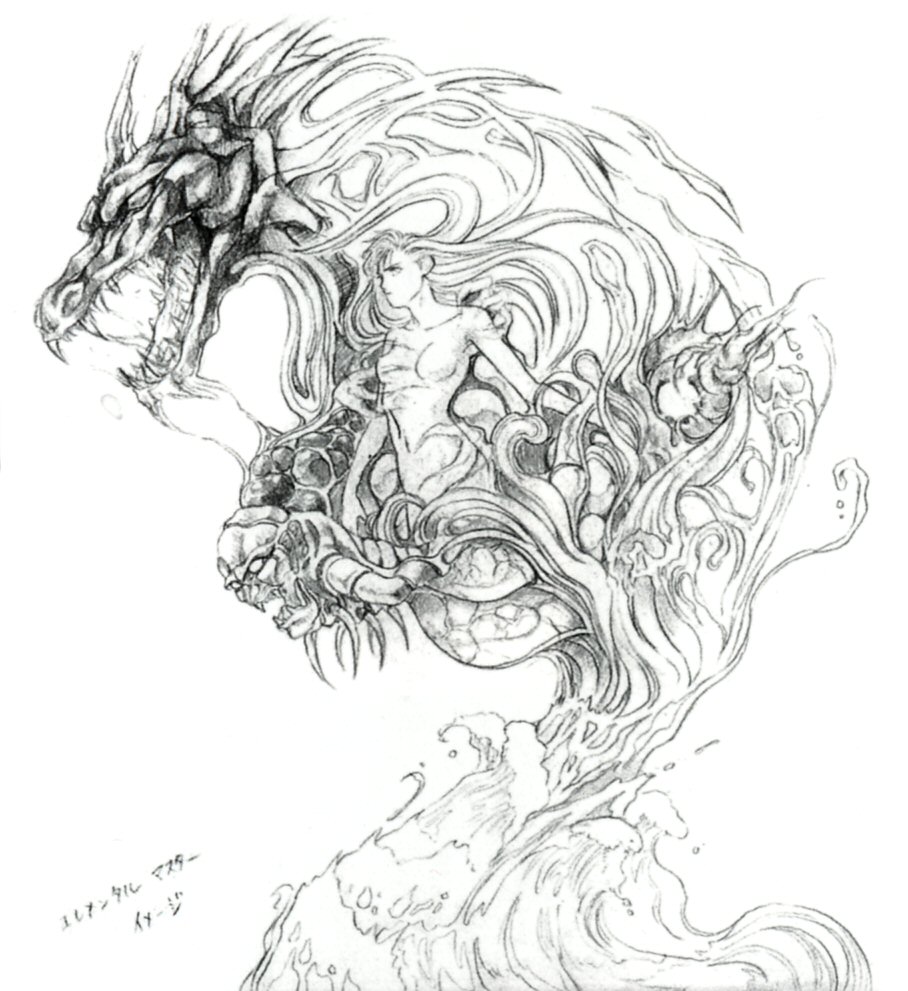
Amano´s FFI-FFVI art. Lovely stuff.
Agree, except the whole androgynous look starts wearing thin after a while. It also kind of makes everyone look like they are in a Japanese play.
Tactics is probably my close second favorite.