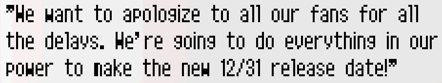
what's with this issue? always been there in plenty of games
I finally started playing Spirit of Justice and im instantly reminded of this, which was also an issue in Dual Destinies and honestly in.. a lot of games. Puzzle & Dragons Super Mario Edition also comes to mind

it's like all fonts are designed for a different width and the 3DS' screen squishes them or something
I realize the screen's resolution aint the best, but unless im mistaken I think it comes down to just font choice? I know some games have text as small and dont have this kerning and spacing (and blurriness?) issue
it's not a dealbreaker, but it gives plenty of games this sort of bootleg / emulated feel. They're just not great for keeping a comfortable reading flow.
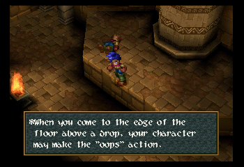
I finally started playing Spirit of Justice and im instantly reminded of this, which was also an issue in Dual Destinies and honestly in.. a lot of games. Puzzle & Dragons Super Mario Edition also comes to mind
it's like all fonts are designed for a different width and the 3DS' screen squishes them or something
I realize the screen's resolution aint the best, but unless im mistaken I think it comes down to just font choice? I know some games have text as small and dont have this kerning and spacing (and blurriness?) issue
it's not a dealbreaker, but it gives plenty of games this sort of bootleg / emulated feel. They're just not great for keeping a comfortable reading flow.