• Hey, guest user. Hope you're enjoying NeoGAF! Have you considered registering for an account? Come join us and add your take to the daily discourse.

Game Informer's February cover is Doom

dmr87

Member
https://www.youtube.com/watch?v=PI3OY9dUVxI

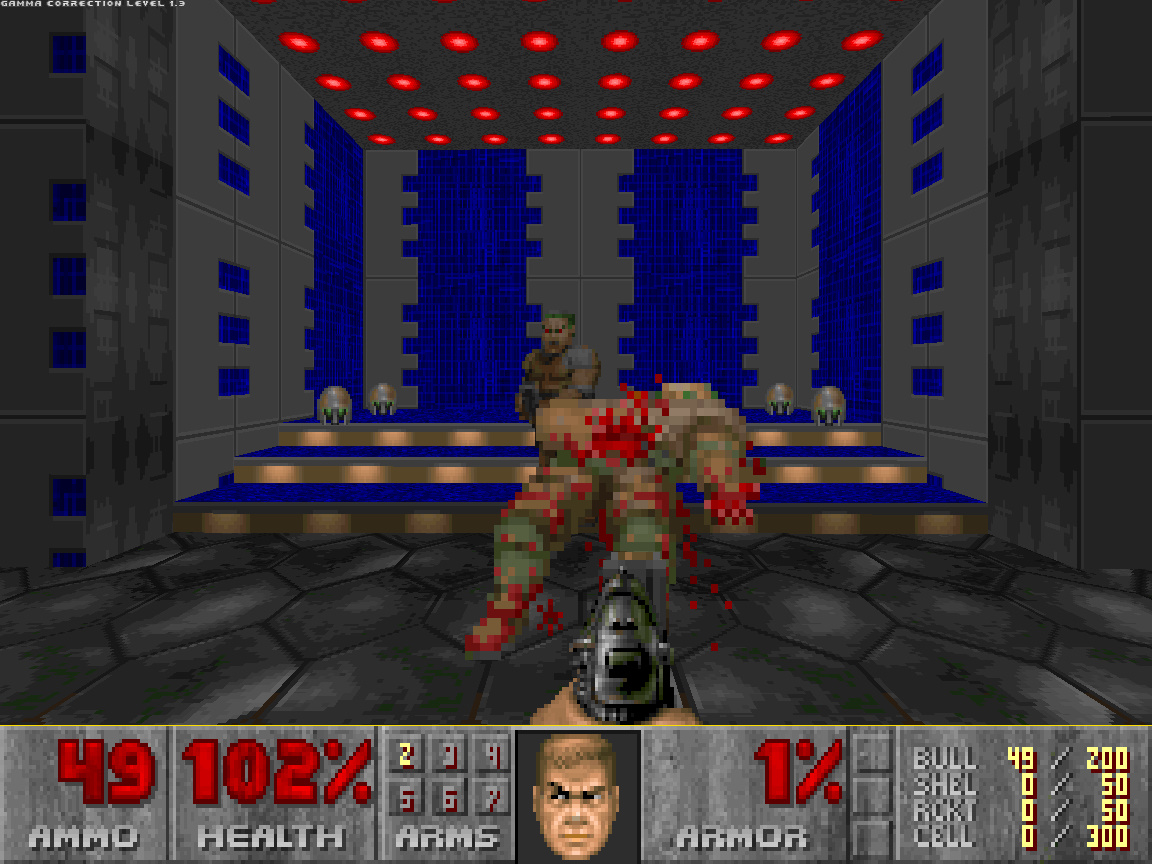
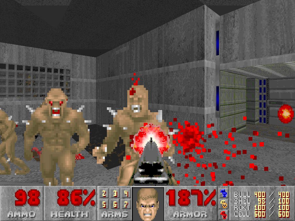
After an 11-year hiatus, the first-person shooter that popularized the genre is finally coming back. In anticipation of this Doom revival, we traveled to id Software's Richardson, Texas headquarters to see how the game is coming together. We spent considerable hands-on time with the single-player campaign, multiplayer, and SnapMap user-generated content system, and in the aftermath Doom has vaulted into the upper echelon of our most anticipated games of 2016.

Throughout our 12-page cover story, we dive deep into how id Software is taking the fast-paced, bloody good combat of the original Doom and infusing it with modern sensibilities. We speak with design director Marty Stratton and creative director Hugo Martin about everything from the new upgrade systems and the idTech 6 engine to demon designs and why they chose the arena multiplayer approach.

v2Eb.jpg


http://www.gameinformer.com/b/news/...er-february-cover-reveal-doom-2416160408.aspx
 

Truant

Member
id games always feel super good, the shooting and enemy hit reactions especially. RAGE really nailed that. I'm expecting great things from DOOM in terms of player movement and combat.
 
I don't like any of the individual models, but the scene/setting look cool.

Are those actual character models or touched up for the cover? Downgrade incoming?

I thought the visuals in the reveal looked better, but again that can just be touched up cover art. Like even looking at the armor in the players arm.
 

Nirolak

Mrgrgr
Are those actual character models or touched up for the cover? Downgrade incoming?

I thought the visuals in the reveal looked better, but again that can just be touched up cover art. Like even looking at the armor in the players arm.

Well, I imagine they wouldn't make it look intentionally worse for the cover.
 
What an ugly colour scheme. :/ Gimme horrible floating red demon balls and pink shithead demons

I guess they're just worried that people wouldn't like it and thus try to be more in-line with expectations for a game of this type, but in doing so I worry that it's just gonna be yet another shooter
 
Having coincidentally just finished Masters of Doom, is Carmack still affiliated with the company and/or did he work on idTech Engine 6? Suppose I could Google this...

*edit*
Oh I forgot he went to Oculus
 
I wasn't a fan :/ that double jump was weak sauce and I was bored after about 5 rounds

I'll second this, Beta was so boring, every time I played it I just wanted to play more U4 beta. But im still hyped for the single player.
 
This game looks hella redundant and frankly lazy. I expect nothing more than a big budget Brutal Doom mod. To trot out all the old weapons and monsters and hellscapes and demon-infested mars bases and cityscapes, with an extra dose of juvenile gore on top of it. With all the color sucked out it because "modern sensibilities"

The original Doom is still perfect. It needed no embellishment.
 

Agent_4Seven

Tears of Nintendo
Oh, so now we putting in-game screenshots on a cover.... okaaaaay, I guess.

Bethesda, is it so hard to hire folks from Meduzarts etc. so that they could make cool marketing stuff for DOOM? Really?
 
There's barely any color in that entire image, pretty uninspiring

Yeah, I don't like it much either. It needs a bit more colour, a bit more style. Hell would be a place of firey pits and bright lightning and eternal flames of damnation. Not this dreary brown and grey.

At least they got rid of the yellow filter. My only gripe is the smaller humanoid enemies look more alien than demon.

They remind me a lot of Jackals from Halo. Really not keen on how alien they look.
 
That's still not very colorful man.

Yes, it kind of is. :v Especially for games of its type. Colorful isn't a binary "shades of brown versus explosions of pastel". Doom used a ton of colour variation throughout, whereas could you imagine a major FPS being designed with that level of variety in its colour design? It's also to do with the lighting, where you can get very bright areas like this:

80916-TheUltimateDoom.jpg

I'm not seeing what you are at all so I guess we'll just agree to disagree.

Also are you really comparing multiple areas in an already released game to a single screenshot?
 
Top Bottom