• Hey, guest user. Hope you're enjoying NeoGAF! Have you considered registering for an account? Come join us and add your take to the daily discourse.

Designer of fake "The Next Microsoft" rebranding, hired by MS to work on Xbox brand

bananas

Banned
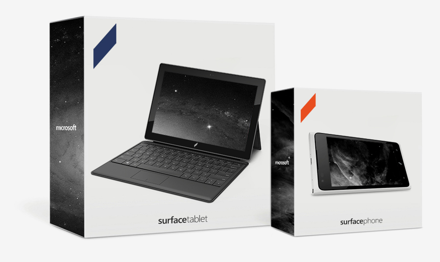
Perhaps you remember this guy from last summer, who presented a hypothetical rebranding effort for Microsoft:

EHncNHI.png
qQP1ZWx.png

http://www.minimallyminimal.com/2012/7/3/the-next-microsoft.html

Well, Microsoft has hired him. Specifically to work on the Xbox brand.

Big news.

I'm working at Microsoft as of summer.

Xbox to be specific.

It’s true. I’m going to go work for Microsoft. When my Microsoft rebranding project went viral, I frequently got asked if I was approached by them. "Yes" is the short answer but this relationship has actually been going on for nearly 6 months.

This was a difficult choice to make. I was approached by countless companies with offers, ranging from electronics manufacturers to ad agencies. Some of the companies that approached were the makers of my favorite products ever. I am even a “fanboy” of some of them. But when it came time to make my final decision, I wanted to work at a place I can really get excited about. Working at a company is like getting married, it becomes a fundamental part of your life. I want to work with awesome people on awesome projects that I can get excited about. If you’ve been watching Microsoft over the past year, it’s been exciting, regardless of what your ecosystem preference is.

I can’t talk about the details of how things fell into place but the choice became obvious. I'll be designing for Microsoft as of summer. I promise that I’ll make the my greatest work ever while I'm there.

I want to thank every reader of Minimally Minimal for the support so far. Without you, I would have never been able to get to where I am. You have been the wind beneath my wings, my catalyst, my mentor. I hope you’ve been able to see me grow since 2009, the beginning of this blog, and continue to see my work develop in the future. I still have my final semester of school left, and MM is only 3 years old. Don’t take this as the end of me as a curious designer, it’s only the beginning.

Always looking forward,

Andrew

http://www.minimallyminimal.com/blog/msft
 

trinest

Member
I don't think it liked this design. No I didn't. I didn't mind that line which twisted into various logos one.
 
That Office one makes me so mad because for Xbox I can just picture him completely intersecting them to form an X and colouring it green. Boom, graphics design.
 

xJavonta

Banned
That paragraph reads as something extremely sophomoric to me. I don't know what it is.

Anyway, good for this guy. Wonder what he's gonna do next.
 

injurai

Banned
ITT: People who don't understand he designed a completely unified brand for Microsofts infrastructure and pipeline of projects. He had a vast portfolio beyond what you see in the OP and on his website.
 

enzo_gt

tagged by Blackace
Looks great. The designs he have appear to be more cohesive than anything the market leader, Apple, can do nowadays anyways.
 

jett

D-Member
ITT: People who don't understand he designed a completely unified brand for Microsofts infrastructure and pipeline of projects. He had a vast portfolio beyond what you see in the OP and on his website.

Yeah, nothing more needs to be said. I really enjoyed the ideas he had for a Microsoft rebranding, it's impressive he worked it all out in three days.
 
Honestly... I don't like anything I see in the pictures. Is he suggesting they also change the Windows logo to a polygon? The Windows logo/Microsoft logo is iconic and easily recognizable to the mainstream. Even the new Windows/Microsoft logo is iconic and still easily recognizable because it stay true to the original. Taking away that for a Polygon? Why would Microsoft even consider that.

Anyone have any links to his work on the Xbox rebranding?
 

jett

D-Member
Honestly... I don't like anything I see in the pictures. Is he suggesting they also change the Windows logo to a polygon? The Windows logo/Microsoft logo is iconic and easily recognizable to the mainstream. Even the new Windows/Microsoft logo is iconic and still easily recognizable because it stay true to the original. Taking away that for a Polygon? Why would Microsoft even consider that.

Anyone have any links to his work on the Xbox rebranding?

I guess it's too much work to actually click the link in the OP to read the basis behind his idea.
 
Dude has a great understanding of design and UI. His Microsoft rebranding project was done in 3 days as a mental exercise. His deconstructions about branding and UI is great work, actually.
random pics:

1000w

1000w

1000w
 
Honestly... I don't like anything I see in the pictures. Is he suggesting they also change the Windows logo to a polygon? The Windows logo/Microsoft logo is iconic and easily recognizable to the mainstream. Even the new Windows/Microsoft logo is iconic and still easily recognizable because it stay true to the original. Taking away that for a Polygon? Why would Microsoft even consider that.
All the cool companies are doing polygons
ibrNRJ5YRTGj0Z.gif
 

MCD

Junior Member
He might have more influence on Windows or Windows Phone 8 where design and font are strong but Xbox? What will he do there? Design the logo?

In any case, congrats.
 
Top Bottom