-
Hey, guest user. Hope you're enjoying NeoGAF! Have you considered registering for an account? Come join us and add your take to the daily discourse.
You are using an out of date browser. It may not display this or other websites correctly.
You should upgrade or use an alternative browser.
You should upgrade or use an alternative browser.
NHL December 2014 |OT| Clearsi is the only stat that matters
- Thread starter Marvie_3
- Start date

Unhandled Exception
Member
Berra has some fucking incredible clearsi
More nonsense stats!
Introducing QuickStats
Quicks Against vs. Quicks For.
"Dan Cleary looked pretty quick there. That's a Quickie."
"Dan Cleary didn't look that quick to me. That's a Quickie against."
Fata1moose
Banned
We've really been lazy on the OT's lately. Though I can't complain as I'm not making them.
MacKinnon though!

MacKinnon though!
Unhandled Exception
Member
Highlight of the avs season, might as well post it every page
Fata1moose
Banned
Highlight of the avs season, might as well post it every page
This is sadly true, things have been looking up though. Berra is almost replaced by Pickard.
We've really been lazy on the OT's lately. Though I can't complain as I'm not making them.
MacKinnon though!
basically this :lol

Terrordactyl
Member
Not as bad as ours, we went from my favorite sweater of all time to literally the worst sweater in the league currently 
Not as bad as ours, we went from my favorite sweater of all time to literally the worst sweater in the league currently
Nope

Fata1moose
Banned
Our thirds are the only good jersey we have right now. Burn in hell, apron stripes.
Screencaps of a video the Stars posted about early concepts for their rebranding:


Article about it with many more concepts and the video: http://www.icethetics.co/blog/2014/11/30/dallas-stars-reveal-road-to-rebrand-with-loads-of-concepts
Thank god they didn't go for a red, white and blue colour scheme.
Article about it with many more concepts and the video: http://www.icethetics.co/blog/2014/11/30/dallas-stars-reveal-road-to-rebrand-with-loads-of-concepts
Thank god they didn't go for a red, white and blue colour scheme.
Terrordactyl
Member
I don't see the east teams all too often, and when I do I rarely see the thirds, I like that buffalo jersey a lot more than ours.
And I had no idea about Dallas considering American colors, Jesus, like any league needs more tens with those colors, Dallas fans dodged a bullet there. Not a fan of their new logo at all but I'm glad they kept green, there isn't a very diverse color palette in the NHL as it is, it would definitely make their arena look interesting too.
And I had no idea about Dallas considering American colors, Jesus, like any league needs more tens with those colors, Dallas fans dodged a bullet there. Not a fan of their new logo at all but I'm glad they kept green, there isn't a very diverse color palette in the NHL as it is, it would definitely make their arena look interesting too.
CrazedArabMan
Member
Every month the OP is going to have Cleary in it isn't it?

Thank god they didn't go for a red, white and blue colour scheme.
The Rangers (Texas) look pretty good. Colours of the state flag etc.
I'd take that over their absolutely shitty primary logo. I can't believe the one they chose, it is all kinds of wrong.
Unhandled Exception
Member
Columbus Stars
The Rangers (Texas) look pretty good. Colours of the state flag etc.
I'd take that over their absolutely shitty primary logo. I can't believe the one they chose, it is all kinds of wrong.
Red, white and blue is too common (coming from a guy whose team has those colors), the green sticks out even if their logo isn't so great.
CreeperBlocks
Banned
Hello.

Unhandled Exception
Member
http://i.imgur.com/LBX1uEE.jpg[img]
Absolutely disgusting[/QUOTE]
Ice this fool Ducks GAF.
[QUOTE][IMG]http://i.imgur.com/QV7yl35.jpg
Ducks fans wouldn't acknowledge Kariya and Selanne on the Avalanche as canon.Ice this fool Ducks GAF.
That shit made the lockout happen.
Unhandled Exception
Member
That shit made the lockout happen.
Here I thought poor foresight made the lockout happen.
CrazedArabMan
Member
Another Cleary month?
It's always a Cleary month.
Calamari41
41 > 38
Why in the world is Dallas re-branding? With the imminent advent of advertisements on jerseys, they currently have the perfect opportunity to be the cheapest lay, as it were. All they have to do is simply change the star to solid red on their current jerseys and they instantly become walking Heineken ads.
Edit: Oh, that video was for the recent re-branding, not a new round. So they can still slap that red star on there!
Edit: Oh, that video was for the recent re-branding, not a new round. So they can still slap that red star on there!
Unhandled Exception
Member
I can't wait for all the local weed shops to buy ad space on the avs sweater. At least then when we play with this level of apathy it'll make sense.

The whole red, white, and blue thing is why I can't stand the Blue Jackets normal logo.
Oh, and token CBJ injury update, Arty's out 2-3 months with torn triceps. Things aren't really going to get better this season. I've tried to be stubbornly optimistic about the season, but it just keeps getting uglier.
http://bluejackets.nhl.com/club/news.htm?id=741752
Oh, and token CBJ injury update, Arty's out 2-3 months with torn triceps. Things aren't really going to get better this season. I've tried to be stubbornly optimistic about the season, but it just keeps getting uglier.
http://bluejackets.nhl.com/club/news.htm?id=741752
Freyjadour
Member
FYI: the 25% off $50 on NHL.com that isn't supposed to work on jerseys works on jerseys (or did this morning). I'd still go with IceJerseys but there it is.
Not as bad as ours, we went from my favorite sweater of all time to literally the worst sweater in the league currently

These you mean? I like those a bunch. I can imagine resenting the change, but it's still a slick looking jersey I think.
These you mean? I like those a bunch. I can imagine resenting the change, but it's still a slick looking jersey I think.
Oh is that the one he's talking about? I love those.
About to plow into a goalie I'm sure.
Oh is that the one he's talking about? I love those.
Agreed, it's a great looking jersey I think.
CreeperBlocks
Banned
Oh is that the one he's talking about? I love those.
It's really nice but I'm just so used to Calgary having a big flaming C on the Jersey. Are these Jerseys new?

Coldnoodle
Member
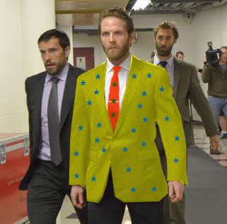
Somebody get this dude a stylist.

megachao24
Unconfirmed Member
I don't see the east teams all too often, and when I do I rarely see the thirds, I like that buffalo jersey a lot more than ours.
And I had no idea about Dallas considering American colors, Jesus, like any league needs more tens with those colors, Dallas fans dodged a bullet there. Not a fan of their new logo at all but I'm glad they kept green, there isn't a very diverse color palette in the NHL as it is, it would definitely make their arena look interesting too.
The Texas literary has the same colors as the American flag.
The U.S. flag:

The Texas flag:

Freyjadour
Member
Ho-Sang not invited to the WJ camp, can't wait to watch this years team get bounce early once again.
No worries, everything will be Fabbrilous