• Hey, guest user. Hope you're enjoying NeoGAF! Have you considered registering for an account? Come join us and add your take to the daily discourse.

Best and worst graphic design (art, UI, etc.) in games

Karkador

Banned
I feel kinda weird bringing this up as an example of best since it isn't out, but Persona 5:

In terms of presentation and style, Persona 5's menus and general UI is some of the best I've seen. P Studio games, in general, have fantastic UI.

For worst, I guess I'll also go with PlayStation All-Stars: Battle Royale's. It looks so bad. And, perhaps a controversial one, but:

Not the "worst," but Super Smash Bros. 4's menus are a terrific, unorganized and confusing mess. Aside from the silhouettes in the backdrop, it's ugly, too.

Those Persona 5 menus look like a nightmare if you dont like the Smash 4 menus.
 

fhqwhgads

Member
It's funny just how terrible Smash 4's menus are, considering both Melee and Brawl had fantastic menu design in both usability and looks. What happened there?
 

Shin-Ra

Junior Member
Hu817n.jpg
Bgtfer.jpg


aYH6b6.jpg
F9rnBN.jpg


tZD1sh.jpg
XKI1cK.jpg

GT6 has some very classy menu styling.
 
Those Persona 5 menus look like a nightmare if you dont like the Smash 4 menus.
I don't see how. They're certainly toeing the line of "overstylized" but everything is clear in the order of menu progression. I still get confused about where things are in Sm4sh.
 

DOWN

Banned
On the crap side of the spectrum, the recently released Witcher 3 is a monstrosity of awfulness.

2W4CiU3.jpg


You can't tell in that picture, but it's a bitch to go through every possible tab. I've spent hours doing inventory management in that game, and it's mostly because of garbage GUI design. The text being tiny as all hell doesn't help. Poor readability, poor usability, and just plain fucking ugly.

Awful HUD, awful UI
 

bobawesome

Member
I feel kinda weird bringing this up as an example of best since it isn't out, but Persona 5:

In terms of presentation and style, Persona 5's menus and general UI is some of the best I've seen. P Studio games, in general, have fantastic UI.

For worst, I guess I'll also go with PlayStation All-Stars: Battle Royale's. It looks so bad. And, perhaps a controversial one, but:

Not the "worst," but Super Smash Bros. 4's menus are a terrific, unorganized and confusing mess. Aside from the silhouettes in the backdrop, it's ugly, too.

It was a mistake for Sakurai's wife to design the menus for his games. They all look horrible.
 
It was a mistake for Sakurai's wife to design the menus for his games. They all look horrible.

It was the same style they used in Brawl, except worse because shit in Smash 4 is way less logically placed. And the style isn't unique either, the general aesthetic also is similar to Kid Icarus Uprising.

I don't want to insult Sakurai's wife or anything, but she needs some inspiration to be able to make a new UI from the ground up. It looks like she really enjoyed the Brawl UI and just keeps using it over and over.

Smash 4's horrible implementation is truly understated. All the single-player content is inexplicably hidden behind "Games and More" with the same visual emphasis given to Smash Tour, a single mode. Smash Tour is given main-screen privileges for no reason other than "this is a new mode for this game".

"Games and More" doesn't tell me anything. What the hell does that mean. "Game?" I'm already playing a game. "& More" is even more vague. The truth of the matter is, everything got bunched together in this section and they couldn't come up with a name to describe it all, so they just with generic whatevers. They could've just called it "random shit" and it would've been more informative. The fact that they didn't know what to name this category makes it abundantly clear that they needed a better hierarchy.


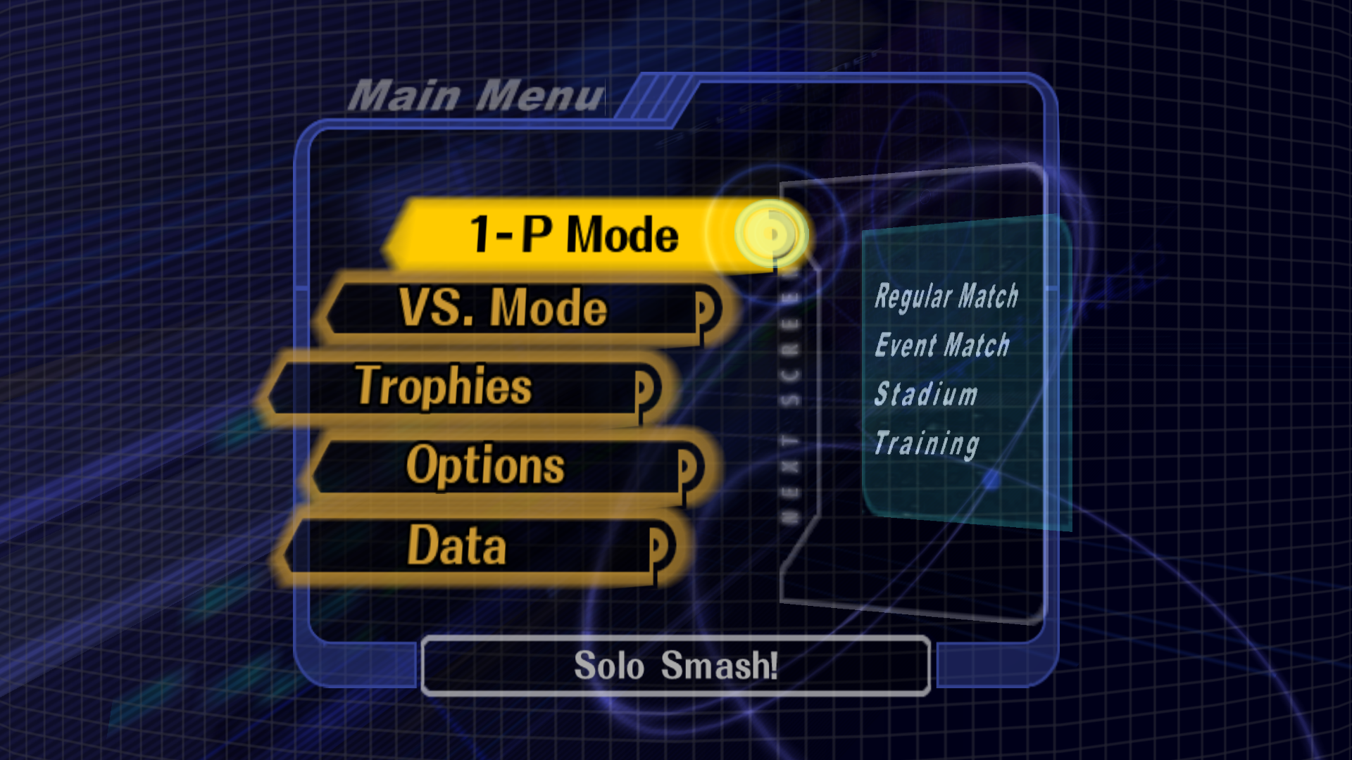
Smash 64 and Melee have the best general idea. Things are divided between multiplayer and single player. Then you have trophies, options, and Statistics. Within single player you can have the Single Player Events, Classic, All-Star, Master and Crazy Orders, etc. (not necessarily in that order). Within multiplayer you can have 2-player Events, special Smash, "Straight up Smash", Online, Smash Tour, etc. (again, not necessarily in that order). Within Data you can have statistics, Challenges, Video Replays, Stage Creator, Masterpieces, etc. Within Trophies you can have Trophy Rush, shop, Gallery, Hoard, etc. Far more logical, far less bizarre hierarchies.
 

Karkador

Banned
Personally, I don't really have a problem with Smash's menus. I think for the most part, I know where to find everything. But I understand that they're a bit "form over function".

My comment about Persona 5 was about that. The items may be on a list, but the way they animate and become part of the dense amount of visual information on the screen is an even bigger push in the direction of "form".
 
It's so dumb when you enter a shop and you have to go thru every tab of your inventory to get to the merchants stuff... esp when certain tabs take a second or two to load....

Up/down and right/left on the right stick has uses. The left stick goes through tabs, the right stick goes between inventory and vendor. Up and down on the right stick can be used to scan long lists, and up in the inventory will return you to the tabs.
 

Pancho

Qurupancho
Up/down and right/left on the right stick has uses. The left stick goes through tabs, the right stick goes between inventory and vendor. Up and down on the right stick can be used to scan long lists, and up in the inventory will return you to the tabs.

What the hell? Where do they tell you that in the game?
 

Karkador

Banned
Chrono Cross UI, especially that ugly brown background and the plain colours used for elements. Also, the save menu.

The only good thing about that menu was that it looked like it ran at a higher resolution than the rest of the game, and it looked pretty nice and sharp for a PS1 game.
 

xJavonta

Banned
New NHL 16 menus look fantastic, which is a surprise because I normally hate all EA sports UI.

Persona 4 is great too, and so is Catherine.
 
My favorite example of going from best to worst has to be Halo 3 to Halo 4 UI*.

Halo 3 -

halo-3-20070701092615139.jpg


In typical 343 fashion of fixing what aint broke, they looked and it and went "nah we can add shit to it to make it better".

And we ended up with this monstrosity -

B2RPu.png


GfuckingG.

*Best images I could find.
 

Spoit

Member
Oh oh!
How about how the Dragon Age series went from:
DAOtactics.jpg

to
da2tactics2.jpg

to not even being able to set conditions for when to cast abilities!
 
I'd add Wip3out to the mix, one of the first games to use minimalism in game menus. Still looks awesome to me.


Ridge Racer Type 4 is king. King I say.

1fxOdDf.gif


jVfyCGJ.gif


mpkZz0L.gif

these posts right here. late 90s PSX games are still unmatched in the sheer progressiveness of their design choices. wip3out and R4 are easily cream of the crop in this respect.


similarly:

Ace Combat 04
also, that end of mission screen with the arrows representing the fighters.
 
Ridge Racer Type 4 is king. King I say.

1fxOdDf.gif


jVfyCGJ.gif


mpkZz0L.gif

Great choice! R4's menues are sublime and slick.

How sexy was that Wipeout HD Fury menu? Too damn sexy.

VyZOsSQ.jpg


Needs music for full appreciation: https://youtu.be/uOjjJBx8eTU?t=2m47s

The WipEout series has always had great design and art direction.

WipEout 2097/XL menues are easy to navigate and clearly presented, with type of race, ship and track, then a simple start button to get going.

wipeout_2097_illus1.jpg


WipEout 3 also had very minimalistic, but simple menues to navigate:

tumblr_nhixroC9Gn1qdzoq5o1_500.jpg


208787-wipeout-3-playstation-screenshot-all-menus-in-the-game-are.png
 

A-V-B

Member
Ridge Racer Type 4 is king. King I say.

1fxOdDf.gif


jVfyCGJ.gif


mpkZz0L.gif

R4 definitely had the best racing art design of all time, and I say that while acknowledging the cyberpunk loglo bliss of the Designer's Republic. Namco was literally insane not to make that aesthetic their eternal brand. I'd pay out the ass to see it in HD.
 

Spinluck

Member
I love the design of Smash 4s UI but holy shit is it unorganized.

I think the Batman Arkham games have nice UI's and menus.

Sonic Generations too.

Persona 5 is looking to be one of the best ever. Sorry for no pics, I'm on mobile.

PlayStation All-Stars and Dragon Age Origins are the worst in recent memory. The Witcher 3 is guilty of shit menus too, Jett covered my thoughts on it.
 

Caronte

Member
Final Fantasy XIII and the sequels all got very good menus and UI in them...


Simple, elegant and intuitive =D

First one I thought. So fast and responsive.

I love Pillars of Eternity UI as well. I think for a kickstarter game (where they don't focus so much in these things) it looks really great IMO.
 
1halo-reach-beta-matchmaking-menu.png


Reach has the best UI by design and functionality, worst is by far Halo 4. I don't know what 343 was thinking with Halo 4's UI
 

DOWN

Banned
My favorite example of going from best to worst has to be Halo 3 to Halo 4 UI*.

Halo 3 -

halo-3-20070701092615139.jpg


In typical 343 fashion of fixing what aint broke, they looked and it and went "nah we can add shit to it to make it better".

And we ended up with this monstrosity -

B2RPu.png


GfuckingG.

*Best images I could find.

1halo-reach-beta-matchmaking-menu.png


Reach has the best UI by design and functionality, worst is by far Halo 4. I don't know what 343 was thinking with Halo 4's UI

Halo Reach.


Some of the submenus in Firefight for example got messy, but the simplicity of the title screen still is amazing.
Reach to Halo 4 was so pathetic and sad. Reach was a marvel.
 
A little surprised to see people bring up Final Fantasy 10 as an example of the "best". I'd describe it as a compost pile of clashing gradient colours, arbitrarily difficult to read, and just all-around unpleasant to look at. A veritable synaesthetic nightmare that could only have existed as a gaudy 90s screensaver, or a PS2 launch game where they were too enamoured by the colour depth of new hardware and the ability to do tacky gradients.
 
A little surprised to see people bring up Final Fantasy 10 as an example of the "best". I'd describe it as a compost pile of clashing gradient colours, arbitrarily difficult to read, and just all-around unpleasant to look at. A veritable synaesthetic nightmare that could only have existed as a gaudy 90s screensaver, or a PS2 launch game where they were too enamoured by the colour depth of new hardware and the ability to do tacky gradients.

Speaking of FF. I really think FF13's menues and presentation are slick as hell. Love them and the smooth looking transition when switching screens.

 
I remember one of the best interfaces I've ever seen is the one from Dirt 3:

Guess I am more of a practically oriented guy, because all the prettiness made for a very slow menu system that infuriated me when I played. The stripped down menus of Dirt Rally are a hundred times better to me, because they are simple to use and fast responding.
 
i didnt like the game that much but i thought the Last of us' crafting system was very easy to use and good to understand. The inventory system was well thought out.

Opposite of this is Dragon Age Inquisition. Terrible menu and inventory and load times to bring up a new damn character.
 
Top Bottom