I shit you not, I did not know the game had a brotherhood feature primarily because of The layout until after I finished the gameI think Assassin's Creed 3 had multiple weapon wheels and none of them were usable.
-
Hey, guest user. Hope you're enjoying NeoGAF! Have you considered registering for an account? Come join us and add your take to the daily discourse.
You are using an out of date browser. It may not display this or other websites correctly.
You should upgrade or use an alternative browser.
You should upgrade or use an alternative browser.
Worst UIs and menus in gaming?
- Thread starter Enter the Dragon Punch
- Start date
Hibiki Kurosawa
Member
Yeah Smash 4's is complete shit.Look at this and tell me where the single player content modes are.

Baffled?They're in "games & more".
krizalidzero
Member
Look at this and tell me where the single player content modes are.
Baffled?They're in "games & more".
OMG, I hate Smash's menu and Splash Screen. ALL of the modes I want to play are almost hidden and every time I turn on the game (not that often) I forget where they were and have to go through the whole thing.
aSDAFSAFasf
JaseMath
Member
Smash Bros. UI is a complete disaster. No visual hierarchy. Readability issues. Hard to find stuff.

They put out a big update a year after release that almost revamped the entire layout of the game thankfully.Burnout Paradise City
It's like the devs were under influence of something to think those menus were usable.
Also car selecting and paint color changing at garage all had 2 sec loading times even on SSD.
I can't say that it was completely absolved of issues but it definitely felt better if I remember correctly
Hammerlord
Member
I don't usually find most user interfaces too bothersome but I was always irritated by the weapon and item boxes in the lower left of the screen in Dark Souls 1. That shit was way to huge. Luckily it could scale down with David and 2 and 3 mostly fixed the issue.
Jeiiya
Member

Thank you, I wish I could thumbs up a post here.
Every time your character levels up or completes an objective in the middle of a fight, I just close my eyes because I can't tell what the fuck is happening.
The pinball arcade's new UI is beyond terrible. It looks like a 90's geocities website with a chrome filter on everything.
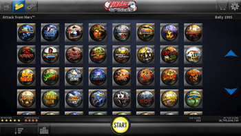
Note: i couldn't find an actual picture of the new ui. It's worse than this.
It baffles me that I cant use the mousewheel in this screen. Or that pictures of the tables were replaced with terrible pinball shaped logos
Zombegoast
Member

Do I need to explain this?
secretanchitman
Member
Off the top of my head, I can't think of a recent game that had a really bad UI. However, the original Xbone UI and even to an extent the current UI is pretty damn bad. Slow, randomly unresponsive, cluttered, and is just a mess. The current UI fixes things a bit but it needs another refresh/revamp to really get it up to speed.

Sonic Generations is a great game, but it's menus look like they wanted to replicate the old geometrical pattern style on the Japanese box arts for the Genesis games, but then decided to use only the loudest variations of primary colors, overdesign it as much as possible, and then use a bubble-letter font.
The end product looks as tacky as a design you'd get on a discount napkin set from Party City.

From the beta, don't know if it got tweaked to not have as many instances of it looking like such a mess.
The Division's UI is fine. It's only shitty in that specific screen because he's standing near the upgrade spot after apparently just completing a mission. It's easily far better than the examples in this thread.
yanipheonu
Member
Controversial opinion: Dark Souls 3.
I was coming from Bloodborne, where everything is slimmed down and much more appealing to the eyes.
Dark Souls 3's Ui just felt clunky and ugly in comparison IMO. Like a UI stuck in last gen mentality.
Those all important item descriptions get less real estate and are just not presented as well as Bloodborne's.
And while still getting used to control differences, it felt like any given command you needed for the menus was more obtuse.
I understand it's more for the Dark Souls fans used to it, but for me, I'd rather they left that in the past. Make a more appealing Ui while not sacrificing the more advanced RPG mechanics souls has.
Along with my many complaints of Skyward Sword, one of them being the hideous looking UI. In the way and a constant reminder of how bad the controls are.
Not the point
But it gets worse
Aside from bad controls and having to be told how to always play the game, the strange addition of dowsing just adds more to a bland looking game with a bad UI with ugly looking dowsing mechanic UI. What is this? Links badly anti-alising chud
Before that one person posts a picture of WoW, you're not allowed to use [that one image] which shows all of the add-ons they have installed.
Smash 4 has a terrible menu too. Why is training hidden away behind menus and as a small icon?
you can hide the UI. how is that not the point in a thread about UI? I agree about the dousing but the controls are great.
Septimus Prime
Member
Xenoblade Chronicles X
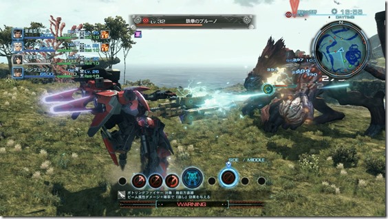
Look at all those meters and numbers and icons, and that's just the overworld HUD! Look at that tiny-ass text; it's pretty much unreadable no matter how large your TV is, and you can't really tell from this image, but each of those action icons contains its own set of meters. And this isn't even going into the sub-menus, which look like this:

What the fuck is going on here?
Look at all those meters and numbers and icons, and that's just the overworld HUD! Look at that tiny-ass text; it's pretty much unreadable no matter how large your TV is, and you can't really tell from this image, but each of those action icons contains its own set of meters. And this isn't even going into the sub-menus, which look like this:
What the fuck is going on here?
iRAWRasaurus
Banned
:lol dat 15 food and fucking paper clip dude.
Welfare
Member
343 actually fixed the Carnage Report and the slow REQ stations in May. Besides those, yeah Halo 5's UI is pretty bad.
themagicalkitsune
Member
Smash 4's menus are so bad they turned me off from the game itself.
harrisk954
Member
Gran Turismo 5: The Thread
Came here to post this!
Dragon Age 2. Even ignoring the fact that the tactics in general were nerfed to hell because of the wave mechanics, the UI itself was a drastic step down compared to it's predecessor. They replaced the nice, nested dropdowns with an 8 item list, when the menus could have upwards of a dozen options. And chopped off like 1/3 of the usable space of the monitor on each side.

EDIT: sorry, _7_ items
EDIT: sorry, _7_ items
ss_lemonade
Member
Do applications that allow you to emulate count? If so, retroarch would be one. I know that it provides a ton of customization but the UI can be pretty bad. The way menus work, how modifying some options can lead to an application that stops working, inconsistencies in design and not knowing right away how to do certain things like changing control mappings.
Controversial opinion: Dark Souls 3.
I was coming from Bloodborne, where everything is slimmed down and much more appealing to the eyes.
Dark Souls 3's Ui just felt clunky and ugly in comparison IMO. Like a UI stuck in last gen mentality.
Those all important item descriptions get less real estate and are just not presented as well as Bloodborne's.
And while still getting used to control differences, it felt like any given command you needed for the menus was more obtuse.
I understand it's more for the Dark Souls fans used to it, but for me, I'd rather they left that in the past. Make a more appealing Ui while not sacrificing the more advanced RPG mechanics souls has.
Bloodborne's UI is an evolution from Dark Souls 1's and Dark Souls 3's is an evolution from DS2's. I think I prefer the former too.
Gran Turismo 5: The Thread
this right here......just awful
darkwing-buck
Member
I just got bf4 on pc and maybe i have to get use to it (idk) but the web browser UI is bad. I had to get into a live multiplayer game just to change the video settings.
Sonic All Stars Racing Transformed.
Every single menu option was brought up as a sliding graphical feature.
Except, it always slid from left to right... and would slide alllllll the way across the screen before letting you pick the next option, and then after you choose it would slide out.
It was like introducing 2 seconds of input lag for every choice in the game. Absolutely fucking horrible. At the end of races, it would sometimes take 15 seconds just to RETRY if you lost because of these stupid menus.
For some reason they were allergic to using screen space so whenever there were any results they'd have to slide them in and out in the same manner, one by one.
Fbh
Member
Playstation All Stars Battle royale.
There is hard to use and ugly bad, and then there is "looks like a fan made menu made in 4 minutes by someone with basic photoshop skills" bad

There is hard to use and ugly bad, and then there is "looks like a fan made menu made in 4 minutes by someone with basic photoshop skills" bad

Kombatologist
Neo Member
The original UFC Undisputed is my most hated. The layout is fine but navigating menus takes a ridiculous amount of time. It makes going through career mode such a damn chore.
EA Sports UFC and UFC 2 have the same issue. Even selecting your fighter is excruciatingly sluggish.
Interferon
Member
The original UFC Undisputed is my most hated. The layout is fine but navigating menus takes a ridiculous amount of time. It makes going through career mode such a damn chore.
This!
Similar to GT5, it's mostly like:*select * loading * back * loading * 2 x confirm(YES/NO) * loading
I really hate it when devs prioritize aesthetics over fluidity. Not to mention, both the newer UFC games and GT6 were better in that regard
People will disagree because I've seen a lot of love for The Last Remnant but my God the UI. I didn't play it for very long before I had to be rid of it - I'm sorry.
EDIT: Obviously there are more reasons as to why I sold the game. Not just the UI.
EDIT: Obviously there are more reasons as to why I sold the game. Not just the UI.

Waluigilicious
Member
Smash Bros 4: The Thread.

I literally burst out laughing irl after reading this.
Bungie
Member
Featuring medals haha. I really like the updates so far.343 actually fixed the Carnage Report and the slow REQ stations in May. Besides those, yeah Halo 5's UI is pretty bad.
Bloodborne's UI is an evolution from Dark Souls 1's and Dark Souls 3's is an evolution from DS2's. I think I prefer the former too.
I wouldn't say that. DaS3's interface takes cues from both DaS2 and BB and also regresses in some aspects compared to both of them (it still annoys me greatly that the menu closes every time you use an item whereas it didn't in DaS2...).
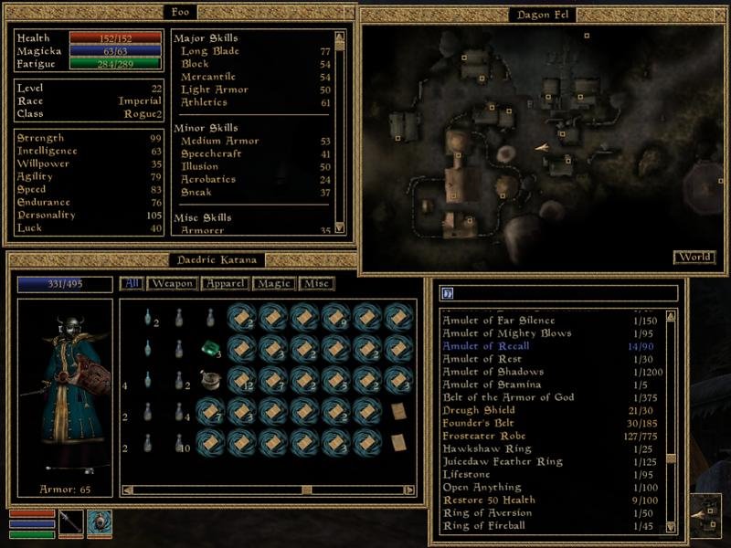
Dr. Benton Quest
Banned
Morrowind is my favorite game of all time. That UI though...
H5's UI is infinitely better then every other one in this thread.
It's clean and easy to use and with the updates has only got a few minor issues.
Corpsepyre
Banned
Ubisoft thread?
Yeah, their games.
Yeah, their games.