• Hey, guest user. Hope you're enjoying NeoGAF! Have you considered registering for an account? Come join us and add your take to the daily discourse.

Your Favorite Videogame Title Logos

deusex.png

I still have no idea what (if any) meaning the logo has. Is it supposed to be Icarus and Daedalus, with JC/Bob Page at the center?

Stay classy, Japan.

 

myy

Neo Member
Unlimited Saga
I really like the splash of colour present here and also the calligraphy-esque form of the text.
cSpYcOG.jpg


Final Fantasy VIII
Portrays a wonderful scene and a key theme for the game. :)
0cafrq1.jpg


BONUS: Canis Canem Edit (Bully)
Always brought Hogwarts to mind, and that's reason enough to like it for me. :D
 

AniHawk

Member
i find i'm drawn most to fonts manipulated slightly to evoke feelings about the game. sometimes i can go for something super fancy when the game calls for it. jet grind radio is a crazy over the top game, so the graffiti look is really the only way to go. i really like the first six legend of zelda logos - having the serif font carry through the entire thing was really classy. starting with the wind waker (really, the oracles games), they got away from that. twilight princess has this weird font and crappy gradient. i don't know why. skyward sword's fits the game more but it doesn't mesh with the text above.
 

Tunahead

Member
I really quite like the Jade Empire title logo. But specifically the version that only exists on the PC DVD Special Edition steelbook of it. I really like that steelbook. A nice sturdy box, with a little art booklet and everything. And on the spine, the title: "Jade Empire: Special Edition"

Well, sort of:

BzuHB7z.jpg


:D
 
Still one of my favorite games ever, but the rest of the world got robbed on the Castlevania IV logo (at its best when you see the logo's blood dropping and pooling at the bottom, panning up to this):

Akumajou%20Dracula%20(J).png

51261_front.jpg


If you didn't buy the mug with this logo from the flyer that came with the game, you have never truly won Sonic & Knuckles.

8459786967_84886b4770_z.jpg
 

dmshaposv

Member
slick ass graphic design right here

half_life_2_logo_by_zeptozephyr.jpg


excellent way of integrating the '2' in the logo as well as the lambda symbol in the 'half'


Also:

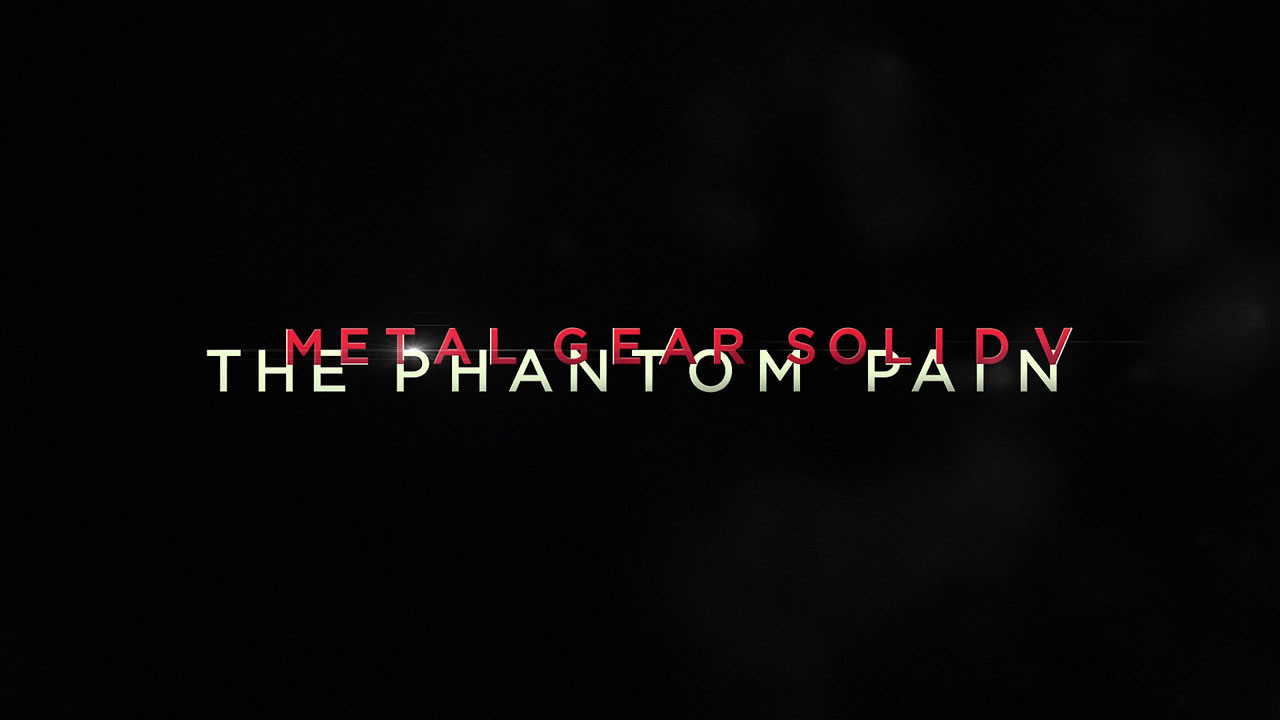
Metal-Gear-Solid-V-The-Phantom-Pain-Screen.jpg


Very conceptually cool logo if you think about what Kyle Cooper (yes that legendary kyle cooper who is a well known graphic/motion designer kojima has used) has done here.


713969.jpg


The negative empty spaces where you don't have MGSV in the TPP, resembles the shrapnel protruding from big boss's head.
 
In terms of overall design, I've always felt that World of Warships has an absolutely excellent logo design:


The game revolves around controlling every aspect of large World War II-era warships, and the logo encapsulates this perfectly. Beyond just the metal, rivets, and rust of the logo, just look at how the emblem and text are arranged: the overall shape of the logo resembles both a front-on profile of a warship of that era:


and an anchor:


Meanwhile, the emblem that crowns the entire logo is the emblem from the World of Tanks logo stylized into an anchor:


Also notice how the World of Warships emblem has a greenish blue color similar to that of the ocean.

The World of Warships logo as a whole has always struck me as brilliant because of how thematically consistent it is, because of all of these elements.
 
Top Bottom