Kai Dracon
Writing a dinosaur space opera symphony
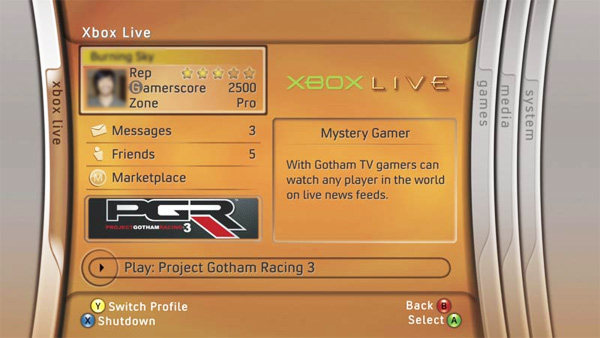
Really crazy looking back on it.
It's as if we are in a different gaming generation now.
The thing I miss about the blades is the compactness and focus. Everything related to only a few major categories right there in one of three blades. Blades felt natural to shuffle back and forth through with the controller bumpers.
Everything since then has felt as if it was constructed purely by marketing staff first, with some limp reminders from an actual UI team tacked on.
And I realize some don't see the problem with advertisements everywhere. But I still think it's bad design, and based on bad principles. It would be one thing if ads were confined to a specific marketplace screen. That's appropriate. But the key thing is, the metro-esque tile interface provides the potential for a customized user experience. They could have allowed you to select which tiles you wish to see on every screen but the marketplace screen. If the user wanted to drag and drop a tile that advertised the hot shit happening on Xbox Live, that's fine. They could have. Instead, the layout is chosen for you and most of it is ad copy, I don't care whether it's for Xbox products or not. With the tiles for your own games and your own content being the smallest and most marginalized. It's honestly kind of insulting.
At least the pins feature may mitigate some of the navigational and organizational damage they've done to the system interface over the years.

") but that lets you remove system updates.
but that lets you remove system updates.