• Hey, guest user. Hope you're enjoying NeoGAF! Have you considered registering for an account? Come join us and add your take to the daily discourse.

Shenmue III to be published by Deep Silver, details for Gamescom meet and greet

Rellik

Member
DHajK22UIAAOYbB.jpg:large

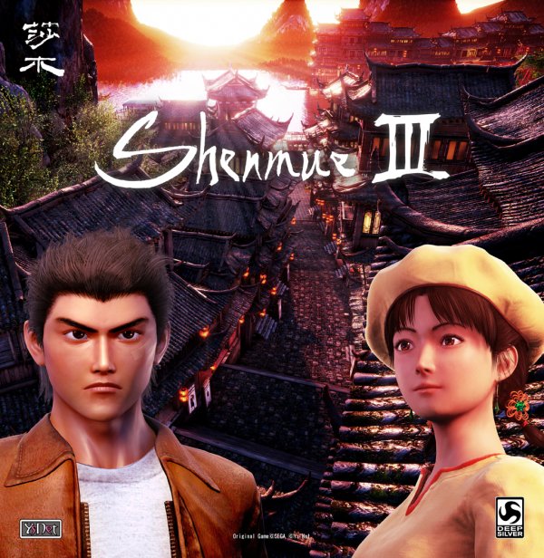
That's not the cover, right? I hope not or I'll die of laughter when I get it.
 
Both faces need work. Sumo managed with Ryo in Sonic ASRT so expect anyone else to do just as good. If only Sega would just give them the Passport disc assets (assuming they even have them). Those were nice!
 

Jcgamer60

Member
Both faces need work. Sumo managed with Ryo in Sonic ASRT so expect anyone else to do just as good. If only Sega would just give them the Passport disc assets (assuming they even have them). Those were nice!

I believe Suzuki-san did state the final models will look better than the passport. We just need to be patient. My issue is I can't seem to shed the fact that this won't have the distinct aesthetics I loved about the first 2 games. As it stands it looks a bit cheap atm I must admit, but improvements are inevitable.

The environments on the other hand look great.
 
I believe Suzuki-san did state the final models will look better than the passport. We just need to be patient. My issue is I can't seem to shed the fact that this won't have the distinct aesthetics I loved about the first 2 games. As it stands it looks a bit cheap atm, I must admit but improvements are inevitable.

The environments on the other hand look great.


Well for now, it looks like a generic European point and click title.
 

jcjimher

Member

I'm loving everything about this. The background and lighting is wonderful, and the logo has personality and is better than the last one (which felt like too much of a rehash of the old games).

The models are perfectly fine (and much better than before). Of course they are not Uncharted-level, but this is a $6M budget kickstarter.
 

jcjimher

Member
Logo change is weird, what was wrong with the original Shenmue logo? Its not like it was outdated or unfitting.

The background behind the logo changes for III, explained by Suzuki himself, is that the original logos were hard to read because of being cursive (letters linked to each other). That's why they made and sustained that horrible Papyrus logo:

HP4HNAR.jpg


But they got a lot of (deserved) criticism and they went back to the original:

logo.png


Although weridly separating the initial S from the rest of the word.

The new logo seems to be a compromise, and I think it's easier to read actually.
 

FingerBang

Member
I honestly don't understand the complaints. People should be happy this game is happening and just be mad at SEGA for not releasing Shenmue I&II HD with better controls.
 
Yeah.. not really. You should play Sonic ASRT again :/

Ok so he looks not perfect but you wouldn't know just racing. Excuses.


I believe Suzuki-san did state the final models will look better than the passport. We just need to be patient. My issue is I can't seem to shed the fact that this won't have the distinct aesthetics I loved about the first 2 games. As it stands it looks a bit cheap atm I must admit, but improvements are inevitable.

The environments on the other hand look great.

I feel Sega had a distinct look in those days not just with Shenmue but Crazy Taxi, Space Channel 5 and even Virtua Tennis, and I think that's where the problem is. Instead, right now it does look on the cheap, uninspired side. Something is off, that's for sure. But I'll remain patient still.
 
The background behind the logo changes for III, explained by Suzuki himself, is that the original logos were hard to read because of being cursive (letters linked to each other). That's why they made and sustained that horrible Papyrus logo:

HP4HNAR.jpg


But they got a lot of (deserved) criticism and they went back to the original:

logo.png


Although weridly separating the initial S from the rest of the word.

The new logo seems to be a compromise, and I think it's easier to read actually.

you could be right about the readability. Its not like I don't like the new logo, actually it looks good.
 

ash_ag

Member
The new logo was no doubt approved by the same person who thought using Papyrus on a high profile product can be considered anything but a joke. :p

Hope it gets changed again. Surely it can't be that hard to find a person who knows calligraphy that can draw a logo in the spirit of the original, yet easier to read.
 

Heartfyre

Member
I'm not too surprised. Games like Persona 5 which, by all rights, should have been published by Sega in Europe, were passed on to Deep Silver, and those Sega/Atlus titles turned out fine. So it's a good partner for this game, I think.
 

orient

Neo Member
Ryo looks very faithful to some of the original high-res renders from back in the day. Shenhua looks a little different from her original model (thinner nose) but different doesn't equal bad. They're never going to look exactly the same as their Dreamcast models when they have tens of thousands of extra polygons to work with. Alas, some fans will never be happy, and the way some of them act on Twitter when something doesn't match the non-existent Shenmue III in their head is embarrassing and entitled.
 

Sentenza

Member
6/10's incoming
Possible. Maybe even likely.
Signs that this could end being underwhelming were out for a while, even if people are willingly making an effort to ignore them, like they did with previous Kickstarter projects.

Nothing that could be blamed on Deep Silver, anyway.

P.S. That cover is dreadful. It looks like something out the PS2 era. They should go with some artwork or something even more abstract, rather than awkward, plain-looking 3D models.
 

oti

Banned
Looking at their list of games shows me that outside of a few, the majority are mostly throw away indie games. I don't expect a large marketing budget from them.

It's Shenmue 3. What kind of marketing budget did you expect for it to begin with? Game is in competent hands, as far as I'm concerned.
 

jamiesummerz

Neo Member
Well they totally fucked the Persona 5 launch in Europe. Not enough copies even when there was 6 months of hype beforehand and it was obvious reviews were going to be great. It was sold out everywhere online in the UK a week before release and didn't restock for over a month after release, only way to get it was paying £70-£80 for the standard edition on ebay or going digital for £55.
 

Spaghetti

Member
Lotta fear mongering in this thread. Game won't even get its first public unveiling until next week and some of you are acting like it's all over already.
 
Lotta fear mongering in this thread. Game won't even get its first public unveiling until next week and some of you are acting like it's all over already.


Let's be honest though. Even as a Shenmue fan, I had been willing to excuse some things. But let's not act like today's news inspire confidence. I dont care for Deep Silver publishing it, but the new logos and renders... eeeeeew.
 

DKPOWPOW

Member
Why does Ryo's face look so bad? It's worse than the DC original. Other than that, still so happy to see that this game is happening. I just hope they got enough funds to make the game good, hopefully they can at least match the original's art style just in HD.
 

jcjimher

Member
P.S. That cover is dreadful. It looks like something out the PS2 era. They should go with some artwork or something even more abstract, rather than awkward, plain-looking 3D models.

I don't think that will be the game cover, but simply a promo material to unveil the long anticipated Ryo and Shenhua models.

In any case, this is the direct continuation of a game from the PS2 era, and wouldn't be surprised if the final cover is not abstract and features 3d models. Both Shenmue I&II did that, actually.
 

orient

Neo Member
Let's be honest though. Even as a Shenmue fan, I had been willing to excuse some things. But let's not act like today's news inspire confidence. I dont care for Deep Silver publishing it, but the new logos and renders... eeeeeew.

These renders are so much better than the Kickstarter models. Still, they're only renders and it's hard to base an opinion on one render of one angle of a character's face. It's the model, in 3D, in the game that matters.
 

Spaghetti

Member
Let's be honest though. Even as a Shenmue fan, I had been willing to excuse some things. But let's not act like today's news inspire confidence. I dont care for Deep Silver publishing it, but the new logos and renders... eeeeeew.
New logo, IDK what's going on with that. Might have been something thrown together independently of YSnet by Deep Silver, and we already know from the last logo change that if fans shout loud enough - it'll be changed again.

Not really seeing what is so disgusting about the new models. Shenhua is a little odd but both her and Ryo's new models can be traced back to CG art from the original games. They're leagues above the cut-rate cosplayers from the E3 2015 reveal.

Like the Ryo model is almost spot on for an update of his original Dreamcast model. I don't get why people would throw a fit over stylised models (which we already knew was the direction YSnet were taking) that are character-accurate, AND with over a year left for tweaks.

It just feels like knee-jerk bullshit from people who either expected a more realistic style or haven't paid attention to any of the established art decisions revealed so far.
 
These renders are so much better than the Kickstarter models. Still, they're only renders and it's hard to base an opinion on one render of one angle of a character's face. It's the model, in 3D, in the game that matters.


Although these renders gives a hint on the direction they're heading in term of design. And it looks bad.


New logo, IDK what's going on with that. Might have been something thrown together independently of YSnet by Deep Silver, and we already know from the last logo change that if fans shout loud enough - it'll be changed again.

Not really seeing what is so disgusting about the new models. Shenhua is a little odd but both her and Ryo's new models can be traced back to CG art from the original games. They're leagues above the cut-rate cosplayers from the E3 2015 reveal.

Like the Ryo model is almost spot on for an update of his original Dreamcast model. I don't get why people would throw a fit over stylised models (which we already knew was the direction YSnet were taking) that are character-accurate, AND with over a year left for tweaks.

It just feels like knee-jerk bullshit from people who either expected a more realistic style or haven't paid attention to any of the established art decisions revealed so far.


It's not because of realism. It just looks painfully bad. Be honest to yourself, these look worse than DC era CG renders of Shenmue... heck even worse than Passport models.
It's because of the design and also because of really cheap textures/look. They look like a European knockoff point and click. And they definitely look more westernised.

This is how Shenua looks:
 

Sloane

Banned
Possible. Maybe even likely.
Signs that this could end being underwhelming were out for a while, even if people are willingly making an effort to ignore them, like they did with previous Kickstarter projects.
Hey, at least that Final Fantasy VII remake will be great... right?
 

openrob

Member
Nocon Kid, who created the HD fan remake in Unity (and was subsequently hired by YSNet) just posted on Facebook saying he is not involved with character creation (he is working on background design).

He created this:
maxresdefault.jpg
 

FaustusMD

Unconfirmed Member
Well... this is certainly shaping up to be a Kickstarter game, all right. That Ryo model is just not good enough and the Shenhua one only looks passable because of her relatively few renders in the past.
 

gogogow

Member

Ryo looks on point. Shenhua otoh.........she initially looks bad when they first showed her, now they changed her again. She originally (from the DC games) actually looks Japanese, although she was Chinese, that's fine by me. But now, I have no idea wtf she is. She still looks bad, generic etc. and looks like an entirely different person.
 
Top Bottom