• Hey, guest user. Hope you're enjoying NeoGAF! Have you considered registering for an account? Come join us and add your take to the daily discourse.

Your favourite console game boxes/designs

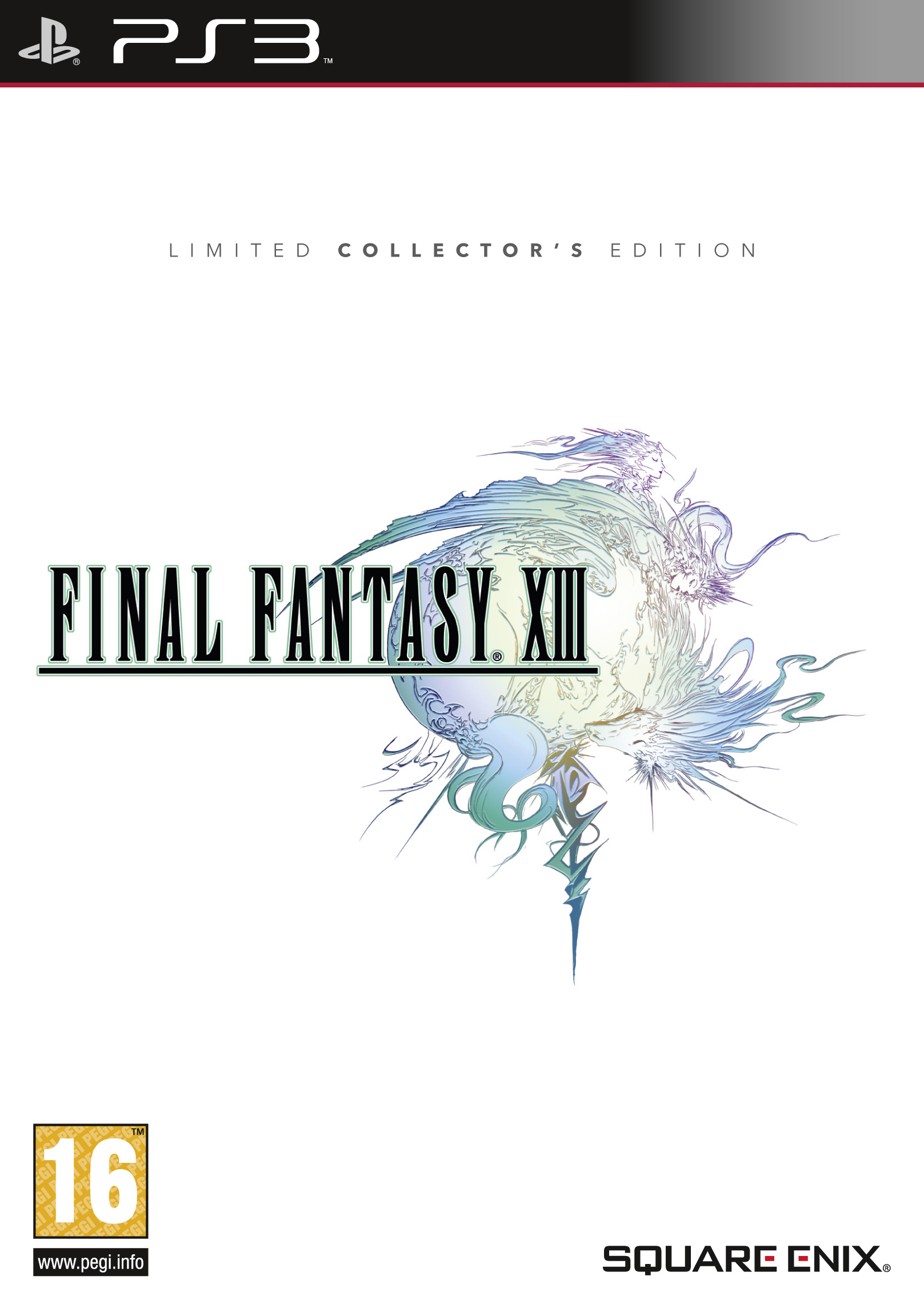
Today I want us to talk about standartised console box designs, both cases and elements of box arts.

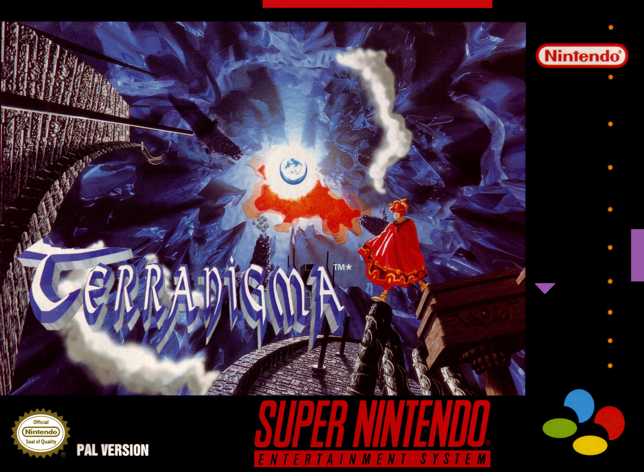
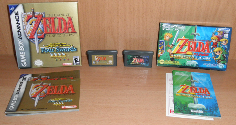
I have to say I really love European Nintendo DS boxes. Well, first of all, the "Nintendo DS" line perfectly fits every box art, and WFC and Touch! Generations logos were informative, distinctive and not spoiling the look of the box art. Secondary, European boxes were thick, solid and made of transparent plastic, which allowed publishers to make dual-sided box art. And, as well as with the other post-DS EU Nintendo boxes, the most of the counterfoil designs (well, at least a big chunk of the library) was just a plain text made with the same font. Combined with awesome manuals and a lot of feelies, this makes these boxes most pleasant to collect for me.

YJdHBTX.jpg
g8cnQiD.jpg

Notable mention for European Wii U blurbs about the amount of offline/online players and the required/supported controllers, with distinctive differentiation between them (so no more hassle about whether Nunchuk is required to play the game, like in the Wii era). But... Japanese blurbs are actually way more informative, with the save file, surround sound and resolution info, as well as very detailed controller chart:

a6J2NsQ.png


So, what are your favourite designs, boxes and touches?
 

DOWN

Banned
Prefer any of the poster ratio boxes to the squared ones. I like the Xbox One cases, except the horrible green.

71213_front.jpg

37007545a7abc397017002fc9a713ea2.jpg

628416-resident_evil_4_ps2.jpg

owJvo-1-630x800.jpg

217.jpg


Haha sorry, but you mention box art itself too. I will just say I prefer the poster shape of home console box art like movies, rather than square like DS
 

Majine

Banned
The Xbox One cases are classy with their embossed logo. Green makes it unmistakably Xbox, but different enough from the 360 cases.
 
Guys, that's not what I wanted us to talk about -__-

I meant the platform-specific game box features - plastic boxes, platform stripes, feature information etc. Like, imagine some hypothetical multiplatform game being released on every single platform ever, and then choose your favourite box.

EDIT: Oh, the thread is not completely derailed yet.

Xbox One cases in general are my favourite because of the matching spines. They look so classy in grey, and the cases themselves are very slimline and stack well.

That's how I always imagined good game box spines. I cannot see the appeal of multicolored ones, except it's some sort of special release with the plastic box being in another colour.
 
People like the Euro DS boxes? As someone with a DS collection made up of about 80% imports, those were the scourge of my collection when they were on the shelf. In a similar way to how Euro PS2 spines looked too bland on a shelf with US and Japanese ones too.

Japanese GBA and the PSP cases are favourites of mine. Japanese Gamecube too.
 

Fliesen

Member
Xbox One cases in general are my favourite because of the matching spines. They look so classy in grey, and the cases themselves are very slimline and stack well.

the fact that both current gen consoles don't use the tall DVD cases anymore but opted to use the short versions is great.

I don't get why the WiiU still has those dumb tall ones.

but since i go mostly digital, i don't really care anyways ...
 
the fact that both current gen consoles don't use the tall DVD cases anymore but opted to use the short versions is great.

I don't get why the WiiU still has those dumb tall ones.

but since i go mostly digital, i don't really care anyways ...

They are, basically, late Wii boxes (with Nintendo logo embodded inside instead of Wii ones), just being made in different colour. Really, molding-wise, they are identical.
 

DOWN

Banned
Guys, that's not what I wanted us to talk about -__-

I meant the platform-specific game box features - plastic boxes, platform stripes, feature information etc. Like, imagine some hypothetical multiplatform game being released on every single platform ever, and then choose your favourite box.

EDIT: Oh, the thread is not completely derailed yet.


That's how I always imagined good game box spines. I cannot see the appeal of multicolored ones, except it's some sort of special release with the plastic box being in another colour.
Haha sorry, but you mention box art itself too. I will just say I prefer the poster shape of home console box art like movies, rather than square like DS
 
I think Wii cases were the least obtrusive visually last gen but even then the logo wasn't amazing, exactly. I definitely hate all of that "platinum hits / player's choice" etc bullshit, they look terrible 100% of the time.

This go around, I think the Xbone cases are nice and subtle in terms of not taking up too much room on the cover, yet I'm still not a fan of the green aesthetic all round.
 

NotLiquid

Member
While the Wii U boxes aren't necessarily complimentary to many multiplatform releases, the European versions do a great job in keeping a cohesive balance on the casing and labels (for some reason the US version has white stripes on the side) and in general it comes together in making many great covers pop out.

My personal favorite has always been the Gamecube though.


There's never really been much to the cases but that distinguished logo, the font variation and the boldness of the "Gamecube" really makes it stand out. The small discs also add a sense of imminent curiosity. Kind of makes the cover stand out in a bold way while opening it and removing the discs has a sense of "greatness can come in small sizes" factor to it.
 
I think Wii cases were the least obtrusive visually last gen but even then the logo wasn't amazing, exactly. I definitely hate all of that "platinum hits / player's choice" etc bullshit, they look terrible 100% of the time.

This go around, I think the Xbone cases are nice and subtle in terms of not taking up too much room on the cover, yet I'm still not a fan of the green aesthetic all round.

They are definitely subtle! Print onsole name on the plastic itself is a really good idea, I kind of wonder now why Sony decided to push Blu-ray logo in the same position instead.

Wii logo was unobstructive, but its assymmetrical design really messed with some box art, especially with ones with the logo at the top. But things flying in front of the banner were cool, I like that in some of Wii U boxes too.

Nintendo-Land-NSMBU-box-art.jpg
 

flohen95

Member
Xbox One cases would be nice if not for this:
I mean, it's cool that someone thinks of the lefties for once, but damn, it's so weird.

I quite like the 3DS's case design. Publisher, Game Logo and Game name on the side, pretty sleek, white. Looks good imo. Here's a horrible picture of a part of my collection as an example:
 

Danchi

Member
People like the Euro DS boxes? As someone with a DS collection made up of about 80% imports, those were the scourge of my collection when they were on the shelf. In a similar way to how Euro PS2 spines looked too bland on a shelf with US and Japanese ones too.

Japanese GBA and the PSP cases are favourites of mine. Japanese Gamecube too.

The majority of my JP imports have plain text, too, though? Sometimes over a coloured background.

I prefer the plain text that we generally see on PAL/JP games. Having the game's logo all squished up on the side usually looks pretty bad, to me. The thicker PAL DS games have some nice ones.

I do like having the publisher above the CERO label on Japanese games too. This seems to have become the norm for most releases (it's hit and miss with 360 imports) late into the PS2's lifecycle (and has spread to EU 3DS/Wii U games).
 
While the Wii U boxes aren't necessarily complimentary to many multiplatform releases, the European versions do a great job in keeping a cohesive balance on the casing and labels (for some reason the US version has white stripes on the side) and in general it comes together in making many great covers pop out.

My personal favorite has always been the Gamecube though.


There's never really been much to the cases but that distinguished logo, the font variation and the boldness of the "Gamecube" really makes it stand out. The small discs also add a sense of imminent curiosity. Kind of makes the cover stand out in a bold way while opening it and removing the discs has a sense of "greatness can come in small sizes" factor to it.

Speaking of GameCube box arts and unobstructive designs... I present you the shittiest design of Nintendo game box ever. EU GameCube one.

fH1leiZ.jpg


Okay, I kinda can understand ratings, but why placing Seal of Quality on front and enlarging Nintendo logo? The same complaints about EU GBA boxes, by the way. And the giant "ONLY FOR PAL60" blurb is the final shot in the head, although there were probably reasons to do that.
 
I think Wii cases were the least obtrusive visually last gen but even then the logo wasn't amazing, exactly. I definitely hate all of that "platinum hits / player's choice" etc bullshit, they look terrible 100% of the time.

This go around, I think the Xbone cases are nice and subtle in terms of not taking up too much room on the cover, yet I'm still not a fan of the green aesthetic all round.


It's like they don't want you to buy their game.

Edit:
Euro DS games are pretty, I agree and Euro-Dreamcast jewelcases are just as great (and far better than those flimsy US-CD cases)
 

flohen95

Member
Speaking of GameCube box arts and unobstructive designs... I present you the shittiest design of Nintendo game box ever. EU GameCube one.

fH1leiZ.jpg


Okay, I kinda can understand ratings, but why placing Seal of Quality on front and enlarging Nintendo logo? The same complaints about EU GBA boxes, by the way. And the giant "ONLY FOR PAL60" blurb is the final shot in the head, although there were probably reasons to do that.

The PAL60 ONLY has a good reason, yeah. Before PAL60 was introduced, most TV's in the PAL region only supported 50hz, and if you tried to play a PAL60 game on a 50hz TV, you'd not get far. At the time the GameCube was out, many TVs still supported 50hz only. Even early Xbox 360 cases still have a warning for that.
Most GameCube games did support 50hz, though, so that wasn't on every box.

Also, it could be worse than your example. Take the German version of that box, for one:

100038.jpg


At least that was before the USK logo had to be made bigger because of government regulations!

It's like they don't want you to buy their game.

Edit:
Euro DS games are pretty, I agree and Euro-Dreamcast jewelcases are just as great (and far better than those flimsy US-CD cases)

Ah, I totally forgot about the Dreamcast. Yeah, those are glorious. The blue fits much better than orange to begin with, and it's got something special to it since it isn't just a normal CD or DVD case.
 

Bricky

Member
I like my case designs classy and undistracting. Xbox One has great case design, but the green doesn't always go well with the actual boxart. My vote goes to PSP/PS3 Slim era Sony boxes:


And like the OP I have always had a soft spot for (3)DS cases, simple and clean layout with a neat robust little package. Shame the New 3DS case is ugly as sin.
 
Also, you didn't even take the worst example: The German version of Metroid Prime 2:

100038.jpg


At least that was before the USK logo had to be made bigger because of government regulations!

Wow, USK logo is so tiny! I will be glad if it will be kept this size - these logos make every bundle disk/collector's edition look like a box with flammables or rat poison.

PAL60 only logo sure had the reason - I understood it, just forgot the details. Makes me think about crappy EU console treatment all the way till the HD era.
 
And like the OP I have always had a soft spot for (3)DS cases, simple and clean layout with a neat robust little package. Shame the New 3DS case is ugly as sin.

Actually, as I stated somewhere here before, I do not really like 3DS boxes - eco holes made them not as robust as DS one (although I have to admit, I like dual-sided covers playing around the idea of holes, like in SM3DL). Thanks God EU Wii/Wii U boxes are not "eco" yet.
 
My favourite two styles of box art/packaging are raw hand drawn unique art styles and minimalism, exemplified best by the classic Final Fantasy covers where you just have a logo and white cover.

This beauty exemplifies minimalism:
playstation20box.jpg


And I don't want to say an obvious answer with a game cover so I'll go with a wild card, which exemplifies art style:
Metal_Gear_Acid_Coverart.png


And the two concepts together:
 

DOWN

Banned
Xbox One cases would be nice if not for this:

I mean, it's cool that someone thinks of the lefties for once, but damn, it's so weird.

I quite like the 3DS's case design. Publisher, Game Logo and Game name on the side, pretty sleek, white. Looks good imo. Here's a horrible picture of a part of my collection as an example:
Those cases are designed for right handed people. Think about it. With previous cases, you gripped each half of the case to open it, but then as a right-handed person you reposition your left hand to hold the half where the disc is so you can use your agile right hand to pop the disc out and place it in the console.

With the Xbox One cases, a right handed person simply opens it and can grab the disc because the side with the disc is supported and won't flap around if you don't reposition your hands, since left hand is already backing the disc.
 
Steelbook cases are nice when not dented.

I also cannot stand current flimsy Wii U cases, though. They're not even eco-friendly, either, and it even says that they contain no recycled materials,too. Just open up a case, look behind the booklets and underneath the recycle cut-out. +1 for Europe and Japan for using sturdier amarays.

wiiugames3.jpg
 

DOWN

Banned
Nah, nothing beats the PS3 case what it comes to that. The semi see-through plastic case and the black logo were a great combination stylistically and worked perfectly accompanying any cover art


Only the old pc boxes surpass it

Nah, PS3 cases meant they always had to crop the artwork compared to the original poster art that 360 cases could fit. Plus, it was silly to have both a plastic bar for the logo at the top and then to print another logo bar on the cover. That's like over an inch of PS3 logos.
 
Top Bottom